Monthly Archives: March 2018

Chelsea Galleries

On February 28 we went to different exhibits and three that I chose are from the Aperture, Benrubi Gallery, and David Zwirner.


Aperture Foundation: Exhibition: Prison Nation

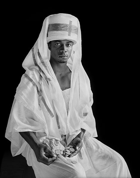
Layla “Roach” Roberts (Inquisitor), 

Photographer: Deborah Luster


I chose this photo because I think that there’s an interesting composition. The black background and the white clothing makes this photo more interesting. In this photo, I think that the man had a light 45 degrees because I can see on the right side of his face more light than the left side. Also, what makes this photo more interesting is the type of clothing that the man is wearing. He looks like some kinds of wealthy man. I feel that the kind of message that the photographer was trying to communicate is how people from those places live.


Benrubi Gallery: Exhibition: Leaning out

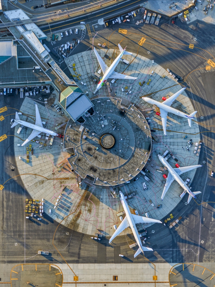
Photographer: Jeffrey Milstein


This photograph was one of my favorites. I love how the photographer shows us our daily life, but in a different view. I never thought how symmetrical an airport could be and how the afternoon light gives this photo a more authentic look. In our everyday life, we go to different places without thinking about our surrounding, but when you see the world in a different way even simple things like a plane, train, etc, can look amazing in photos. The shadows are important in a photo but I wish that I could see this photo without the shadows on the above-left side of the photo because I feel it would look more interesting.


Gallery: David Zwirner

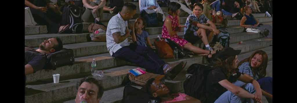
Exhibition: Scenes from the Blackout  (Photographer: Stan Douglas)

This was the last exhibition that we saw together. The first time that I saw this photo I didn’t know exactly what was it about, but when I was seeing more photos in the gallery I notice how this is how people “would react” if we had a blackout. I chose this photo because I don’t see people fighting or doing any kind of bad thing. They are just talking (some of them) and just waiting for things to go back to normal. The only thing that I don’t know is where the light on the left side is coming from (on the stairs) because if this is a blackout I feel that there is a lot of light and less shadow.

Michael Paul Smith

Michael Paul Smith is a photographer who creates realistic photos by capturing the detailed scenery with his camera. He is really good at taking these pictures outdoor and using his car collection and forced perspective. He mentioned that his process and his strong attention to the subjects are the keys to create these scenes. He eyeballs the scene to get a perfect frame with a forced perspective.

So as he said “Keep everything in scale. From the thickness of the shingles down to the wallpaper design and door knobs, everything must be in the proper relationship to each other”, he mentioned that the devil is in detail. In my opinion, we should take some time to get everything in a proper way and to make sure everything is set okay in the frame. I will try what he done for his work so far, and apply on to my shootings. I will definitely focus on the scale rule because I believe thats the main part of this project.


Micheal Paul Smith

Micheal Paul Smith is an interesting photographer. He amazes everyone with his style of photography. I love how toy cars and detail structure surround looks so real. Level of perception his photos have is so surreal because it looks like a real location where cars would be standing. He makes everything by hand which creates placement and scale. He knows how to angle every shot according to the location. He adds extra materials on roads to create a real experience. Looking at his photos can inspire me today use any objects nears and create a location to shoot. He is an expert in that but He changes our vision to create photos like his. He is changing the perspective of this of photography. His idea of using toy cars and detail models is very innovative and it evaluates on our vision to shoot in a different way.

Michael Paul Smith

Michael Paul Smith builds detailed miniature scenes and photographs them. Most of these tiny environments are of streets or involve cars. Smith pays attention to the details in the scene in relation to the surrounding background that will be included in the photo. By manipulating light, Smith creates the desired feel. The images are not filled with light, rather they have areas where light is focused and encourages the viewer to look at the whole photograph, or just a specific spot. The color scheme of the props in each scene are harmonious to one another, the background, and the subjects. For each image to look correct & appealing, Smith uses low angles and forced perspective to create interesting depth and angles throughout the scene.
By emulating the techniques Smith uses to create his work this week’s class shoot can be successful. This week I will be using different pattern cloths and gel lighting to covey the messages of the selected poems.

Richard Avedon & Jonathan Mannion

Richard Avedon is a legend. The New York Times said that “his fashion and portrait photographs helped define America’s image of style, beauty and culture for the last half-century”.  All of his photography is black and white and is compose against a white background. He has captured lots of celebrities which includes Andy Worhol, Marylyn monroe, isek Dineson etc.  Avedon was always intrigued by peoples expression and reaction.  That is exactly what all his shot consist of.  With minimalistic approach he captured the subject reaction up close.

Johnathan Mannion on the other hand is both a photographer and film director.  He made a lot of cd covers and most of his shots like Avedon are black and white. Being that he was Avedon’s student a lot of his styles was an influenced to his.  Eventhough most of his work is colorless he is very good at positioning his subject to describing of what they are about and who they as an artist, actor or singer.  He has a talent of pacement and capturing emotions.

Maternity Shots

The maternity picture that Annie Lebowitz created for Demi Moore and Awol Erizku created for Beyonce are both very stunning photography.  Both of these picture’s purpose is to pronounce the bump of these public figures.  The photos also emphasizes women’s ability, grace and strength.  Both of these photos, the model has their arm framed around their belly. 1 to emphasize it more and 2 to shows how a mother will always protect their baby.


The portrait of Demi Moore mainly shows strength and courage.  She looks like she wants to pass her legacy to her future child and protect it with all that she got.  The lighting illuminates the subject and the background.  The light is coming from a high angle hitting 80 percent of the subjects face as well as casting a shadow underneath her.  This shots is simple but powerful at the same time.  it got to do with the way she is positioning herself too.  Her body is sideway which this way you can see the contour of her stomach and her facial area is turned to the opposing side.  This makes her look powerful and optimistic.

The portrait of Beyonce on the other hand.  This shot in my opinion is not as elegant as Moores portrait even though the photographer adds a floral background to try to make it match. I understand that different artist has different styles but i believe in less is more.  i feel that the floral background as well as the thin cloth that on her face; there is just too much going on!! it seems very unnatural.  What i like about this photo is that she looks very content, very loving and nurturing.  She looks like she is going to take care of the babies(twins) with all that she got.

Philip Lorca-diCorcia

Philip Lorca Dicorcia is an American photographer that his work alternates between reality and fantasy.  His shots are carefully planned, he take shots of everyday occurrences and adds a twist of cinematic feel into it.  The color in his photography are very vivid and you can say that all his shot can pose as an advertisement.  All his work really emphasizes on the model’s expression/reaction.  He is one of my favorite photographer because he’s a guy that can make a boring situation full of life and excitement!

In this gallery “Hustler” Philip Lorca went around LA shooting images of male prostitutes. instead of paying them for sex he would pay them to have their picture taken. This gallery is all staged.  The men he found came to LA from all over the country for a glamorous new life that they believed could be found in Hollywood. The titles of the photos included the subject’s name, age, hometown and the fee exchanged. My favorite shot from him for this gallery would be Roy, ‘in his 20s’, Los Angeles, California, $50. This shot is perfectly proportioned.  The subject is lying directly in the middle of the bed while having his head dangled over the edge of the bed.  Th subject has perfectly mid length hair which makes a beautiful symmetric shape for the shot.  The main light source seems to be coming from the left side making the right side of the subject face darker.  The meaning behind this photo tells me that he did not expect Hollywood to be like this.  He made a huge mistake and hes having flashbacks of all he did till this very moment.

Chelsea galleries

As a class we took a trip to see different photography galleries specifically in the chelsea area. These were all very interesting to look at, especially at the fact that they were all selling for at a very high price point.

The first stop was at Apperture Foundation: Prison Nation.  This gallery explores inmates and incarceration in the United states. The selection of photos shows the different sides to life  behind bars.  As we start our tour with this fine lady which was an intern for Apperture Foundation, I have noticed that most of the prisoner that were presented was not the expression that i had expected. I thought they were going to look sour, upset and perhaps even suicidal but instead they were posing happily in front of the photographer; throwing up the peace sign, having a big smirk and laughing.  What i found amusing is that one of the photographer was also correction officer at the time.  Photography was one of his main hobby i would say.  We then the came upon portraits of inmates that were either going in there for life or may have a death penalty.  These portraits had a black background and what i have noticed is that these set of photography looks drastically different from the photos that we saw earlier.  The models were more serious and they seem like they have a lot of thoughts going through in there head.  The pictures was taken inside of a bleacher, that was how the black background come to be about.  They were all dressed in costumes for a play that they had to do.  It doesn’t seem like they wanted to do the play or even be there at all.  These feelings were greatly expressed greatly through their faces.  When i walked in to these set of photos i didn’t really enjoy it that much until i heard the story behind it.  it immediately changed my perception of viewing these photography.

The second stop was a gallery called Leaning out.  This was one of my favorite gallery through the whole trip mainly because the pictures was at a birds eye view of the cities  of New York and Los Angeles.  At first i thought it was taken from a drone and i was surprise of how the picture quality came out.  These photos were huge and most of them were even taller than me.  I spoke to the receptionist and later found out that the photos were taken from a helicopter which  explains the high definition in them.  Through this gallery i cant help but imagine how it would be like to take these photos especially from so high up in the air.  With the propeller spinning and the wind all up in your face it must takes some great skills to keep steady. I would like to be in his place one day because i love heights!!!

The final stop, Yossi Milo Gallery.  This gallery focused on photos of churches.  This was a interesting gallery because according to the tour guide these pictures were made up of thousands of close up images of the same church.   The photographer would take pictures of every angle of the church day in and day out. He would then mesh all the good pictures in to one glorifying beautiful top to bottom photo of the church.  It was super interesting to look at because no matter where your eyes moved its like you’re look at that portion of the building directly.  This take massive amount of skills to execute. kudos to the artist!!!

Inspiration: Michael Paul Smith

The work of Michael Paul Smith is really interesting because we can see every detail of his projects. Also, it is amazing how he can get photographs to look so real with only a compact camera. And the Last thing that I liked about his work, it’s that every project is like a challenge because every project is not the same as the others that he had worked.

For our next class, some ideas that I have to make my shoot more successful is to use depth of field and broad lighting.

Chelsea Galleries

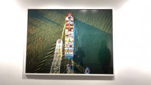
I was amazed to see how bird's eye view photography. I never imagined a ship would so interesting to see from top view. It is so colorful and it allows us to see how color harmony works in our surroundings.

Benrubi Gallary Exhibition: Leaning Out Photographer: Jeffrey Milstein.

Last week, we visited Chelsea art galleries and we looked at many photographs. I loved three photographs which interested was Benrubi Gallary which was at 521 W. 26th St. The exhibition was leaning out and photographer Jeffrey Milstein. I was amazed to see how bird’s eye view photography. I never imagined a ship would so interesting to see from the top view. It is so colorful and it allows us to see how color harmony works in our surroundings. Benrubi Gallary enhance my vision of photography. It has from all around to get the most out of the ship.The colors are vibrant and require a lot of light to get this kind of shot.

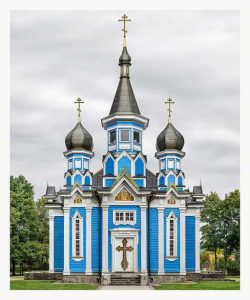
Yossi Milo Gallery Exhibition: Facades- Grand Tour Photographer: Markus Brunetti

The second image which got my attention is this one at Facades at the Grand Tour at the Yossi. It was amazing to see how this image was taken by Markus Brunetti. I was amazed by the color and how the photo is taken at the center. The most amazing thing is every detail is captured in the photo and for a photographer, it is an achievement. The light is perfect for this kind of shot because of you able to see each detail in the image. Again I mention the color is very hard to get in outside location. For architect this the best example to idealized this building.

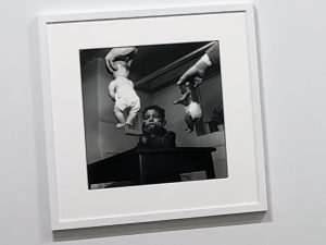
The image is unusual and has a lot curiosity towards what is going on in the image.

Jack Shainman Gallary, Exhibition: I am you Photographer Gordon Parks

The photograph is taken By Gordon Parks. The image has a different angle from where it is taken from. It is a very unusual composition of this image. The kid in the image is looking very thoughtful and the two babies are handing in front of him. The image has al lot curiosity because you want to understand what is going on. The light has created a contrast effect on images which focuses on the babies and the kid.