Professor Michals

Category: HW1-Composition (Page 1 of 4)

HM#1 Describe a Photograph, by Silvia English

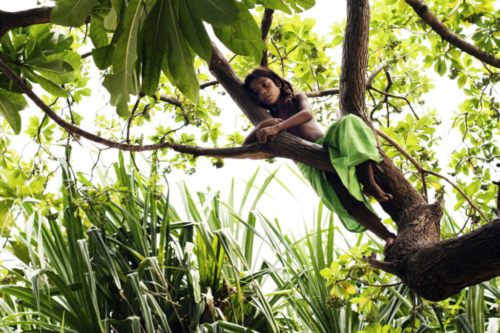
A little girl playing in a tree on the island of Tarawa.

The photographer that I chose is Malin Fezehai who is an Eritrean/Swedish photographer based in NY but has worked in the middle-east, Asia, America, and Africa. Malinā€™s focus on communities of dislocation around the world. She published a book called ā€œSurvivorsā€ to remind us about the violent extremism and this violence impacts the civilian population.

The photograph that I chose is from the album ā€œDisplacedā€. It tells us  a story of a sad child resting between the branches of a tree, who seems to be melancholic, lost in deep thinking, but at the same time so comfortable that the tree and the kid are like part of each other. One with nature

According to the Vanishing Nation video, KIRIBATI is an island the size of Manhattan or even smaller in the South Pacific. As a consequence of the climate crisis, typhoons and other natural disasters, and the projected sea level rise, Kiribati could be uninhabitable in 50 to 60 years. Maybe the child is sad about the future, or even the present, since the water levels will destroy their land.

This photograph makes me sad, but hopeful. 

Elements: Rule of Thirds, Diagonal Lines, Contrast of light and dark (greens).

Malin Fezehai intended to focus on the kid, her love for the tree, nature and her home land, and his sadness about the climate crisis. Most likely all the inhabitants of Kiribati will have to immigrate to New Zealand or Australia and to leave their home behindā€¦

HW1 – Nastassia Molicheva

https://www.malinfezehai.net/projects/displaced
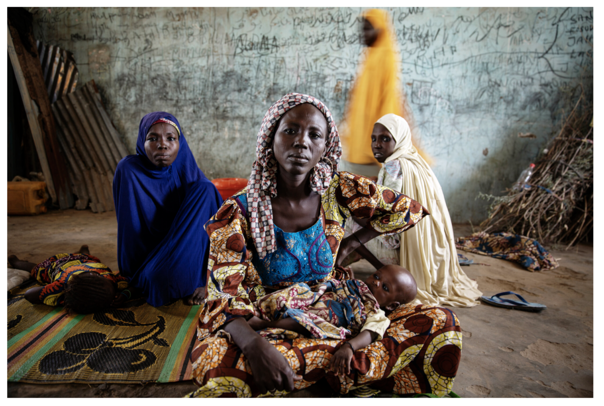
The photograph I chose for the assignment was taken by an Eritrean-Swedish artist Malin Fezehai. It is a part of her collection named ā€œDisplacedā€ that covers stories of people who were forced to flee their homes due to wars, food insecurity, climate change, and other triggering factors.


It pictures Attah Modu, an IDP (internally displaced person) living in a camp in the border town of Ngala, Nigeria, with her child in the foreground and other women and a kid in the background. Attah had to leave her village after multiple attacks by Boko Haram (a terrorist organization based in northeastern Nigeria, which is also active in Chad, Niger, and northern Cameroon). She remembers feeling unsafe at her home and losing neighbors and friends to daily violence.
In this photograph, Fezehai tries to create a visual representation of the people who are weathering through crises and tough circumstances of Boko Haram’s insurgency, showing the effects of women’s past on their current life. When you take a look at the image, you can feel the heaviness that lies on these women’s shoulders after everything they have been through. I chose this photograph because I was lured in by its composition and use of color. Attah’s pose also reminded me of the Renaissance-era Madonnas.

There are a few formal elements used in this photo: symmetry, diagonal lines, and leading lines.
The element of symmetry in the photograph is pronounced both through the portrayal of the women sitting behind Attah, and the metal/wooden scrap and branches leaning on the wall. The scrap also acts as a representation of diagonal lines, as they reach the opposite corners of the photo, as well as leading lines, as they point at the women sitting on the floor. One can also argue that they are creating a frame within a frame, too, pointing the viewer’s attention not only to the faces of the sitting women, but to the shadowy figure of the woman in yellow, and the wall behind them that is covered in scribbles.
The contrast of women and their children with the background accentuates the unsettling feeling of being displaced. It shows the difference between the warmth of the community vs. the makeshift and temporary “home” they have to settle in.

HW 1 – Andy Montesdeoca

This photograph was taken by Christopher Gregory-Rivera, a Puerto Rican photographer. This image is a part of a series titled Hurricane Maria, in which Gregory-Rivera documents the destruction the year the hurricane hit the island in 2017, and then again in 2018–just one year later. This photograph is meant to display the quotidian nature of Caribbean life–one can see paradise while doing the dishes. Within the context of the larger series, this photo is from 2018, which displays the aftermath of Maria. By demonstrating the proximity of nature, Gregory-Rivera is demonstrating to the viewer the duality of nature: its beauty and destructive unpredictability.

I chose this photographerā€™s work because a lot of his work is set in Latin America, namely the Caribbean. Being of Latin American descent, this work deeply resonates with me and captures my experience. I can see this photo and feel like I have been in this kitchen, I know this tile, this sink. I have seen this view while looking outside of my parentsā€™ kitchen window. To be in parts of Latin America is to deal with the contradiction of being amongst some of the most beautiful natural sights and smells, eating amazing fruits I can only name in Spanish, all the while contending with extreme levels of poverty. In Gregory-Riveraā€™s case specifically, seeing this paradise in shambles due to the lack of government response on a local level, and as a subject of colonization by the US Empire.

This photograph demonstrates 3 elements we discussed in class: a frame within a frame, figure to ground, and contrast of light and dark. These three elements all work in conjunction to highlight the palms in the center of the photo. The window acts as a frame; the contrast draws our eyes to the plants outside the window. Nature is the subject, this ever-present force and reality for Puerto Ricans, whom inhabit this small, precarious island.

Homework 1 – Describe a photo

Hurricane Maria

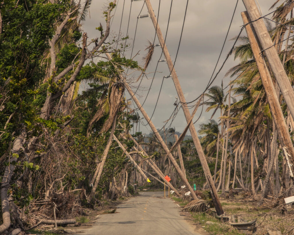
The photograph I chose is titled Hurricane Maria and it was taken by Christopher Gregory-Rivera. The photograph itself is just one of the many shots that were taken around 2017 to 2018. From what Iā€™ve read this photograph displays the aftermath of Hurricane Maria within the northeastern Caribbean. The row of power lines have collapsed against the trees across the road. The sky is clouded over with gray clouds and there is no sign of the sun. There are tree branches scattered on the ground and they donā€™t look like they were cut down but instead fell off due to the strong winds from the hurricane. I believe that the photographer is trying to show the audience the severity of the aftermath courtesy of Hurricane Maria. The purpose of this photograph is to show how much damage and destruction a single hurricane did in just two weeks. I feel a bit of sadness when I look at the photograph. What I love most about the image is how outspoken it is, from the battered trees to the gloomy sky. This image is forthright.

The photograph, Hurricane Marina, contains various examples of compositional principles, each of which help emphasize the message of the image. The first compositional principle that is noticeable is the rule of thirds. In the center of the photograph it appears to be somewhat empty compared to the rest, the road is nearly empty with the exception of some branches and debris. The center is not the main subject and it seems to be on both the left and right side; they range from the tall trees to the power lines. If you were to remove both sides from the original image that would mean getting rid of the message. The second compositional principle is the use of pattern in the photograph. Instead of taking a single shot of just one tree and power line he took a whole bunch of them. There are dozens of trees on both sides and in general they all mostly look alike, especially on the right side. This goes for the power lines as well, they all fell in the same direction because they are all connected. Even before this all took place power lines themselves  form patterns and stay linked for miles rather than be scattered and stay separated. As strong as the hurricane may have been they managed to knock them over and not break the pattern as much seeing as how they are still buried in the ground this goes for the trees as well. The last compositional principle is the use of symmetry or rather asymmetry. In the photograph there are two subjects that display symmetry and that would be both the road and the sky. If you were to fold the image in half the road and the sky would be lined up perfectly. Their forms are consistent whereas the rest of the subjects look very irregular and asymmetrical. While there are trees on both sides of the photograph they look different from one another especially when it comes to shape and size. On the right side there are about nine power lines while one left side there is only an array of trees.

Hw_1 Describe a Photo

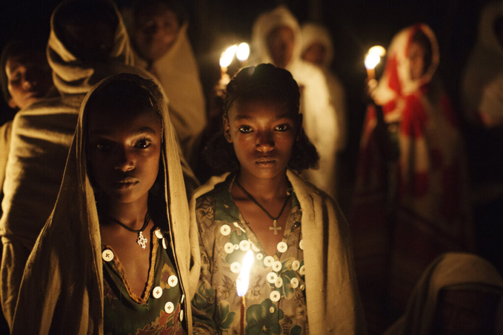
I am in love with this unnamed portrait by Malin Fezehai. This portrait was taken in landscape orientation, capturing a scene of two young black girls in the foreground, and several similarly dressed adults in the background. The two girls in the foreground both wore gray hooded shoals, floral gowns tattered with white buttons, and a necklace with an iteration of a cross at the center. The two girls occupy the left two-thirds of the frame, looking directly into the camera with a piercing stare, almost as if to reject the viewersā€™ presence into their cultural space. The centered girl did not have her hood on and was holding a flaming stick, serving as a torch, at around chest height. The flame illuminates her face and exposed clavicle with warm-toned natural light, casting shadows above her lips, down her nose bridge, and atop her clavicle. The other girl on the left third of the frame, who, judging by proximity and appearance, appeared to be her sister, had half of her face submerged in shadow. The position of the flame cast a heavy shadow on the right side of her face, essentially splitting her face in half with highlights on the tip of her nose, left half of her jaw, cheek, and eye socket. By utilizing high contrast of lights and darks paired with the girlsā€™ seemingly unshakable glare, Fezehai established intense visual drama by creating an extremely unsettling atmosphere. Looking at this photograph, I felt that the two girls were studying me, declaring that they could see me even if no one else could, and telling me to leave all at once.

Fezehai frames the adults in the background across the top third of the frame, creating a visual hierarchy that begins at the eyes of the children and guides the viewer to the adults in the background. This framing can also represent the cultural hierarchy of the community, with the elders at the top and children below. The adults are wearing gray shoals wrapped around their heads and some of which are also carrying torches. The torches the adults are holding are considerably thicker than the one the young girl in the foreground has in her hand. Furthermore, in the rightmost third of the frame, the background shows a woman wrapped in a red and gray shoal instead of the much more prevalent solid gray shoals that almost everyone else wore. These differences between the children in the foreground and the adults in the background could represent the childrensā€™ cultural infancy to not yet being able to fully embody the traditions of their elders. The asymmetry of the composition and the lone hooded person in the bottom right corner of the frame also contributed to the mystery of these peopleā€™s culture. Whether they were crouching to pick something up, or they are a dejected member of this community the viewer will never know. Still, framing the children by surrounding them with their cultureā€™s elders creates a strong sense of belonging, community, and protectiveness from the childrenā€™s perspective, while also instilling an ever-present unease to the viewers for intruding into a cultural space many of us have no part in.

Unnamed portrait by Malin Fezehai
« Older posts

© 2024 COMD3330_D039_SP22

Theme by Anders NorenUp ↑