Professor Michals

Author: Darren Le

Let's making a design

Final Proposal

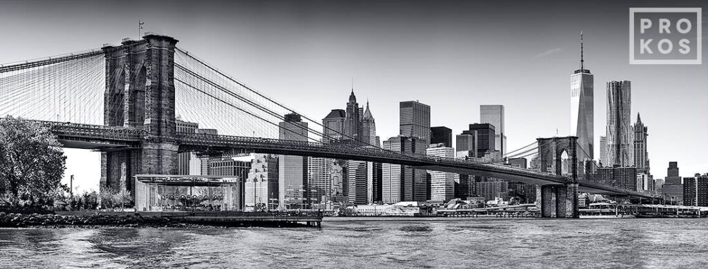
Topic: It is about large-scale photographs incorporating architectural elements and sweeping natural and urban views. Genre: of photography interests me and I’d like to explore is the street photography. This is a big challenge to myself because a question is how I can make those famous places be more interesting. This might be large scale print (90×30 maybe). Honestly, I don’t know the purpose will it serve in my portfolio and how it will highlight my conceptual thinking, my design sense, my lighting skills yet but I feel very optimistic about this project. 

Subject: Literally, I’ll be photographing the Brooklyn Bridge and the Manhattan skyline (B&W) daytime and nighttime, lower Manhattan skyscrapers and Brooklyn Bridge, Brooklyn Bridge Tower and Cables, Manhattan’s cityscape from Soho vertical and horizontal. 

Style: It will look like commercial use in editorial, display, and advertising campaigns. I will use panoramic photographic style to communicate the love of the city where my family and I are here for nine years now since we moved from another country. Anyway, my point is trying to show large-scale photographs incorporating architectural high buildings and city views. This is also the another looks at our city.

One example and one image with my description.
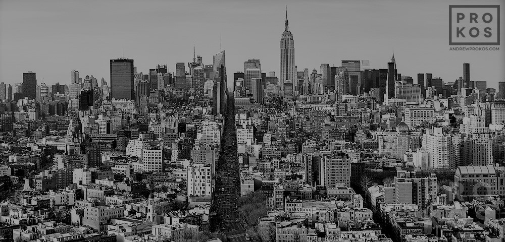
This view is an ultra high definition panoramic cityscape photo of Midtown Manhattan as seen from Soho, New York. This photo can be up to 90 inches wide.

Lighting: I will light it as this will be day and night in my project

Link to my Milanote Mood Board:

https://app.milanote.com/publish-preview/1NLHzR16lGG45M
HW 8: Photographic Style

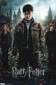
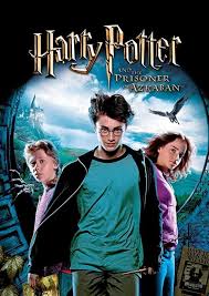
There is much fill is used to brighten the shadows by candle lights on the left and right side. A background light used to separate the subject from the background is just the light above main character’s head. The palette’s tone is dark with yellow, black, and green created magical World. The models are magicians, so the palette is perfect for their hair and eyes. The framing is super tight because they wanted to make a chaotic situation and conflict between characters and subjects surround them such as bird, book, castle, moon, and hat. The angle of view is looking straight to the audiences.

Describe a photo

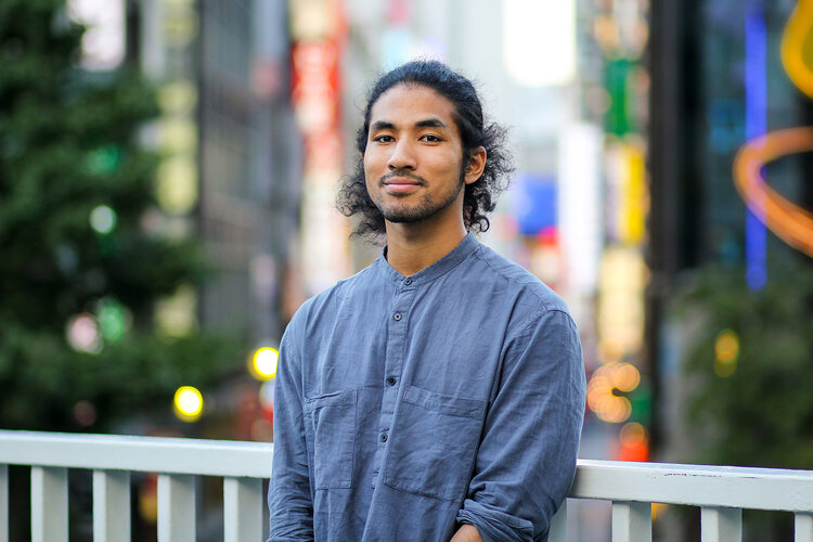
 Alex Webster is the name of the photographer. I choose Alex and one of his projects on Diaspora Japan. The idea is about the dispersion or spread of a people from their original homeland. In this case is people move from Africa to Japan. I feel like home when I look at the photograph. The subject possesses a hair bun, engaged language and culture. I love this photo because of the confidence that can be seen in the portrait.

Diaspora Japan by  Alex Webster

Experiences of people of African descent living in Japan is what the photographer is trying to say in the photograph. The purpose of the image is the positive look from them.  I believe the author chose this shoot for a thumbnail of the interview series because of the elegant look from him.   

Three of the formal elements we discussed in class that are most important in the photo that I selected are symmetry, figure to ground, contrast of light and dark. The photographer’s use of those three compositional principles is dynamic. That composition carries the feeling of the that makes you look at it repeatedly. Symmetry is nearly perfect because the subject is right at the center. The “Line of Symmetry” is the imaginary line where you could fold the image and have both halves match. In terms of landscape, a person is a character, and a city is a background. About contrast of light and dark, the light on his face creates the perfect contrast with his dark eyes. His hairstyle interrupted the color texture of his eyes and was a window to the soul. Hierarchically, my eyes start looking at his face, follows his eyes downward, then up towards his hair, then downwards to the white balcony behind his shoulder which merge seamlessly into the colorful city behind him.

© 2024 COMD3330_D039_SP22

Theme by Anders NorenUp ↑