Professor Michals

Author: Giulia Feleppa

The Final Project Statement_Giulia

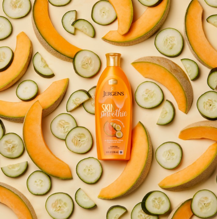
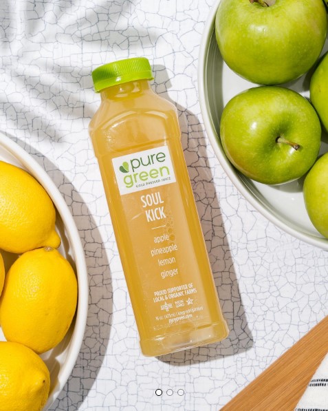
Topic: The photography that I will try to reproduce is food/product photography. I will try to create contexts and interesting background (that we usually modify or add in Photoshop using exiting pictures) for the product advertised with real props, or picturing the product in a real context such as a restaurant countertop or a kitchen table.

The purpose of those pictures will be to explore stop motion to create gifts and short videos for social media. I would like to focus on lighting and composition to create better food photography which is already in my portfolio and show my skills in stop motion.

Subject Matter: I will shoot the NAKED juice or smoothie

Style: The pictures will be colourful, playful and I will use different props to make the picture interesting.

The short videos from Huddlstudio captured my attention (which I discovered scrolling Instagram) and they are my first inspiration. They create stop motion videos for different brands. I will try to recreate exotic or daily contexts like the one in the pictures attached.

Lighting: I will use daily light and spot lights to enhance the product and the scene. Lighting will be the biggest challenge in this project since I don’t have professional lights, but I will do my best

https://www.roguemarkstudios.com/blog//marketing-stop-motion-animation

HW 8: Photographic Style_Giulia

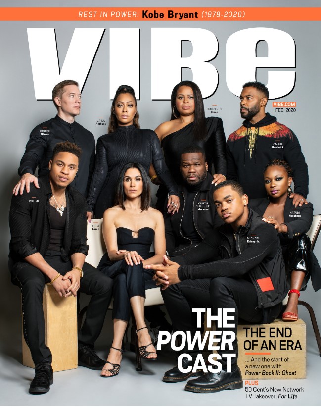
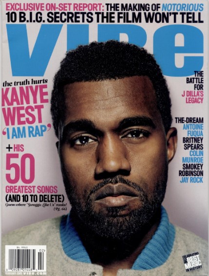
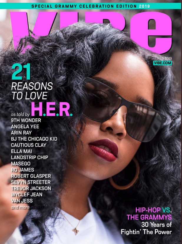
In the Vibe covers I chose the lighting style is mostly butterfly and Rembrandt. It seems like they used reflectors when the head of the artist is slightly tilt to fill up a little bit the shadows on the side of the face (Usher and Her cover). The background has not be lighted up to separate it from the subject (except for the first cover maybe) infact some shadows on the background are visible, but very light color background such as grey and light brown has been used to make the artists stand out. The framing changes from half body (3/4 shot) or shoulders and up when the artist in the cover is just one and into a full body when there is a group. In Her and Kanye West covers the head and the hair fill up most of the space. One of the constant elements in all Vibe covers is the point of view of the pictures. Most of them are taken at the eye level or under the eye level (at a low angle, to express a monumental or intimidating pose) . The second element is that all the subjects look directly into the camera. The third constant element is the mood and the expression of the artists. They all have really serious and intimidating face (the prison pose typical of rappers).

HW1-Composition-Giulia Feleppa

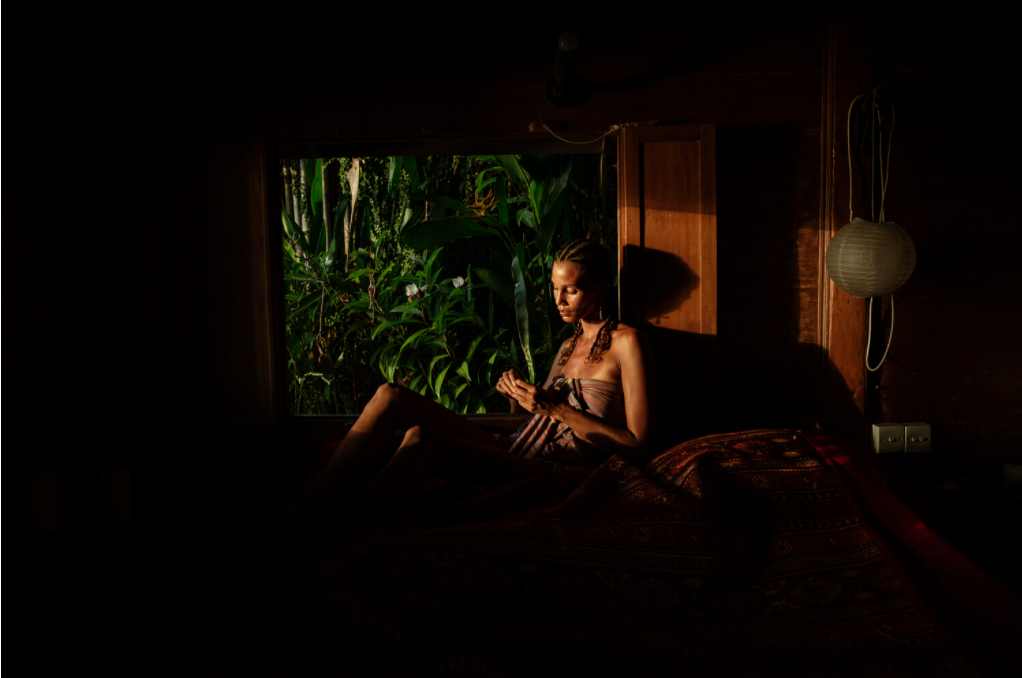
This picture was taken by Malin Fezehai. I chose it from the portraits section on her website and unfortunately doesn’t have a title or caption (or at least I was not able to find them). In the picture a beautiful lady has been portraited while looking down on her hands (maybe holding something really tiny and not visible to the observer) sitting on one edge of a bed or couch really close to a window that shows an amazing green landscape. The picture could be telling so many stories such as about a lonely moment of the lady in her home while chilling after a long day, a moment of peace in her trip in an exotic place escaping from an heartbreaking relationship. It might be portraying an intimate conversation of the lady with nature, a moment of meditation or even the waiting time for someone or something. In between all those different interpretations I like to think that the lady is in a moment of meditation/revelation. As the picture reminds me an rnb music video, I imagine the lady singing (about her distant lover as in a romantic scene) about that peace she found in being in the nature. She seems calm and enjoying her moment of loneliness while totally lost in a deep thought. The green of the leaves right outside the window gives a sense of hope in her story. The warm light underlines the beauty of her skin. It is like she is looking from her inside world which has calm and warm tones (the brown/red/yellow shades of the pillow, of the lamp and of the window details) to a world full of hope and vitality. Bathed in the light coming from the window she seems confident in her body and maybe having a moment of revelation while thinking. Looking outside the window I got lost in the “jungle” landscape which for me doesn’t have an end and it represents an endless world of hopes for the lady. I really liked this picture from the first moment I saw it because of the contrast between the light and darkness, but also because of the contrast between the colors of the outside the window and the inside of the room which makes the picture deep and at the same time look like a photoshopped composition. 

The photographer uses more than three compositional principles. The first one I noticed immediately is the contrast of light and darkness where the light is used to define the silhouette of the lady and just few elements or details in the composition, leaving all the not essential elements outside. The light gives deepness to the landscape in the background, gives confidence to the lady’s body but also creates a shadow of the lady that appears huge and predominant (it seems like we can see the dark side of the main character in this picture, her dark reflection). Furthermore, the light represents the communication between the foreground (the lady and the room) with the world outside the window. Another compositional principle I noticed is the frame within a frame which is created by the darkness around the center of the picture and the second frame created by the window’s frame. The same darkness creates also a negative space from which the parts of the picture hit by the light emerge (a sort of figure to ground). Lastly the lady is pictured in one of the intersections of the horizontal and vertical lines that divide the picture in thirds. In fact, the corners of the window frame underline the subdivision in thirds. 

© 2024 COMD3330_D039_SP22

Theme by Anders NorenUp ↑