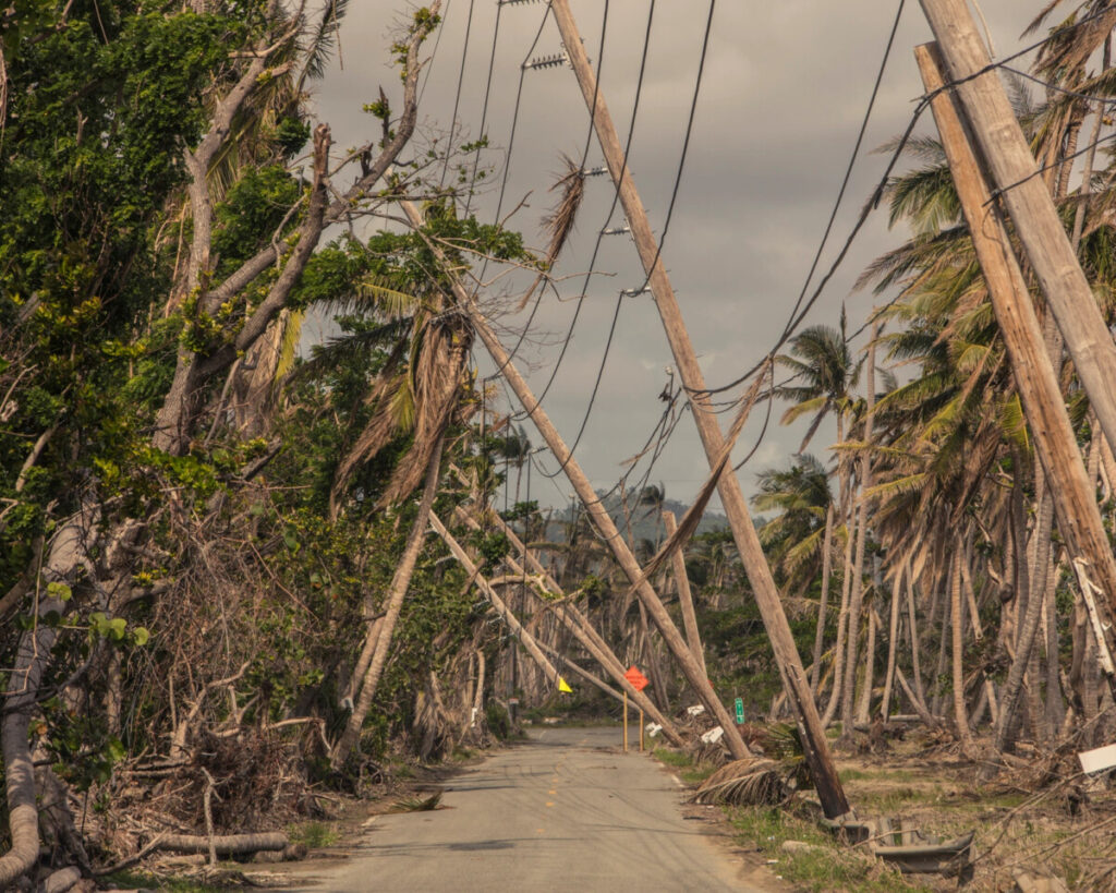
The photograph I chose is titled Hurricane Maria and it was taken by Christopher Gregory-Rivera. The photograph itself is just one of the many shots that were taken around 2017 to 2018. From what I’ve read this photograph displays the aftermath of Hurricane Maria within the northeastern Caribbean. The row of power lines have collapsed against the trees across the road. The sky is clouded over with gray clouds and there is no sign of the sun. There are tree branches scattered on the ground and they don’t look like they were cut down but instead fell off due to the strong winds from the hurricane. I believe that the photographer is trying to show the audience the severity of the aftermath courtesy of Hurricane Maria. The purpose of this photograph is to show how much damage and destruction a single hurricane did in just two weeks. I feel a bit of sadness when I look at the photograph. What I love most about the image is how outspoken it is, from the battered trees to the gloomy sky. This image is forthright.
The photograph, Hurricane Marina, contains various examples of compositional principles, each of which help emphasize the message of the image. The first compositional principle that is noticeable is the rule of thirds. In the center of the photograph it appears to be somewhat empty compared to the rest, the road is nearly empty with the exception of some branches and debris. The center is not the main subject and it seems to be on both the left and right side; they range from the tall trees to the power lines. If you were to remove both sides from the original image that would mean getting rid of the message. The second compositional principle is the use of pattern in the photograph. Instead of taking a single shot of just one tree and power line he took a whole bunch of them. There are dozens of trees on both sides and in general they all mostly look alike, especially on the right side. This goes for the power lines as well, they all fell in the same direction because they are all connected. Even before this all took place power lines themselves form patterns and stay linked for miles rather than be scattered and stay separated. As strong as the hurricane may have been they managed to knock them over and not break the pattern as much seeing as how they are still buried in the ground this goes for the trees as well. The last compositional principle is the use of symmetry or rather asymmetry. In the photograph there are two subjects that display symmetry and that would be both the road and the sky. If you were to fold the image in half the road and the sky would be lined up perfectly. Their forms are consistent whereas the rest of the subjects look very irregular and asymmetrical. While there are trees on both sides of the photograph they look different from one another especially when it comes to shape and size. On the right side there are about nine power lines while one left side there is only an array of trees.


I love this photo too. The way the poles are increasingly tilted as they go away from the camera implies the motion of their falling. That sense of motion hints at the tremendous power of the storm.
Careful with the term rule of thirds. It doesn’t really apply to a photo like this. It is better for a photo with a main subject that is placed to the left or right and not in the center. This photo is more of a landscape without a central focus.