Prof Anmol Dhamrait | COMD2300-E098 | Spring 24

Category: Part B: Personal Branding Moodboard (Page 3 of 3)

Kevin Dewitt’s Moodboard and Writeup

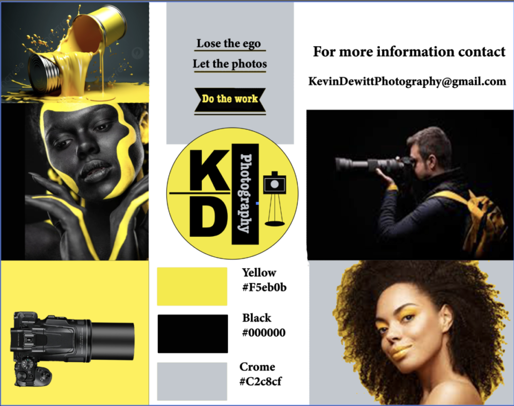
Hello everyone my name is Kevin Dewitt and today i wanna talk a little bit about my mood board as well as my logo design. First off i wanna say i had a great time making this mood board. At first I saw this as challenging because I didn’t know where to start or what to do so let me take it from the top. The reason I chose the colors I did was because I wanted things to be bright. It attracts the eye level therefore you can control what is viewed. Being that I now have your attention this is where the images attached to the moodboard step up and helps me sell my services. We are designed as people to be creative so with that being said the yellows are bright and present a warm feeling when you come to be photographed. The chrome is added to pull your eyes in another direction and allows you to notice the contrast between the multiple colors. The black stands for excellence and allows the bright colors to be complemented rather nicely as a whole. The typography is legible and free from confusion so there aren’t any mistakes or miscommunication. My thought process on being able to explore different avenues shows that I don’t want ordinary. I want to go over and beyond and stand out from the others. My design of the logo shows a straight to the point look, Its minimum but allows you to understand exactly what I do and it shows confidence in the brand. I believe it is different from what you see in today’s market and that is how it was intended to be.
Amir Akram Moodboard & WriteUp

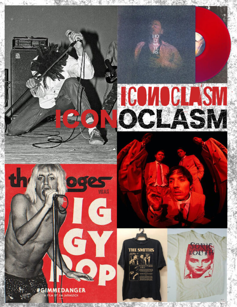
The moodboard created to guide my brand’s identity is meant to encapsulate a focus on musicians that are notably groundbreaking, yet rough around the edges. This balance of grunginess and avant-garde mentality is what I want the brand to feel like, as it is meant to provide visuals for up-and-coming artists and bands that exist on the margins.

The color red has been chosen in order to convey passion, rebelliousness, and aggression (these attributes would attract musicians that value the same traits in their artmaking practices). The black and white image on the top left corner of the layout is of the original lead vocalist of the pioneering hardcore band Bad Brains.

I would want images created by my brand to capture this same level of rawness in the midst of live performances, as well as creating merchandise that feels equally wild. The brand I am imaging is a more grass-roots version of the company Bravado, which handles the design of merchandise and marketing campaigns for big-label artists such as Billie Eilish, 21 Savage, and Ariana Grande. Since Bravado is mainly geared towards A-List acts, I would want my brand, which is tentatively named Iconoclasm, to cater towards indie artists in local scenes. This is part of the reason why a rough-and-tumble approach is a valued aspect of my brand; it conveys a feeling of authenticity and being down-to-earth/approachable

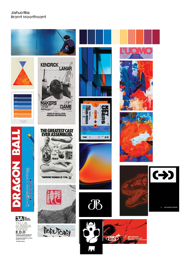
Joshua Blas (Part B) Brand Moodboard

  1. I chose a screencap from a show called Cowboy Bepop. It has one of it’s protagonists fishing, and I just enjoyed the serenity and calm the scene has. There’s also the fact that the water was probably handdrawn.
  2. I chose a few gradients and color combinations of blue and orange. Blue is the color for calm, and orange is the color of optimism. These two emotions are what I’d like my brand to embody, feeling calm and looking toward the future with hope.
  3. I added a few posters with interesting typography on them. They make use of bold san serifs and hand-drawn ink for big text. The hierarchy of small, medium, large are probably most important here.
  4. I also added in a few logos that come from my favorite artists and designer. The red one seems like it was stamped, since it’s on top of a sketch paper. The logo with the monkey is used on the graphic novels the artist produces.
Newer posts »