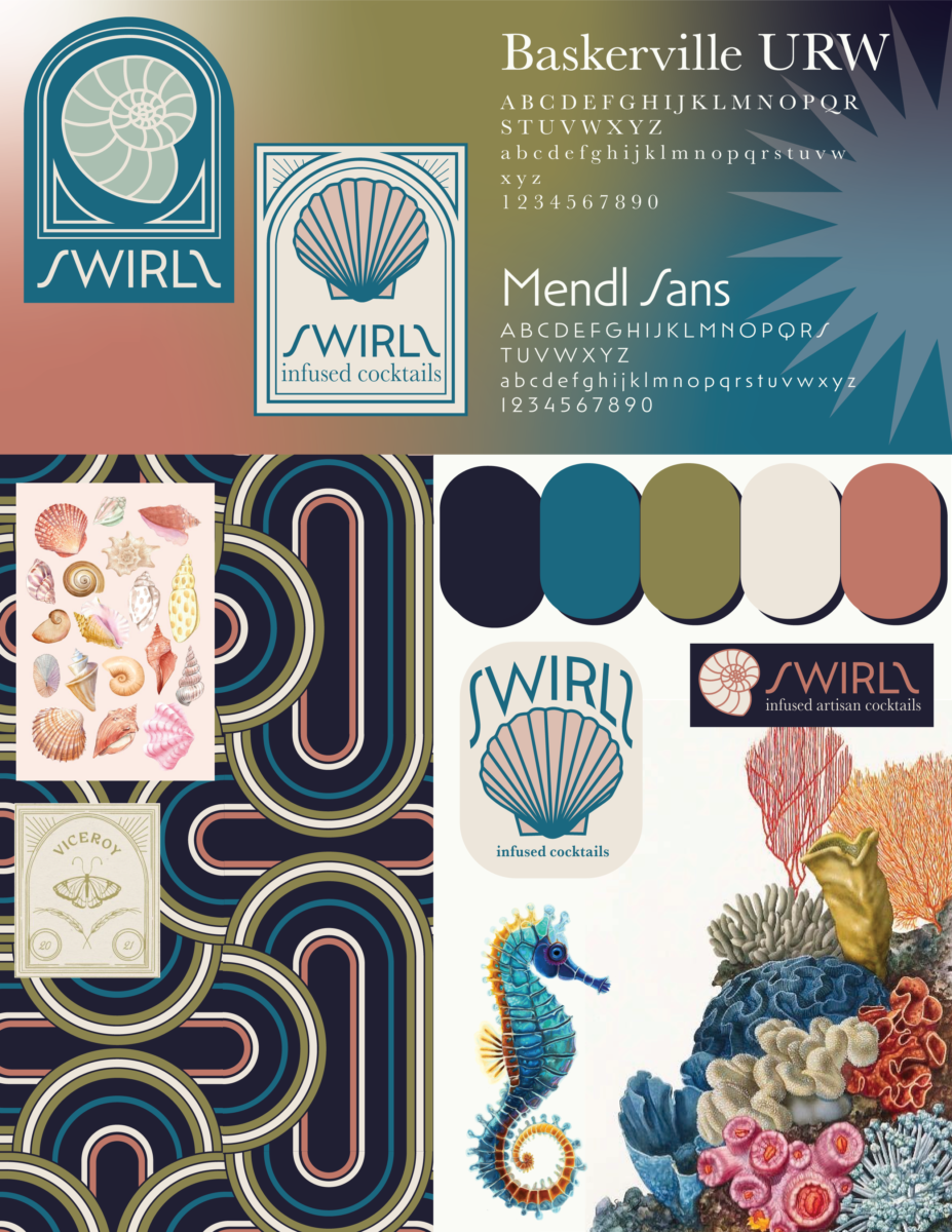
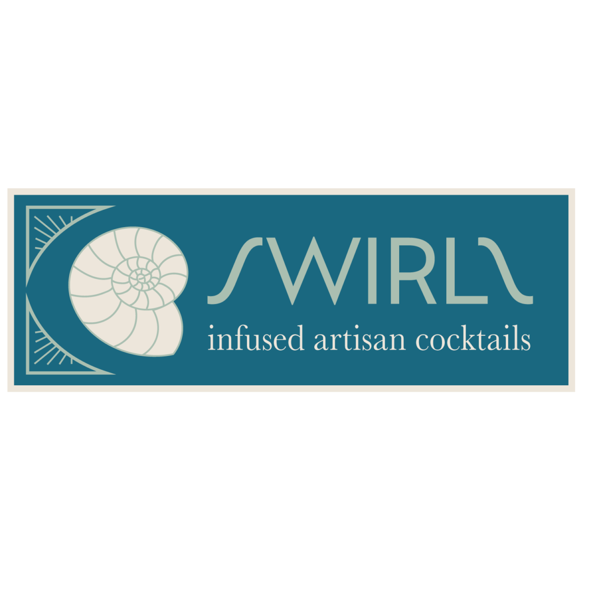
As mentioned in the first exercise, I wanted to make my logo classy, calm, and coastal. I started my mood board by drawing a seahorse and creating my pattern on the bottom left. I knew I wanted signature patterns as I use pattern and texture in my art. The pattern and colors are both heavily inspired by Art Deco. I wanted it to be instantaneously recognizable.
I originally had a much brighter color pallet, but then I realized those bright colors looked too playful for my intended purpose. I stuck to a muted triad of colors with navy and creme as my two neutrals. I used those same hues with lighter tones later for highlights.
As for my logos, I did a lot of research on art deco logos and illustrative logos. My issue was that most “Art Deco” logos were interpreted as “steam-punk,” which is overdone, cheesy, and plain incorrect for the period. Yes, both include gold, but that’s about it.
My last dilemma was including the deco theme with a coastal theme. How to make it look elevated and versatile. Miami Art Deco inspired me for my choice of colors and illustrative elements in my designs.
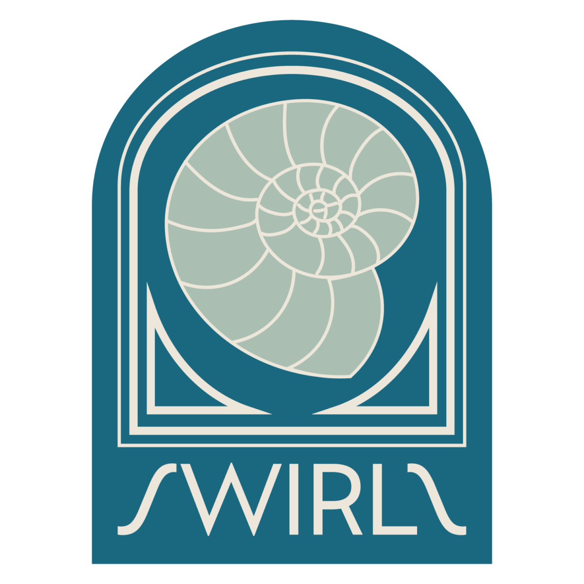
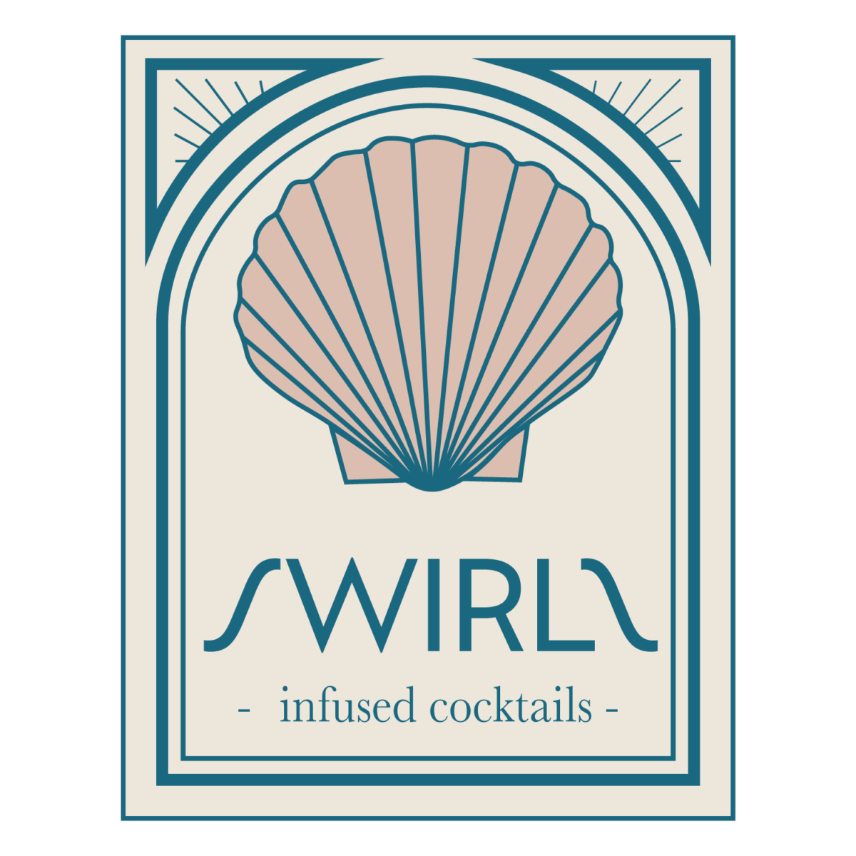
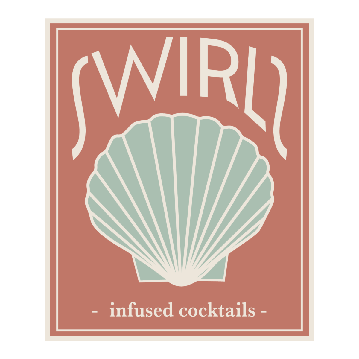
The goal company is a high-end cocktail company. I created a few logos I had been playing with to see which I liked more. I like them all for different reasons, but I also enjoy that they are all a part of the same company. I liked that all the logos I came up with could be applied to different parts of the company “Swirls” I created. The idea was to have multiple logos for different applications: a canned cocktail, a bottle of rum, a mixer, and bartending accessories.
Logo Ideas


Leave a Reply