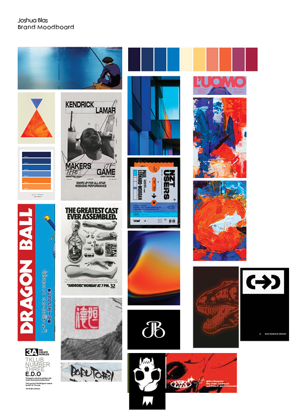
- I chose a screencap from a show called Cowboy Bepop. It has one of it’s protagonists fishing, and I just enjoyed the serenity and calm the scene has. There’s also the fact that the water was probably handdrawn.
- I chose a few gradients and color combinations of blue and orange. Blue is the color for calm, and orange is the color of optimism. These two emotions are what I’d like my brand to embody, feeling calm and looking toward the future with hope.
- I added a few posters with interesting typography on them. They make use of bold san serifs and hand-drawn ink for big text. The hierarchy of small, medium, large are probably most important here.
- I also added in a few logos that come from my favorite artists and designer. The red one seems like it was stamped, since it’s on top of a sketch paper. The logo with the monkey is used on the graphic novels the artist produces.


Leave a Reply