Robin Michals | COMD 1340 Photography 1 DO97

Author: Yunique Griffith (Page 2 of 2)

My Best Pair

Out of today’s lab, my favorite pair of photos that I took today would be my Worm eyes view and my low angle shots. Both of my images were difficult to pull of due to both having to be done in the middle of the street, but fortunately enough, they came out great. My first image would be one of my low angle shots of a restaurant building down by the boardwalk. For me to pull of this shot, I wanted to incorporate both the sign of the restaurant and the building. I wanted to show the viewer that the photograph I took can be achieved in many different ways and depending on the framing, can achieve different moods. To achieve the image, I needed to lay down flat on the street while aiming my camera up at the side of the building ensuring that I captured both the side of the restaurant and its sign.

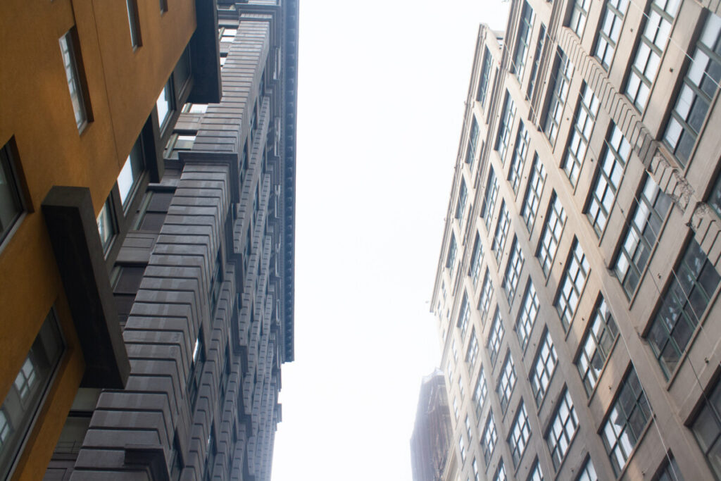
For my second image, I achieved a Worm Eyes view in which I used the other side of the same building from my first image and an office building across the street. To achieve the Worm eye effect, I needed to make sure that both buildings seemingly connected overhead to make it seem that they were hovering over me. This was really fun to pull off, no matter how many photos I tried to take of it to achieve a perfect shot. There was a mood I was trying to achieve and that would be both soothing and tranquil. However, viewers can also perceive my photos as something different achieving different moods.

Yunique Griffith HW#1

https://www.suzannesteinphoto.com/Sample/i-z2MhdNZ/A

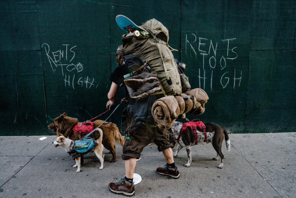
The photograph that I personally chose was that by the amazing photographer, Suzanne Stein. The photograph that I chose doesn’t have a name to it, but I found that this photo is very prevalent amongst our society today. The photograph seems to focus on the man with his belongings and his dogs in which is set in New York City. I feel the intentions of the photographer is to highlight how the increase in rent throughout this country is displacing many people onto the streets with no job and little to no income. The text written across the boards gives the viewer the perception in which the increase of rent is gradually pushing people out their homes. The purpose of the image emulates once native inhabitants having to migrate to new territory due to fiscal constraints of what they once called home. Having to pack what they can and become transients with their beloved pets to a new home. It also shows the consistent struggles people have to deal with while losing their havens to increased rent and which could be also be a byproduct of gentrification. 

The mood of the image gives off a dreary, tiring, unstable and unsafe feeling. The reason in which I chose those words is because when people lose access to their homes, they are immediately cut off from their shelter, security, and protection. Surviving while living on the streets is dangerous and it can promote an unsafe lifestyle to become accustomed to. There are many compositional principles I see within the image I chose. The three that immediately comes to mind is Symmetry, Figure to Ground, and Fill the Frame. These three principles can be easily seen within the photo giving off the basis in which it’s set.

The first principle I see within the photo would be Symmetry. Symmetry can be easily be seen as pleasing to one’s eye and for my photo the subject, which is said to be the man, shows him as the focus of the image. He lines up exactly in the middle of the photograph capturing the viewers immediate attention. The second compositional principal within my photo would be Figure to Ground. There is a stark contrast between the subject of my image, the man and his dogs, and the background, the text displayed across the boards. It’s very distinct when it comes to the photograph showing how the subject can be something easily shown to the user’s eye as opposed to the background. The last compositional principle I see within my photo would be Fill to Frame. I chose fill to frame as a principle for this image because it shows the viewer the subject that needs to be focused within the photograph. The subject, the man and his dogs, shows what the viewer should see when first placing their eyes on the photograph.

Newer posts »

© 2024 COMD 1340 DO97

Theme by Anders NorenUp ↑