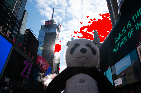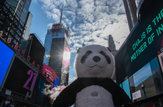

This image was a little dark and overexposed. I lowered the highlights to 0 to help lessen the overexposure and increased the blacks to about 53 to lighten up the image in general. I increased the shadows to about 28, along with clarity at 23 to define the outline of the panda, to separate it from the background.


You are going in the right direction. I would increase the exposure more so it is right for the panda and it is the main subject. I would open up the shadows more as well maybe to +50.