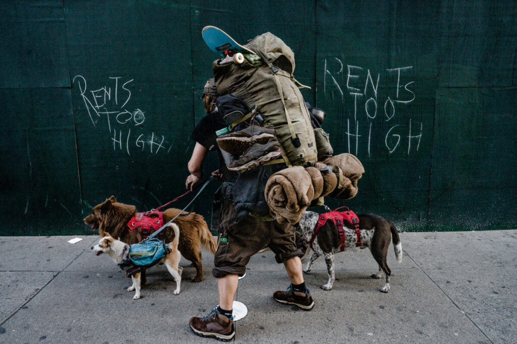
The photograph that I personally chose was that by the amazing photographer, Suzanne Stein. The photograph that I chose doesn’t have a name to it, but I found that this photo is very prevalent amongst our society today. The photograph seems to focus on the man with his belongings and his dogs in which is set in New York City. I feel the intentions of the photographer is to highlight how the increase in rent throughout this country is displacing many people onto the streets with no job and little to no income. The text written across the boards gives the viewer the perception in which the increase of rent is gradually pushing people out their homes. The purpose of the image emulates once native inhabitants having to migrate to new territory due to fiscal constraints of what they once called home. Having to pack what they can and become transients with their beloved pets to a new home. It also shows the consistent struggles people have to deal with while losing their havens to increased rent and which could be also be a byproduct of gentrification.
The mood of the image gives off a dreary, tiring, unstable and unsafe feeling. The reason in which I chose those words is because when people lose access to their homes, they are immediately cut off from their shelter, security, and protection. Surviving while living on the streets is dangerous and it can promote an unsafe lifestyle to become accustomed to. There are many compositional principles I see within the image I chose. The three that immediately comes to mind is Symmetry, Figure to Ground, and Fill the Frame. These three principles can be easily seen within the photo giving off the basis in which it’s set.
The first principle I see within the photo would be Symmetry. Symmetry can be easily be seen as pleasing to one’s eye and for my photo the subject, which is said to be the man, shows him as the focus of the image. He lines up exactly in the middle of the photograph capturing the viewers immediate attention. The second compositional principal within my photo would be Figure to Ground. There is a stark contrast between the subject of my image, the man and his dogs, and the background, the text displayed across the boards. It’s very distinct when it comes to the photograph showing how the subject can be something easily shown to the user’s eye as opposed to the background. The last compositional principle I see within my photo would be Fill to Frame. I chose fill to frame as a principle for this image because it shows the viewer the subject that needs to be focused within the photograph. The subject, the man and his dogs, shows what the viewer should see when first placing their eyes on the photograph.


You picked a strong photo that explores a really serious issue to write about.
That the man is between the two written statements “rent is too high” is the crux of the photo. This does use symmetry in a way. The background is really clean not offering any distraction from the man. And Stein does fill the frame with him.
The man is in the middle of the photo but what we see is not his face but his belongings. these possessions look very worn adding to the dreary felling you mention.