Robin Michals | COMD 1340 Photography 1

Category: HW1_Composition (Page 2 of 3)

HW1 – Composition – Max Cardenas

https://www.thomasholton.com/work/thelamsofludlowstreet

In 2010, photographer Thomas Holton would begin a 15 year long series of photographs that depict the lives of the Lam family in Chinatown. Holton says that despite being half-chinese he never felt any type of connection to the New York City neighborhood of Chinatown. In an effort to “experience more of the daily life of Chinatown,” he made an effort to meet people in Chinatown, where he met the Lam family. He would visit them often and the Lams would allow him to participate in their family life and events. After some time, Holton became unexpectedly attached to the Lam family, citing that he, “never expected to become so close and emotionally tied to my ‘subject matter.'” In the end, he came to the conclusion that a person is not defined by the socially constructed idea of race but rather by our own experiences and family history. There is no right or wrong answer to the photographer’s initial inquiry of “what it means to be ‘Chinese.'” However, he did come to a greater understanding of what it means to be human.

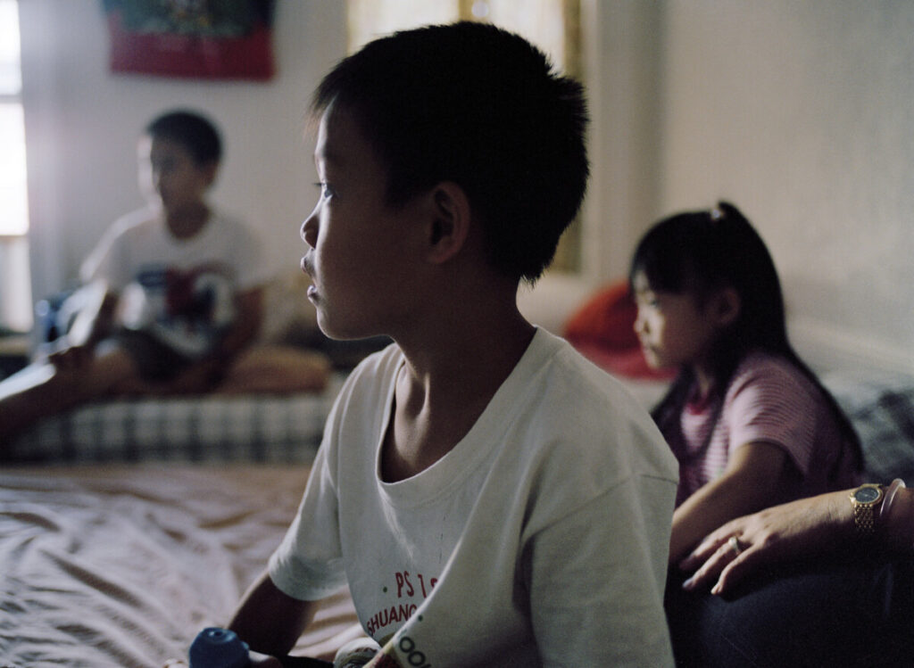
Thomas Holton’s collection, “The Lams of Ludlow Street,” is very thoughtful in terms of composition. In this specific photo, he makes use of the rule of thirds, figure to ground, and symmetry to create a tone of individuality and unity among siblings. There are three children in this image, one in the foreground and two in the background. At a first glance it appears as though the child in the middle is the sole subject of the image as he is in the foreground and the image of him is sharp and clear. But there are also two children in the background on either side of him. They’re relevance to the image is emphasized using the rule of thirds, as their faces align with the intersections of the 3 by 3 grid. In addition, in this composition, they create a symmetrical and balanced image by being on opposite sides of the foreground subject. This adds on to the photographer’s portrayal of individualism within culture. We are drawn to the child in the middle but we learn more about him by having the siblings in the background. He is his own person but he also has a family history that will shape who he is/becomes.

HWK 1: Composition

Photographer: Thomas Holton

Title: Drying Laundry

The subject matter or this image is the laundry that is being hung out to dry and framing the rooftop landscape of Chinatown above. The intention of the photographer is to showcase an element of traditional daily living and perhaps the silent and unspoken beauty that aligns with it. This image is apart of Holton’s photographic series titled “The Lams of Ludlow Street”. Holton describes the series as “an investigation into the life of one Chinese family living in New York City’s Chinatown neighborhood” (Holton, 2015) He expresses that the series serves as a means to explore and comprehend his connection to his Chinese heritage.

I believe the mood and feeling of the photograph is intimacy, traditionality, and calmness.

In modern days, drying laundry is often done with the single push of the button. You throw your wet clothes in a drying machine, and press start. But in this image, it’s hanging your clothes, one by one, and letting them meet the warm sun and city landscape that overlooks the rooftops.

The three formal elements I’ve chosen are Frame within a frame, Leading Lines and Patterns and Repetition. Holton utilized Frame within a frame in the way that he captured the line of clothing just below the rooftop landscape. Through this technique he emphasizes the skyline and buildings by using the clothing line to “frame it”. Leading Lines are also utilized through the clothing line. The line of the clothing leads off the picture, perhaps to make the viewer think, where is it going? It also works as a line that leads the eye through the city’s landscape, going from left to right. Patterns and Repetition is shown in the colors of the clothing and the hangers on the line. The pattern consists mostly of white and red in both the clothes and hangers.

Through the usage of these elements, Frame within a frame, Leading Lines, and Patterns and Repetition, Holton skillfully guides the viewer’s gaze, emphasizing the skyline and cityscape while capturing the essence of his exploration into his Chinese heritage.

hw 1 composition

Paloma Alexandra Pryor

HW 1

Photography 1

https://www.thomasholton.com/work/thelamsofludlowstreet

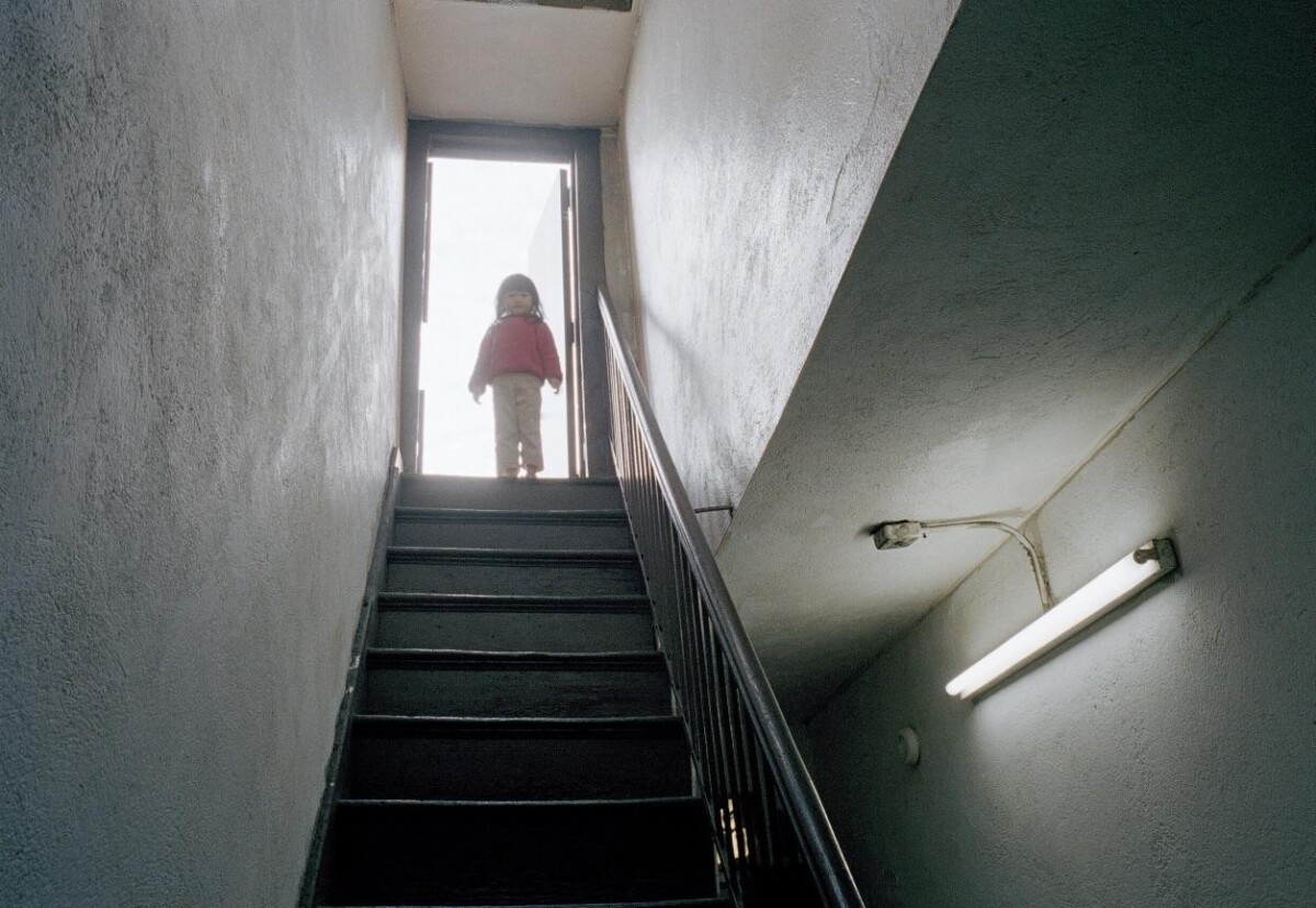
Playing on the Roof by Thomas Holton

(The Lams of Ludlow Street )

This photograph by Thomas Holton is titled Playing on the Roof. Apart of the works collection titled The Lams Of Ludlow,. Taking place in the heart of new york’s chinatown, lower east side area, where there is a strong cultural and historical vibrancy. This photographer living in this neighborhood essentially made that the subject, where he writes how he felt like a “visitor” and wanted to learn more. By living and getting closer to the subject of his photography the author learned more not just about a family or a new culture but a lot about human connections. I think that the main purpose of exploration comes across in the photography and the intentions to show audiences that glimpse as if you’re a part of the family is also very strongly expressed in the photographs by Holton. There is a familiar and comforting mood to the imagery as well as a vulnearable and raw essence to them.

Three of formal elements utilized in this photograph are framing, figure ground, and leading lines. In this imagery we can see the door frame draws in the viewers focus and embellishes the overall composition by adding that geometric element as well as drawing attention. Similarly, the element of figure ground contrast is definitely used here. In the sense of the little girl being at one corner against that brighter color in contrast of the dark background surrounding the stairs and walls. Also with leading lines, the lines of the stairs are where the little girl is at the top, these lines of the stairs basically draw you to the image’s subject matter. Emphazising focus on the main person in the photograph and the overall composition, creating a visual for the viewer to pay attention to. I feel this image had a lot of the elements utilized by Holton in one.

HW 1- Photo Description

Image title

Your subtitle here

https://www.thomasholton.com/work/chinatownsurface

Thomas Holton’s “Chinatown Surface” is a captivating photographic series that offers a unique and intimate glimpse into the daily lives of Chinese-American families living in New York City’s Chinatown. Through a meticulous and thoughtful approach, Holton delves into the complexities of cultural identity, family dynamics, and urban life.

Holton’s project spans over a decade, showcasing a deep commitment to capturing the multifaceted aspects of Chinatown’s community. The photographer’s immersive engagement with the subjects and their environments allows for a nuanced representation that goes beyond stereotypes, presenting a rich tapestry of stories within the Chinese-American experience.

Chinatown Surface by Thomas Holton masterfully employs the principles of the rule of thirds, Fill the Frame, and Patterns and Repetition to create a visually compelling narrative. Holton’s adept use of the rule of thirds guides the viewer’s gaze through each frame, skillfully placing subjects at key intersections, enhancing the overall composition. The Fill the Frame technique is evident in the tight, intimate shots, immersing the audience in the details of daily life within New York City’s Chinatown. Furthermore, Patterns and Repetition play a crucial role in conveying the rhythm and harmony of the community’s existence, as seen in the recurring motifs of bustling market scenes, intricate architectural details, and the ebb and flow of daily rituals. Through these compositional elements, Holton not only captures the essence of the Chinatown experience but also invites viewers to connect with the subjects on a profound and personal level.

In Thomas Holton’s “Chinatown Surface,” the meticulous combination of elements such as color, composition, and narrative intricacy serves to evoke a poignant mood and a rich emotional atmosphere within each photograph. Holton’s careful consideration of color, often vibrant and culturally resonant, contributes to a visual vibrancy that reflects the dynamic life within Chinatown. The composition, with its thoughtful framing and attention to detail, captures both the intimacy of family life and the broader urban context. This balance adds layers to the mood, offering viewers a nuanced understanding of the subjects’ experiences. Furthermore, Holton’s incorporation of audio interviews and written narratives deepens the emotional impact by providing a personal context to the visual elements. These narrative layers allow the audience to connect not only with the visual aesthetics but also with the stories and emotions embedded in each frame, fostering a profound and empathetic engagement with the subjects and their daily lives. Through these carefully orchestrated elements, “Chinatown Surface” resonates with authenticity and emotion, creating a mood that transcends the visual to offer a profound glimpse into the human experiences within this vibrant community.


Photo Description

Marilyn G.M

https://www.suzannesteinphoto.com/Paris/i-hKWHKrW/A

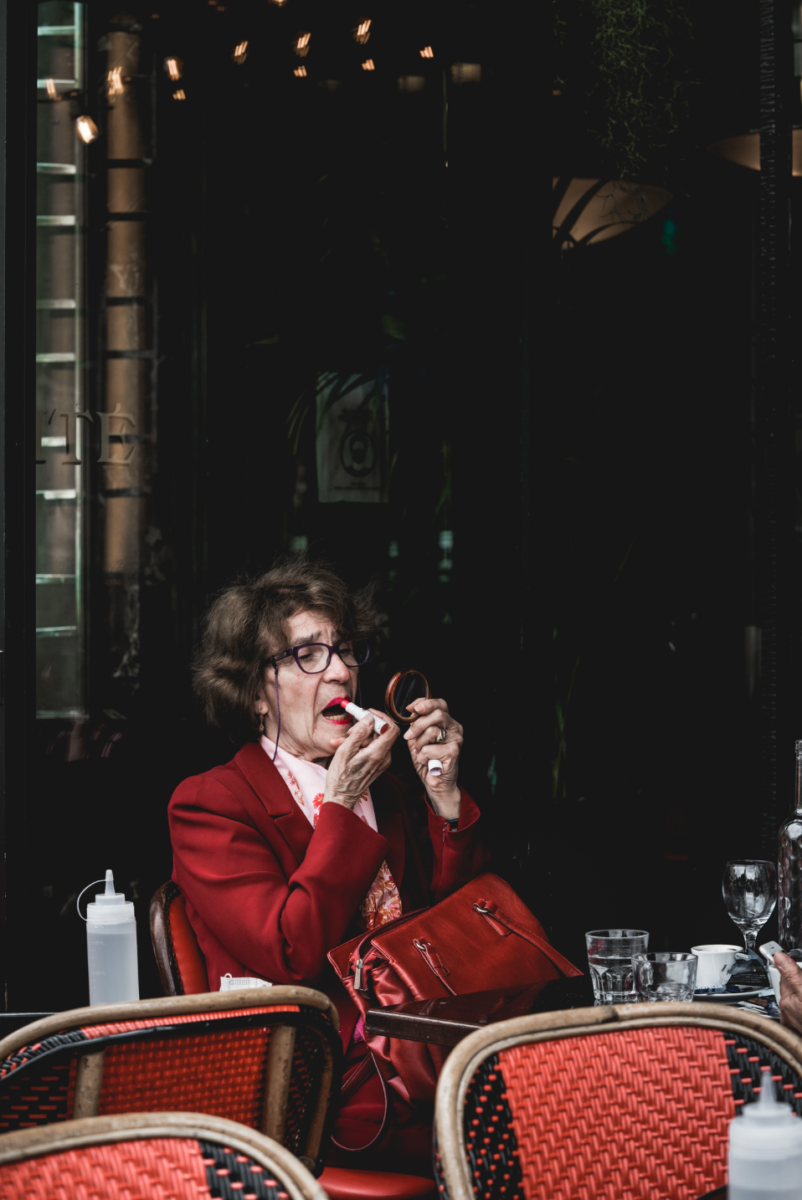
Suzanne Stein’s photograph captures an intense moment of timeless elegance and opposition against societal norms. The central figure, an elderly lady, sits in what appears to be a restaurant, dressed in an appealing red outfit that commands attention. Her attire, a bold choice of color, symbolizes passion, vitality, and persistent dedication to self-expression. Clad in monochrome, she carries a matching red purse, a testament to her meticulous attention to detail.

The woman’s concentrated eyes are focused on a handheld mirror, where she delicately retouches her lips with an intense red lipstick. This act of self-care and adornment signifies a refusal to conform to conventional notions of aging. It embodies a quiet rebellion against the societal expectations that often dictate how individuals, especially women, should present themselves as they grow older.

The photograph’s composition adheres to the principles of the rule of thirds, with the lady positioned at the bottom left, drawing the viewer’s attention to her presence. Her resilient and graceful demeanor radiates against the backdrop of her dimly lighted surroundings.  The darkness enveloping the background isolates her, emphasizing her singular focus and strength of character.

The mood evoked by the image is one of quiet determination and resistance. Despite the passage of time, the lady radiates confidence, challenging perceptions of aging with her timeless glamour. Her choice of wardrobe and the meticulousness of her actions suggest a readiness to embrace life fully, unapologetically celebrating her individuality.

Through Stein’s lens, we are invited to contemplate the beauty and resilience that transcends age. The photograph serves as a powerful reminder that true elegance knows no bounds, and that strength lies in the ability to defy expectations and embrace one’s identity confidently.

« Older posts Newer posts »

© 2024 COMD1340TueSpr24

Theme by Anders NorenUp ↑