Robin Michals | COMD 1340 Photography 1

Category: HW1_Composition (Page 1 of 3)

HW 1 COMPOSITIONS

Suzanne Stein is the photographer of this photo. This photo was taken in the streets of New York City downtown. In this photo you are able to see four men dressed in cold attire to be more specific jackets and hoodies. Also some of them have ski masks on and they are just smoking and enjoying themselves. The photos intention overall is to demonstrate the real view of New York City. A quick background to note is that in New York City you will find lot of people smoking in public places. Everyone in the middle class and poverty class is what makes up most of New York and its streets. I love how the photographer gives the true of New York with this photo because thats usually the attire people are wearing to feel comfortable and the daily hobbies. The fact that they are also wearing sunglasses shows how comfortable they feel as they are.

In this photograph one of the principles used is fill the frame. The 4 civilians take up most of the photo while they are all smoking and sort of telling the viewer how they are the main focus. Another principle that I feel is used in a subtle way is pattern and repetition because each of them have a head cover and by all of them using it in a photo you are able to tell the weather and also brings out how comfortable these individuals feel. Another principle being used is diagonals because when you look behind all four individuals you are able to notice the buildings direction and how it gives off the impression that they are walking towards the front. Also the way the smoke flows to the right of the photograph helps show some movement making it dynamic and a captivating image.
Homework 1

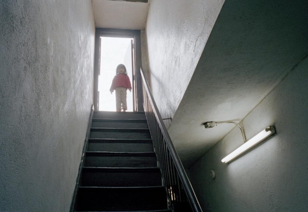
Thomas Holton’s “Playing on the Roof,” part of “The Lams of Ludlow” collection, captures how vibrant Chinatown is and how Immersed the neighborhood’s are and there cultural richness, Holton delves into the lives of its residents, uncovering insights into human connections. The photograph shows familial warmth and vulnerability, showcasing Holton’s skillful use of formal elements like framing and figure-ground contrast, leading lines to create a compelling visual narrative. Through this image, Holton invites viewers to experience the inviting atmosphere and rich tapestry of human connections within Chinatown. Holton’s intimate exploration of Chinatown is palpable in this picture because he skillfully utilizes the elements to draw viewers into the scene. The door frame acts as a focal point, guiding attention towards the little girl, while the contrast between her and the background adds depth and visual interest. The lines of the stairs further emphasize her presence, creating a composition that reflects Holton’s deep connection to the neighborhood and its inhabitants. Through this image, he invites us to share in the warmth and humanity he found within the streets of Chinatown.

HW 1 – Composition

Suzanne Steinā€™s ā€œLittle Dog on San Julian Stā€ is just one photograph from a series on Skid Row, Los Angeles. In the photograph, we can see a dog sitting on a computer chair while another person in the background is seen in distress. Around these two is a dirty street littered with articles of clothing and plastic bags/wrappers. In addition, we can see tents where the people of Skid Row would sleep and baby strollers which appear to be used as storage. Stein, being a social documentary/ street photographer, aims to take photographs of the everyday life of the people of Skid Row. As such with this photograph she was able to capture this real moment of the environment that the people and pets of Skid Row reside in. The image invokes this feeling of despair that the people are facing; it acts as a sort of call to arms for changes to be brought to help these people get out of this terrible situation.

Through the use of diagonals, figure to ground, and the rule of thirds, Stein can capture the vulnerable state of many people who live in Skid Row. The use of diagonals can be seen through the positioning of the shopping cart and the black metal fence in the background that helps guide us to certain different points of interest in the photo such as the dog on the chair and the person in the background through the disarray of the environment. Figure to-ground composition with this white dog sitting on the blue computer chair and the person further to the right is mostly separated from the cluttered background to the left of the photograph. As the viewer, we can more clearly distinguish between the clutter and figures. Lastly, the rule of thirds is established through the positions of the dog who is exactly centered but falls along the lines of the rule of thirds.

hw1- composition

The Lams of Ludlow Streetā€” Getting Dressed for Graduation

Photographer: Thomas Holton

This photograph by Thomas Holton features a student in presumably her own bedroom getting ready for a graduation ceremony. At first glance, our eyes are drawn to the figure checking her attire; and around her, the frame is filled with elements suggesting that the camera is pointed into the room from an outside space. We can see that further in the background, the walls are decorated with hanging lights and decorationsā€” all above a soft surface, which is likely a bed or something similar. Thomas Holton is a photographer who was investigating his interest in the daily life of people in the Chinatown area when he was introduced to the Lam family. Since, he has been accompanying them in their daily activities. Given this background, I feel that the message he is trying to convey through this photograph is one linked to the passage of time and milestones. Graduation is often seen as an event celebrating the completion of an education course. Itā€™s like a benchmark indicating how much an individual has experienced. Thus, I think that Thomas Holton is trying to convey that feeling of achievement through this setting. It feels like weā€™re watching her prepare to take the next step. Sheā€™s also alone and focused on herself so I get the feeling sheā€™s an independent person.

In this photo, I can identify the rule of thirds, frame within a frame, and leading lines. Holton placed the subject according to the rule of thirds to balance the areas of the and used leading lines to guide our attention to the main subject. A third of the frame is taken up by a dark surface highlighted by a collage. Due to the angle of the collage on the right, the edges form diagonal lines pointing towards the interior of the room, welcoming the viewer in. Frame within a frame is also used here to further enhance the contrast of space. Since the right side of the composition is taken up by what I assume is the door to the room, viewers can feel the space in between the camera, the doorframe, and the room where the subject stands. Personally, I like how the photographer uses frame within a frame to convey the feeling of watching as someone takes steps in growth.

HW 1 – Photo Description

The Lams of Ludlow Street – Washing the Dishes

Photographed By Thomas Holton
https://www.thomasholton.com/work/thelamsofludlowstreet

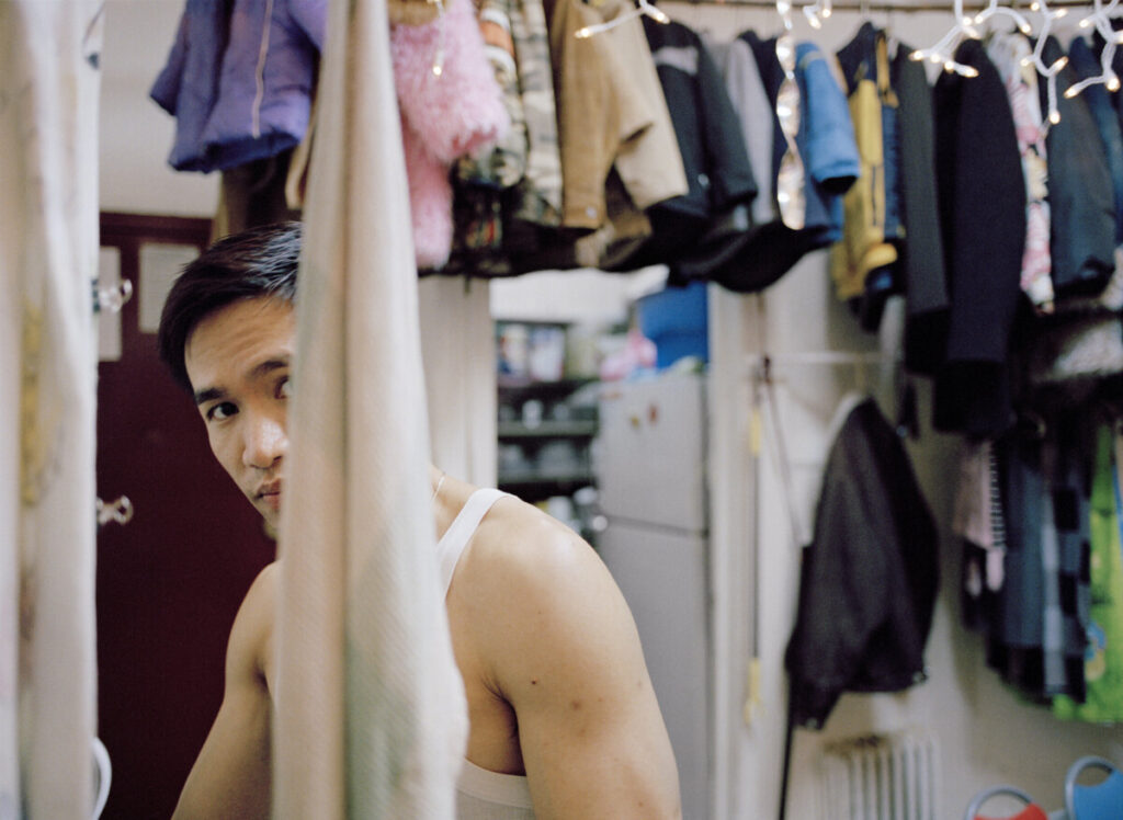
This image was taken by Thomas Holton, an NYC-based photographer who has spent 15 years taking photos of the Lams to create his book “Thomas Holton: The Lams of Ludlow Street.” Holton’s photos follow the Lams throughout their life in their cramped apartment located in Chinatown, a community/neighborhood of Chinese businesses and tenants settled in Lower Manhattan. In this collection of photos, Holton takes occasional pictures to create a visual representation of the daily and casual life of the Lam family. Although the house the Lams live in isn’t a nice suburban house or a luxurious condominium, their small apartment showcased by Holton’s photos creates a wholesome mood that depicts their big and happy family.

Thomas Holton uses the Rule of Thirds, Figure to Ground, and Dominant Eye in this specific photo. Upon first glance of the photo, the photo seems very clean. The man in the photo is the only thing in focus while the background is slightly blurred. This is an accurate portrayal of the compositional technique “Figure to Ground.” Since the man is much clearer than the background, the audience’s attention will be more focused on the figure rather than the blurry and less detailed background. Using the compositional technique “Rule of Thirds” also helps draw the audience’s attention to the figure in the photo. By placing the man’s face at one of the intersections, the photo becomes more balanced and aesthetic. If the figure was to be positioned in the center of the frame, the photo would feel less alive and boring. Finally, Holton uses the compositional technique of “Dominant Eye”. Although the man’s eye isn’t positioned in the center of the photo like the traditional definition suggests, it makes the image seem less static and creates eye contact between the audience and the figure. As Steve McCurry says, “Rules are meant to be broken.”

« Older posts

© 2024 COMD1340TueSpr24

Theme by Anders NorenUp ↑