Category Archives: Type Talk Discussion Activities

Jiang Hailey_Felix

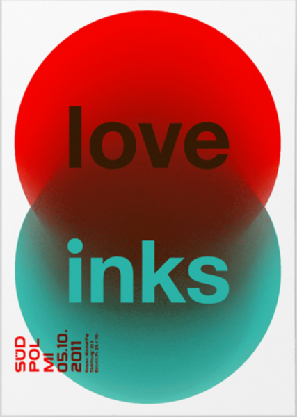
In this poster, Felix builds a strong hierarchy with scale and arrangement. ‘love’ and ‘inks’ are the largest and was placed in the center of this poster which drags viewers’ attentions. All the informational texts are legible in its size and style.

Colors also play a important role here. By using complementary primary colors like green and red, black and white. It creates a high contrast and a lot of visual vibration. Which is visually appealing to the viewers.
Williams Kayla Felix

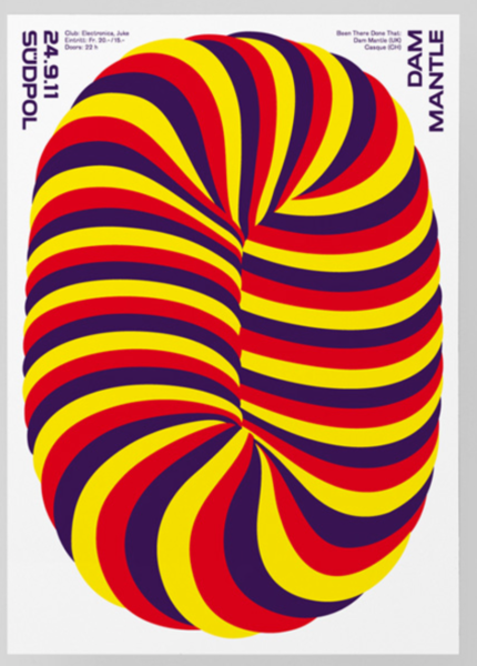
This design works best for me because the colors and picture catches my attention and the lettering is easy to read unlike with other posters that caught my attention, but was a bit difficult to read. However, in a way if someone was passing by those other posters and was not in a rush to go anywhere, then they could really stop and try to figure out the other posters. But this one was more easy and still caught my attention.

Hernandez-Garcia Yamileth Felix

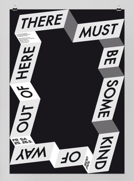
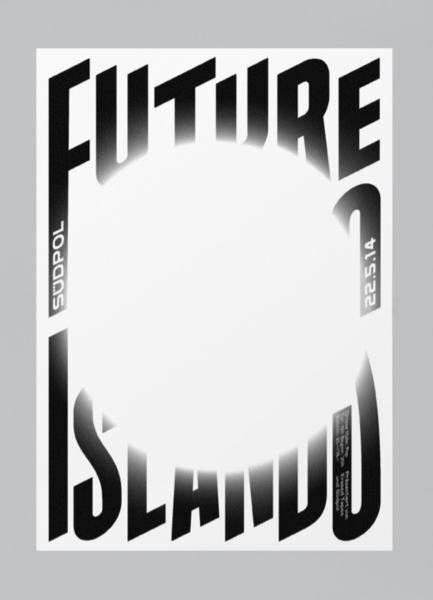
I really liked how this design demonstrated more expressive lettering and especially how the poster design brings meaning to the expressive lettering and overall message. The letters are and design fits well with each other showing that the words can’t get out as if it was a maze. There is some sense of hierarchy to this poster design as well.

Consuegra Pamela _Scher

The Most impressive design in the documentary to me was the citi bank logo. I have had this bank since I was taking my first design classes and always noticed the simplicity of the design and the resemblance to an umbrella. It was really cool to find out why the umbrella was incorporated into the design and also to see how the logo changed and became more inviting and modern.

Consuegra_Pamela_TT_Depero

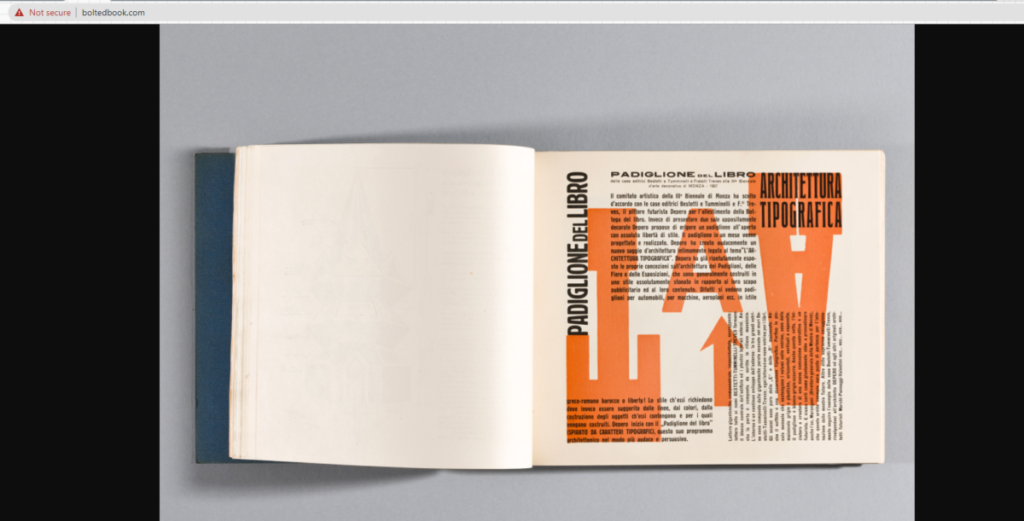
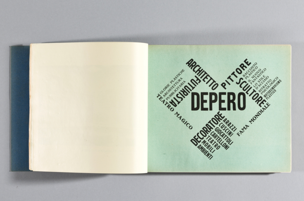
The First image places the words in an eye catching shape. This secures the attention of the audience and is a very creative way to use type. Technically it is a type within a type. The second image uses overlapping layers to contrast letters and different colors helps to differentiate between the background and overlaying text. While one of these is neater than the other I feel they both work in terms of aesthetic and uniqueness.

Barshtein_Andrew_TT_Depero

What I like about these is just how much the text forms into a cohesive structure. The first one uses various fonts and weights, the bolder weights acting as more of a skeleton for the lighter weights on the outside. For the second one, I like the way the text wraps into a sort of triangle or pyramid, pointing to the text on the left. The text on the left is also laid out very neatly into columns. The word “meccanici” acts as a sort of support or rest for the list of words to the left of it.

Williams_Kayla_TT_Depero

I really enjoy these pages. I like how the words in the first page kinda goes along with the image on that sent at the top. And it just seems like typeface used works so well with the image. For the second one, I enjoy the simplicity of the typeface, how it was sans serif and bolded, yet put onto a full blue background. It’s so simple, yet it makes the page more easier to read and understand.