
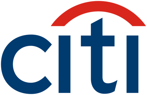
The Most impressive design in the documentary to me was the citi bank logo. I have had this bank since I was taking my first design classes and always noticed the simplicity of the design and the resemblance to an umbrella. It was really cool to find out why the umbrella was incorporated into the design and also to see how the logo changed and became more inviting and modern.
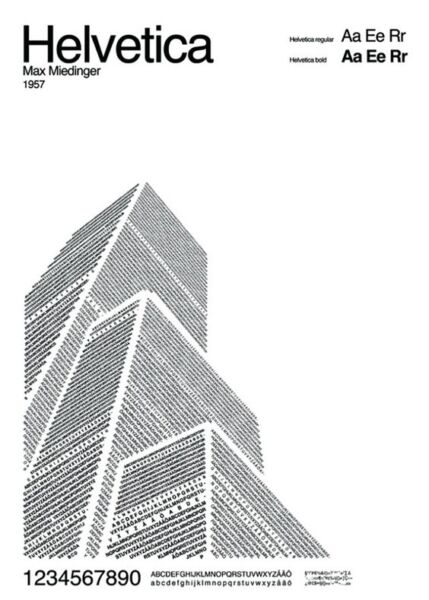
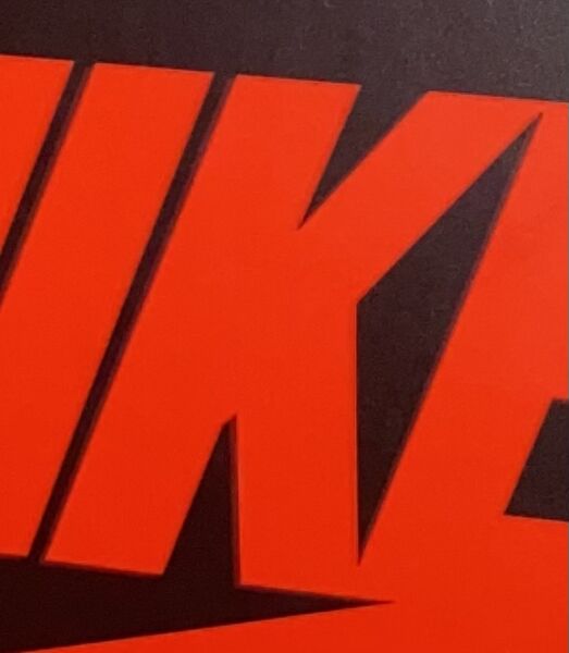
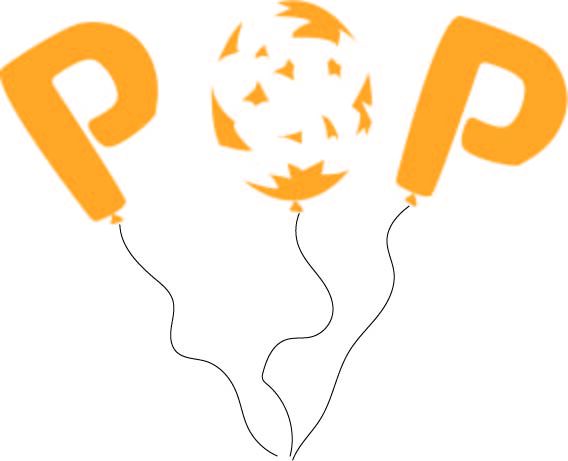
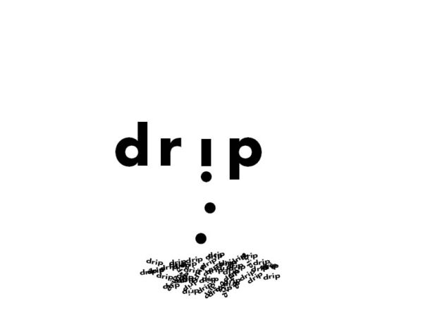
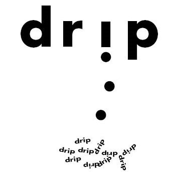
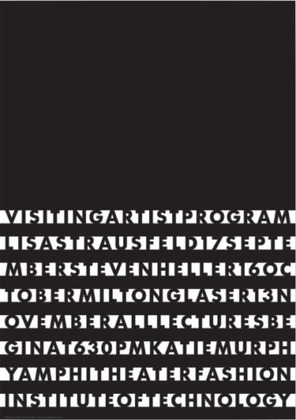
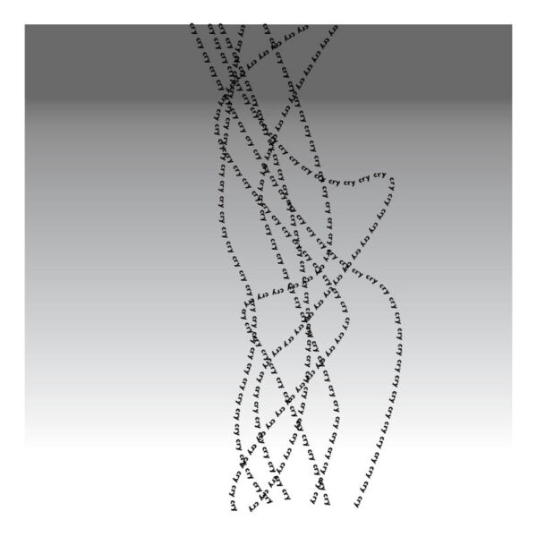
I feel that this poster works the best because it is very creative yet simple. The black and white doesn’t overwhelm the reader and the different facing text makes the lines look very clean. I appreciate the minimalistic vibe of this design and the clever design is impressive.

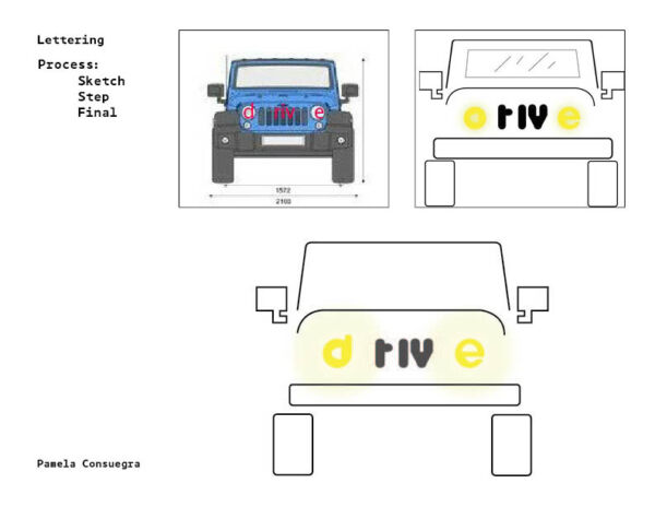
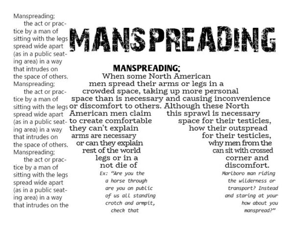
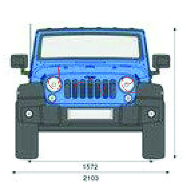
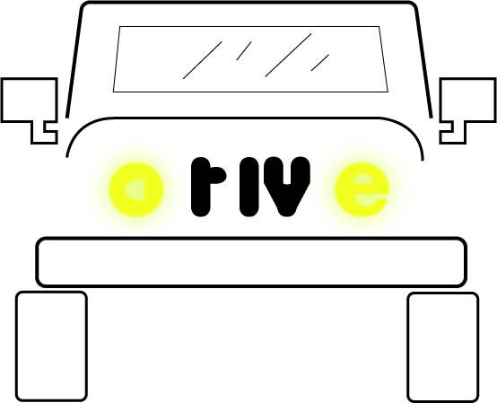
Final Version

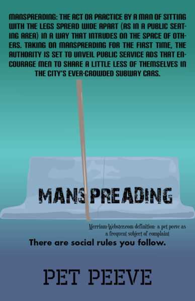
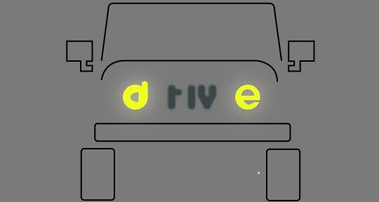
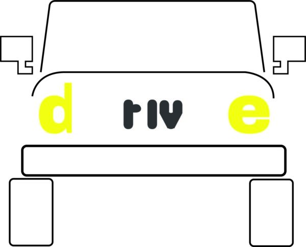
Refined Version
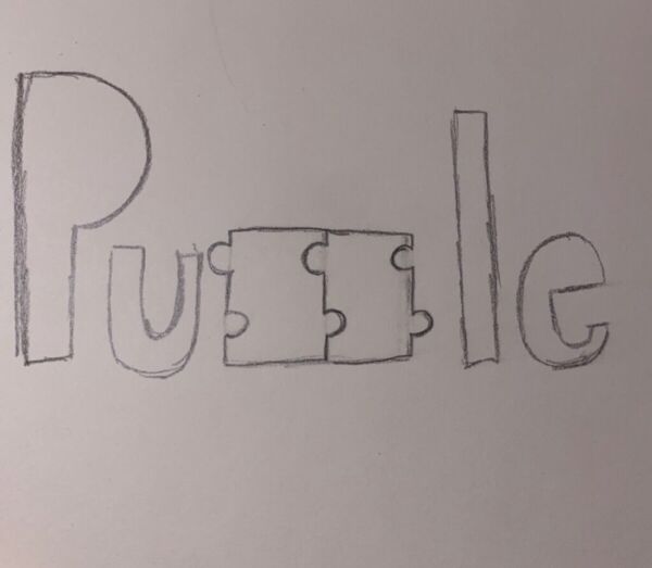
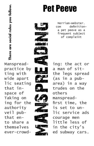
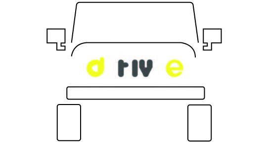
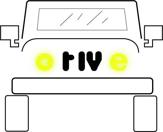
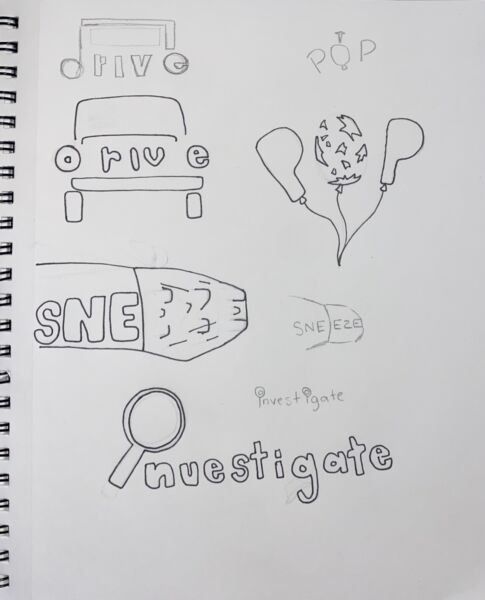
First Sketch


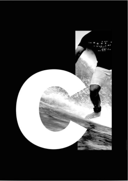
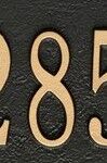
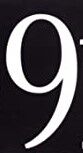
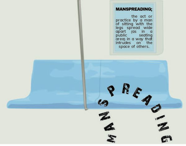
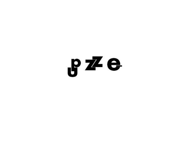
The first image does not work because the letters are blending into the background and are too simple and spaced out to read separate letters. This design looks like an eye exam instead of something you can actually read. The second design works well because the thick letter is used to contrast the graphic image. The framing of the letter and the filling in is a very smart decision and really catches the eye.


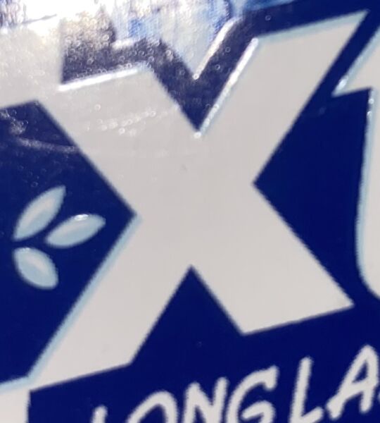
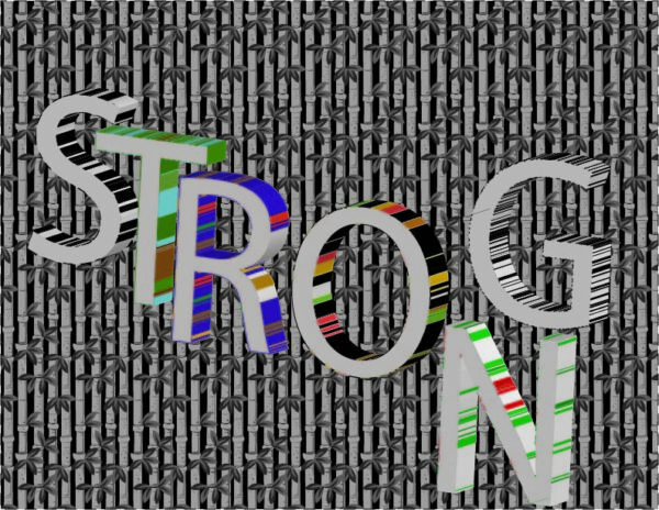
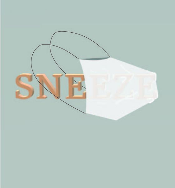
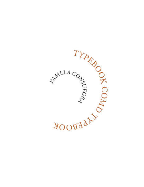
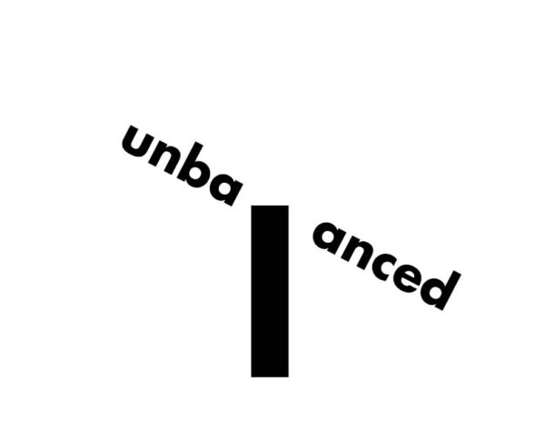
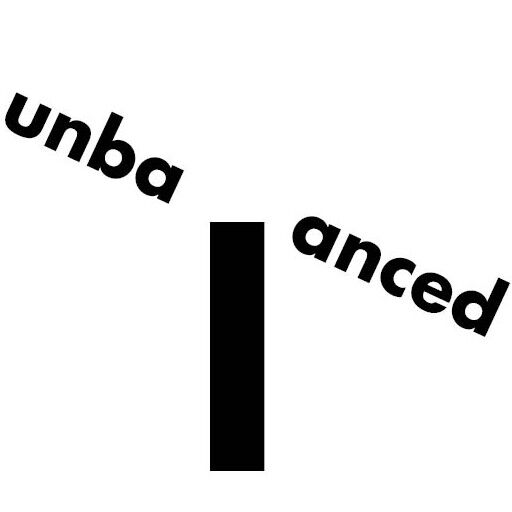
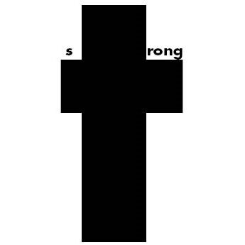
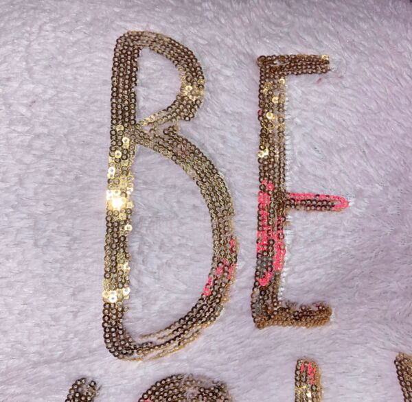
The First image places the words in an eye catching shape. This secures the attention of the audience and is a very creative way to use type. Technically it is a type within a type. The second image uses overlapping layers to contrast letters and different colors helps to differentiate between the background and overlaying text. While one of these is neater than the other I feel they both work in terms of aesthetic and uniqueness.
The OpenLab is an open-source, digital platform designed to support teaching and learning at City Tech (New York City College of Technology), and to promote student and faculty engagement in the intellectual and social life of the college community.