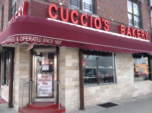
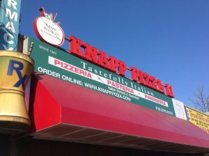
I’ve only lived in Gravesend for three and half years and one of the first things I’ve noticed about the typography being used is stores use a lot of sans serif. The stores have been here for a long time. The pizzeria seems to use three type families which seems a bit overkill. The bakery on the other hand uses sans serif for their signs. It’s interesting seeing newer type families on stores that have been here before I was born.


Author: Amanda
Hello! My name is Amanda and I’m a Communication Design Major here at City Tech. I transferred here back in Fall 2015 after obtaining an associate’s degree at Kingsborough. I have been doing art since high school when we mainly worked with a variety of traditional mediums from charcoal to oil paint.
It wasn’t until college when I started to learn how to work digitally. While I have experience with InDesign, I haven’t really worked with it in a while so I’m a little rusty. Typography is a sub-topic of graphic design I find myself struggling with. I hope by taking this class I can better understand how it works and how to use it in an effective manner.
When I’m not at school or at work, I’m on the computer going through social media, playing video games or improving my drawing skills.
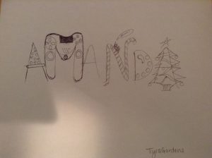
Picture done by Tyra


Recent Comments