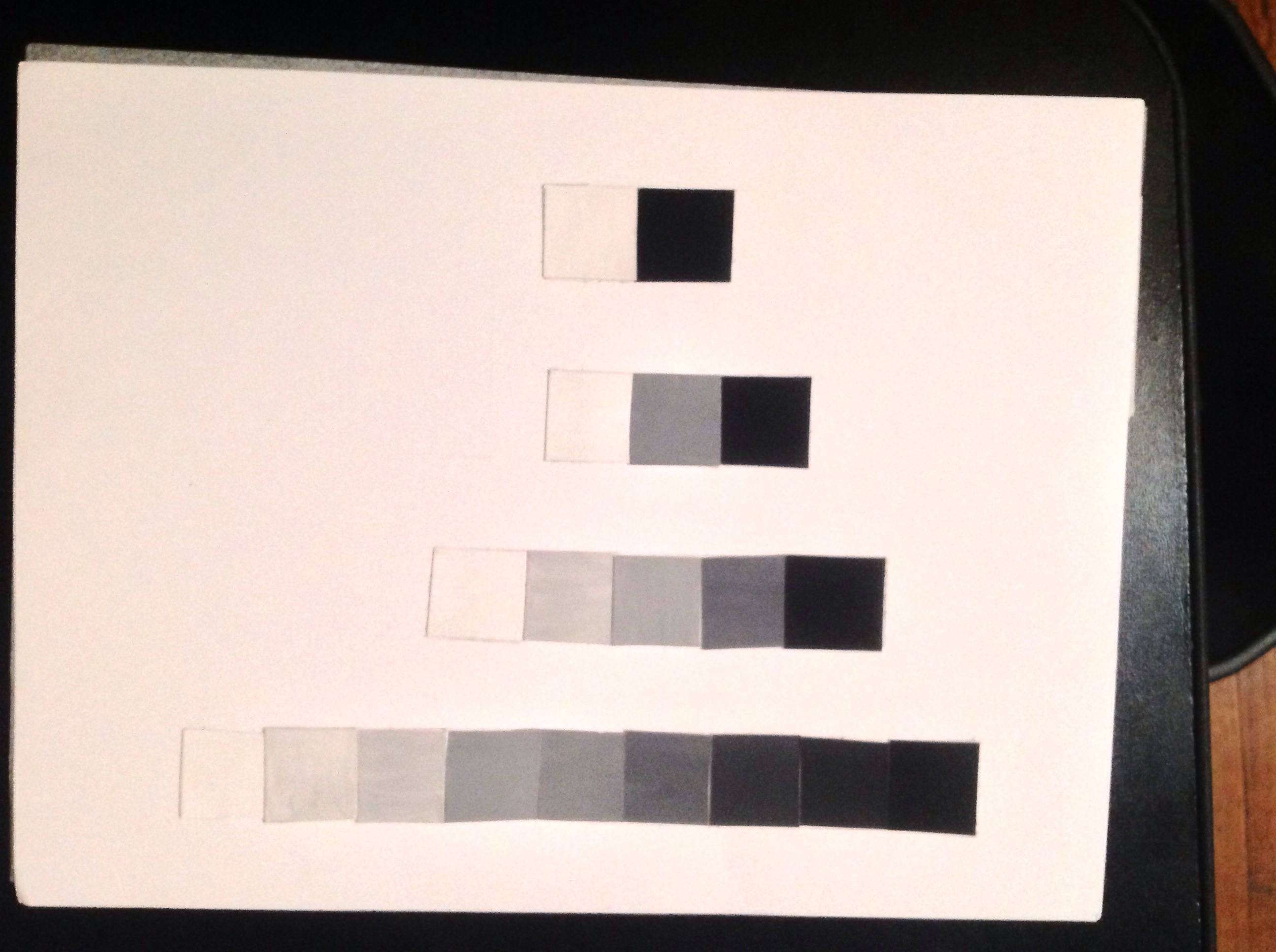
Hello class … This my finish value scale done with white and black gouache paint , creating a value scale representing eleven EVEN steps from black to white.
All posts by Amera-Rime Lulu
Graphic Design principles 1/ VALUE RANGE RESEARCH
For the first part of assignment #3 I had to go and take 2 photographs that represent high key and low key. During class I was only able to take high key and a low key photographs. These are the 2 photographs I took that represent high key and low key.

(UP) The low key photograph consist of mainly a dark value while having a light value color that represents the subject inside the dark environment.
(DOWN ) The high key photograph consist of mainly light value of white while including a small value of dark colors to define contrast.
Graphic Design principles 1/ Rhythmic Elevations
Project explanation CLICK HERE FOR PDF 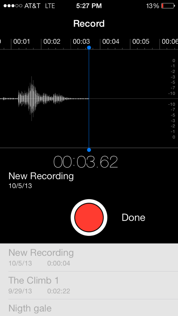
 Project explanation
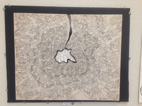

Line and Sound
Expression of Form, Emotions, or Concepts
Mapping Personality
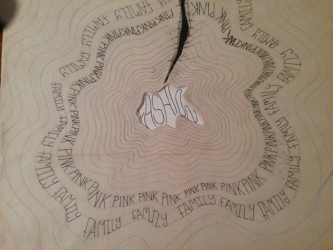
Using the geometry produced by the sound pulse of a recording of my name in accordance with my initial sketches, I was able to produce a waveform line that acted as the inspiration for the topography of the mountain.
The waveform line was then “bent” to form the peak of the mountain.
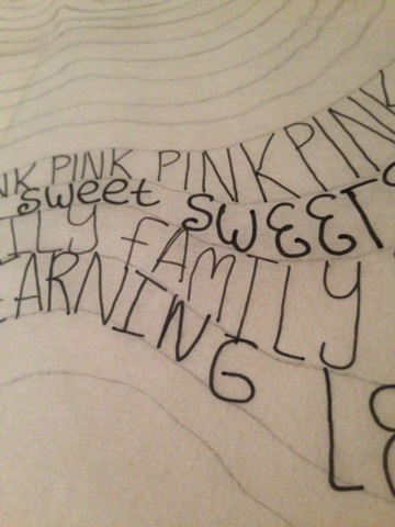
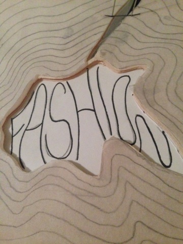
The text used in the project are words that describe who I am as well as my personal interests. They come together to form an overall texture and gradually decrease in width toward the peak of the mountain to create a sense of hierarchy and three dimensional interest. At the mountain peak, the word fashion is the center focal point of the entire work. Fashion is the foundation of my ideas and thoughts and will always be present as a inspiration for my work.
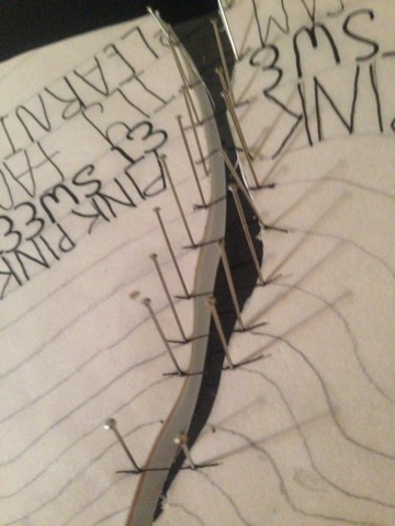
I have chosen to add a river to my topography symbolizing the flow and the connectivity between my personality traits. A stitching of thread held in place by sewing pins illustrates the bind that fashion has on all of the layers of the topography. The river was placed between the dip in sound created between my first and last name.
Materials Used:
-Foam Core -Construction paper -Trace paper -Acetate -Pins -Thread
Graphic Design principles 1/ Pattern Mashups
Graphic Design principles 1/ Line, Rhythm & Pattern
Graphic Design principles 1/ Line & Rhythm
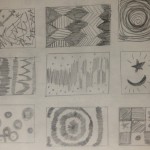
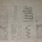
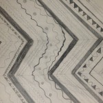
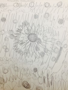
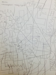
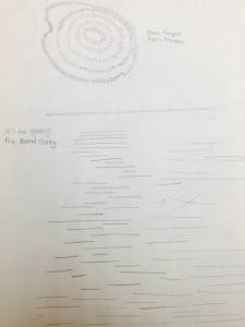
Monotony and Variety
For the first image of Variety i was listing to firework by katy perry you can listen to the song here. ( https://www.youtube.com/watch?v=QGJuMBdaqIw)
the second image of Varity i was listing to wrecking ball by miley cyrus – you can listen to it here (https://www.youtube.com/watch?v=mRFHAvdwXXs)
the last image is of two Monotony images the top one is by listing to demi lovato – dont forget https://www.youtube.com/watch?v=oYDDiqhhzbQ
and the bottom half by listong to if i die young https://www.youtube.com/watch?v=Aw8W6hYGZ0E
Graphic Design principles 1 /cont Assignement 1: A View from my window Final Step – Paper Cutout
- FINAL STEP !
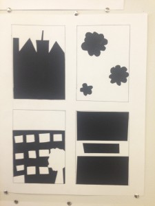
Hello …
This the last post sadley in the view from my window serious… however there are many more projects to come.
This part of the assignemt was to create Cut Paper Compositions out of black paper to make a contrast with the white 14×17″ Bristol Board, Using my inked thumbnail compositions as a guide, I created 4 figure-ground relationships (2 stable, 2 ambiguous) .
this part of the assignment of hardest to do but the most rewarding for to have my first peice ever of art work done.
I’m really proud of it , and the reviws i got from other classmates where very posative , and they loved my work as much as i loved my work. There is a few things i would have done diffrenty but i guess with paractice and my passsion i will do just fine in this class.
Another fellow Classmates Worked i really adored was the work of Sineah O’mahony. I loved her drawing and it was such an inspiration to me. Everything in the her project i belive is the perfect outcome for the project .
The element in her project showed the i belive perfect relationship between posative and negative space . her Ambigous figures challenged me to find the focus point and her stable images were easy for me to find. Her art work was very pleasing and i can see a very high level of craftman ship.
Till the next Assignemt
Live, Love & Desgin
– Amera
Graphic Design principles 1/ Cont Assignment 1: Development of Skill and Craft “a view from my window”
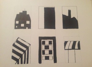
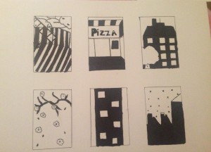
I will stard by saying i never how much time this would take me…
It took me more time than i would have taken me last semester to do my PRE-CAL Homework ..
With that said, this assignment helped me devolpe a critical eye to look at details in everyday life.
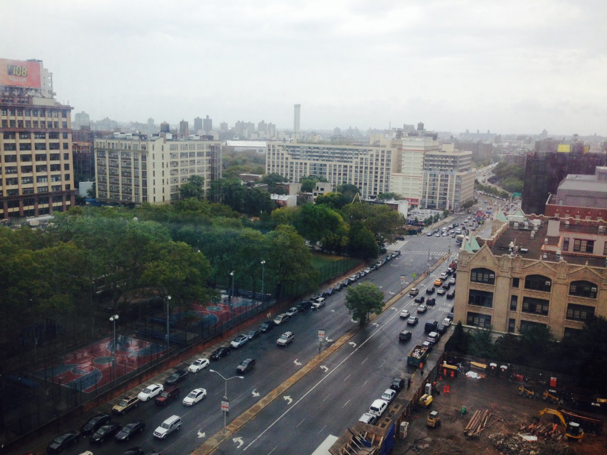
even thougth the view out of my window is nothing special , typical new york with brick appartnemts buildings and tree and cars. it got me looking for the intresting and to find the beauty in the city that never sleep.
the first thumbnails was made before the class talk and critque , after that i took it and though about a away to make it more intresting with the figure ground and stable images, and kept the comments in mind while i re-did a new version.
I took the same window but looked at it from a diffrent point of view and at the nigth time and i got this.
I hope you guys like it .. till next post .
live, love and design.
xoxo
Amera
Graphic Design principles 1/assignment #1 View From My Window (Research / Inspiration) & (Experimentation / Iteration)
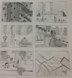

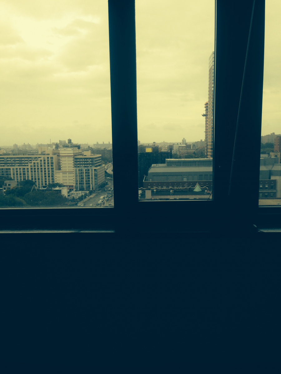
Outside my window I see buildings and stores. The view is very geometric and and clean lines.
The view it self is very can be viewed from many different views and angles. I live on the 6th floor of an apartment building in Brooklyn, NY. The Buildings themselves are very interesting at first glance they may seem simple but at a closer lok you can see alot of detailing and hard work.
Hello World !!
Hello World .. my name is Amera-Rime Lulu . I’am a Student in New York city of technology.
I love graphic and fashion design. so welcome to my journey of becoming one.
xoxo
Amera
