Category Archives: Uncategorized

Class 24 | Color Interaction Free-Study (final part )

amera and mei final
Paired Color Interactions


Hi Class, this is my final composition work with Mei Dan Zhu, it was really fun to work with her and she is very easy going ………..  the Red section Repesents Mei love for music and life that i did for mei and the pink side is what mei did for me that represents me and my love for fashion and my dream to travel.

both our composition are made digitally using photoshop and illustrator.


Color Interactions

Value Color Iteration:0639interaction

The same yellow, violet, and gray were used in these examples, but they appear to change relative to how they are used together. This interaction between colors varies between how the colors are used, so it is important to look beyond Color Theory and color science if color is to be used successfully in art and design.


Extra Credits:


Simultaneous Contrast Research

RESEARCH

Our eyes give us a very subjective view of the world. This subjectivity leaves us susceptible to a variety of optical illusions. The fact that we are not very good at estimating the absolute brightness of a region, but have a strong ability to detect differences between neighboring regions causes simultaneous brightness contrast illusions. This type of illusion makes the perceived brightness of any region in a complex image vary depending on the brightness of the region’s immediate surroundings.

The illustration below shows how our perception of a colors in different Mediums 11-03-04-spiral article27-squares1 Simultaneous_Contrast_by_JustMarDesign SimultaneousContrastIllusionDetail

Class 21 | Balance, Symmetry Field Trip (free study)

For me this was a very challenging project but at the same time a very fun Project .

I tried to incorporate my interest of fashion and fashion illustration into the theme of Ben  metaphor, balance, and the range of saturation (prismatic, muted and chromatic gray).

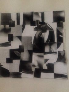
I used the same color and but in different ways.

My Design Process includes two pieces of art that i later on Merged together

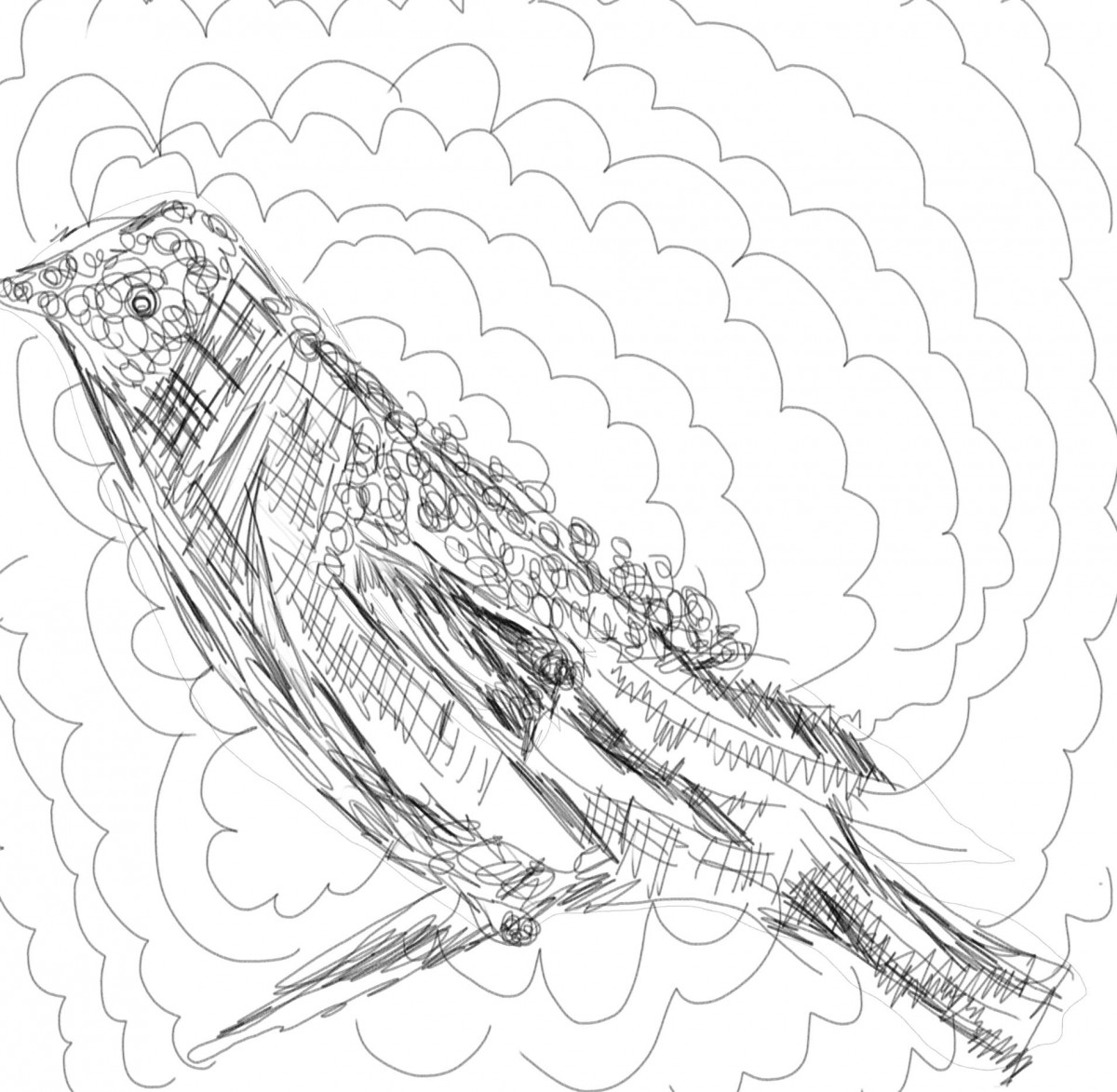
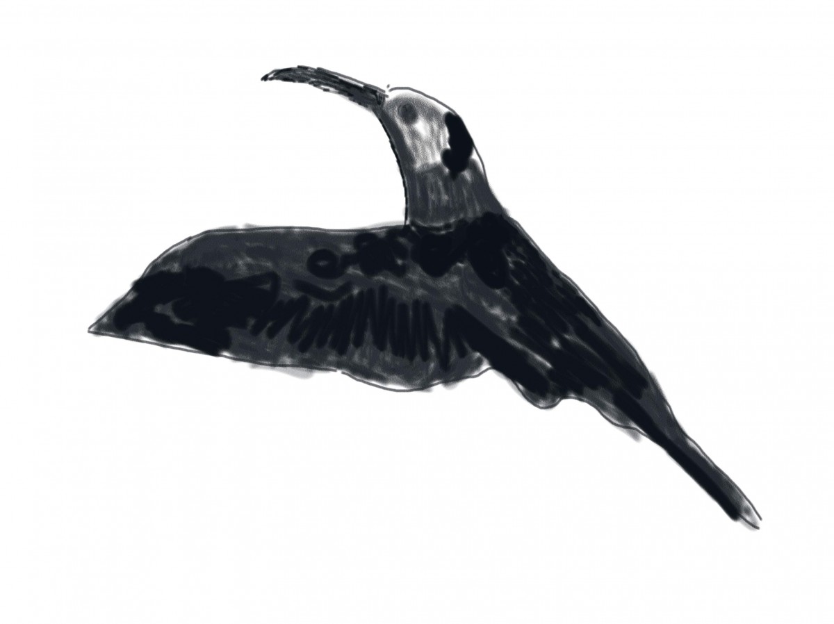
First i started doodling while we were in the train station the birds in the ben art.  so i knew i wanted to incorporate into my piece somehow

pelemary sketch 2 Pelimary sketch 1 Pelimary sketch 3


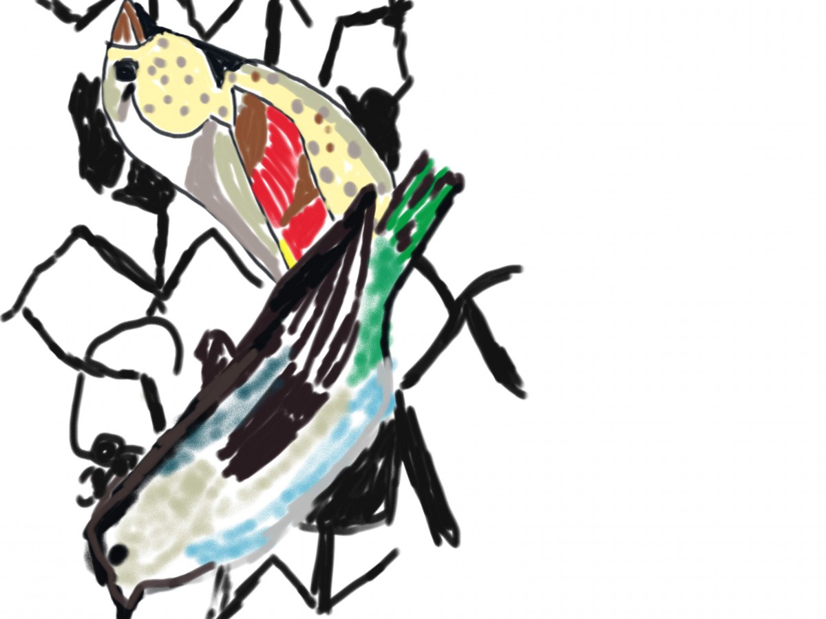
and here is my last version of my digital paint of this inspired bird Paint with Watercolor final (14x17)


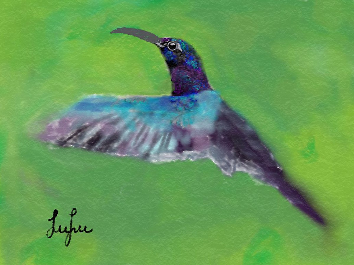
After that i was inspired by the subway so i started sketching that inPelimary sketch 1 b

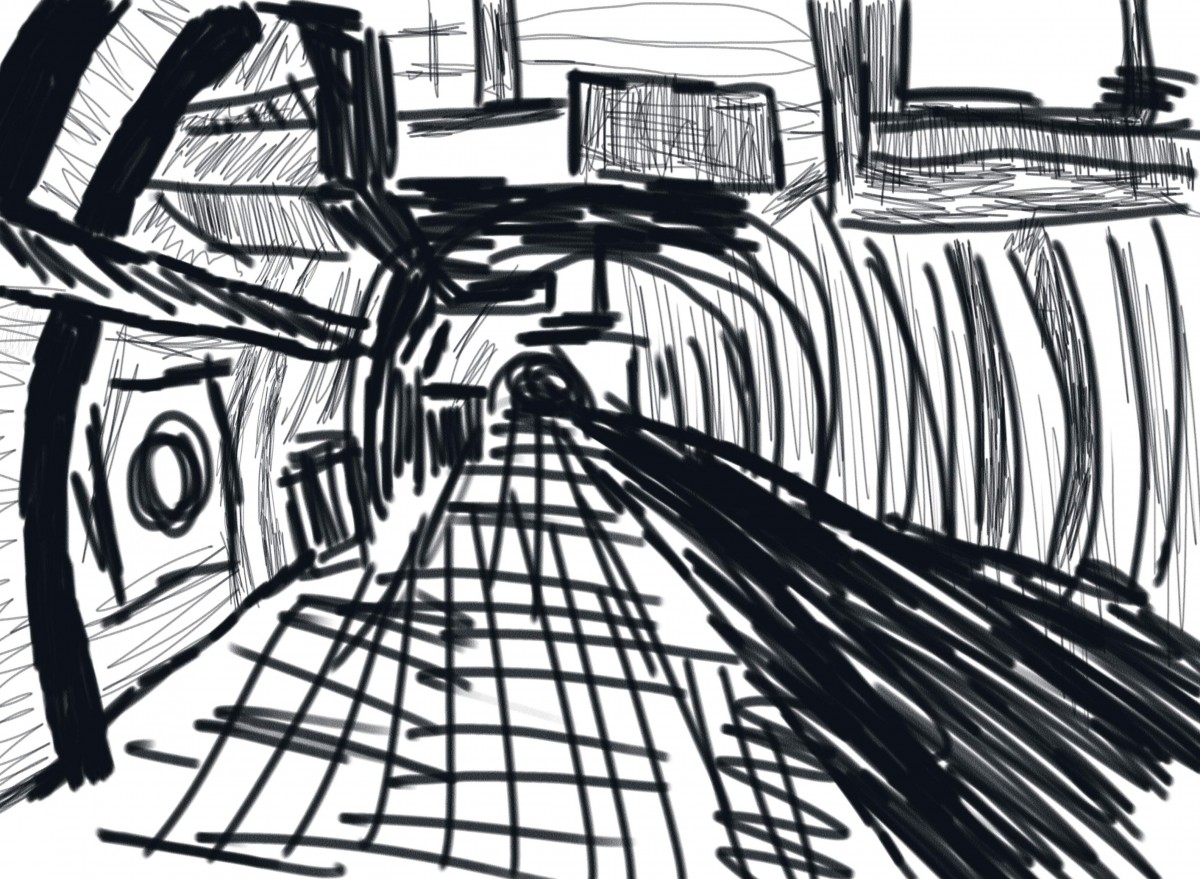
I knew i wanted to incorporate Ben idea of departures and arrivals so i sketched people to add to my scene subway art sketch


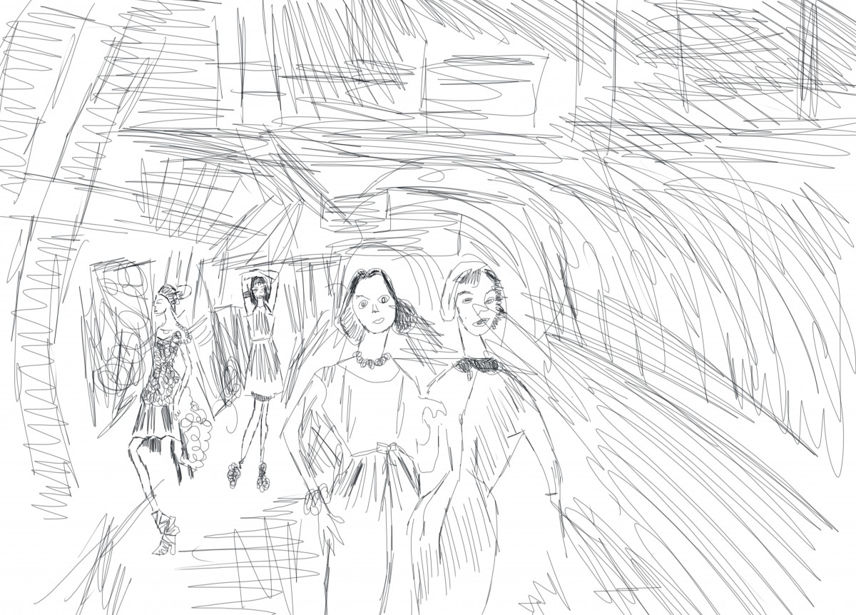
After playing Around in Photoshop for few hours  here is my final work Subway Art

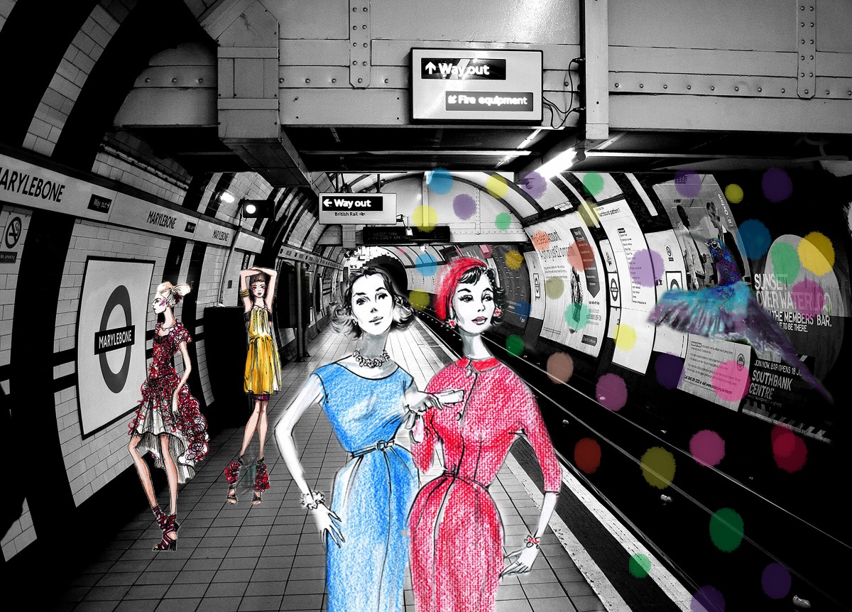
My idea was the arrival and departure of people from different decades in the subway a futuristic subway and i incorporated my bird in the subway wall art . The Colors i chose to add to my   are elements of the color theories we been studying in class.

I hope you guys like it .

Thank you for reading

Field Trip to Artists Space

20131027-181342.jpg

20131027-181416.jpg

20131027-181449.jpg

20131027-184056.jpg</a

Richard Hollis is an British graphic designer that who has a great influence in today's graphic designs and aswell as The history of graphic design .

As an aspiring painter in mid-1950s London, Richard Hollis admired Constructivism and the kalte kunst (cold art) of Swiss artists like Max Bill and Richard Paul Lohse, but at an art teacher’s suggestion he took up graphic design instead, taking on the visual strategies that employ text and images to communicate ideas. Famously part of the team that helped wrestle John Berger’s 1972 BBC series “Ways of Seeing” into a book, Hollis found inspiration in the television format—what had arguably become the predominant way of seeing. At the time, setting images within the relevant parts of text and using a bold sans serif font (to give the text a weight that would echo the series’ emphatic narrator) were, in graphic design.

Richard today counties his journey I. Graphic design in an amazing way the will influence graphic fleshing a students like us for generations to come.

Class 12 | Value + Emphasis + Scale


Hi class here are my first drafts and my final draft of my value scale collage I will be working on for the next following blogs

The assignment was Using printouts of the portraits taken in class, transfer the grid provided to the printouts. Measure, mark in pencil, and cut out each square carefully.
Use variety of scale to develop contrast, hierarchy and emphasis. Some of the squares in our grid should be small, some large, some medium.
Rearranging and experiment with your portrait pieces until we developed 2 unified 6″x6″ compositions as follows: 🙂

20131027-121256.jpgoriginal Portrait

20131027-120505.jpg
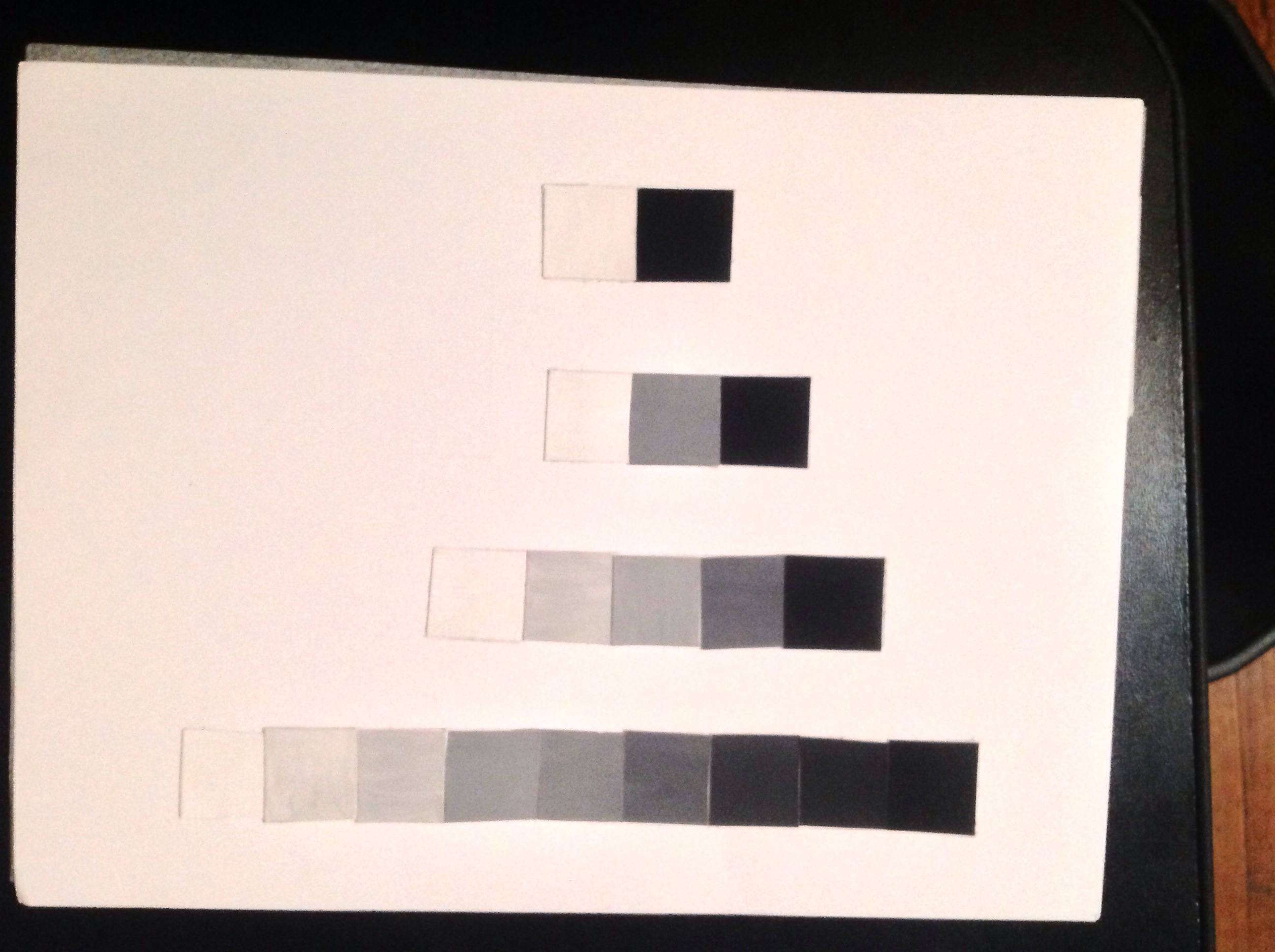
Broad range value portrait 


second and final draft of value scale 20131027-121348.jpg