The Egg

The Egg & Garlic
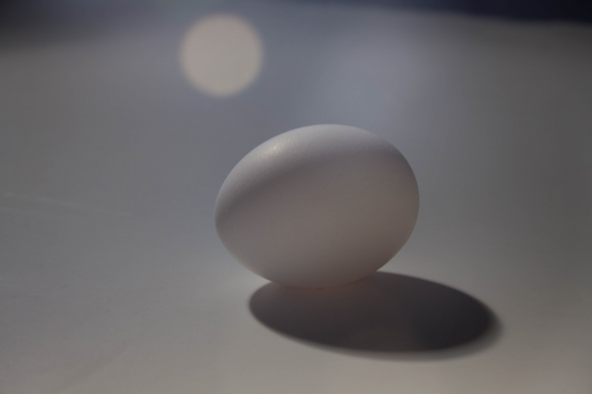
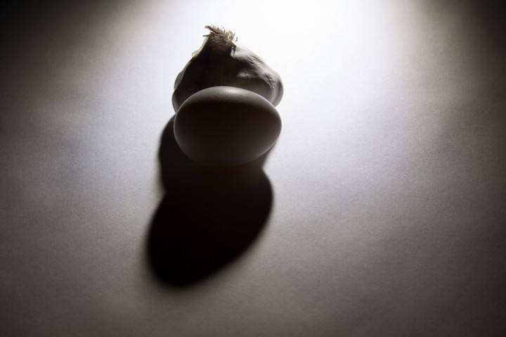
I really like this photograph because we used a back light setting; also the camera was set up at a high angle so that we can define the two figures because of the lighting.  This gives the image certain dark look to it and because the shapes also help to created interest into the composition of the photograph.
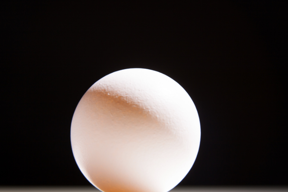
Posted in LL4-Studio Light Basics | Leave a comment

Egg Lighting

The Lighting we used was continuous light. In this photo the lighting is diffused and has a lens glare on it. This image shows a unique since of different lighting from the hard light of the other images. This image shows an amazing effect of back light. The darker back light shows a serious feeling.

IMG_9367

Posted in Homework, LL4-Studio Light Basics | 1 Comment

Learning Log – Egg project

Screen Shot 2014-11-04 at 12.47.53 PM

I chose this image as my personal best, I like how the egg is a strong contrast to the dark black background. This image’s lighting is side light.  This type of lighting helped the yolk inside the egg shine through. The image appears simple, clean cut, and sharp which i believe was the goal of the project.

Posted in Uncategorized | 1 Comment

The Egg

Our group captured this image of the egg and gralic

Our group captured this image of the egg and garlic

On the left is what i believe is my groups personal best. I decided to go with this image, because of how the reflection of the egg and the garlic was so clear. It was very interesting to see how the light direction created a kinda hard shadow and didn’t interfere with the reflection. We see that the light is side light, the shadow is in the left. On the reflection we see a little bit more detail of the garlic , since so much light is hitting the actual image and to me i like how this image  gives us this nice and interesting feeling of how the egg has a soft shadow on the egg itself. I enjoy how the background  brings out the white in the image.

Posted in Learning Logs, LL4-Studio Light Basics | 1 Comment

Personal best of Egg

15687035686_58a2b19688_z

I like this photo because of the lighting. the lighting is coming from across the table and it gives off this heavenly atmosphere and a sense of camouflage to the white paper. The light was focused and the light dimmed as the photo was taken.

Posted in LL4-Studio Light Basics | Leave a comment

Gallery Review

  1. Rectangular Squares (group exhibit)

    All of the photos in Rectangular Squares utilize the idea of frames within frames. The images are all of different things, some subjects are people, others are objects or spaces. Some of the frames used within the images were windows, doors, screens, and light switches. There were a few images in particular that stood out to me:
    Nandita Raman’s Untitled #7 which shows a glass screen and through the square openings, the people on the other side are clear but the rest of the image is unclear, and the other image was Alex Webb’s Ethiopia which shows a woman in a doorway, many fruits on a windowsill and a wall design that is made out of rectangles. The press release says that the “images conjure suggestion out of structure, semblance out of geometry… The square, itself an ancient symbol of stability…” and before reading this, I didn’t really understand the point of stressing the squares and rectangles but after reading, I see that the intention of the curator was to take images that used framing to show how squares and everyday life in certain places interact, showing their connection.
    In Alex Webb’s photos, Ethiopia and Bombay, he uses direct light and the most important element is of course the use of the square/rectangular shape to create frames within the image. Another important element is color which vividly separates the people from the scenery. What you could take away from these photos emotionally is the idea that you get a little insight as to how others live and the fact that there are cultures worth exploring.

  2. Ansel Adams – Classic Images

    This exhibit contained mostly photos of landscapes in Western places like Yosemite National Park. The photos were in black and white and used contrasting light so the photos were still very striking and inviting. In the press release, it says that Adams once said “Sometimes I think I do get to places just when God is ready to have somebody click the shutter,” and I feel that after reading that, it makes a lot of sense as to why the subject matter of his photos are mostly things found in nature. It also says later in the press release that he was an environmentalist which makes sense and shows his connection to the nature in his photos. His intention with these images was to highlight the beauty of these areas. Without reading the press release, I would understand that he had a strong interest in environmental photography but I didn’t understand why until reading it.
    The lighting is mostly direct – light areas are light and dark areas are very dark, making the contrast very high. An element that is really important is leading lines because they are what guide your eyes through the images. Being that this was my favorite exhibit of the day, I feel that the mood left an emotional impact, one of serenity as well as adventure. Serenity because he highlights these environments so beautifully and adventure because it looks like it would be a freeing experience to be standing where he stood whilst taking them.

  3. Stephen Shore

    The photos in Shore’s exhibit were a variety of landscapes and portraits of people and areas in Israel and Ukraine. There were many images of the sandy open spaces and houses in Israel and the people in Ukraine and the way they lived. After reading the press release, you see that the reason for photographing in these two places was to show the daily life in Israel and showcase Holocaust survivors in the Ukraine but before reading the press release, I honestly didn’t even notice that the photos weren’t all taken in the same place.
    The light used in most of these is direct sunlight and some of the most important elements were angles. In photos like the image with the tiny car, the high angle adds to the feeling that the car is so little and in the ones with people, you feel that you’re on their same level. After understanding the reasoning behind these photos, you can have a better sense of how to respond emotionally to the Holocaust survivors as well as catch a glimpse of the everyday life in Israel.

Posted in Uncategorized | 1 Comment

Home Studio

IMG_1189


My main issue in creating my mini studio was where to put it. I decided to try a space in my washroom. It’s a tight fit, in between the dryer and the wall and the surface I used is a hamper but with some cloth covering the clothes in the back and eventually, the top of the hamper, it can be converted when necessary. Another problem I ran into was finding outlets for the lights. I discovered a forgotten outlet right on the right side of the hamper but I did not have one for the left side and at the time that the picture was taken, I didn’t have an extension cord to reach the other outlet. I now have an extension cord and I’m able to plug in the other light as well.

Getting the materials wasn’t as hard as I thought it would be. I purchased my lights and clamps from True Value and even though I felt like I looked really out of place in the electrical aisle, I found everything quickly. My uncle let me borrow his tripod so I didn’t have to worry about that & I have tracing paper to use as my diffusion screen as a friend advised me to do. The one issue I do have to resolve, however, is finding a way to make sure both lights stay up securely. There isn’t much space in the area so putting two light stands isn’t going to work. I currently have them placed on two sticks but I fear that at any moment, one could tip over. Once I figure out how to secure those, I’ll feel good about shooting in my mini studio.

Posted in Uncategorized | 1 Comment

Galleries

The first exhibit we visited was in Aperture Foundation titled The New York Times Magazine Photograph, which feature images from various photographers. The purpose of the photographs in the exhibition was to provide images that depicted current event. Some stories covered were the Kuwaiti Inferno and the act of terror on World Trade Center. A common trend in these photographs involve humans and their reactions during tragedies. One photographer stepped away from this trend and instead photographed the bedrooms of dead soldiers, which I found interesting. Ashley Gilbertson took his photographs in monotone with the complete room in focus. He had a tendency to use the daylight that would come in from the window for his lighting. Along with the photograph was a caption that explained the death of the soldier, some died from enemy explosives and there was even on who committed suicide. The black and white really made these ordinary bedrooms appear grim and depressing.

The following exhibit was displaying Ansel Adams Classic Images. Adams focused on capturing the beauty of the environment because he wanted to preserve wild space. All of his photos appeared to use daylight with an extensive depth of field. The use of daylight also helped him create high contras in many of his image especially in “Winter Sunrise,” where it is greatly noticeable from the different lighting on the mountains. His photographs help the viewer appreciate the beauty of nature and it does invoke a feeling that this is something we should protect.

The final gallery we visited was for Stephen Shore in 303 Gallery, a photographer well known for his use of color photography. His photographs exhibited are the ones he took in Israel and Ukraine. Similarly, to the previous two, he also relied on front lit daylight and kept a sharp focus. He seemed to be interested in using bright and vivid colors to contrast against duller colors easily noticeable in photograph of the homes in Israel. His exhibit would exert a calm atmosphere, but not relaxing. The photograph of survivors of Ukraine captures strong emotions of the elderly who seem they only want to forget about the past. If Shore were not photographing a person, he would focus on the texture of walls, objects and other objects that provided great contrast.

Posted in Homework | 1 Comment

Gallery

Visiting many galleries on tuesday was a very great experience to me. I didn’t know that there was such galleries that are free to the public to look at so this was very good to know. I learn that  many photographers usually have a purpose for taking there photographs a certain way and the reason its composted weather it be because it wants to give us the audience a message or because it has a  unique style that represents who the photographer is.

The first exhibit, The New York Times Magazines, I enjoyed the photographer work by Ryan Mcgliney. He did the summer and winter Olympics and where placed in the magazine.The photographer Has a very different understanding of the human body and has studied the history of photographer and motion of people ? In this series he created many types of athletes soaring throughout the air which were titled simply up. I enjoyed looking at his work, because of the way the lighting was directed to. We see a type of gradient in the background that gave the photo a more colorful mysterious look.  These photos also have a light contrast and the athletes  have a type of silhouettes. These photographer are negatives. These photographs were published August 8, 2004.

Another photo gallery that I really enjoyed looking at was called Sepia Eye Rectangle Squares. SepiaEYE is pleased to present Rectangular Squares, a group exhibition featuring the work of sixteen artists whose photographic images conjure suggestion out of structure, semblance out of geometry. Beatrice Pediconi, Seven, 2014 was the photographer and date of the image. A specific photo really made me feel happy relaxed and was full of mystery. .It made me feel mysterious and curies at the same time. The photographer who I enjoyed looking at with the gradient blue panels was called Beatrice Pedicon. This image was so simple, very efficient, had  great feeling to it since blue is considered a cool, relaxing color and in many ways very interesting. These images went  darker in the top and lighter at the bottom. This painting was made from a water color something very different from a photograph.

Lastly, the last gallery that really caught my attention was the Sephen Shore. When I first walked in, and when thru the gallery I noticed the high definite colors that each photograph that was hung up had. It caught my eye because our eyes are meant to get led to items on the photographers that stand out more. At first I thought this gallery was about places like in the European culture but later learned that these images are about peoples homes who actually survived the holocaust back when the jews were treated very badly by the germanys. These photographer photographed their condition, items and places where these people lived. Now all these photographers have more meaning. An example of a photo that I enjoyed was called called Home of Tsal Groisman, korsun, Ukraine, July 20, 2012. It was a chromogenic color print. The light direction from this image is gearing more towards the statue. Where there are many objects in the background.

I enjoyed watching every gallery we had went to. My favorite image out of these three has to be the one from Pedison. I really did enjoyed  his water color painting. It has a great feeling to it the gradient in the background it was such a great picture.


Posted in Homework, Uncategorized | 1 Comment

Gallery Review

The first photographer is Sebastiao Salgado and his exhibit or his group of photos is called “The Eye of the Photojournalist” and it was taken in the early 1990s. It depicts a story of these group of people, in black and white, working all day at an oil field. Some photos showed people in a state of exhaustion and also shows a wide angle view of a person or a place. they had some exposure to show the details on the person. The images were also sharp and each photo clearly focuses on one subject that relates to each other. I believe that the photographer’s intention was to show how stressful and hard it is for people who work constantly everyday. Overall, I enjoyed the photos he displayed.

The next photographer is Ansel Adams and his photos are “Classic Images” His photos consist of outdoor portraits of mostly nature and a few people here and there. Some of his photos had a town with an evening sky and some even had mountains with clouds hovering over them and I thought that looked awesome. The photographer’s intention was to show how beautiful nature is in both daylight and nightfall. I believe his other intention was to show natural habitats and towns that are not anyway related to a city with technology. The photos had sidelight with an extensive depth of field and they show a  calm and peaceful atomosphere.

The last photographer is Stephen Shore and his Photos are taken around Israel and Ukraine. Most of these photos consist of subjects that are inanimate objects or people. Some have close-up of an object and some are wide ranges such as buildings or the road. These photos, unlike the previous two, have color and they are taken mostly outside. The photographer’s intention was to demonstrate how live is for the middle-eastern with riots and wars happening over there. There is natural light and most are straight up taken rather being taken at an angle.

Posted in Homework | 7 Comments