Skip to content


week 9

This week we have started very big project that is going to take time more than couple of weeks. One of Marla’s existing clients wants to change their all interior signage. That means we are working on huge files. For example one of the signage that I have started is about 75 inches long. Even then we have very busy layout as well. But this time client is more flexible and let us do some nice touches to organize the content. Another thing is since we are going to change every signage inside the place, we have to be consistent. This is good because we have similar solutions for different content. This makes things easier. We don’t have to think for typeface, graphics and colors individually. Also creating very consistent designs makes look each of them better.

The other thing about this week’s work that I have learned new features in Indesign. I know the software has so many features but I have not use it much so I am not aware of most of them. So this week I have learned how to use basic feather and gradient feather effect to manipulate images without using Photoshop. Actually after learning this effect at work I have applied similar ones to my own portfolio. It definitely gives nice look to images without interfering the text or other images around them.

 

Posted in Assignments.


week 8

To be honest sometimes I really don’t like the menu designs that we are creating. Because clients do not want to spend much money on their menu but they want to put every little information in there. Some of them still want old fashioned graphic style like boxes and bursts while some of them wants very overwhelming and busy layouts. Even though you try to convince the client in order to keep your artistic dignity and/or find reasonable ways to satisfy them, you end up with a design that client approves.

However, this week I have worked on a menu that was really modern, clean, and elegant looking. It was for a catering company that serves mostly in Manhattan. Instead of folded brochure they prefer booklet. As a result of that there were so many white space in the layout. Images on the menu were high quality professional pictures. Even the paper plays very important role when you want to make something noticeable. The typeface, leading, margins… all these elements have their own space without squeezing the other. What makes me surprised more is that Marla designed that beautiful catering catalog. When I first met with her I thought she uses the software very well but she lacks the design skills. However, I realized that under given conditions she can create an artwork as well. This also shows that in the real business world you are not going to get job offers that matches your artistic skills or expectations. I think how picky you can be is related to how much money you need.


Posted in Uncategorized.


week 7

This week I had really fun project to do. NCT theatre company wanted t-shirt designs for their upcoming show “Grease”. My supervisor is expert in Indesign but when it comes to using pen tool and tracing she struggles. So she gave the project to me. I always enjoy more when I work in Illustrator. During this project I have been told that people makes really good money just by tracing and outlining the graphics. That would be really good if I earn money for doing what I like. Another thing that was good for me to learn more about silk-screen printing. I mean of course I was not at the printing facility to see how things get done, but even setting colors for this type of print is important. Our design was four color and we just used tints or shades of these four colors to give some texture and/or dimension to it.

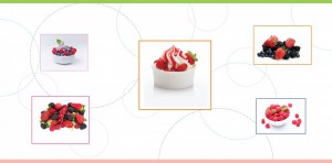
Meanwhile, I have finished the frozen yogurt board. I have changed the existing image on Photoshop and replaced the low res images with high quality ones. Also I have used the grid for more clean look. The only thing is, since Marla has so many different projects at the same time, I just finish my part and give it to her but I do not know if that design is really produced. But they are not coming back to me for any corrections. So I would consider this as a good sign.


Posted in Assignments.


week 5

This week we had some problems with Marla. She could not find the file that I worked on it because I was saving files differently than her. To solve this problem we find a naming convention and determined a location on the computer to save files. Also we spent some time to organize our folders to be on the same page. So far everything seems synced. I have been working as a freelancer for two years but I have never had to hand in any project before finishing it. So it may take time to get used to save my works thinking someone else may use them.

Other than that we have two other projects. First is one of the old clients opens a frozen yogurt section in their restaurant and needs visual elements to promote that section. We are going to design a board to use on the counter. The size of the board is kind of big, so we have to use very high quality images. Therefore I spent some time to find these images. Also I did some research to see what is out there related to frozen yogurt business. At the end I came up some design options and Marla was going to show to the client. If they approve we will do a big menu board design that will be hanged on the wall.

Second project is a signage for a Peruvian restaurant. Marla designed a logo for this client and they want to use that logo in their outside signage.The only thing is that they want different font for logo and they do not decide what color they want. So on Tuesday I tried to come up with different font options and color combinations. I prepared eight different combinations and Marla took them to the client for proof .


frozen-yogurt-counter      frozen-yogurt-counter2

Posted in Assignments.


week 4

This week I had back to work on menu that I started on the first day of my internship. For this project Marla only had asked me to write and organize the text without any decoration. after I handed in Marla did the design and everything. The client wanted a simple two color design. But after Marla sent them a proof they told her they did not like it because it was too simple. That was very interesting because at the beginning the client has seen all different options from Marla’s portfolio and they picked the one that simple and two color design. I am sure this happens all the time. It is hard to satisfy people when they do not know what they want. So this time Marla gave the project to me and we decided to go more colorful and playful. I add more images, shapes, and color. But I tried to stay on the simple side for just in case. Time to time I asked Marla’s feedback and she gave me positive comments. On Monday I left the menu half done to continue the next day. On Tuesday, when I got back to the office I found that Marla finished the menu. She did some changes and carried the design from simple to complex. She used big outlined burst shapes, boxes and gradient bars. She is in this business about twenty years. Even though her final design seems so busy and little outdated I think she knows better what her clients want. Because at the end of the day we do this job to pay our bills. If client likes your design your bills get paid.

Posted in Assignments.


week 3

WEEK THREE

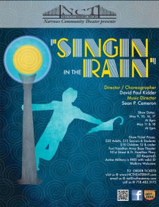
This week I showed Marla my flyer design and she loved it. She told me that she sent my design to the theatre committee and everyone on the committee also liked the flyer. However I continued to work on the flyer because it is going to be printed in different formats. Also I had to add mandatories to the design.

On Monday I also worked on another menu. Again it was an update. The client wants to add new sections to their menu and also change the prices. Changing price is not a big deal. You just rewrite the numbers. However, trying to fit new content into existing and already packed up design layout is really hard to achieve. You have to analyze the layout to find some empty space that you may use it for new text. Changing font size and leading is another solution. In graphic design posters, book and album covers, advertisements, logos seem more complicated and sophisticated and we all want to design them. But if we are problem solvers I think designing nice, legible, organized and really affordable menu is a very challenging problem. It requires so much time and experience. When I could not find any more space Marla took the menu and changed it the way the client wants. I still do want to design posters and covers more than designing menus but I would like to be able to solve problems as fast as Marla.


Singing-in-the-Rain-logo_seyhan

Posted in Assignments.


Journal Entry#9

This week we are working on a new logo for a life counseling company named “Love to the people” and worked together to get as many ideas as we could. They taught me that the first ideas are sometimes the most common but they help you build on other ideas. In other words you have to get them out of your head in order for you to design something better. A good example of this was when giving the name of the company we each though we should have a heart in the logo. Being that this was our first idea we had to push further to think of what else can represent “love” without showing a heart that is so literal. We also said that maybe a heart is the right way to go but it had to be completely different from all the other hearts that are used in different logos. The thought process was really good because I got to see and hear how they come up with different ideas and the reason something wouldn’t work. After sketching and brain storming we started to design on illustrator. The design process took a few days and we narrowed down our selection to the design that best represented the over all message. I had many good ideas but they made me refine them because I tend to put many details into the logo which can get lost when its resized. The lesson of the week for me was “less is more” when designing a logo. The internship is going well, and I like how they take the time to explain things to me and show me how I can make it better.

Posted in Uncategorized.


Journal entry#8

Today my task was to design a business card for Angels Consultant Services. The company had a lot of information that had to go on the card and requested to have a simple but elegant design. They also allowed us to use color which I think is a favorable feature but where the challenge came in was finding the right position to but all the information and make it look nice, simple and readable. I was told to make three different versions so I did two horizontal and one vertical to see which one would look best with the information giving. Although I did not have to make a logo for the company I tried to make the name of the company stand out. I was advised that when you have many information you can put the most important ones bigger and what’s not as important can go really small. This way you have more room to play around with the design and you can create nice visuals with the different sizes. I decided to play around with shapes and angles for the vertical card because I wanted to make it a little more interesting and dynamic. For the horizontal cards I used bars to bring the attention to a certain area. I was not completely satisfied with the business cards because I felt like the whole process was rushed. She said that they did not pay a lot for us to give them more ideas and their was also another project that we had to work on that had to be finished by the end of this week. She also said that the client will let us know if we should do another design or just rearrange what we have.

The next project we moved on to was a single page Ad that will be featured on the “bump magazine”. The Ad is promoting our company’s baby photography packages for this up coming year. I was giving specific instructions on how the design should stay true to the brand identity of glyph creative studio. To keep the brand looking the way it should I had to use centric gothic for the font and use the color blue for the background. What I was allowed to change was the layout of the ad and I was able to select the baby pictures that I felt was right for the promotion. I also came up with a cool pattern for the background and helped wording the phrases that she wanted to incorporate. This was a fun project and a learning experience on how to design around  the identity of a company.

Posted in Uncategorized.


Journal entry#7

I read the Article “brainstorming myth” by Jonah Lehrer I found it to be really interesting. In the beginning of the article it talks about how in the late nineteen forties Alex Osborn decided to write a book on how effective working in teams could be. As I am reading the first few paragraphs I can’t help but to agree with the idea that when you work with a group of people that listen to you and don’t shut you down you are more open to discuss your ideas. I thought that working in groups would help someone who is shy speak up a little more because they can bounce back ideas from each other. I also thought that brainstorming was a great way to get your mind thinking by hearing what others have to say. I was in shock when I continued to read and they said that Brainstorming does not work. The reason why I found this hard to believe because if it doesn’t work then why do we continue to use this system. According to a study done at Yale University there was a group of twenty five students that had to follow team brainstorming and another group that did brainstorming on their own. To my surprise the group who worked individually was the one who came up with the most effective ideas. The same study has been done many times before and they still end up with the same conclusion “it doesn’t work”. In my opinion I don’t think that working in groups is completely ineffective there are pros and cons to it like everything in life. I personally don’t have a problem working alone or in a group I think everyone should try brainstorming both ways to see which one works best for them.

Posted in Uncategorized.


week 2


Because of the President day I did not go to the office on Monday this week, but I worked through home. On Monday, I finished my tasks on the  project that I started last week. The menu that we are creating is almost done but there are some little details to work on.  Since there is not much to work on that project on Tuesday Marla gave me two new projects. One is just upgrading  prices on an existing menu.  So I did it right away. The other one is more complicated. We are going to create a flyer for a theatre company for their upcoming show. Marla wanted me to take the responsibility and design that flyer. So even though at the beginning I thought this job is just about making simple menus and updating them, there are other projects that requires more creativity. In fact Marla also showed me her other projects that includes tshirt design, booklet design, sticker design for company cars…etc. She said she is designing almost anything that printable. So this makes this internship more excited, sophisticated and fun.

At the beginning I was not so bright because of my lacking InDesign knowledge, but with this flyer project I think I could show some impressive work by creating a flyer in Illustrator. The only thing is design process requires more time to work so I had to take files home with me to work on during the rest of the week.

By the way I recently did the procrastinating test and I found out that I am an average procrastinator. I was kind of surprised because I usually try to do things on time. Honestly not voluntarily but after being a mother I realized that even though I put things off I have to deal with these things eventually but the stress level gets higher. So I prefer to get things done before everything piles up. But some times when you have to deal with so many things at the same time I think procrastinating is inevitable. However, if you keep it under control it does not end up badly all the time.


Posted in Assignments.