Austin Felix Barclays Center Final

Austin Felix

English Final


After a long ten years of controversy and planning the Nets basketball franchise are welcomed to the Atlantic yards in the new Barclays Center.  This new building with a non ordinary exterior provides the new community with entertainment hosting sporting events concerts and more. Barclay’s Benter gives Brooklyn a major sporting team after the many years of not having one. This new facility will open up multiple opportunities to the community offering jobs and attracting people to the Atlantic Terminal Mall.

As described in “”Writing about Architecture” by Alexandra Lange there are four ways to critique a piece of work. The formal, experiential, historical and activist critiques are the options to begin a critique. Looking into Barclays Center’s purpose, development, design and affect on Brooklyn’s history makes it a great example for each form of critique.


FORMAL

First look at the new facility and a view of this dynamic curve and unusual use of material as a finished exterior is what stands out. This building has a rusted color exterior giving it a rough look different from anything seen in the Atlantic yards area.  Barclay’s Center is designed by the architect firms Ellerbe Becket and New York City firm SHoP Architects.  A major component of the arenas design is its pre-weathered steel façade and glass structure. As a 21st century building the use of these two materials are common. As architecture begins to modernize the common materials for new structures are glass and steel.

An 117-by-56-foot “Oculus” extends over a 5,660-square-foot section of the plaza outside of the main arena entrance, and contains an irregularly shaped display screen that loops around on the inside of                         the structure. This part of the structure is the most eye catching as its curves create a surface that appears to be soft but the façade still provides a rough texture. These two ways of viewing the design are what make it so unique and sets a great example for working with materials and creating a design to provide multiple thoughts.

The façade of the arena is modern but as for color not really. The pre weathered steel has a brown color. Different from modern designs now that follows shiny steel or

metal and glass properties. The LCD screen located within the Oculus also provides much lighting and color to the entrance. Its bright colors and light displays the building name, upcoming events and advertisements. It’s a great way to gather the attention of the neighbors of the community or visitors


HISTORICAL

Going back to as far as 1956 when the Brooklyn Dodgers moved to Los Angeles this new arena has many effects on history. Major league sporting teams are found all over the US and these have the power to bring together the people in that community and supply them with a source of entertainment. Sad to say since the Brooklyn Dodgers relocation up until 2012 this community had now major league team.

“Welcome to Brooklyn” as the advertisements read all over Brooklyn welcoming the Nets basketball franchise. Sports play a big role in communities and now with the Barclays Center complete Brooklyn’s residents may now feel their community is complete.

The new arena may be complete now and a success but there have been many controversies over the Atlantic Yards Project.  The Atlantic Yards located in Prospect Heights was going under a major renewal. *Empire State Development, in conjunction with the Metropolitan Transportation Authority (MTA), the City of New York, and affiliates of the Forest City Ratner Companies, proposes to implement the Atlantic Yards Project in two phases. Phase 1 includes the Arena, four residential and commercial towers, along with an updated MTA rail yard and a brand new subway entrance (cited #1). Urban plans were to add more mixed use and residential spaces for the area were underway.

As always money is a big supporter and when money goes wrong everything else does. The MTA set a bid for the area but higher bids were being placed eventually reaching a limit with FCR companies.


ACTIVIST

Social and economic benefits are a great advantage due to the Barclays Center and the rest of the Atlantic Yards proposals.  The Nets franchise alone has great social uplift.  Welcoming this franchise opens up the community making people fans and supporters. The games held with the arena aren’t just for entertainment and to watch a basketball game. There is a sense of fun and unity between the people.


As an example Hurricane Sandy was a disaster hitting NYC hard and causing much damage. The NY Knicks vs. Brooklyn Nets was supposed to the opener for the season in the new arena. Unfortunately it was postponed and within the next day or two the NYK had a home game against the Miami Heat here at Madison Square Garden. At this time the people of NYC were still in shock from the effects of the hurricane but the game went on. The significant part was fans although in hard times traveled and were able to enjoy a Knicks victory at MSG setting aside the aftermath of Sandy and putt smiles on their faces. I believe that is a great social impact to the community done by the Knicks franchise and MSG and have strong feelings Barclays Center and the Nets would provide the same for the community.

            Economically the arena may have been part of a multibillion dollar project but it has a positive affect for the people. According to NYtimes article “In Brooklyn, Bracing for Hurricane Barclays” Liz Robbins says 10,000 or more jobs should be available soon. The new high-rise condos will also provide residential spaces generating money from buyers. Overall the presence of this new 22 acre renewal will bring to businesses all around money by just attracting the many people traveling to and from the area.

EXPERIERNTIAL

            As a big basketball fan and a Brooklyn native the Barclays Center is a huge excitement. The news of the Nets moving to Brooklyn definitely caught my attention and as an architecture student I fell in love when seeing this new arena.

            The Barclays Center is very local and take me about 25 minutes to get there allowing me to visit multiple times.  I have witnessed the progress of the new building from start to finish. My first visit to the inbuilt arena I was in a state of curiosity. I saw the work that was being done as a question mark.

            I found that feeling pretty normal being that it was just framework. About 2 years later there is a little more progression but that curiosity is still what I felt. At this moment I spot curves in the structure few glass components but not much color.  This great positive curiosity made me more eager to see the completed project.

            2012 is here and I am at the Atlantic Terminal mall across the street from the arena and watching these rusted panels be laid out on the side of the building. Still with a curious thought I ask myself many questions; Why are the rusted frames laid into a pattern, what is the glass façade finish going to look like, what color lights are going to be used and how?

            In the shortest amount of time I hear a news reporter stating the Barclays center is now complete. Arriving to the site and standing a few feet from the entrance I get a feeling of success and rebirth. Strangely the curiosity remains, the rusted panels I were watching be placed are the exterior finish and it’s something I knew seen before. The color and pattern say a lot about the architect and design for the future.

            I admire this arena not only because it is a reflection of self but because that curious feeling I received from just looking at the frame stayed with me till the end of construction and still today. Using a rusted pre weathered steel as an exterior finish creating smooth curves and gave a rough tough look for the building is very out of the box of anything I seen before.


Works Cited


1. NYS Empire State Development

Link: http://www.esd.ny.gov/Subsidiaries_Projects/AYP/AYAboutUs.html

2. New York Times

Link: http://www.nytimes.com/2012/09/23/nyregion/with-barclays-center-arena-set-to-open-brooklyn-          braces-for-the-storm.html?pagewanted=all

3. Writing about Architecture: Mastering the Language of Buildings and Cities (book)

Alexandra Lange-published byPrinceton Architecture Press 2012


Posted in Uncategorized | Comments Off on Austin Felix Barclays Center Final

Guggenheim – Valerien Yepes

Final Project – ENG 1101

Valerien Yepes

Professor Gold

ENG 1101

12/10/12


The Guggenheim Museum


            The Solomon R. Guggenheim Museum is a well-known non-objective (abstract) art museum located on the Upper East Side of Manhattan in New York City. It is also referred to as “The Guggenheim”. The Guggenheim Museum was established by the Solomon R. Guggenheim Foundation and was designed by Frank Lloyd Wright. He designed it so it’s cylindrical, wider at the top than at the bottom. The Guggenheim opened and was instantly identified by the public as an architectural landmark but what lies deeper through this magnificent museum?

             The Guggenheim has an enormous amount of history behind it. It adopted its name after its founder, Solomon R. Guggenheim who passed away on November 3, 1949. In 1943, Frank Lloyd Wright’s duty was to design a building which would be called the Museum of Non-Objective Painting. It was established by the Solomon R. Guggenheim Foundation in 1939 but later on it was renamed because of the death of Guggenheim. The museum went through many modifications which had caused the project to be delayed from appearing to the public.

            Frank Lloyd Wright made six separate sets of plans and 749 different drawings to design this museum. The costs of building materials had begun to rise due to World War II which did not help create this museum sooner. Those were not only some issues that were causing the interruption of finishing the museum but the death of Guggenheim slowed it even more. Frank Lloyd Wright had different ideas for this museum and the cylindrical design was not a plan he thought of when he was making his drawings. He wanted a ten story tower. Which in his idea he was able to make work rooms, storages and even apartments. The Solomon R. Guggenheim Foundation’s curator Hilla Rebay later on told Wright “I want a temple of spirit, a monument!” Wright’s design wasn’t planned on making The Guggenheim a temple and spiritually made, but he was told to. Wright’s focus was to determine to not waste so much space instead of closing in. Frank Lloyd Wright’s masterpiece finally opened to the public on October 21, 1959 and was immediately recognized as an architectural landmark. Wright was unable to be there when his masterpiece opened since he passed away six months before on April 9th, 1959.

            In 1968, Wright’s son-in-law William Wesley Peters, designed a smaller framing of the building by making it eight-stories. The building was then closed in 1990 for a major interior construction and restoration. Two years later The Guggenheim re-opened and was said to be one of the most celebrated and critically acclaimed works. They were able to add more space that included offices and a restaurant. This caused the museum to become a huge hit. Gwathmey Siegel & Associates greatly improved the museum but did not change so much of what Wright had done to it. Since it was one of Wright’s most important building, they were capable of not taking away his original design.

            This museum would have not existed if it wasn’t for Solomon R. Guggenheim and Baroness Hilla Rebay. Guggenheim at first collected Old Masters, but when he met Rebay she had converted him to modern art. She was dedicated to art and was only devoted to non-objective paintings. Non object paintings appeared to be painting that was unrecognizable symbols or objects. The artwork she did was also recognized as Non-objective art. She recommended to Guggenheim to begin a museum full of non-objective art. With Rebay’s helped they began to bring in artworks by Kandinsky, Gris, Léger, Moholy-Nagy and others. Without them realizing that this museum would one day become part of Guggenheim’s famous collection. These paintings are now located in Frank Lloyd Wright landmark building the Guggenheim Museum.

The museum was featured in The New York Times when it celebrated its 50th anniversary in 2009. The museum exhibited some of Wright’s drawings and his original model of the museum. That exhibition drew about 372,000 visitors for the 87 days the show was being opened. “Museum surveys show that for the 900,000 to 1,000,000 people who visit every year, the building consistently ranked over the art as the reason for visiting. Architecture buffs say the Guggenheim is Wright’s most visited building and his only major commission in New York City.” For the New York Times to write about the museum in such a way is a big deal. It attracts more visitors and tells the person that the museum is more than just a building with art inside its doors.

The way Wright designed this building was spectacular to anyone who has seen it. The view from outside is so different having a swirling design. Not only has it expanded throughout the years but it got more popular after adding a restaurant and offices to it. The way the building looks from outside it catches your eye instantly. This beautiful building is considered to be a piece of art and architecturally alluring. This architectural art stands out not only from the outside but as you enter the building you are able to see a winding staircase where it can take you to the exhibit.  Walking into the sky-light room with art spiraling around the outer edges from top to bottom of the room is nothing you’ve ever seen before. Going to each floor, looking the same from the outside and ground level isn’t what it seems. Each level has its own kind of art from back in the 1940’s to present day.

            The museum continues to thrill visitors and provide a unique forum for the presentation of contemporary art. In the words of Paul Goldberger, “Wright’s building made it socially and culturally acceptable for an architect to design a highly expressive, intensely personal museum. In this sense almost every museum of our time is a child of the Guggenheim.” The 96 feet building being spiral causes it to be very famous and it draws crowds to the Guggenheim. The tower’s simple facade and grid pattern highlight Wright’s unique spiral design and serves as scenery to the rising urban landscape behind the museum.

                        Wright had designed many buildings and had a lot of experience. He had created 1,141 designs, of which 532 were completed before his death. Making The Guggenheim his last design, which in my opinion is an honor to have such a magnificent structure.  The original Guggenheim is built in New York but has been copied in other areas of the world such as Venice, Berlin, Las Vegas, Spain and many more. This building became well known for the art it carries and the architectural building design.

            It has become an international museum that many countries or states have but New York has the original museum Wright made. Many things lie in this museum the history that went behind it with a tycoon establishing this museum of non-objective paintings.  The famous Solomon R. Guggenheim and his partner Baroness Hilla Rebay made what is now today one of the most famous museums known. The Guggenheim Museum since the beginning has been known for its architectural work and the art inside it.  This unique design wasn’t built until after Guggenheim passed away but Wright worked on it and made a sensational job.

WORKS CITED:

Muriel Emmanuel. Contemporary Architects. New York: St. Martin’s Press, 1980. ISBN 0-312-16635-4. NA680.C625.

The Textile Block Houses“, by Tim Street-Porter, ArchitectureWeek No. 420, 2009.0318. pC1.1.

Website © 2012 The Solomon R. Guggenheim Foundation (SRGF)

Winter, Damon. “Solomon R. Guggenheim Museum.” (2009): n. page. Web. 18 Dec. 2012.

Randall J. Van Vynckt. International Dictionary of Architects and Architecture: Volume 1- Architects. London: St. James Press, 1993. ISBN 1-55862-087-7. NA40.I48 1993. p997-1003.

Posted in Uncategorized | Comments Off on Guggenheim – Valerien Yepes

Alex Cooper
Professor Gold
Eng 1101
December 18,2012

The Hearst Tower, located on West 57th street was designed by Sir Norman Foster of Great Britain. The building is the first in New York City to be listed as a “green” building which should be a new, widely used concept in architecture. The building is a high-tech, modern styled building. It was constructed in April 30, 2003. It was built on top of the original Hearst headquarters which is the smaller, 6 story building that originally occupied the space. This building really shows the contrast of the different style of architectural design through this project.

Historical approach:
Sir Norman Foster was born in Manchester, England in 1935. He grew up with a father who managed a shop in a poor location of Manchester. He was sent to a private and grammar school by his parents. At the young age, Foster had an urge to finish school in only two years and move forward into the work force. “He was determined to make money by all means” was stated by the 2010 edition of Design Bloom Newsletter. The building that inspired him was The art deco express building in Manchester.

The International Magazine Building was designed as a 6 story building for the Hearst headquarters in 1927. The Hearst corporation always believed there would be a high rise building that would rise above the original building. The 6 story building cost them 2 million dollars to build. It had a much older, retro design to it. You could quickly tell when the building was built just by seeing it. This building was designed by Urban and George P. Post & Sons


When the Hearst corporation began to grow, there was a demand for a bigger building. In 1946, plans were meant to build a high rise building on top of the 6 story headquarters. This plan was never executed. In 2003, construction on the Hearst Tower started. The building was constructed on top of the 6 story building. This bigger building would be able to hold 20,000 employee’s. The tower began to be constructed in April, 2003 and finished in 2005. It was a huge move toward the modernization of Architecture. This building had a unique structural design to it. It was listed as a high tech style of architecture which was very common from Sir Foster.
Formal approach:

The use of glass for the surface area of the exterior of the building is really interesting to the human eye. Usually other buildings that use glass for their exterior keep their buildings flat, and straight forward. In “Writing about Architecture”, by Alexandra Lange, Lewis Mumford states “Transparency is the future of architecture.” I agree to this because a lot of modern buildings are being built with the continuous use of glass that makes up most of the exterior if not, all of the exterior of the building. I think it is just a matter of time until we find a new resource that could replace glass.

The building was the first in New York to be listed as a “green” structure. The structure of the building uses recycled metal. The metal is 90 percent recycled. That isn’t very common in other buildings especially considering the design of the building as well as the era it was built. The floor of the atrium is constructed with heat-conductive limestone. The stone has the ability to heat during the winter and cool during the summer. The waterfall located inside the building, uses recycled rainwater from the roof. There is a tank in the basement of the building which collects the water from the roof. It then distributes the water through the waterfall.

The Hearst tower really attracts people through the exterior structure of the building but, when you enter the atrium, you will only be amazed at the design. Sir Foster really succeeds at keeping the interest of the exterior to the interior of the building. When entering the atrium, you see huge steel beams that go from the ceiling to the limestone floor on a 45 degree angle. You then notice the usage of natural light. The huge, diamond shaped windows capture enough light to brighten the area of the atrium.

A “green” building is a very strong movement to the new generation of architecture. Finding different ways to use and reserve energy in an efficient matter plays a big role in our future. Many buildings ignore the use of a “green” structure. This building is far superior in terms of creativity than many other buildings in New York.

Experiential approach:
I really enjoy visiting this building. It shows no resemblance to any other buildings in New York. The building is certainly one of its kind. A building with this many attributes to it, creates intense competition in the field of architecture. An energy efficient building itself would gain a lot of attention to people of interest. I feel like this building would inspire many people in and out of the field of architecture. If people had the chance to really study this building, they could be enlightened on the intelligence of Sir Norman Foster. He deserves a lot more credit than he is given by the public. Many people have never even heard of this building nor seen it.

I think the contrast of the old building and the new building is very interesting because they are two completely opposite structures. I am very surprised that the original headquarters was not torn down prior to the construction. This is a true example of preserving architecture. In the book, “Writing About Architecture, ” in chapter 3, “What’s worth preserving”, Lange talks about what gains to right to be preserved. I think that was one thing that was kept in mind when designing this tower. The old headquarters reminds the people where the business started. The new tower reminds the people where the business is heading.


When entering the tower, I become speechless on the interior design. The way the natural light brightens up the atrium, the way the steel beams plant into the ground on a 45 degree angle, and the way the interior of the building doesn’t lose the intensity it creates on the exterior is just amazing. Many buildings have great exterior designs, but when you enter the building, it lacks the intensity.

Activist approach:
This building serves as a change in architecture. It should give other architects ideas on what they should start implementing in their work. The fact that the building is located in New York, it should have a higher influence on architects because it should motivate them to start creating buildings with new explorations within the designs. If all buildings were flat surfaced, straight up structures, there wouldn’t be much progress in the field.

I think the building’s a landmark to people who actually know about the structure and the different uses of “green” materials. If this building was publicly promoted to people, they’d probably appreciate it more than they do without knowing about it. It is really amazing how a building can have a great design and also be good for the environment. This building is more than just an attraction, it is a movement. It is a gateway to a new era of architects. I think if buildings like this would spread around in all cities, America will be definitely on a new movement that would make our country an even better experience to visit in terms of architecture.
I think this building serves as a positive structure to its community, and city. It is located in a busy city where energy is constantly being used and wasted. We live in a city where cars and buses are beginning to be made to conserve energy and still serve its purpose to the people. If cars and buses are the only thing in this city making progress, why shouldn’t architecture be making progress along with them?

When one building is being created for a positive cause, shouldn’t others follow? I believe buildings should use the method that Sir Foster used on his structure and serve more than just the community, but serve the environment. When a building like this is created, it should inspire other architects to start making buildings of the same sort. In that case, more buildings of this sort would be built. I am not saying older buildings should not be inspired, but I believe that a new era is here where we are experimenting with new technology. Why should this new technology be used in benefiting the environment?

 
Works Cited
Hearst Tower Biography

http://www.hearst.com/real-estate/history.php

Foster + Partners

http://www.fosterandpartners.com/Practice/Default.aspx

Foster, Norman, Sir. Hearst Tower: Foster + Partners. Munich: Prestel, 2010

http://en.wikipedia.org/wiki/Hearst_Tower_(New_York_City)


Posted in Uncategorized | Comments Off on

Brooklyn Bridge: A Wonder of the Industrial World

Robert Daley

Professor Gold

ENG 1101

December 18, 2012

Brooklyn Bridge: A Wonder of the Industrial World

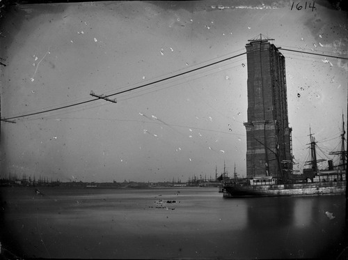
New York State is home to the most National Historic Landmarks of any state in the United States. Most of these structures, buildings, or spaces being located in the New York City area. One of the most famous National Historic Landmarks located in New York City is the Brooklyn Bridge. The Brooklyn Bridge connects the boroughs of Brooklyn and Manhattan over the East River, and is one of the oldest suspension bridges ever built in the United States. It began being constructed on January 3, 1870 and was completed and opened on May 24, 1883. This bridge had a few names throughout its history but was officially named the Brooklyn Bridge in 1915 by the city’s government and was later declared a National Historic Landmark in 1964. The bridge has been serving as a gateway from Brooklyn to Manhattan or vice versa for almost one hundred and thirty years. The Brooklyn Bridge has been and still is a huge integral structure to the success of New York City, allowing people driving or walking, either commercial or pedestrian, to travel from borough to borough. This structure can never be dismantled or altered due to its beauty and significance to the second largest city in the world.

Architectural criticism is constantly in effect as new buildings and structures are being built every day. There are many different architectural ways to view or criticize a structure, but the most common are formal, experiential, historical, and activist. Each view reflects on what that person criticizing the structure finds important. The formal architectural criticism approach focuses on the visual aspect of a structure or building; how the building is organized, its materials, and its connections. The next criticism view, experiential, puts importance on how a structure makes the viewer or reader feel; emotional connection between the reader and architect. The historical approach is interested in the architect’s career and how that architect fit his or her structure within a limited framework; its personality and presence in the world. The final architectural criticism view is the activist view; not focusing on who wins or loses with this structure being built, but the structure’s social and economic benefits to society.

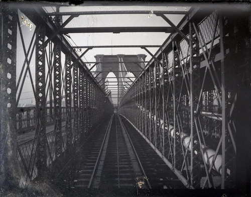
The Brooklyn Bridge is a neo-gothic suspension/cable-stay hybrid bridge that is five thousand nine hundred and eighty-nine feet in length and eighty-five wide. The distance between the bridge’s two towers is one thousand five hundred and ninety-five and half feet. At the bridge’s middle span, or the roadway’s highest elevated point; it is suspended one hundred and thirty-five feet above the East River. The towers of the Brooklyn Bridge are built of mostly granite, limestone and Rosendale cement. Rosendale cement is a natural type of cement that was produced from argillaceous limestone from in and around the Rosendale, New York area. The granite blocks of the bridge were shaped and quarried in Maine and then shipped to New York.

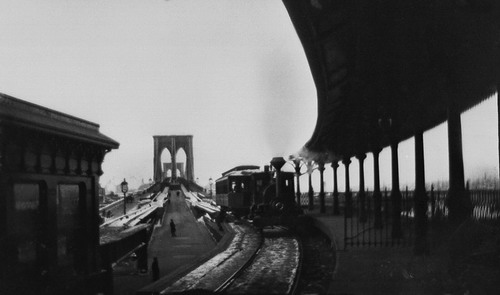
When the Brooklyn Bridge was initially built it allowed travel via elevated trains and streetcars; elevated trains up until 1944 and street cars up until 1950. The present day Brooklyn Bridge’s roadway has six motor vehicle lanes; three Manhattan bound and three Brooklyn bound. These vehicular lanes are located on the lower level. The bridge also has one pathway on the upper level designated for pedestrians and bicycles. As you walk along this pathway the cables of the bridge create a unique web-like pattern. The roadway has height and weight restriction of eleven feet and six thousand pounds. Due to these restrictions, buses and large commercial vehicles are prohibited from using the bridge.

The Brooklyn Bridge’s paint scheme is “Brooklyn Bridge Tan” and “Silver”, but another color scheme has been argued to be its original paint and that is “Rawlins Red.” “Rawlins Red” is a color generated by the presence of the iron oxide mineral hematite.

The Brooklyn Bridge connects my home borough (Brooklyn) to the most noteworthy borough (Manhattan). This bridge allows me to travel over the East River and admire the water and beautiful city on my journey. The bridge is lit up at night by floodlights showcasing its impressive features; allowing me to admire them from a great distance or while I am actually on the bridge. The Brooklyn Bridge has always been significant to me because some of my fondest memories of my childhood came from traveling the bridge. My parents and three siblings and I would walk the bridge in the summer; soaking up the sun and soothing breeze created by the river. We would stop at the bridge’s midpoint to take pictures of both Manhattan and Brooklyn; attempting to get panoramic photos with both boroughs in the picture. I’ll always remember the feeling in your feet while you walk the bridge, as hundreds of cars pass beneath your feet; shaking the ground you stand on. It used to make me nervous when I was younger but now it is just another thing I admire about the bridge and its fascinating technology to able support such a tremendous weight. After my family and I would arrive in Manhattan, we would either find a place to eat and/or visit the South Street Seaport. The South Street Seaport offers many tourist attractions.

The Brooklyn Bridge was originally designed by American civil engineer John Augustus Roebling, who died of a tetanus infection at the age of sixty-three in 1869; fourteen years before the completion of the bridge. Before his death, John Augustus Roebling placed his son in charge of the project. Washington Roebling was his son, who shortly after his father’s death developed caisson disease which made him physically unable to supervise the construction of the bridge. Washington Roebling’s wife, Emily Warren Roebling was put in charge under her husband’s guidance to help finish the construction of the bridge.

John Augustus Roebling was known for his wire rope suspension bridges. His most famous works are the Allegheny River Aqueduct, the Monongahela River Suspension Bridge, the Cincinnati-Covington Bridge, and of course the Brooklyn Bridge. Since he was accustomed to designing suspension bridges, him designing the Brooklyn Bridge was a huge factor in its success.

An activist’s view of the Brooklyn Bridge will analyze the bridge’s significance to society. Before the Brooklyn Bridge was built, the only way to travel from Brooklyn to Manhattan was via ferry. The Fulton ferry from Brooklyn would dock directly across the East River at the South Street Seaport. Since ferryboats were the predominant means of transportation into Manhattan for Brooklyn residence, accidents on the harbor were very common during the late 1800s into the early 1900s. These ferryboats would collide with other ferries, excursion steamboats, oyster boats, and passing freight ships. Not to mention the risks of taking a ferry during this time period, but these ferries were also overcrowded due to the lack of other means of transportation. The building of the Brooklyn Bridge alleviated these problems; offering a safer path into the city.

It cost over fifteen million dollars to build the Brooklyn Bridge, but despite this large quantity of money, the tolls charged when the bridge was initially built helped recover the money that was invested in building the bridge. If you were a pedestrian walking the bridge, it would cost you a penny to cross. If you were transporting a sheep or hog it would cost two cents. It would cost five cents to travel with a horse or cow, and it would cost ten cents to drive a wagon pulled by a horse.

If the Brooklyn Bridge was never built the city of New York would not have had the industrial boom it had during the late 1800s and early 1900s. The Brooklyn Bridge connected two metropolises; advancing New York City into the 20th century. I don’t know what our city would be like without it.


Works Cited

                        Troup, Catherine. Economic Effect

http://www.brooklynbridgeaworldwonder.com/economic-effect.html

Cultural Impact

http://www.brooklynbridgeaworldwonder.com/cultural-impact.html

Burdge, Brooke. The Influence of Transportation on the Decline of South Street Seaport

http://www.fordham.edu/academics/colleges__graduate_s/undergraduate_colleg/fordham_college_at_l/special_programs/honors_program/seaportproject/decl/transportation.html

Psn, Barat. Today in History: Roebling & the Brooklyn Bridge

http://primarysourcenexus.org/2012/06/roebling-brooklyn-bridge/


http://en.wikipedia.org/wiki/Brooklyn_Bridge#Construction

https://www.brooklynmuseum.org/opencollection/research/brooklyn_/photographs/

Posted in Uncategorized | Comments Off on Brooklyn Bridge: A Wonder of the Industrial World

St. Patrick’s Cathedral: A Gothic Revival building

Carlos Mo Wu

Professor Gold

ENG 1101

18 December 2012

Saint Patrick’s Cathedral: A Gothic Revival Building

Photographed by author.

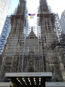
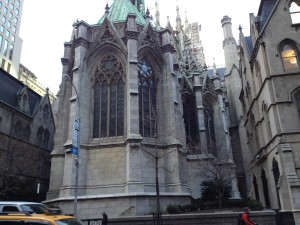
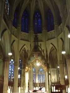
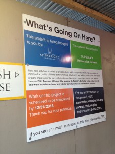
Saint Patrick’s Cathedral is a Neo- Gothic church designed by the architect, James Renwick Junior. This cathedral is located at 5th Avenue and 50th Street, Manhattan, New York City. The construction of this church lasted from 1858 to 1878. The reason of this project was to replace the old Saint Patrick’s. The cathedral is currently active and undergoing a major restoration (First and last photographs). Some classic architectural features can be found at Saint Patrick’s which are stained glasses, ribbed arches, cluster columns, etc. In 1976, it was declared National Historic Landmark (“St. Patrick’s Cathedral, Lady Chapel, Rectory, and Cardinal’s Residence”.).

In this text, I will describe, narrate and, importantly, criticize St. Patrick’s Cathedral in the following approach: (a) Formal, a visual description of the building; (b) Experiential, how this church makes me feel about it and my thoughts on it; (c) Historical, a contrast between buildings that were constructed in different period of time and the influence of the architect’s career in the buildings; and (d) Activist, is the building successful? This approach primarily targets how successful the building is in terms of purpose and, of course, use.


Formal approach:

Photographed by author.

Normally, passengers or visitors will read a building from the façade to the rear elevation. Unfortunately, I was not able to do so because of the recent restoration of the cathedral that pretty much obstructed my reading of it. However I was able to have a view of the façade after walking up to the 5thavenue. One strange feature of this ancient architecture piece is the elevator-looking front door. Despite of it, as my eyes move upward I managed to experience more Gothic style features such as the pointed arches, buttress piers, and more details of ribbed arches and also the spires which are hard to have a clear view, especially the pinnacles, because of the cathedral’s height. In the back elevation, I noticed a semi-circular dome that resembles a Roman dome (circular).

Photographed by author.

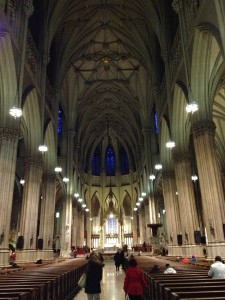
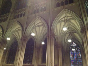
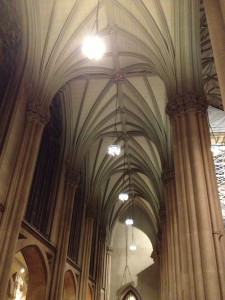
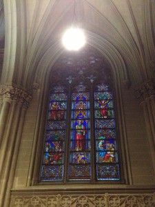
As I witness the interior design of the church, my first priority was to find Gothic style features. First, I stood in the middle of nave to have a clear picture of what I was looking for. On both sides of the nave, I could see sculptures of Saints. From the point I was reading left to right, I could see most of the fancy Gothic designs. The ribbed vault was absolutely beautiful. The vault design blends perfectly with the pointed arches because every detail of it is spiky. Since the ribbed arches are design in a way that each course goes a bit beyond the others, the columns are a perfect touch because they are composed of several small ones put together. This is the reason they are called Cluster Columns. There is one more feature and cannot be missed that is the stained glasses. As I walked through the cathedral, my eyes could not move off from those colorful and painted glasses. They were so sharply produced and maintained that always can get one’s attention.

Photographed by author.

According to History of St. Patrick’s cathedral by John Murphy Farley, he states “The interior of the Cathedral, like its exterior, is cruciform….” (p.161, 2). I really agree with him because the cruciform is a feature that I was also looking for when I was having a tour in the cathedral. I have to be honest that it was a feature that I noticed with extreme attention. I believe that a normal tourist would not even notice it because he/she will be mostly focused on attractive cluster columns, ribbed vaults and stained glasses. Also, Farley greatly emphasizes on the cluster columns as “ornamented with beautiful foliated capitals” (p.162, 1). It is undeniable that St. Patrick’s Cathedral is a masterpiece of Gothic architecture.

Experiential approach:

I always like the ancient architecture. It is not because of inspiration but the design and amount of work and years to construct a building. St. Patrick’s Cathedral makes me feel like witnessing a lost art. Nowadays, buildings or structures such as St. Patrick’s are becoming scarce. That’s the reason it gives me the notion of excitement and accomplishment when I stood in front of its façade.

Photographed by author.

Before I went to visit the cathedral, I already have seen a couple of photographs of it. The moment I saw the photos, I was amazed how beautifully it was built and the way it was design. From I have studied about history of architecture, the Gothic is one of the most complex looking styles in history. The symmetry of it with the amount of details and decorations, I can feel the hard work that workers put on it.

From the façade, I have a feeling that this ancient designed building can be described as modernism because of its static look. Not only that, but the height is also a contribution to this concept. It is also common sense that the height is related God that it tries to reach His glory. If you have not realized, the ribbed arches and any spiky details are pointing upwards to the sky to emphasize and make the believers feel closer to God.

The moment I entered the cathedral, I felt I was being transported to the past because I never witnessed such a design and decorations. The sizes of the columns and glasses almost made me think as a mini guy. The scale of this cathedral can really make people feel being dominated. But my most meaningful experience with this building is the high quality level of abstract art it presents and how it makes me interpret that architecture can be more than just shape and proportion.

Historical approach:

Photographed by author.

According to Smithsonian Institution Archives, James Renwick style was influenced by his engineering background. Having a good understanding of structural support is a key to build a massive scaled edifice. Renwick has won a couple of design competitions and worked on Gothic style buildings using by his knowledge of architectural history. St. Patrick’s Cathedral is the finest achievement of Renwick. Since he had so much experience on Gothic style, Renwick tweaked the cathedral’s design a bit by using a mixture of German, French and English Gothic architecture(http://siarchives.si.edu/history/exhibits/documents/renwickdrawing.htm, 4).

St. Patrick’s cathedral is a great inspiration for skyscraper designers at the time it was constructed. In the late 18th century, there were not so many buildings at the scale of St. Patrick’s. If you compare those modern skyscrapers around the cathedral, you can tell that they seem to have about the same height. Especially the commercial building next to the church is a perfect example of scale comparison (left skyscraper, looking at the façade).

Photographed by author.

If we compare modernism and ancient architecture, there is no doubt that the ancient styled buildings are more artistic and decorated. As time goes by, architecture has suffered a big evolution from complex decorations to simple-looking buildings. The difference that I have noticed between the two is, designers from the past focused more on decorating every single piece of the house from the very entry way to the roof. Meanwhile, modern architects express their design by the overall shape of the house.

Activist approach:

Photographed by author.

As the National Historic Landmark Program states, St. Patrick is “is the first large-scale Medieval-style church in America. Begun in 1858, its spires were completed in 1888”(1). This cathedral is a great importance for The United States and mostly for the believers. This church served its purpose providing homes for those lost souls and also became a place for tourists.

It will be insulting to remove such a church that was “paid for not only by the contributions of thousands of poor immigrants but also by the largesse of 103 prominent citizens who pledged $1,000 each”(http://www.saintpatrickscathedral.org/about_history.php, 1). This is a project where many people with different background contributed to create this landmark. I, sometimes, consider this cathedral as the people’s house.

According to Farley, St. Patrick’s appeared in newspaper with the following tittle “the noblest temple ever rose in any land to the memory of Saint Patrick, and as the glory of Catholic America”(P.131, 1). Not so many brand-new buildings are published and exalted in this way. Especially the tone of it is completely unseen and unheard. The tone of this tittle is victorious and patriotic.

In essence, St. Patrick’s cathedral is a wonderful place that represents the Gothic architecture. It revives the most precious and fundamental elements such as the ribbed arches and buttress piers. Without the invention of these features, people would not understand the significance of how to scale a building by using ideas extracted from them. This is because the ribbed arches can achieve significant height while the buttress piers hold the building up. What if these Gothic features never existed? Would the people be very concerned about it?

Annotated bibliography

“The History of St. Patrick’s Cathedral.” N.p., n.d. Web. 5 Dec. 2012. <http://http://www.saintpatrickscathedral.org/about_history.php>.


This research uses data from an organization that belongs to the church itself. It is also the official website of Saint Patrick’s Cathedral. This information describes the history of Saint Patrick’s and how contributions were a factor that it exists.


Farley, John Murphy. History of St. Patrick’s Cathedral. New York: Society for the Propagation of the Faith, n.d. Print.


This book uses data from the “Society for the propagation of the Faith” which is an international association for prayers, catholic priests, etc. This book describes in full details of the design and history of the church along with the architect’s biography.


St. Patrick’s Cathedral Set To Undergo $177 Million Restoration [New York] 7 July 2012: n. pag. Print.


This is a CBS News source which is truly reliable because of its popularity. The news describes a plan that will put Saint Patrick’s Cathedral in major restoration. Not only that, but several architectural features will be added as well.


Smithsonian Institution Archives, n.d. Web. 5 Dec. 2012. <http://http://siarchives.si.edu/history/exhibits/documents/renwickdrawing.htm>.


This is an educational source that fully describes in details of James Renwick’s life and career. It also has a sketch of a castle made by Renwick.


Pitts, Carolyn. “St. Patrick’s Cathedral, Lady Chapel, Rectory, and Cardinal’s Residence”. National Register of Historic Places Inventory-Nomination. August 1976. National Park Service.


This is a document proving that St. Patrick’s Cathedral is declared as a History Landmark.


St. Patrick’s Cathedral, Lady Chapel, Rectory and Cardinal’s Residence. N.p., n.d. Web. 7 Dec. 2012. <http://tps.cr.nps.gov/nhl/detail.cfm?ResourceId=1646&ResourceType=Building>.


This is a governmental website proving information about St. Patrick’s significance to America.


Posted in Uncategorized | Comments Off on St. Patrick’s Cathedral: A Gothic Revival building

Rockefeller Center: What Does a Skyscraper Mean to You?

Shawn Nevers


English 1101


Prof. Matthew Gold


12/13/2012

The Glorious Rockefeller Center

   The Rockefeller Center is one the world’s most illustrious structures. Built in 1930 and completed by 1939, the Rockefeller Center is not just one of New York’s cynosure sites it also is one of America’s omphalos structures. This noteworthy building was sponsored by the notorious John D. Rockefeller Jr.  and designed by Raymond Hood and a bundle of architects. The Rockefeller Center was another way to emphasize the eminence of the Rockefeller’s. Before the birth of the Rockefeller Center, the structure that lived there was Columbia University until the Stock Market Crash the area was completely leased by Rockefeller Jr.. The area initially was going to be turned into an opera house but because of the strength of the stock market crash it enticed Rockefeller Jr. to move forward and create a skyscraper. The funding for this structured was approximately $250,000,000 which was an extraordinary amount of money in the 1930’s. The Rockefeller Center is absolutely effervescent.


My own experiences at lead me to believe that this structure is a bit more idiosyncratic over other skyscraping structures. In my early childhood, I would visit the Rockefeller Center every June, October, November, and December. My favorite time was in December because the Rockefeller Center was absolutely celestial during the holidays and I was always able to entice my parents into taking my sister and me there. When I visited other structures such as the empire state building the only thought that I felt were aesthetic and historic. As I approached the Rockefeller Center I felt and endless amount of thoughts like pulchritudinous, miscellaneous, and harmonious. The Rockefeller center is a prime example of a truly unique skyscraper. In James Murray‘s work The Architect and the Skyscraper he states that a skyscraper “is anything that makes you stop, stand, crane your neck back, and look up (3). Skyscrapers have that characteristic but what about the senses that you feel or what happens to you as you approach this structure? Is it a structure that plays with your mind or is just an extremely tall structure that looks the meet a city’s zoning limit? Zoning gave each city a different stereotypical skyscraper making each city look unique (4). In 1916, New York changed the way its skyscrapers would look for good by passing its first zoning limit (9). The zoning law forced cities to build structures to a certain height. The Rockefeller Center doesn’t need to be a skyscraper to look aesthetic but zoning laws limit and take away what a structure can develop into. For example, a structure that exceeds the zoning limits is Burj Dubai in Dubai. It developed into a very complex structure because it exceeded the zoning limits.  Murray said “New York made people think of skyscrapers as prestigious but in fact shorter building can have just as much impact” (21). The Rockefeller Center isn’t the tallest structure in the world but it captures the essence of a skyscraper and even more because it attracts people from the different parts of the world and its public relations draw publicity.

Skyscrapers have become a accustomed to people throughout the world. Even though the Rockefeller Center was one of America’s oldest skyscrapers and being that America was the first country to start the era of skyscraping other countries have created structures that can match the effectiveness of skyscraper here in America. In the novel Skyscrapers of the Future by Carlo Aiello, Aiello allows journalist to talk about different skyscrapers in different countries. Two of the journalists were Brian Ahmes and Chad Porter; they were talking about one of the most statuesque in Southern Asia the “Grand Metropolis.” Much like the Rockefeller Center the Grand Metropolis serves as center Piece in Asia. It also is a site that attracts an endless amount of tourist and brings in plenty of money due to its complexity. This structure also brings in different thoughts and characteristics that make an “out of the box” project. Ahmes and Porter said “at first glance, this tower echoes a typical building in its constructional phase (22)”.  This is what makes the structure unique if it is able to affect your senses and you can appreciate the building in a way that makes it feel more than just some everyday structure. Further down Ahmes and Porter said “moving up the tower’s podium, exposed detailed sections reveal overlapping floors and roofs from above and below (22)”. Some structure don’t really affect like their supposed to but this one peculiar building brings a sense of imagery. When I look at the Grand Metropolis its looks like a Twizzler that’s standing on its own and that is structure that is worth preserving.

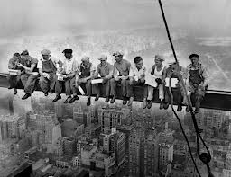
Here is an image of the construction workers building the Rockefeller Center.  By looking at this image one can say that the skyscrapers in the 19th century were unbelievably cautious to the workers’ health. This image says that the designers of this structure were very determined, focused, and talented. Today the majority of construction and planning goes the technology but these workers are especially gifted because the average construction worker today wouldn’t go such depths such as death to create a skyscraper. This is also another image of the Rockefeller Center from the 1930’s. There is a difference from the Rockefeller Center in the 1930’s and Rockefeller Center we all know today. The neighborhood has drastically changed and become more technological. However, the building itself stand unchanged and its looks preserved.

  The head leading architect for this edifice is Raymond Hood. Hood was already famous in the world of architecture: previously he along with his peers constructed the Chicago Tribune Tower and the American Radiator Building, Mcgraw-Hill Building, and the Daily News Building. Hood was a brilliant architect and solidified his name in American architecture because he and the other architects like Wallace Harrison not only created a structure that is beloved by America. Hood worked mostly in Art-Deco style and was a student at MIT an Ecole des Beaux-Arts in Paris. In the library journal news article in August 1982, there was a small section on Raymond Hood. The article said hood captured and had a big contribution on metropolitan culture back in the 1920’s. During that time Hood was a part of a competition in making the best tribune tower which he had won.


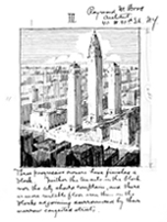
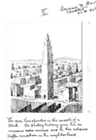
This is a picture of Hood’s sketches and this is his thought process of one of his structures till he reached phase 3 where he was satisfied with what he drew. Hood loved towers it was no surprise that he was the head leader of the Rockefeller Center project. He had different techniques that separated him from the pack of architect during his time. He had a theory on limiting the amount of volume based on the frontage of the streets. His theory turned out to be a huge success this allowed rentable space, more light and air for the tower’s occupants and plenty of street space for the public. Hood wasn’t just an architect he was a true visionary.

The Rockefeller Center is a pompous structure. It isn’t like other skyscrapers; it’s dovetailed, variegated, and animated. The Rockefeller Center is one of the reasons why people call New York City “the city that never sleeps.” My experiences with the Rockefeller Center up to my adolescence has made me understand why it was built in the neighborhood that it was built, why was it sponsored by Rockefeller Jr., why was Hood chosen as the leader to create this structure and why is it one of the focal points of the United States. It was another example to show the wealth, power, and influence of the Rockefeller clan. This design should became a national landmark sooner than in 1987 because this structure resembles the struggles and hardships of United States such as the Cold War, Great Depression, Stock Market Crash, Cuban Missile Crisis, and Civil Rights movement. The Rockefeller Center is space worth canning.

http://www.skyscraper.org/EXHIBITIONS/FUTURE_CITY/NEW_YORK_MODERN/walkthrough_hood.php

Journal Library, Raymond Hood, August 1982

Murray, John. The Architect and the Skyscraper, (Think James Photo, Jan 2012), 27

http://Polis-City.de/polis/media/downloads/pdf/03chicago.pdf

Aiello, Carlo. Skyscrapers of the Future, (I ngram DV LLC, Jan 2010), 200

http://www.google.com/imgres?q=construction+of+rockefeller+center&hl=en&client=safari&sa=X&tbo=d&rls=en&biw=1639&bih=699&tbm=isch&tbnid=ILsdYuxKLcv9WM:&imgrefurl=http://blogs.artinfo.com/artintheair/2012/09/21/iconic-photo-of-construction-workers-lunching-atop-a-skyscraper-was-faked/&docid=8eoxHGCUUb3w3M&imgurl=http://blogs.artinfo.com/artintheair/files/2012/09/skyscraperlunch.jpg&w=600&h=375&ei=MszKUN7FD4fo8QTfvoDgAg&zoom=1&iact=hc&vpx=1131&vpy=97&dur=1990&hovh=176&hovw=283&tx=153&ty=111&sig=112695081857931569947&page=1&tbnh=133&tbnw=219&start=0&ndsp=35&ved=1t:429,r:6,s:0,i:108

http://www.rockefellercenter.com/art-and-history/history/1930s/

http://www.rockefellergroup.com/history/history.html

http://en.wikipedia.org/wiki/Rockefeller_Center


.


Posted in Uncategorized | Comments Off on Rockefeller Center: What Does a Skyscraper Mean to You?

Class Notes – 12/11/12

Research methods
Look not just for books about your specific buildings, but also about:
— geographic area/neighborhood
— type of place (urban vs. rural development)
— time period of construction
— architects
— social history — community — and business

MLA Citation
http://owl.english.purdue.edu/owl/resource/747/01/

Parenthetical citation: in-text citations – http://owl.english.purdue.edu/owl/resource/747/02/
— end of the sentence in parentheses before punctuation mark

Sample works cited: http://owl.english.purdue.edu/owl/resource/747/12/

Son of Citation Machine: http://citationmachine.net/index2.php

Posted in Class Notes | Comments Off on Class Notes – 12/11/12

Final Project Assignment

Paper Length: 5-6 Pages (~1300-1500 words) + photos

Due Dates:
Dec. 4: One-paragraph topic summary posted on blog
Dec. 6: Annotated bibliography posted on blog
Dec. 11: First Draft due – bring to class
Dec. 18: Final Project Due

Related Class Notes: Class Notes – 12/11/12

See below for assignment details
Continue reading

Posted in assignments | Comments Off on Final Project Assignment

Topic Summary

New York State is home to the most National Historic Landmarks of any state in the United States. Most of these being located in the New York City area. One of the most famous National Historic Landmarks located in New York City is the Brooklyn Bridge. The Brooklyn Bridge connects the boroughs of Brooklyn and Manhattan  over the East River, and is one of the oldest suspension bridges ever built in the United States. It began being constructed on January 3, 1870 and was completed and opened on May 24, 1883. This bridge had a few names throughout its history but was officially named the Brooklyn Bridge in 1915 by the city’s government and was later declared a National Historic Landmark in 1964. The bridge has been serving as a gateway from Brooklyn to Manhattan or vice versa for almost one hundred and thirty years.

Posted in Uncategorized | Comments Off on Topic Summary

The Guggenheim – Rough Draft

Valerien Yepes

Professor Gold

ENG 1101

12/10/12

The Guggenheim

The Solomon R. Guggenheim Museum is a well-known non-objective (abstract) art museum located on the Upper East Side of Manhattan in New York City.  It is also referred to as “The Guggenheim”. The Guggenheim Museum was established by the Solomon R. Guggenheim Foundation and was designed by Frank Lloyd Wright. He designed it so it’s cylindrical, wider at the top than at the bottom. The Guggenheim opened and was instantly identified by the public as an architectural landmark but what lies deeper through this magnificent museum?

The Guggenheim has an enormous amount of history behind it. It adopted its name after the death of its founder, Solomon R. Guggenheim who passed away 1952. The museum went through many modifications which delayed the project from appearing earlier to the public. There were six separate sets of plans and 749 different drawings. The costs of building materials rose due to World War II. Solomon R. Guggenheim, the museums benefactor, later on died in 1949 delaying the project even more. Frank Lloyd Wright didn’t originally plan to build The Guggenheim in this cylindrical design. He called for a ten-story tower with workrooms, storages, and private studio apartments. Wright passed away April 9th 1959 and his masterpiece wasn’t opened to the public until October 21st later on that year.  In 1968, Wright’s son-in-law William Wesley Peters, designed a smaller framing of the building and making it eight-stories. The building was then closed in 1990 for MAJOR interior construction and restoration. Two years later The Guggenheim re-opened and was one of the most celebrated and critically acclaimed works. Adding more space including offices and a restaurant the building was a huge hit. Gwathmey Siegel & Associates greatly improved the museums capabilities without taking away Wright’s original design.

The design of The Guggenheim is absolutely stunning. From the outside, seeing the cylindrical design catches your eye instantly. Walking into the sky-light room with art spiraling around the outer edges from top to bottom of the room is nothing you’ve ever seen before. Going to each floor, looking the same from the outside and ground level isn’t what it seems. Each level has its own kind of art from back in the 1940’s to present day.

Frank Lloyd Wright had a tough time dealing with The Guggenheim financially. He was commissioned to design the museum in 1943. The Solomon R. Guggenheim Foundation’s curator Hilla Rebay later on told Wright “I want a temple of spirit, a monument!” Wright’s design wasn’t planned on making The Guggenheim a temple and spiritually made, but he was told to.

Wright had designed many buildings and had a lot of experience. He had created 1,141 designs, of which 532 were completed. Before his death, making The Guggenheim his last design in my opinion is an honor. Architecture buffs say that The Guggenheim is Wrights most visited building and only major commission in New York. The original Guggenheim is built in New York but there are also others in Germany, Spain, Vegas, Berlin and many other places.


WORKS CITED:

http://www.greatbuildings.com/architects/Frank_Lloyd_Wright.html


http://www.guggenheim.org/guggenheim-foundation/architecture/new-york


http://topics.nytimes.com/top/reference/timestopics/organizations/g/guggenheim_solomon_r_museum/index.html


Posted in Uncategorized | Comments Off on The Guggenheim – Rough Draft