My role in Faculty Commons is intern in their design team. My supervisor is Professor Biehl, she is also the director of Faculty Commons. Last semester, I received the application emails on this position from several professors. I asked professors about the information about this position and they also encouraged me to take this opportunity. I didn’t really have time to prepare because the application deadline was soon and it was at the end of the semester. I spent a day creating a resume, cover letter and gathered some of my works from different classes. In the mean time, I also did some research on questions that might be asked during interview. I prepared a Q&A list for myself and practiced with my sister, she had a lot of experience in how to prepare an interview.
Cover Letter
Resume
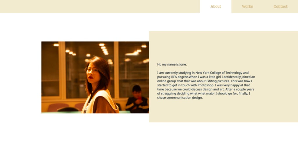
After about one week, I received an email notifying me to prepare for an interview and prepare a portfolio site. I was lucky that I just took Web Design 2 with Professor Wong by that time, so I had some knowledge on creating a website and I have a domain. I created a simple portfolio site which have an about me page, contact page and project page that shows my work.
Portfolio Site
The interview was held in Zoom. I was interviewed by Lu first, a college designer and then I was interviewed by Professor Biehl. They asked me some questions during the interview such as my strengths and weaknesses, the reason I chose to be a designer, what make me a good designer, and they also asked me to describe a time when I have a conflict at work etc. After a series of question, they asked me to go through my portfolio site and my personal feelings about my work.
I was very nervous during the interview, but Lu and Professor Biehl were nice. They encourage me to challenge myself and also gave me some useful feedback on my previous project in class. It was a good experience.
The Faculty Commons Department dedicated their effort to City Tech’s faculty members and students since 2005. It’s a non profit organization center for teaching, learning, scholarship and service coordinates all professional development, grants and assessment activities of faculty at New York City College of Technology(CUNY). The members in Faculty Commons Design Team are mainly students major in Communication Design in City Tech and the director are Professor Mary Ann Biehl and Professor Shelley E Smith. There are currently 8 designers, 1 webmaster and 4 design interns. Faculty Commons design team works with City Tech Library, Human Research Protection Program, School of Arts and Sciences, and a lot of different clients in the school. As the design team of the department we create material such as poster, web banner and t-shirt to promote workshops and events which help faculty and students to have better experience. They also published “Nucleus,” a quarterly news letter which demonstrates the creative and academic faculty activity at City Tech undertaken through the Faculty Commons.
Faculty Commons is located at City Tech in Namm Building room 227. Because of the pandemic, all of us are working from home. We communicate with each other through Zoom meetings, e-mail, and sometimes mobile phone chatting applications. Every week, we will have a weekly meeting to share our updated works and receive feedback.
Last semester, I started to worry about when I should get my internship. I noticed there are positions in our school which were the design intern positions in Faculty Commons. I applied for it and also went through the interview. I was surprised that I was selected. I also went through a week of the training program in summer with other interns and our trainers.
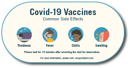
During the training program, we were assigned to work on City Tech Writer Posters, personal poster that reflects ourselves and a group project that make a campaign for encouraging students to get vaccinated. It was intense, because we need to finished these project in just one week. Our trainers were very patience and willing to give us useful feedback. I was lucky that my group members were friendly, we talk to each other everyday. Some of my group members also help me with illustrations because I was not good at illustration.
After we had an introduction lecture for digital video, we gained a little knowledge of editing video. It is important to know how to edit a video in this industry as digital media became a larger character now.
While I was doing this assignment, I found that the audio is very important to the video. If background music is required, the editor has the responsibility to find background music that matches the idea of the video’s content. The volume of my voice and the background music must be adjusted to a matchable level so that the audience could hear both of them clearly.
The length of the video that the client requires is also an important element because it determines how much informations I could show to the audience. In this case, I also need to consider the duration of each piece that I show in the video because if the duration is too short, the audience will not be able to remember. In my opinion, before we edit a video, we should list the requirements and some of our ideas on a note because during we are editing we will forget some details. In this way, we can make sure the details and the requirements are on the video before we save and upload the video.
Both of the interviews gave us a lot of informations about the movie and JJ Abrams. However, they give us different informations and feeling because they have different angles and styles.
The first video was more about the interaction between JJ Abrams and the movie, while the journalist of the second video actually asked more about the interaction between the movie, JJ Abrams and the fans.
Another difference I found was in the first video the journalist was in the camera while the second video was not. I think the way that the second video used made the angle more consistent and helped the audience stayed focus on JJ Abrams. The way that the first video which involved both of JJ Abrams and the journalist was another style which gave me a sense of communication between people.
Both of the advertisements used CMYK color theory. Besides, they used a black background to make a contrast with the vibrant colors. Both of them also used color to illustrate the silhouette of the objects and made them overlaps. The advertisement from Apple also used the analogous color which made the video more vibrant. Both of them used repetition while Dr. No used simple repetition and movements and the Apple advertisement showed the object transferred to another object by changing the shape.
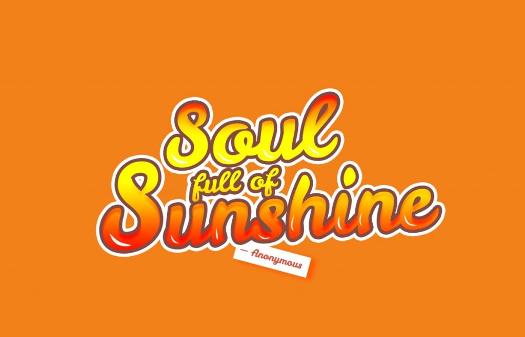
We needed to pick a quote and come up with three designs of the visual quote. When I was looking for quotes, I thought I should use an optimistic quote. I did some research on famous quotes, I decided to use “Soul full of sunshine,” because it gave me an image of how people treat life in a positive attitude.
For my first concept first draft, I used a red and orange color based background because it looked like the colorful clouds during sunset. Besides, I used white color for most of the words to create contrast with the background so the viewer could read the words clearly.
Draft 2
I changed the background and the typeface on the second draft. In this draft, I used different brushes and made them multiply to each other to imitate a watercolor effect. I used mainly orange color on both the background and type to emphasize the idea of sunshine. In addition, the quote was partly multiplied to the background because I wanted to imitate the reflection of the sunshine.
In my draft 3, I broke the circle and change the outlook of my design. However, I decided to keep the orange background and the script typeface. In addition, I decided to add a complementary color to orange, which was blue. This created a huge contrast. I used script typeface on “full of sunshine” because I also wanted to make a contrast with the “Soul” that was in a bold and san serif typeface. I struggled for a long time when I was choosing a color for the “Full of sunshine” phrase because of the complex background. Eventually, I chose the white color and I added the drop shadow effect in orange tone.
Concept 2
Draft 1
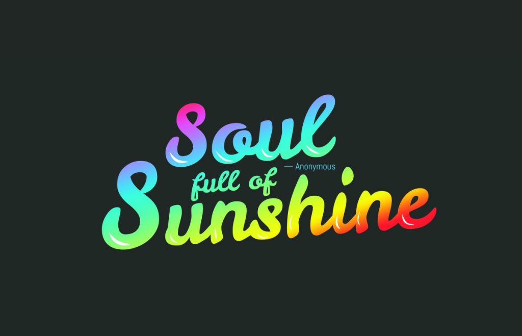
In the draft 1 for concept 2, I created the typography by copying the same layer and apply different effects on the layers. In addition, I also added some reflection spots on each of the letters to increase the sunshine concept. The color red, orange, and yellow came up to my mind when I thought of the sun, so I decided to apply these three colors on the gradient effect and put it on the typography.
This is another version of draft 1, I changed the color of the background and kept the typography the same as draft 1. I used the blue as a background color because blue was the color of the sky, it also created a contrast with the orange typography.
This is a second version of draft 1. I wanted try different kind of background because both of the typography and the background on the first version rely on orange tone. I used a white background and put some yellow spots on the background.
In draft 2, I decided to play around with the color of the typography. I applied rainbow color to the typography and adjusted the angle so that the yellow color laid on the word sunshine. I did this because I wanted to imitate the sunshine reflection. The color of the rainbow always gave me a joyful feeling and I think it matched the concept with the quote. I also changed the way of how I put the “Anonymous” because the rainbow typography was so eye-catching and I did not want to add another attractive element to this piece.
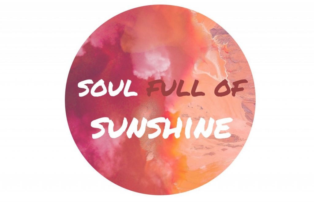
I did not make more drafts on my concept 3 except for I added the credit to Anonymous. I like the simplicity of this piece. I chose a calm and quiet image that actually showed sunshine to express the attitude of this quote. I put the word “sunshine” right at the sunshine spot to emphasize it. Besides, I used the same typeface as well on the phrase “Soul full of” because I wanted to keep them consistent in order to keep this piece simple.
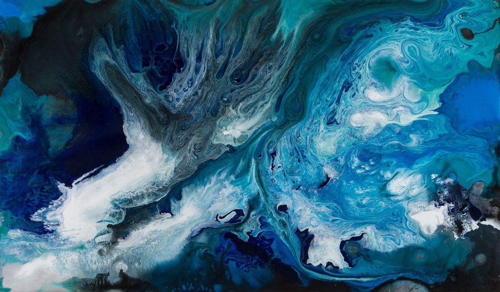
Today we visited the virtual “Blue” exhibition at Nassau County Museum of Art. I like this piece that was showed the exhibition very much because I personally like blue and violet color. This piece reminded me of the beauty of the ocean and how mysterious is the ocean. The mixture of different kinds of blue and white gave viewers a sense of layering and depths. The combination of the different blue colors and white color also gave me an image of the sea wave in motion that brought me both fear and calm. In conclusion, it was a mixture of tranquil and turbulent.
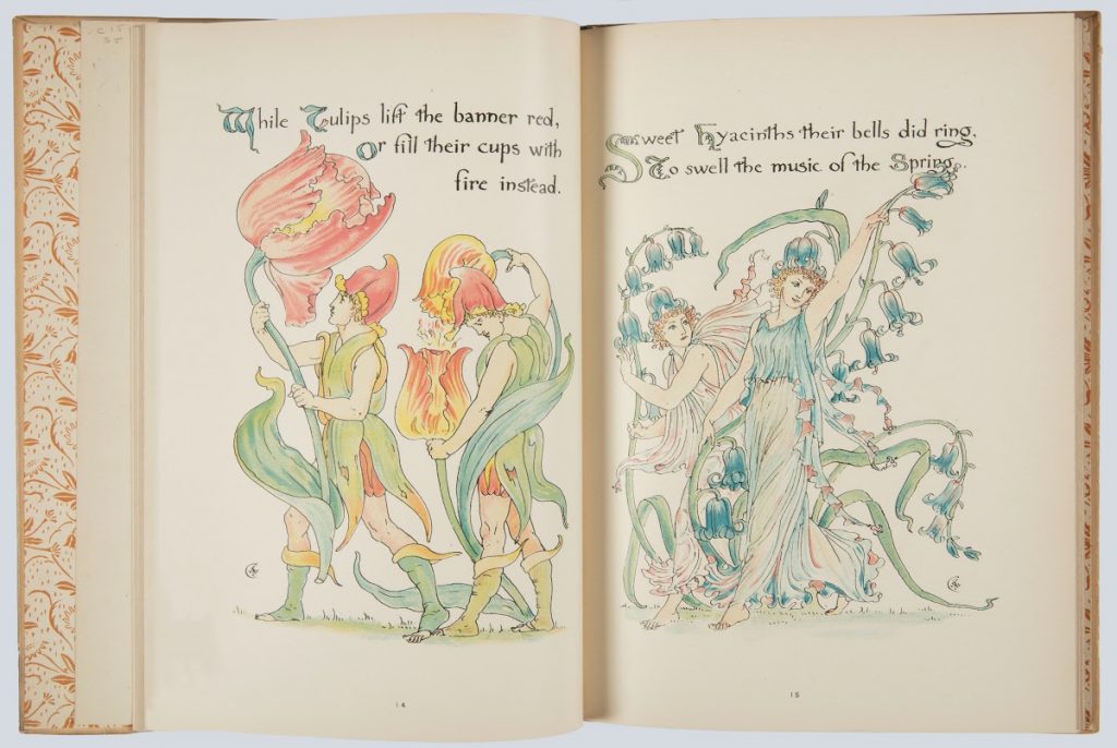
Flora’s Feast: A Masque of Flowers, Walter Crane
This book Flora’s Feast was illustrated and written by Walter Crane. I found this piece in a virtual exhibition in Cooper Hewitt. The flowers that Crane illustrated were beautiful and Crane also showed the details of the flowers. Crane used flowing lines and saturated colors to depict the flowers. The interactions between the humans and flowers that Crane illustrated are also interesting which makes me think of they must be having a celebration event. Crane also put the features of the plant on humans and the typography. In this way, the integration between the type and illustrations became more interesting.
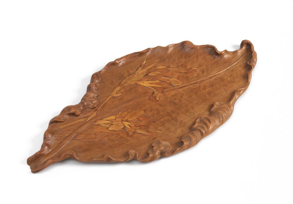
Leaf-shaped Wooden Tray, Émile Gallé
This piece is also in Cooper Hewitt from Émile Gallé was made of wood. The streamlines on the edge looked real. Besides, Émile Gallé also carved some plants for decoration on the surface of the leave. The details of the leaf were carefully carved by the artist including the extruded line that lay in the middle of the leaf and the streamlines that at the edge of the leaf. The light and shadow that all of the details created make this piece became more realistic. In addition, because of the material, there is some natural pattern that makes this piece more attractive and organic.
Ikko Tanaka was one of the greatest artists in Japan. A lot of his pieces were still stunning in this era. Tanaka was an artist that combines modernist principles and Japanese traditional style. All of his works showed minimalism and a sense of geometric style. Posters that Ikko Tanaka designed were very impressed, that there were a lot of new designers looked for inspiration from his works. He was also one of the directors of Muji retail company which was a famous Japanese style store. Even though he passed away in 2002, his works and designs made him unforgettable.
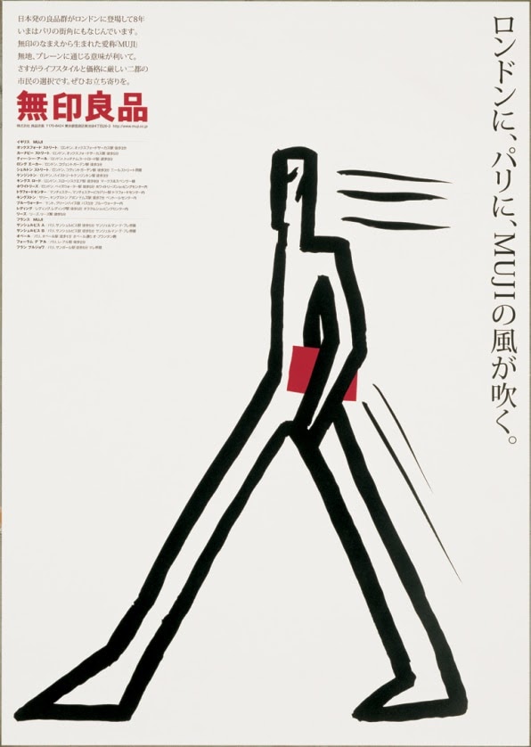
As one of the directors of Muji, Ikko Tanaka helped Muji turned into a successful retail store. In his career life, he followed a “less is more” rule. Muji was that kind of store that the products and decoration were simple but everything in the store was so unforgettable. Figure 1 was one of his Poster designed for Muji. The title of this piece was “The Muji Wind Blows in London and Paris.” In this artwork, there was no unnecessary element. The man which simply was used a black brush to illustrate was the main element in this poster. He carried a red book that correlated the Muji Asian word trademark. There were also simple lines behind the man shown the movement and wind by the man. In just a simple graphic, Ikko Tanaka used his simple and strong style to present the idea and the title of the poster.
Figure 1 The Muji Wind Blows in London and Paris, 2000, Ikko Tanaka
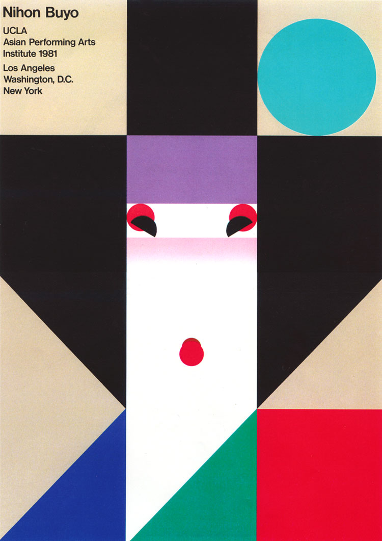
As a Japanese symbolic artist, Ikko Tanaka participated in a lot of international events such as UCLA Asian Performing Art. Figure 2 was one of the artworks that were in the Asian Performing Art Festival held at UCLA. This was one of the most successful Tanaka’s posters. There was no complicated drawing or color at all in this poster. All Tanaka had in this poster were basic geometric shapes and colors. We could also see that he used the grid system to create this poster. Although the format of this poster was very simple, Tanaka created a vivid geisha by how he placed the shapes and colors. In the poster, we could see the pale face with the pink blush of the geisha, and the symbolic red lips and eyeshadow.
Figure 2 Nihon Buyo, 1981, Ikko Tanaka
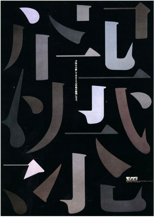
On the other side, he had also done a very impressive job on typography. The title of figure 3 was “Typography Poster.” This poster was not only his most famous typography design and also his first poster composed of only typography. In this typography design, none of them were really a word or a complete character. Each of them was a part of a character. In this design, we could see that Tanaka had a strong sense of composing elements. He showed the beauty of Asian words by this composition. He also used bright colors and dark colors to make more contrast to the poster which made the poster more impressive.
Figure 3 Typography Poster, 1993, Ikko Tanaka
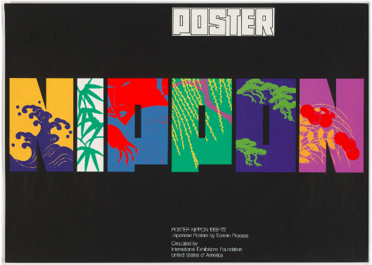
Another typography poster (figure 4) that Tanaka designed was “Poster Nippon 1955-72.” Nippon meant Japan, which meant that this poster could represent Japan. As we could see that Tanaka used all capitalized letters to keep the size of the letters similar. In this case, it made the poster looked cleaner. Tanaka also put several symbolic elements inside the letters, such as the wave, the bamboo, the geisha and the pine tree. All of these were great elements in the Japanese art field. A lot of traditional artists in Japan inspired by these objects.
Figure 4 Poster Nippon 1955-72, 1972, Ikko Tanaka
In conclusion, every piece that Tanaka designed had a strong idea and he did a good job on how to let the viewer understand what he wanted to present. Besides, as one of the most important directors of Muji, he understood what the customer wanted. For so many years, his artworks and Muji’s style were very similar, it was modern but classic, simple but memorable.
Starbucks is one of the largest coffeehouse chain in the world. The total net revenues of the fiscal year 2019 were $ 26,508.6 million. Starbucks was founded in Seattle in 1971. Starbucks’ management makes sure that they use high-quality coffee beans and equipment. Besides, there are a lot of different products from Starbucks other than coffee beverages such as different flavors of tea, burgers, bread, and so on. Starbucks insisted on making good coffee and excellent service for its customers made the company successful. The rise of Starbucks was not only credited to the taste of its coffee but also its iconic logo.
Source: The Designer Inspiration The first logo of Starbucks
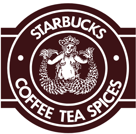
When Starbucks just open, it sold high-quality coffee beans, tea, and spices. Starbucks’s first logo was designed by Terry Heckler in 1971. Back in that time, Heckler’s workshop was called Heckler Bowker. Bowker was Heckler’s co-worker. At the same time, Bowker was the co-founding of Starbucks. The mission for Heckler was to design a logo for Starbucks. The idea of the logo was unpredictable, “It’s a metaphor for the allure of caffeine, the sirens who drew sailors into the rocks,” said Heckler. Heckler read a lot of marine books in order to get inspiration for the logo. Eventually, he found a woodcut that had a two-tail mermaid. As can see in the image above, the main element of this logo is a mysterious naked siren with two tails and she was smiling. This was a very symmetric logo with the brand’s name and its products listed around the siren. Heckler chose to use a San Serif typeface and all the letters were uppercase. The kerning between letters was very tight that they were almost touching each other.
Source: The Scott Smith Blog The original siren that inspired Heckler
In the 1980s, Howard Schultz was a director in the Starbucks company. He started his own coffee shop in 1985 which sold beverages instead of coffee beans. He believed that selling beverages would be a huge business. The picture on the right was Schultz’s coffee shop’s logo which made a huge impact on Starbucks’ logo evolution. In Schultz’s coffee shop, he provided not only good quality expresso to the customer, and also a relaxing place for the customer. The result of what Schultz did supprised everyone. his coffee shop Il Giornale made a good performance, he had three expresso bar by 1987. Schultz purchased Starbucks in 1987 and became its chairman.
Source: The Designer Inspiration The logo of Il Giornale
In 1987, Schultz decided to change Starbucks’ logo. The second logo was provided on the right. This time, the logo added green color to the outer circle and the center became black. The green color was a great choice that provided a sense of freshness. The symbolic two-tail mermaid remained but it became a combination of line and simple shapes which made the logo look cleaner. In this version, they also decided to use the siren’s hair to cover her breasts. In addition, instead of the small dots between the words, they used stars in this version. The star reflected the merger of Starbucks and Il Giornale.
Source: fineprintart.com The second logo of Starbucks
Starbucks tweaked the logo in 1992. There was not a huge difference on the third logo. We could see the picture on the left, the designer gave up the bottom of the siren graphic. The mermaid’s navel was no longer visible and no one can see her full pose any longer in this logo. This made the logo more streamlined and more acceptable to a broader audience. The company felt that some people might feel uncomfortable with the image of a naked woman; especially on their coffee cup.
Source: The Designer Inspiration The third logo of Starbucks
In these years, Starbucks was already a worldwide company. Starbucks never abandon its original mermaid siren. The company thought that keeping the mermaid siren was a way to tell the customer that they keep their spirit and love. However, in 2011, a cleaner logo was created. In this version, they enlarged the siren graphic and removed the wordmark. Since the mermaid siren is always the iconic symbol of Starbucks, they removed the wordmark to achieved modern simplicity which is more suitable for the future. The green color became the negative space of the graphic and the positive space remained white. We could see that the star on the crown was kept which credits the earlier Il Giornale logo. This new logo gave people a sense of freshness and conciseness.
Source: The Designer Inspiration The fourth logo of Starbucks
Today, there are 3,1256 Starbucks stores in the globe including licensed stores and company-operated stores. The siren icon became a symbol of coffee and even a lifestyle. While they kept their excellent quality coffee they never stop creating new products to attract different customers. For example, Matcha Frappuccino and Dragonfruit Refresher, etc.
Source: Starbucks.com Nitro Cold Brew
Source: Starbucks.com Matcha Green tea Frappuccino
Source: Starbuck.com Dragon Drink
Source: eatthis.com Starbucks storefrontSource: eater.com Starbucks logo on a coffee cup
For the visual quote project, we need to pick a quote and design three versions of the visual quote. When I think of this project, I think I should use a quote that is positive. I picked “Soul full of sunshine” for my project.
For this concept, I used a colorful background and a circle to try to let the viewer think of the sun. I made the word “sunshine” bigger to emphasize the point of the quote.
I used mainly orange for this concept because when I think of the sun, the orange color came to my mind. In this version, I did not use too many elements and skills, I used a hand script type fave to make it more humanization. I also used the pen tool to draw some reflective elements to make typography pop up.
Photo By Negative Space
In this version, I used a background that is peaceful and calm. I put the word “sunshine” right at the sunshine spot. The rest of the words I made them transparent because they are less important. The transparent words are darker and are placed into a dark place while “sunshine” looks bright and placed right at the sunshine spot made a huge contrast.