
Project Description:
We needed to pick a quote and come up with three designs of the visual quote. When I was looking for quotes, I thought I should use an optimistic quote. I did some research on famous quotes, I decided to use “Soul full of sunshine,” because it gave me an image of how people treat life in a positive attitude.
Concept 1
Draft 1

For my first concept first draft, I used a red and orange color based background because it looked like the colorful clouds during sunset. Besides, I used white color for most of the words to create contrast with the background so the viewer could read the words clearly.
Draft 2
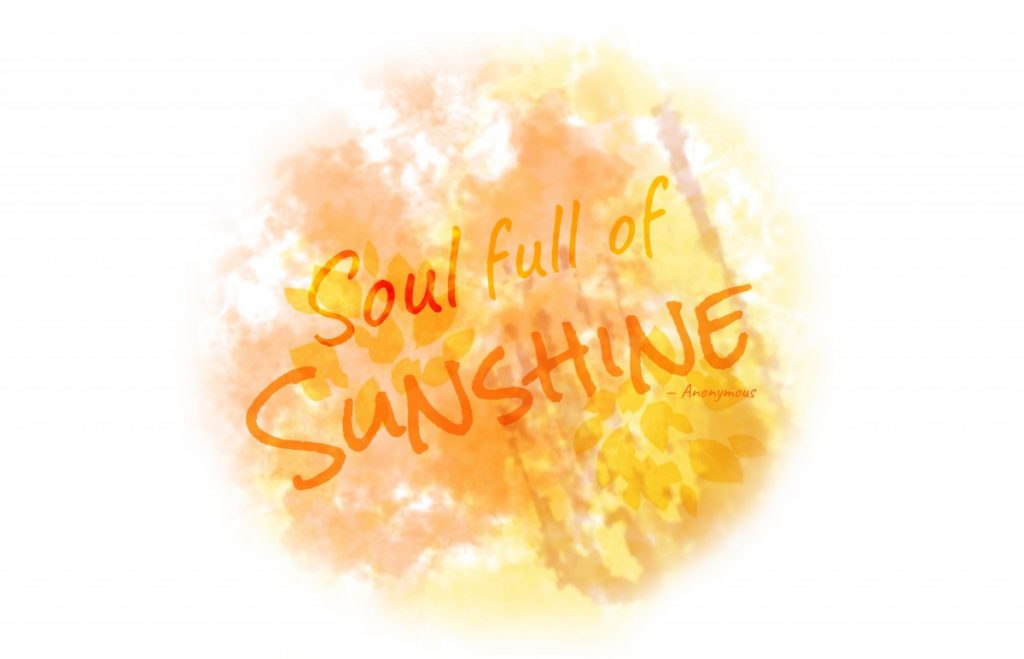
I changed the background and the typeface on the second draft. In this draft, I used different brushes and made them multiply to each other to imitate a watercolor effect. I used mainly orange color on both the background and type to emphasize the idea of sunshine. In addition, the quote was partly multiplied to the background because I wanted to imitate the reflection of the sunshine.
Draft 3
https://openlab.citytech.cuny.edu/zijunhuang-eportfolio/files/2020/04/Version1Draft3.pdf
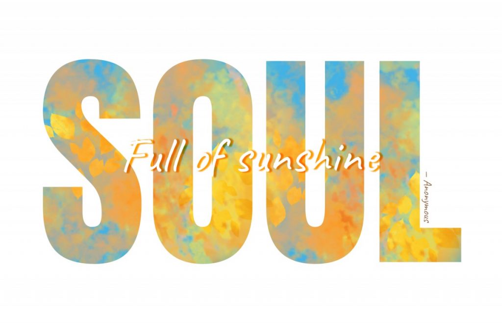
In my draft 3, I broke the circle and change the outlook of my design. However, I decided to keep the orange background and the script typeface. In addition, I decided to add a complementary color to orange, which was blue. This created a huge contrast. I used script typeface on “full of sunshine” because I also wanted to make a contrast with the “Soul” that was in a bold and san serif typeface. I struggled for a long time when I was choosing a color for the “Full of sunshine” phrase because of the complex background. Eventually, I chose the white color and I added the drop shadow effect in orange tone.
Concept 2
Draft 1
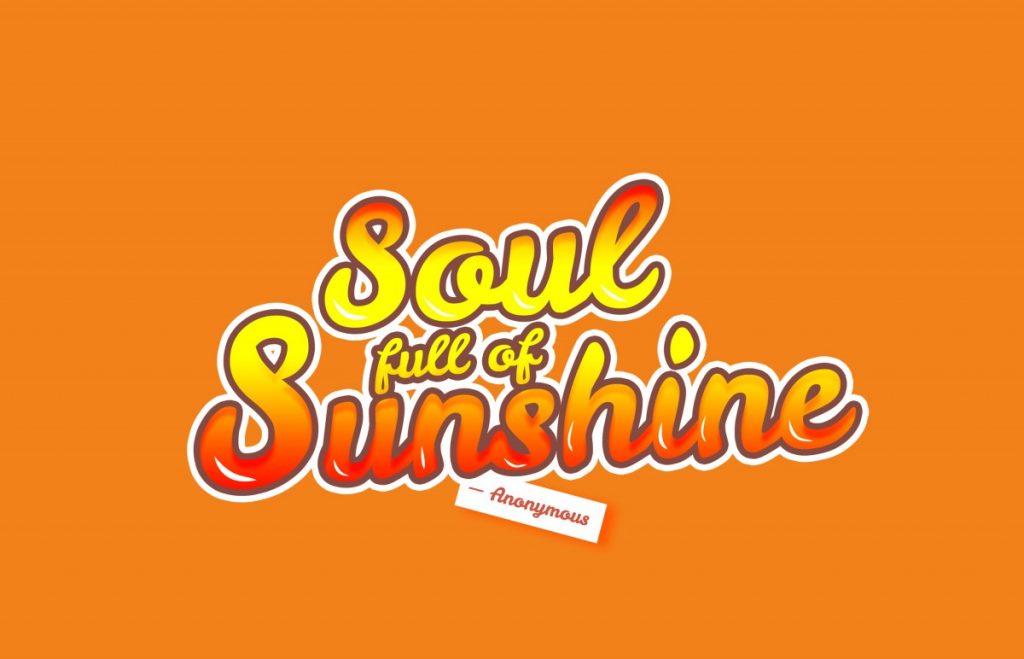
In the draft 1 for concept 2, I created the typography by copying the same layer and apply different effects on the layers. In addition, I also added some reflection spots on each of the letters to increase the sunshine concept. The color red, orange, and yellow came up to my mind when I thought of the sun, so I decided to apply these three colors on the gradient effect and put it on the typography.
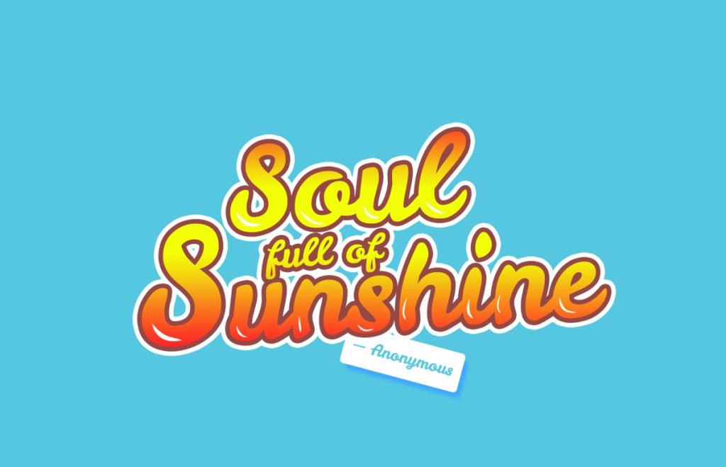
This is another version of draft 1, I changed the color of the background and kept the typography the same as draft 1. I used the blue as a background color because blue was the color of the sky, it also created a contrast with the orange typography.
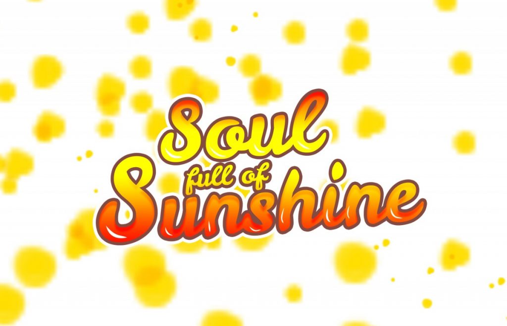
This is a second version of draft 1. I wanted try different kind of background because both of the typography and the background on the first version rely on orange tone. I used a white background and put some yellow spots on the background.
Draft 2
https://openlab.citytech.cuny.edu/zijunhuang-eportfolio/files/2020/04/Version2Draf2_1.pdf
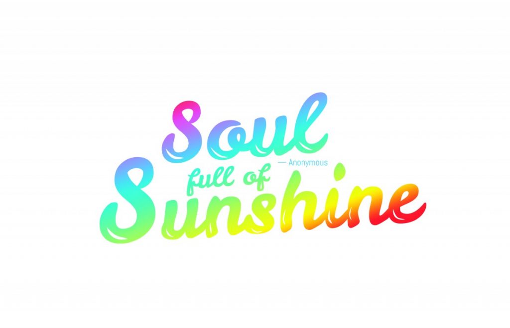
In draft 2, I decided to play around with the color of the typography. I applied rainbow color to the typography and adjusted the angle so that the yellow color laid on the word sunshine. I did this because I wanted to imitate the sunshine reflection. The color of the rainbow always gave me a joyful feeling and I think it matched the concept with the quote. I also changed the way of how I put the “Anonymous” because the rainbow typography was so eye-catching and I did not want to add another attractive element to this piece.
https://openlab.citytech.cuny.edu/zijunhuang-eportfolio/files/2020/04/Version2Draft2_2.pdf
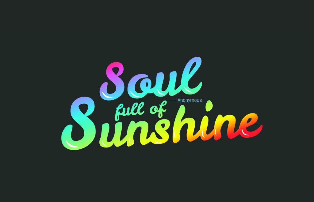
This was another version of draft 2, I changed the background to black color. The typography looked more vibrant in the black color background.
Concept 3
https://openlab.citytech.cuny.edu/zijunhuang-eportfolio/files/2020/04/Version3-1.pdf
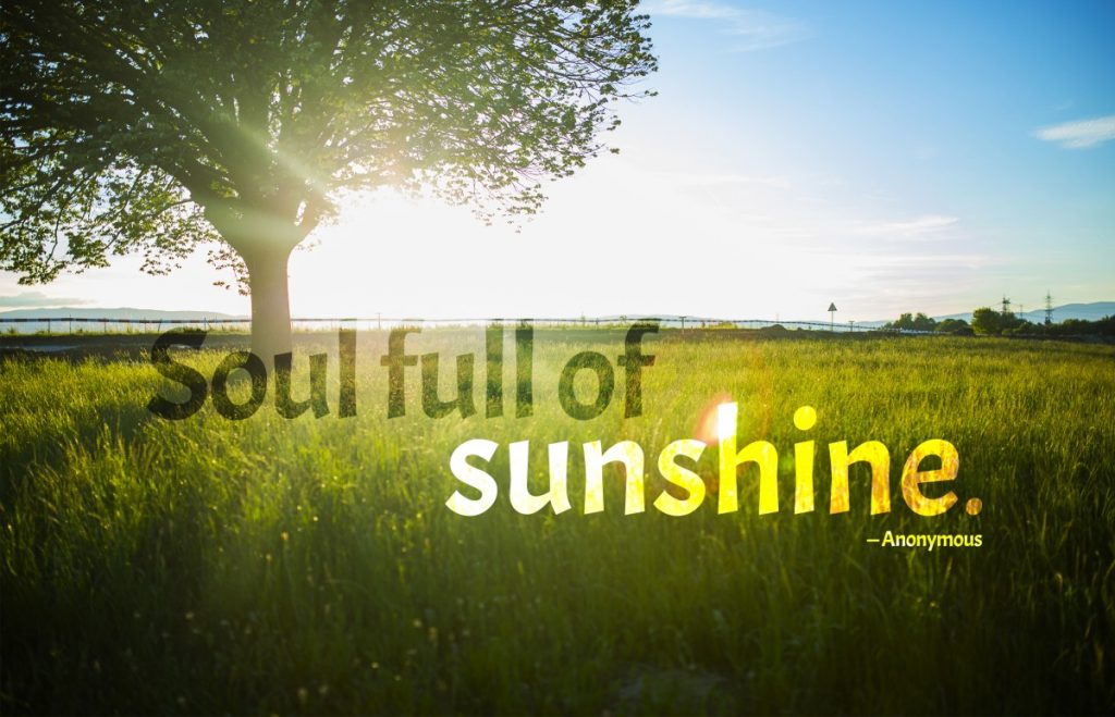
I did not make more drafts on my concept 3 except for I added the credit to Anonymous. I like the simplicity of this piece. I chose a calm and quiet image that actually showed sunshine to express the attitude of this quote. I put the word “sunshine” right at the sunshine spot to emphasize it. Besides, I used the same typeface as well on the phrase “Soul full of” because I wanted to keep them consistent in order to keep this piece simple.

