Starbucks is one of the largest coffeehouse chain in the world. The total net revenues of the fiscal year 2019 were $ 26,508.6 million. Starbucks was founded in Seattle in 1971. Starbucks’ management makes sure that they use high-quality coffee beans and equipment. Besides, there are a lot of different products from Starbucks other than coffee beverages such as different flavors of tea, burgers, bread, and so on. Starbucks insisted on making good coffee and excellent service for its customers made the company successful. The rise of Starbucks was not only credited to the taste of its coffee but also its iconic logo.
The first logo of Starbucks
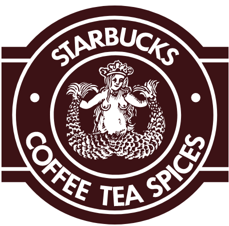
When Starbucks just open, it sold high-quality coffee beans, tea, and spices. Starbucks’s first logo was designed by Terry Heckler in 1971. Back in that time, Heckler’s workshop was called Heckler Bowker. Bowker was Heckler’s co-worker. At the same time, Bowker was the co-founding of Starbucks. The mission for Heckler was to design a logo for Starbucks. The idea of the logo was unpredictable, “It’s a metaphor for the allure of caffeine, the sirens who drew sailors into the rocks,” said Heckler. Heckler read a lot of marine books in order to get inspiration for the logo. Eventually, he found a woodcut that had a two-tail mermaid. As can see in the image above, the main element of this logo is a mysterious naked siren with two tails and she was smiling. This was a very symmetric logo with the brand’s name and its products listed around the siren. Heckler chose to use a San Serif typeface and all the letters were uppercase. The kerning between letters was very tight that they were almost touching each other.

The original siren that inspired Heckler
In the 1980s, Howard Schultz was a director in the Starbucks company. He started his own coffee shop in 1985 which sold beverages instead of coffee beans. He believed that selling beverages would be a huge business. The picture on the right was Schultz’s coffee shop’s logo which made a huge impact on Starbucks’ logo evolution. In Schultz’s coffee shop, he provided not only good quality expresso to the customer, and also a relaxing place for the customer. The result of what Schultz did supprised everyone. his coffee shop Il Giornale made a good performance, he had three expresso bar by 1987. Schultz purchased Starbucks in 1987 and became its chairman.

The logo of Il Giornale
In 1987, Schultz decided to change Starbucks’ logo. The second logo was provided on the right. This time, the logo added green color to the outer circle and the center became black. The green color was a great choice that provided a sense of freshness. The symbolic two-tail mermaid remained but it became a combination of line and simple shapes which made the logo look cleaner. In this version, they also decided to use the siren’s hair to cover her breasts. In addition, instead of the small dots between the words, they used stars in this version. The star reflected the merger of Starbucks and Il Giornale.

The second logo of Starbucks
Starbucks tweaked the logo in 1992. There was not a huge difference on the third logo. We could see the picture on the left, the designer gave up the bottom of the siren graphic. The mermaid’s navel was no longer visible and no one can see her full pose any longer in this logo. This made the logo more streamlined and more acceptable to a broader audience. The company felt that some people might feel uncomfortable with the image of a naked woman; especially on their coffee cup.

The third logo of Starbucks
In these years, Starbucks was already a worldwide company. Starbucks never abandon its original mermaid siren. The company thought that keeping the mermaid siren was a way to tell the customer that they keep their spirit and love. However, in 2011, a cleaner logo was created. In this version, they enlarged the siren graphic and removed the wordmark. Since the mermaid siren is always the iconic symbol of Starbucks, they removed the wordmark to achieved modern simplicity which is more suitable for the future. The green color became the negative space of the graphic and the positive space remained white. We could see that the star on the crown was kept which credits the earlier Il Giornale logo. This new logo gave people a sense of freshness and conciseness.

The fourth logo of Starbucks
Today, there are 3,1256 Starbucks stores in the globe including licensed stores and company-operated stores. The siren icon became a symbol of coffee and even a lifestyle. While they kept their excellent quality coffee they never stop creating new products to attract different customers. For example, Matcha Frappuccino and Dragonfruit Refresher, etc.

Nitro Cold Brew

Matcha Green tea Frappuccino
Dragon Drink

Starbucks storefront

Starbucks logo on a coffee cup
https://openlab.citytech.cuny.edu/zijunhuang-eportfolio/files/2020/03/LogoHistory2.pdf
See works cited next page.

