original idea (the first monkey): https://www.univie.ac.at/ksa/apsis/aufi/folk/folk-v02.htm
if the first one isn’t acceptable (little red riding hood): https://www.dltk-teach.com/rhymes/littlered/story.htm
original idea (the first monkey): https://www.univie.ac.at/ksa/apsis/aufi/folk/folk-v02.htm
if the first one isn’t acceptable (little red riding hood): https://www.dltk-teach.com/rhymes/littlered/story.htm
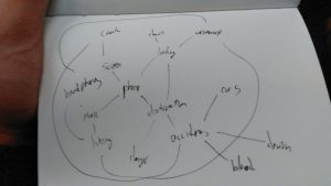
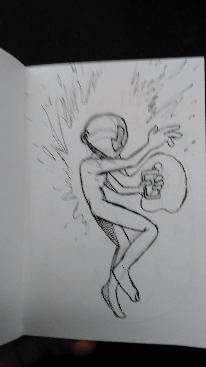
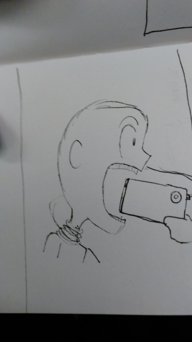
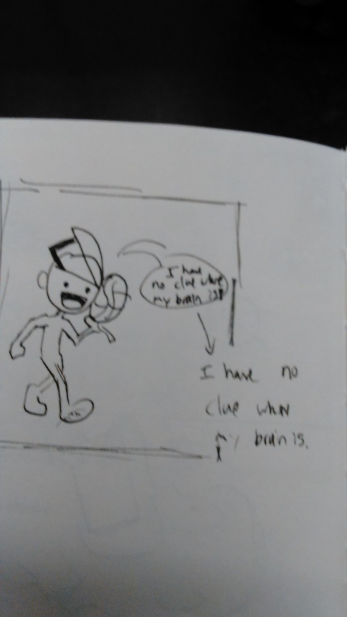
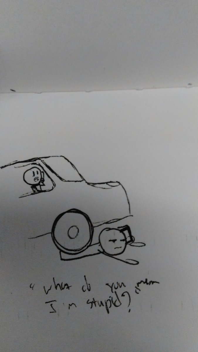
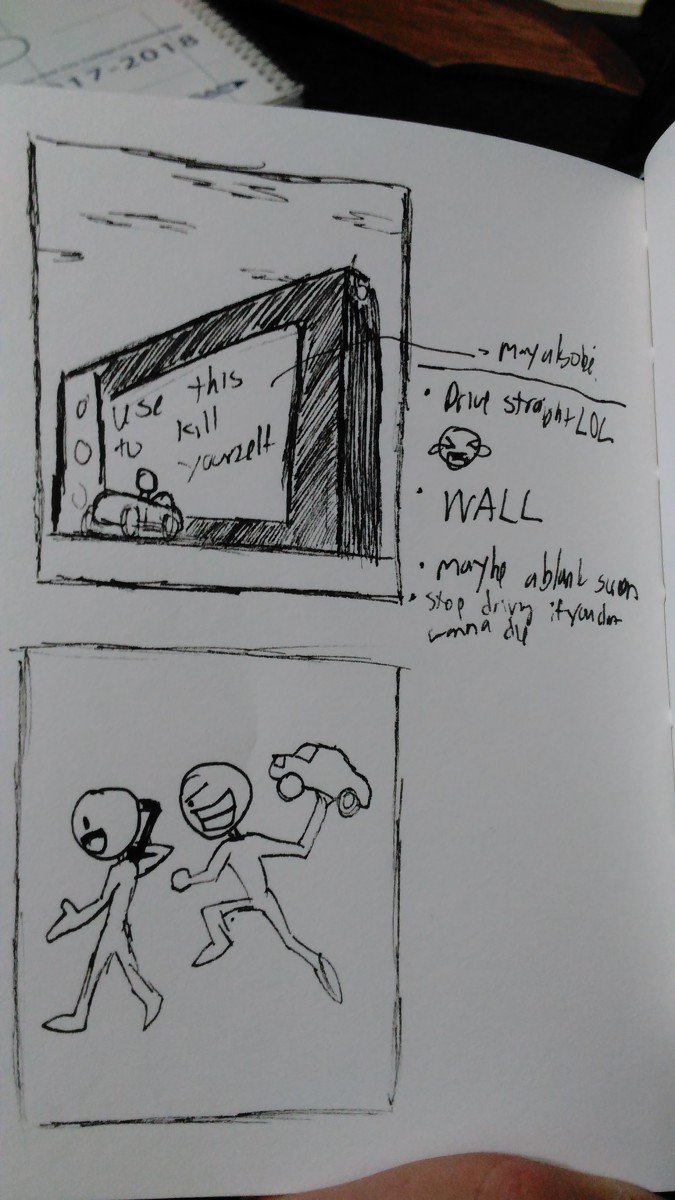
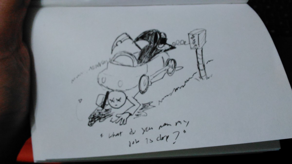
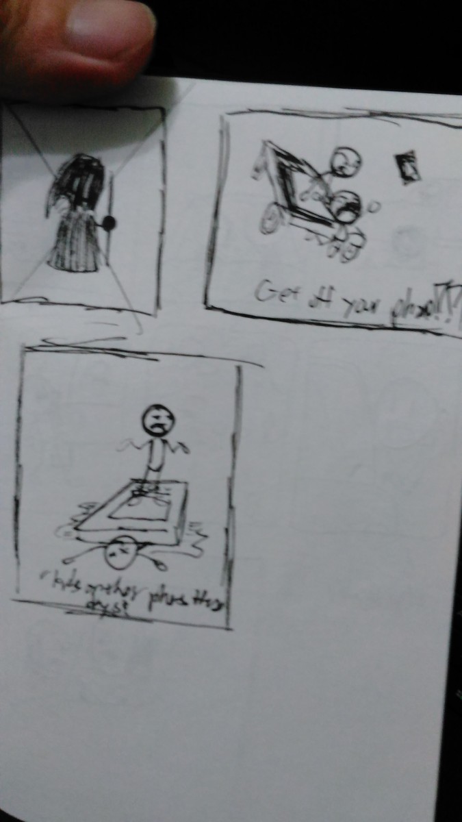
Editorial Illustration Topic: Bullying
Half the Students should hang their 3 concept sketches on the black board for critique. The second half of the class will hang after to allow for space.
On a post it note write:
Each student should read each about each project and then examine all of the designs. Using chalk each student may make 3 marks for each project. They can have no opinion: 1 make under each sketch. They can put 2 marks on their favorite and 1 on their next favorite, or they can really love a sketch and put all 3 marks under each.
Discuss the projects and why students felt the way they did. Designers should go with the one they / the instructor likes the best but class feedback should be considered too.
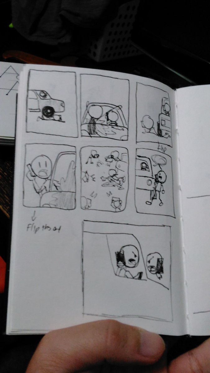
Students should share the drawing challenges they had, (for example having to draw hands ) and the turtorial / advice they researched to help them.
DUE NEXT WEEK:
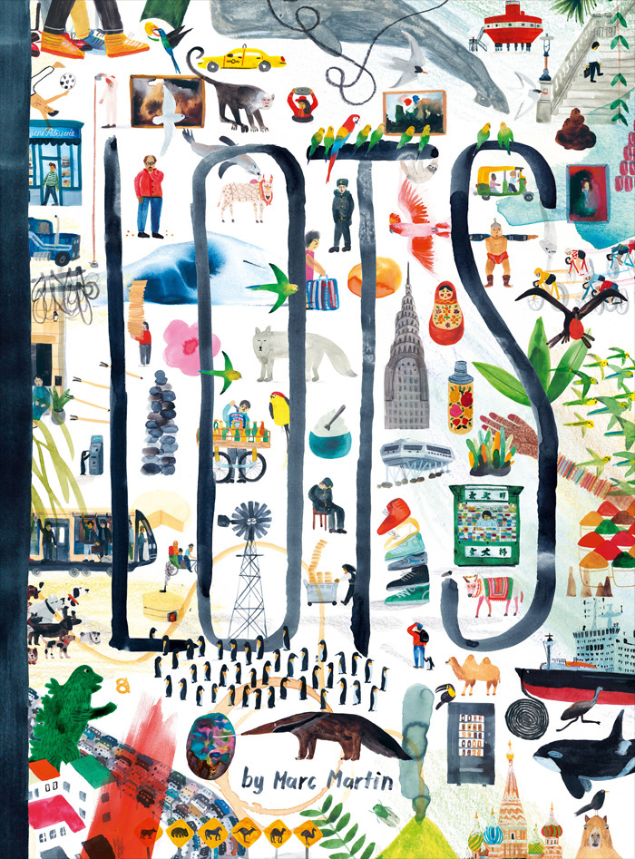
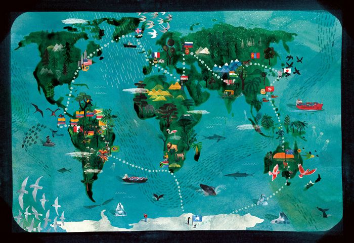
Marc Martin is an award-winning illustrator, artist and book maker based in Melbourne, Australia. Most of Martins work is with watercolor, gouache and pencil. His work is a world of vivid color, rich textures and “occasional scribble.” Martin is also the author/illustrator of A Forest, LOTS and A River. Having trained and worked as a graphic designer, his moonlighting as an illustrator eventually led him to a successful freelance career. I learned that Marc draws/finds inspiration from his surroundings, nature, animals, and the city he lives in.
At the museum Marcs illustration caught my attention. The piece is from the book series called, ‘LOTS’. It’s an incredible picturebook, that takes you on a guided journey around the world. The first moment I looked at it, instantly it reminded me of our first project we did in class with the collage of our illustrations. It reminded me about the use of ink and water color we used to finalize of the process.
As I researched about Marc I found a blog post about his process when creating his book. He first brainstormed which places he was going to draw by making a list. Finally he then narrowed it to 14 places and made sure that he had at least one location from each continent. He then talks about the material he used for his work, which was watercolor, pencil and gouache to add different vibrancy on each other pages as well to “reflect the colors and energy of each location.” He then goes in depth about this project how it was like a travel diary and part fact. He wanted to make a book that captured all the unique things you can find in various places around the world. For this book, he used a combination of watercolor, pencil and gouache to achieve a feeling of immediacy and vibrancy on each page, reflecting the colors and energy of each location.
Altogether, it really made me analyze and reflect about how that’s the same exact process we took in class to achieve our final illustration. It’s not about your first thoughts, it’s about brainstorming with many different thoughts and then narrowing it down to a smaller number. With Project 2 I’ll defeinlty keep this in mind and for all future projects hands down.
LOTS: A Book About Everything, For Everyone
Source: http://blog.picturebookmakers.com/post/157523453476/marc-martin
.
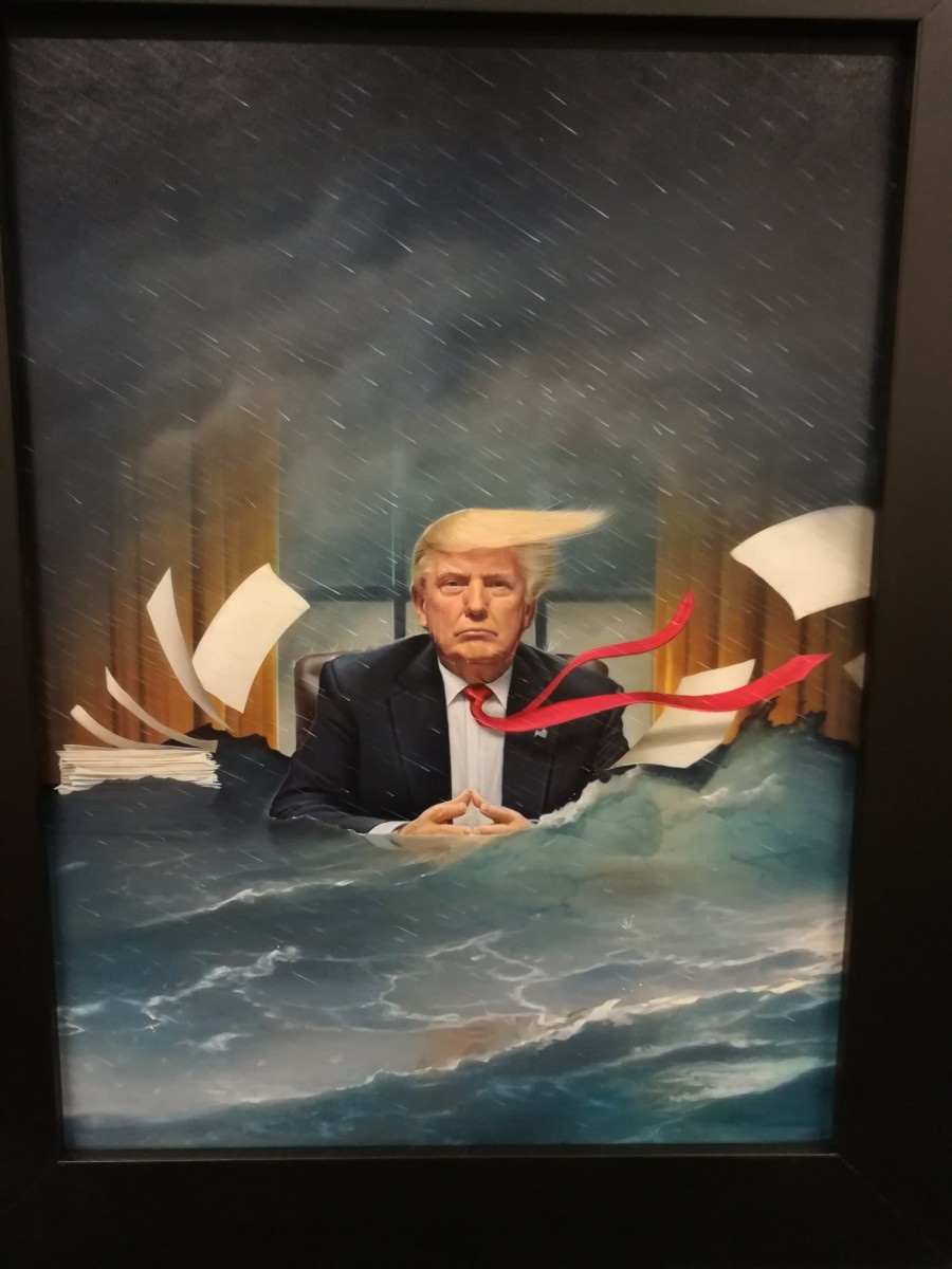
At first, when I saw the illustrator made by Tim O’Brien, it reminds me of the same name that I had read novels from my previous English classes. However, when I researched, Tim O’Brien that made this Illustration is different from the Tim O’Brien that made novels read from my English classes in the past.
Tim O’Brien (The illustrator that made this painting) is an Illustrator and portrait painter. He has an inspiration of pop culture where he infuses into artistic visions that simultaneously reveals strangeness and familiarity. Most of his work is cliented to TIME Magazine, including the painting above. Other clients include from Der Spiegel, TV Guide, New York Magazine, The New York Times, Newsweek, Business Week, and many others. He also designed United States Postage Stamps and won multiple awards in the Society of Illustrators in New York City which he is the president of many illustrators.
In the painting about Trump, the illustrator, Brien created the sense of realism of Trump in the president room while mixing mother nature such as the rain and the floods, creating a cold story of the painting. President Trump has a variety of some colors which shows the Hierarchy that the audience looks at this first and then the flood with the gradients of water, making it realistic as an ocean. The setting is in a rainstorm with dark clouds raining in a 45-degree angle, interpreting that the wind is blowing east, which affects Trump’s Tie, his hair, and papers. The combined sense of realism and the destruction of mother nature affecting realism creates a gloomy story of Trump producing the disaster of the world.
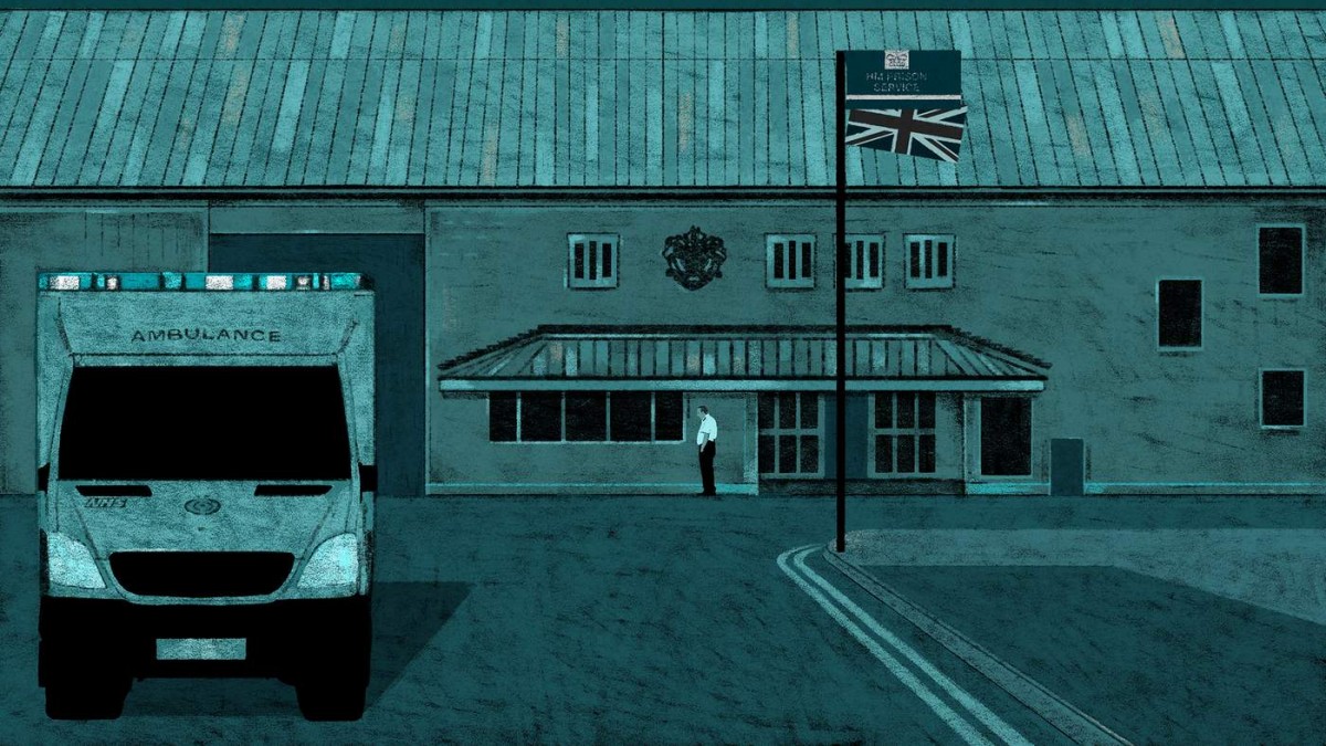
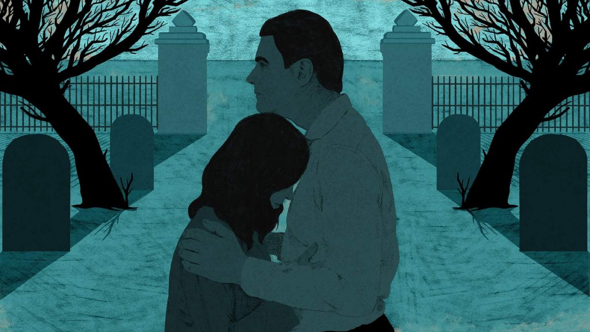
These works by Rebecca Hendin were done for an editorial series under BBC. “Lost In A System’ is about a drug crisis in UK prisons, and how a son of two parents were startled in post cannabis personalities and growing mental health issues. It’s a grim story and the artist of the editorial, Rebecca Hendin, reflects the concepts using the appropriate color schemes and texture.
The monotone color of teal gives just enough personality to imitate specific shadow colors. The usage of color aside from grayscale is what gives a bit more life to the artwork. Grayscale in itself is an uninteresting, and newspaper like colortone. To at least set a hue gives it more ways to take it than just a sad story. Even while there is a teal tone, it’s not impossible to distinguish what colors are what. The Union Jack flag can still be seen to have a red tone, even under a sea of its counterpart color.
Material wise, the granularity and scratches combined cover the flat surfaces of color, giving texture to the work. Line strokes are varied or non existent to determine distance of the object, which gives varied indication of what shade the object is.
Overall, these pieces are accompanied by grittiness and grain by the stroke, but it works to express the tonality of the work, as well as make good non-simplified detail which is very fit for an online posting. The colortone is right for the expression of the story too.
How to Break Up With Your Phone by Miguel Portan
From the moment I saw this piece it caught my eye. It’s not very much to it and it’s straight to the point but is it so relatable. It is digital art with sort of a paint based look by Miguel Portan. Which I believe make it into the New York Times. It displays a person trying to disconnect from their phone but some parts of the person’s face is still glued to the phone causing the face to look irregular and elongated. The image doesn’t have much shading or details. It’s very simplistic with very few colors but a certain kind of texture to the coloring making them pop. The movement in this piece is very well constructed as I find my eyes shifting from the person’s face to the phone and then back. The negative space in the piece and the contrasts between the red shirt and green background makes for a very eye pleasing visual, I think it gives the image unity. For me the two focal points is the person’s face and the phone.
I really think this piece works because I automatically connected with it on a personal level. As the name implies how to break up with your phone is self explanatory towards the image. Even without knowing the title of this piece I believe anybody would have been able put that connection together. As it is known, we live in a technology based society were phones and computers are everything, so I find myself and people of my generation glued to their phones. We live on our phones and it’s hard to go days or even hours without it. This piece reminds me of that problem and relays the relatable message very well. Personally I have been finding ways to spend less time on my phone even though it plays a big role in the improvement and evolution of portable technology, that has greatly improved our lives to an extent. Cell phones are very innovative devices constantly improving, but the daily connections and unlimited amount of time the average young adult spends on their phone is unhealthy and it distracts them from reality. There’s but so much you could take from the virtual world or media/internet. At the end of the day, reality and living life is what’s most important, the outside connections, communication and experiences are what’s really going to make an impact and become memorable. So I have a heavily support this piece and its deeper meaning of breaking the cycle of being glued to your phone.
As far as the other work by this artist go they are all simplistic and unique, and they happened to be digital art as well. Some of them even have similar topics like social media, web browsing, data files and others. From that I could see that this artist is very well interested in the virtual world and technology, whether that’s showing the negative side of it or just shining a light on the subject.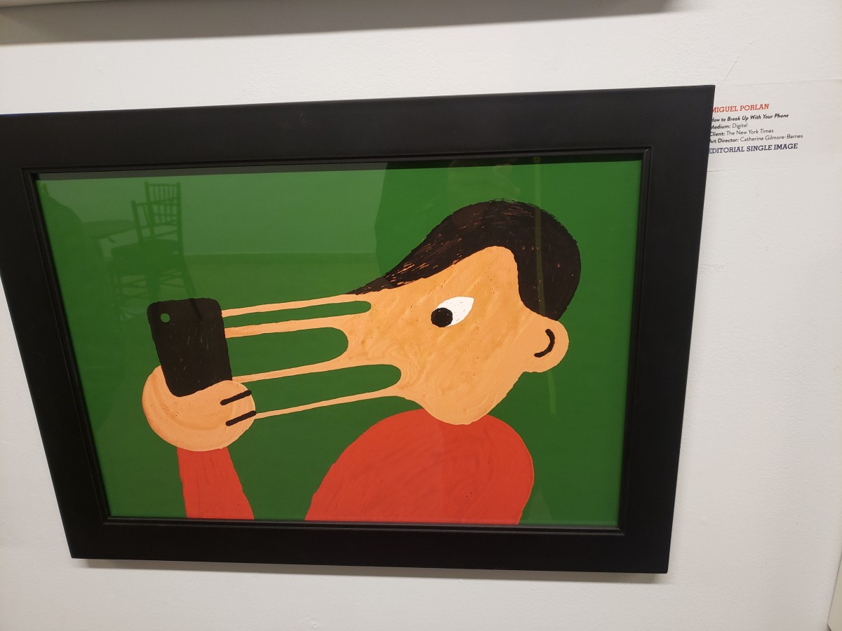
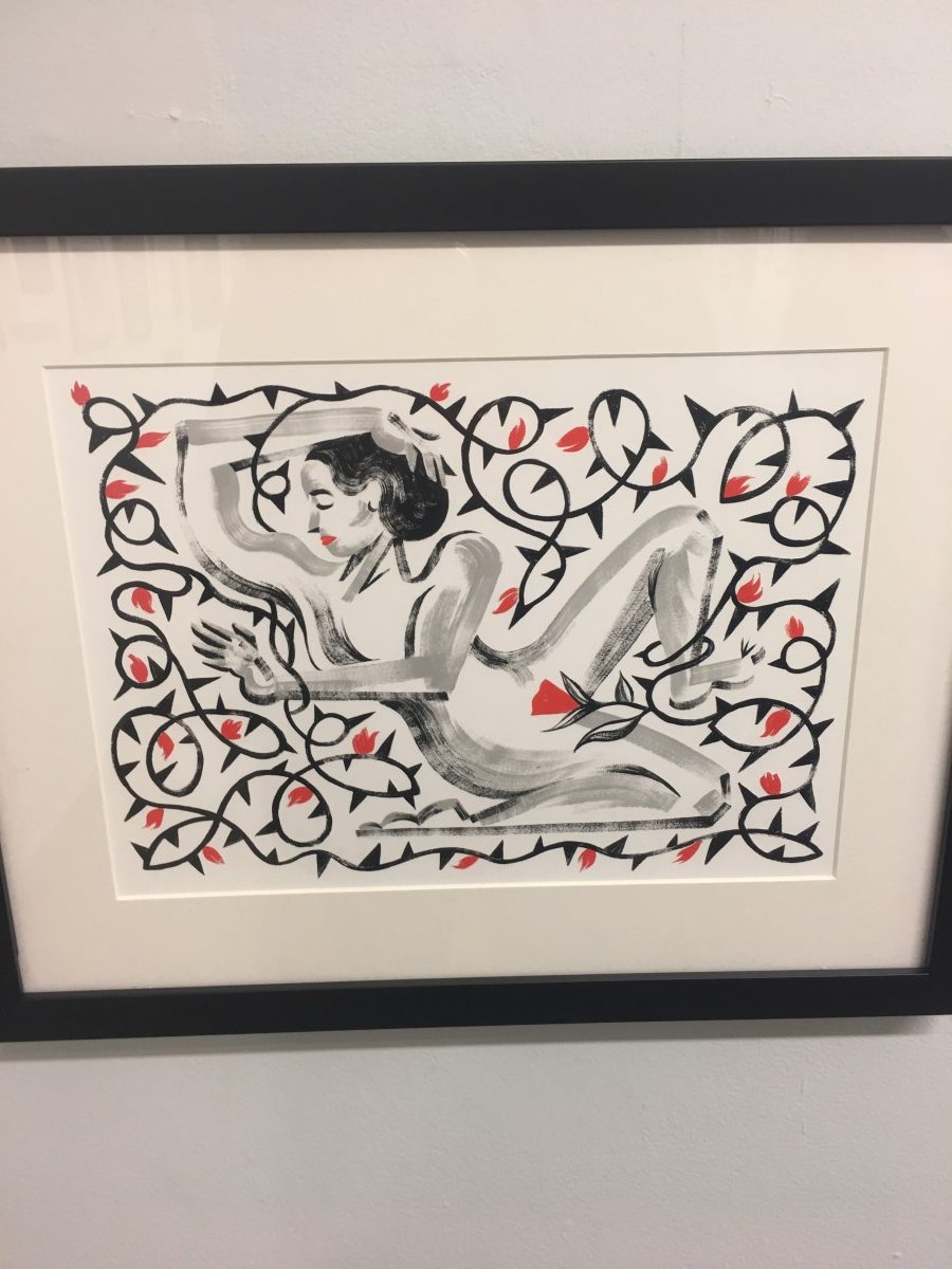
I found Chole Cushman’s illustration particularly amazing the moment I saw it in the gallery. This illustration contains thorn flowers in a motion composition around the drawing of the female body made of black and grey scale. The illustrator used a medium of Gouache and Digital. I found this illustration interesting because I like connecting the female body with nature, so I personally enjoy visuals that describe a story with flowers, leaves, or water; along with a female body. It expresses poems or quotes through drawings that several people can relate to.
Before I researched what inspired Chloe to create this amazing illustration, what I found interesting was the use of motion and how she didn’t illustrate nature in a beautiful and pleasant way, instead, she demonstrated her concept in a painful way. She placed thorns around her body wrapping her arms and legs physically hurting her, except for her most intimate part. First, I thought that the concept of the illustration was self-worth and how women should intimately love themselves. After my research about this piece of art, I learned that the artist emphasizes her illustration The Agony of intimacy for her client Hazlitt.
Hazlitt was a woman that struggled with a chronic pelvic pain disorder known as Vulvodynia, which affects between eight and sixteen percent of women. The women who experience this disorder feel internal rug burns along with small blades splitting every woman’s most precious intimate part. Any internal vaginal pressure can trigger this pain, the slightest touch, period, even when they sit down. Hazlitt was afraid of sexual intercourse, it was the most traumatic experience for her. She didn’t know how to be intimate involve with her partner of 6 years, any type of affection in the relationship she would reject. She didn’t feel comfortable with her body, mostly with her most intimate part. Apart from all the different doctors she visited, her partner forced her to go to a clinical sexual health trial, where she found a treatment that changed her whole life.
After Chloe captured Hazlitt’s story she decided to illustrate her client’s pain and desire in this illustration by placing the woman body as the focal point. The artist illustrates the concept of physical pain with thorn around what it seems, Hazlitt’s body. After a rough journey of pain, the biggest, healthy and beautiful flower with leaves placed on her intimate part communicates how she’s finally free.
The OpenLab is an open-source, digital platform designed to support teaching and learning at City Tech (New York City College of Technology), and to promote student and faculty engagement in the intellectual and social life of the college community.