Field trip post

Img Of illustration


Information about the illustration

The reason i chose this illustration is because it depicts something i relate to which is working to death or my fear that possibly the only reason we’re alive is to work. This is to me represents my lower middle class struggles and what the reality of these industries make us feel like. Blue collar working from his death bed because it never really ends . The Artist who created this piece is Pete ryan ; he created this piece for the washington post and it is called “How to prevent working to death” .

pete ryan is an amazing artist and what intrigues me most about his work  is focused on concepts and metaphors. There is some literal representation of storytelling and satire in this piece for me and I personally feel like His visuals are tricky , bold and graphic.

Sketchbook/Imaginary Ideas

Hi Professor,

I had a problem uploading my 4 sketches on open lab; it says that the image is too big so I uploaded them on my eportfolio instead. I still have yet to do my 3 concept sketches but will do start them in class tomorrow.

https://openlab.citytech.cuny.edu/amarte-eportfolio/2019/03/18/sketchbook-imaginary-ideas/


The Swamp

This illustration is made by John cuneo called “The swamp”. This illustration caught my attention due to the colors and the main person being illustrated Donald Trump. There where a few illustrations of Donald Trump that were in the gallery, but this one caught my attention because it was the most different and meaningful in my opinion.


The illustration shows Donald Trump playing golf in a swamp. It is very interesting because he is around many animals that are in the swamp that look like they want to attack Donald Trump, but he is playing golf and ignoring them. This goes back to Donald trump’s campaign where he said he was going to drain the swamp. As in get rid of the people that are bad in the government. Instead he is playing golf and not doing what he said. I think the idea of him playing in the swamp and the animal’s around him shows how he doesn’t care about the swamp and luckily John cuneo didn’t care to illustrate this.


John cuneo has done many pieces for The New Yorker. When doing this piece he was trying to block the noise of people in the media. He also know when to actually illustrate something controversial and make sure no one is doing something similar or else he won’t do it. He also makes the illustration very profane and inappropriate for the magazine that they won’t be able to publish it. Just so sometimes he can stay away from the political topic. Overall the artist and the illustration was very well done and just one of the great political illistration with a story to tell.

Jennifer Chung Field Trip Post

Gracia Lam is an award-winning illustrator. She was born in Hong Kong and raised in Toronto. She became an illustrator because she found how you can communicate and bring stories into the light to the audience. Her goal is to visually communicate with the audience and to uncover hidden treasures every day. Gracia Lam designed what I found interesting at the museum. She designed art for Real Simple Magazine and it’s a scene where you can either think it’s a couple, friends, family, etc, sitting on a bench in the rain and the woman seems to be holding an umbrella but the umbrella represents as a waiting text bubble. This icon usually means either someone is waiting or the person is texting or complete silence.

This design stood out to me because I thought to myself how I relate to this design. What I got from this was waiting for a text from your loved one and not getting a response. However, the meaning can go in many different ways. I research an article relating to the art on realsimple.com and the article talks about disagreement with others. The article basically summarizes how if two people disagree, we shut them down and don’t connect with people who don’t see the world as you do.

Overall, I think the art shows a clear statement to the audience. She used great colors and textures to express darkness and the mood in the art. The two people show clear body language and the idea to have the umbrella act as bubble icon is really creative.

Society of Illustrator Society of Illustrator Society of Illustrator


20 thumbnail concepts

Coyote ugly the musical

Coyote ugly is one of my favorite movies and its about a shy girl who find her voice by singing along with a jukebox in the bar she started working in which is called coyote ugly. Coyote ugly is a term created for a deunken one night stand you wake up to that is so ugly you rather chew your arm off then wake them up. It is also the name of this bar.

These sketches are for the coyote ugly musical

These thumbnails include stage presence, coyote hats , beer jugs, juke box symbolic to the movie and solo microphones

Idea web and first page of sketches

The musical basically breaks down themes of the movie -and significant scene and symbols

This image requires alt text, but the alt text is currently blank. Either add alt text or mark the image as decorative. This image requires alt text, but the alt text is currently blank. Either add alt text or mark the image as decorative. This image requires alt text, but the alt text is currently blank. Either add alt text or mark the image as decorative.

Field Trip Discussion Post

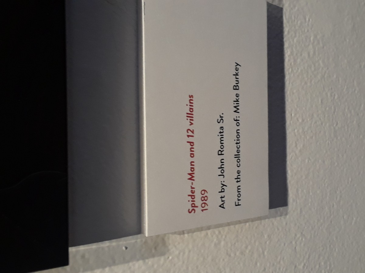
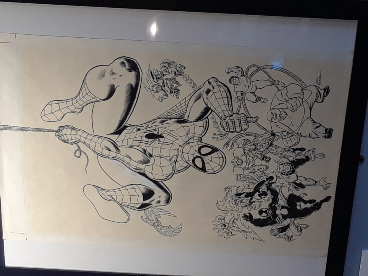
  • SPIDER-MAN AND 12 VILLIANS 1989

The trip was actually really enjoyable since I kinda thought we were gonna stand in one place all day until the end of time. But it was a rather interesting find looking at all the award-winning Illustrations on display. But what caught my eye specifically was the Stan Lee section on the 3rd floor of the Museum. Sure I may not be a particular fan of Marvel anymore since I feel like it’s been oversaturated. But what really think stands out about it other than the actual artwork is the inking. I myself want to be a Manga Artist, so I would mostly work with ink and sometimes even color in my panels. Which working with color is a lot harder since I don’t have a full enough grasp of color shading with markers, pens, and other materials.

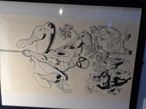
The specific piece I saw with Stan Lee (Writer) and John Romita Sr called “Spider-Man and 12 Villains” created in 1989. I particularly like the line and stroke difference in the cover. After doing some research on it I found out that Romita didn’t really want to draw Spider-Man, according to an excerpt from Comics Alliance.

The only reason I did Spider-Man was because Stan asked me and I felt that I should help out, like a good soldier. I never really felt comfortable on Spider-Man for years. I had felt at home immediately on Daredevil. On Spider-Man I felt obliged to ghost Ditko because — this may sound naive, but I was convinced, in my own mind, that he was going to come back in two or three issues… The only reason it wasn’t better was that I couldn’t ape him any better.

So it was a surprise to find out that this cover to that Spider-Man comic really only existed as a sense of a sense of helping a friend like Romita said, which I think is a nice sentiment.