Cooper Hewitt is a museum based of different eras of artwork in digitalized form. There are graphic design artworks shown all throughout the museum. They present artwork to their audience through technology, which captures many people’s attention. There are exhibits of Pixar and their process of animation, historical posters and propagandas, architectural structure and its history, etc. Every design and poster at Cooper Hewitt leaves an impression to their audience because of its overwhelming colors, artwork and structures, and its interesting usage of technology.
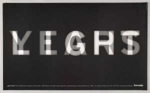
One of the illustrations that interested me the most was the poster designed by Michael Bierut for the Architectural League of New York. The poster (23.5” x 38.5”) was designed in 1999 and is called, “Light Years.” (Figure 1) The medium used was offset lithograph on whiten wove paper, so it’s considered an illustration and print that has been digitalized. I like this piece because it shows great usage of opacity to relay a full message especially on the black background. Black and white shows extreme contrast on the piece and the overlapping of the words create a luminescent effect on the background like film titles from an old movie projector. And the word, “light,” can show a meaning of the light balance in transparency, the literal term of light to show brightness, or it can even mean the young years. There are different interpretations to the message, but it depends on each individual.
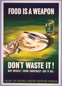
Another illustration that interested me was another poster piece designed and published by Office of War Information. The donor of the piece is unknown, but it was designed in 1943 and called, “Food is a Weapon.” (Figure 2) The medium used was lithograph on paper (22.75” x 16.375”) and it is a drawing on print that has also been digitalized. I like this piece because the message is very direct and straightforward. Food is everyone’s source of survival and without it, people will die. So it’s saying that food is a weapon because it’s a necessity and it’s your lost if you waste it. Everything that can be consumed should be used, cooked, and eaten wisely while following nutrition standards. I also appreciate the color choices of this piece because the usage of black, white, yellow, and green brings out contrast between every object. There’s yellow on the surface surrounding the plate, cup, and napkin meaning that there’s a light source above the objects and its casting shadows everywhere. The bones on the plate is probably there for dramatic reasoning or drama and the boldness of the white sans serif type heightens the emotional intensity.
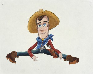
The third piece that interested me was one of my favorite childhood characters. The character name is, Woody, from Toy Story (figure 3). It was created in 1995 by Bud Luckey and Ralph Eggleston for Pixar Animation Studios. This is a concept art developed with mixed media on a regular letter size paper. Although I never had the chance to watch past the first animation that came out, I still liked the characters and theme of the cartoon. Woody was always the calm one, but in a bigger picture, he’s another piece of Andy’s toy collection that can talk and run around on adventures. The color used on Woody and his apparel are carefully adjusted to match each other. There’s great usage of the RBG scale like the blue scarf, the red shirt, and the greenish pants. The overall appearance that stands out are his facial features. His pale face with big blue eyes and a cheeky smile with a light reflection.


