
In this visually enhanced quotation project, we had to choose and create a design for a quote that has meaning to us. I believe in type standing alone to communicate a message to its viewers, but I also believe in images adding more personality and emotions to a concept. In my concepts, I used images and different typefaces to bring out the quote and it’s meaning to me.
In the first concept, (Enhanced Quote 1) I used a quote by Mary Lou Retton, “A trophy carries dust. Memories last forever.” I like this quote because it reminds me of the trophies I have sitting on my shelf being eaten away by dust. Every time I look over at them, I don’t think about why I got it, I think about the memories behind it. I think about the effort, time, and people who were there with me at that moment to share together the happiness. The brightness and contrast has been slightly reduced in comparison to the original to make the type stand out more than the picture. The type isn’t exactly the focal point but with a dark color in contrast to the bright sky, I made the type to stand out more. For a quote like this with a sentimental looking background, I figured the best typeface to use is Serif because it shows more seriousness and mood into the whole concept.
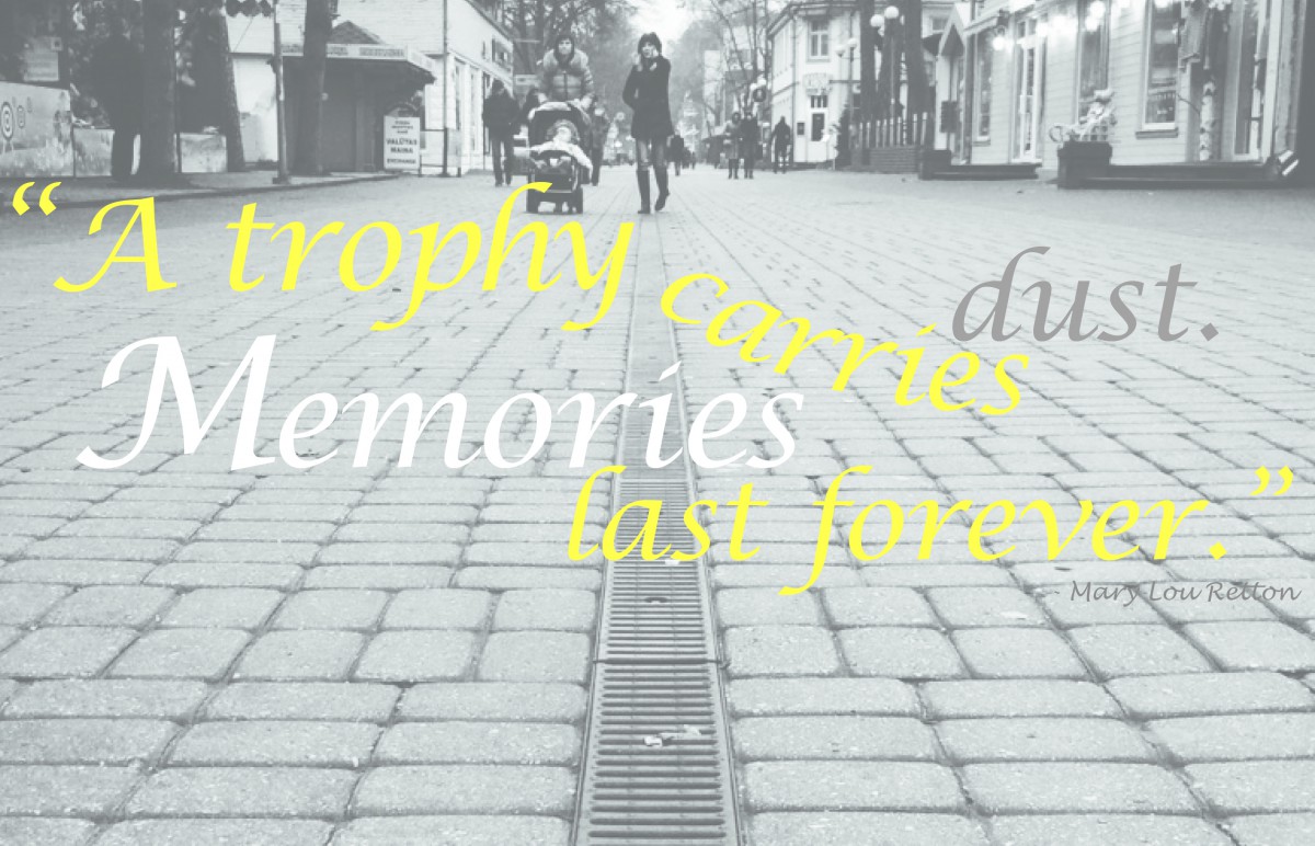 In the second concept (Enhanced Quote 2), I decided to use a picture of a road in one point perspective because I feel like a road can really bring out the meaning in the word “memory.” Memories can get so long, just like a road, and it will keep getting longer as you live on. Every moment, is like every step taken. And I designed the quote like that to bring some meaning into each individual word. A trophy is usually seen in a certain shade of yellow, so I made most of the words a lighter shade of yellow. The word “carries” is in the shape of a scoop to show it literally carrying dust. And “dust” is in gray because dust is known as being gray. Memories is in white because when I think of that word, I would think of a thought bubble which is usually white.
 In my last concept (Enhanced Quote 3), I designed the quote to looking like a trophy cup to show meaning into the quote. The type is in a yellow that has been set to 100% yellow with 13% black because I figured 100% yellow is too bright in contrast to the white background, so it won’t stand out as much. I wanted to keep the background white and plain because when memories come to mind I think of white to correspond with it. Inside the cup is some gray to literally represent dust and I used a 10% tint of black because I didn’t want a dark gray color to become the focal point. I was originally going to leave the type as it is but then it wouldn’t look like a trophy so I decided to add the handles to express it more in detail. The base is curved like any other regular cup would be and inside the base, I included the person who said the quote.

