You will be reading and annotating the article “80s Design is Alive, Well, and Living in 2019” by Nadja Sayej, published in PRINT, on March 6, 2019

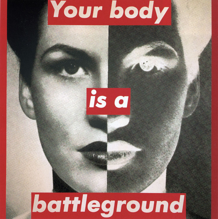
This image is one of the examples of postmodern art from the 1980s. It was created in 1989 by Barbara Kruger. The design shows a woman with half of her face in black and white, and the other half is a negative image. Then you can see the typography headline, “Your body is a battleground”, which is spread out across the design. You can see the designer wanted to grab the audience’s attention with the bold typography and red color. It’s kinda thrown in your face, telling you what it’s about. The design shows the battle between a woman and her body along with her troubling thoughts about her weight. Hence “battleground”, the struggle of going back and forth with yourself.

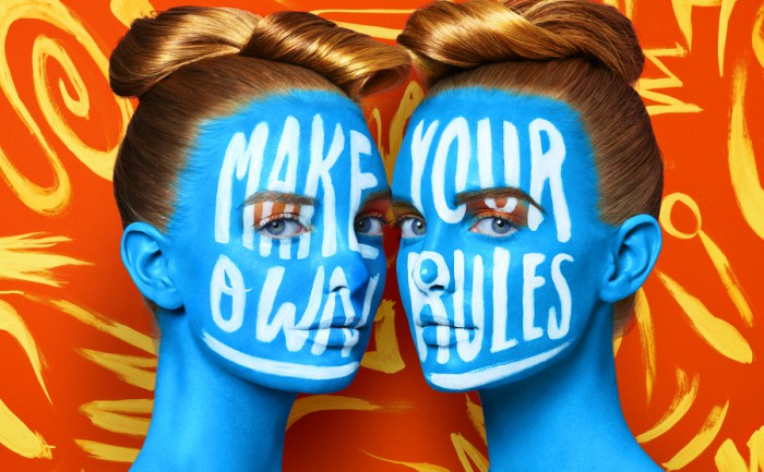
The image I chose was from a contemporary artist name Jessica Walsh. Her work is all about doing what you want and how you want, breaking the rules, and making your own. Which is something I liked about her while seeing her work online. In this design, you can see two women facing each other while looking into the camera. They have the words “MAKE YOUR OWN RULES” on their face in bold and in white. Not only are the words bold and in your face but so are the colors in the image. The orange, yellow, and blue is in a way screaming in your face. it’s bright, eye-catching, and not following any rules as well. They are wild, free, and messy. Which is what the artist is trying to convey to her audience.
Annotations


Leave a Reply