At the top of the post copy and paste the following: 80s Design is Alive, Well, and Living in 2019” by Nadja Sayej, published in PRINT, March 6, 2019
- Find 1 example of work from a postmodern graphic designer from the 1980s and 1 example of work from a contemporary graphic designer from the last five years.
- Deconstruct the works and explain which visual and/or ideological elements are associated with Postmodernism of the 1980s and why.
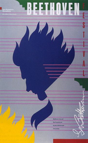
This is the Beethoven Festival, 1983 poster by post modern designer Michael Cronan. When looking at this poster, the first design element that grabs your attention is a silhouette of Beethoven set in the center. There are staff lines covering the whole page giving us the sense of a music sheet. There is little typography used and some shapes added that makes the poster feel less empty. This poster has a lot of aspects of post modernism as it takes advantage of the grid to create equal spacing of the staff lines and create alignment for the text and design elements. Post modern art was an advocate of minimalism, clean looking design, minimal colors, and this poster is a great example of that.

This is a contemporary poster from the Spider-Man: No Way Home movie 2021. When viewing this poster, you can tell that it is very different from the Beethoven poster. This poster compared to the Beethoven poster is much more graphic as there is a lot of texture, 3d elements, and effects being used. It is more advanced and appealing to look at. However, there is still some elements of post-modernism being used as we see the use of the grid to align the text and characters of the movie in the middle.


Leave a Reply