80s Design is Alive, Well, and Living in 2019” by Nadja Sayej, published in PRINT, March 6, 2019
Questions/Prompts
- Find 1 example of work from a postmodern graphic designer from the 1980s and 1 example of work from a contemporary graphic designer from the last five years.
- Deconstruct the works and explain which visual and/or ideological elements are associated with Postmodernism of the 1980s and why.
Response
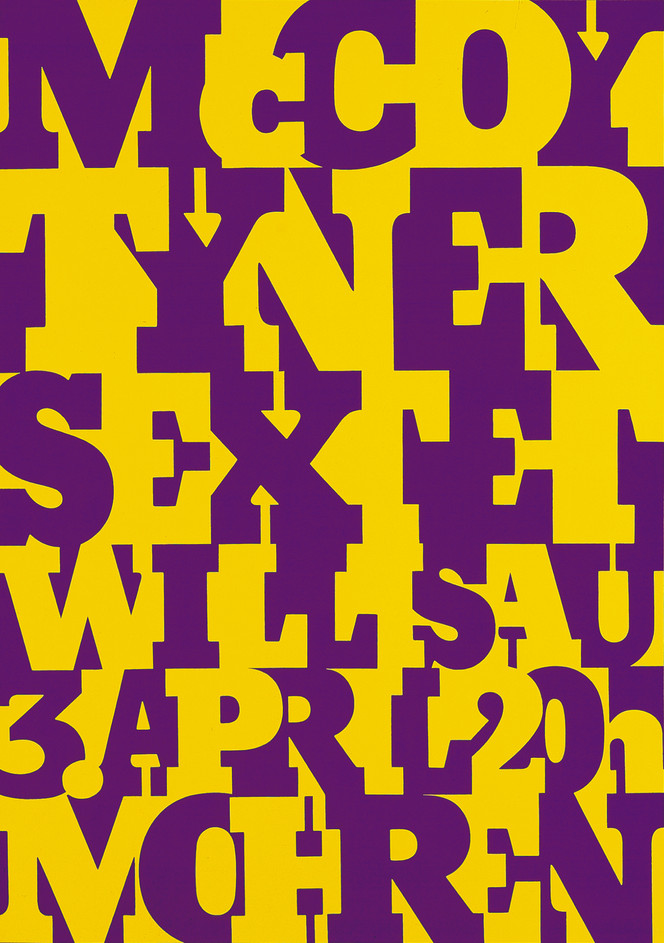
First poster that I found interesting is called “McCoy Tyner” done by Swedish postmodernist designer Niklaus Troxler. Created in 1980, Troxler decided to create a poster that was dedicated to exploring new ways of expressing typography. Regarded as a type giant, Troxler used only two colors to help bring this type into life. However, one thing that I noticed while looking at this poster was the negative space utilized between the types. It’s almost as if the negative space, engulfed in yellow, molds the letters together to help complete it as a word. The colors and the spacing between the letters helps bring this piece to life. To understand why I selected this poster within the postmodernist era is because it represents an eclectic and colorful style compared to other designs. It also utilizes saturated colors, funky patterns, and even strong contrasts of color, all major components of the postmodernist era.
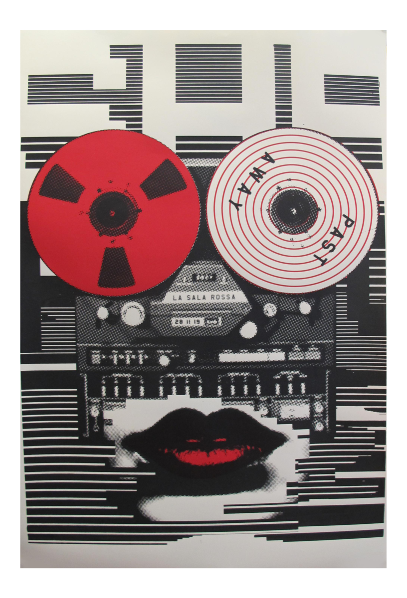
My second choice was a poster called “Past Away” by contemporary designer, Sebastien Lepine. Created in 2019, this poster gives off a retro aesthetic, mainly used to promote the film. This poster is unique because it’s a different take on creating movie posters in the current era. When looking at this poster we can see a loud pattern used as the background with two film tapes used as eyes. Although, From the desaturated colors to the retro type on top, this poster was created in modern times, but meant for an audience from the past. As stated in my first poster selection, this poster only uses three colors, white, black and red. A simple poster with limited design elements, helped bring in the audience for this particular film. Using elements such as a limited color palette, loud pattern, and retro type helped differentiate this poster from others with the modern era.


Leave a Reply