Madeleine Morley; Master László Moholy-Nagy Saw Photoshop Coming, 90 Years Ahead of Time (2019), AIGA Eye on Design; László Moholy-Nagy; Typophoto (1925): found in our main text Graphic Design Theory: Readings From the Field by Helen Armstrong on pages 32-34; Jan Tschichold, “The Principles of the New Typography” 1928: found in our main text Graphic Design Theory: Readings From the Field by Helen Armstrong on pages 35-38
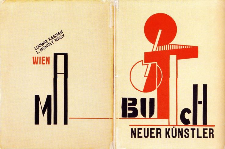
The author’s aesthetic approach was to create asymmetry from typography and make it different than what they were used to doing. For example, the cover of “Buch Neuer Kunstler” (1922), shows the uniqueness and asymmetry of the typography. Certain letters are emphasized, and some letters are of different shapes and sizes, which makes them unique. This artist is making their own type of art using typography.

This approach to typography is better than the traditional design/typography of the past because it has a more visual aesthetic to it, it’s unique, and influences other artists and/or viewers to create art like that or try to come up with something different and maybe better.
The role typography, photography, and other media should play in shaping a new kind of design are they should influence people to push the boundary of what photography and typography can be. Finding ways to make it more unique to them and/or improving typography and photography. Showing how they can be used in many ways to create art.
Technology advances influenced aesthetic forms and theories in early 20th-century design through the production of posters, ads, magazines, etc. Through these advances, artists were able to create their own unique art and get it to the public. They could use the boldness of letters, many colors, and drawing styles to draw people to their work. Their work would inspire others and they would make work like that or come up with new ideas.
Annotations


Leave a Reply