This past Monday our class went on a field trip to the Cooper Hewitt museum of art. It was a rather interesting visit, I must say. I found the interactive pen to be the most enjoyable part of the visit. I brought my friend Walker with me so I can have an awesome buddy with me and not be touring an unknown area alone. He has been to the museum before so he more or less knew where each exhibit was and what they were about. We even made a little contest with the pen by scanning as many exhibits in the fastest time possible. Needless to say, I won by a landslide. Ha ha.

The best part about scanning the exhibits with the pen is being able to log on to their website and get digital images of each exhibit that was scanned! You are even able to keep designs you made on their fancy digital art tables. The tables were really interesting too! You are able draw, make 3D models, browse through digital paintings and collections and even save all of these to your pen!

Awesome pen!
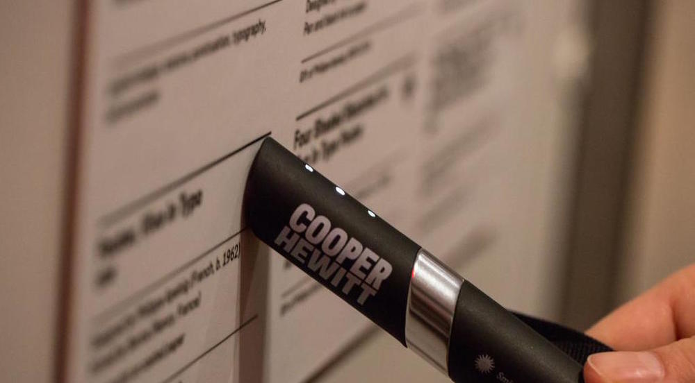
Scanning with the pen!
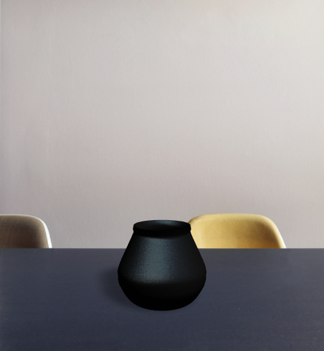
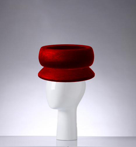
As a mostly 3D model artist, loved the 3D aspect of the tables so I made a lot of different designs. You can change the mode in which you design in as well. For example, you have the option of making 3D modeled hat designs or vase designs. You can even change the textures used in the models. I switched between a black matte color, black fabric texture and a black plastic texture. There was even an exhibit where you could draw on the table and have it appear as a wallpaper pattern on the walls around the room! Here you can see the designs I did.
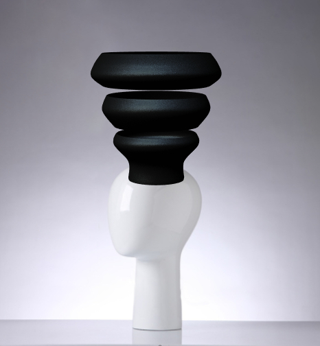
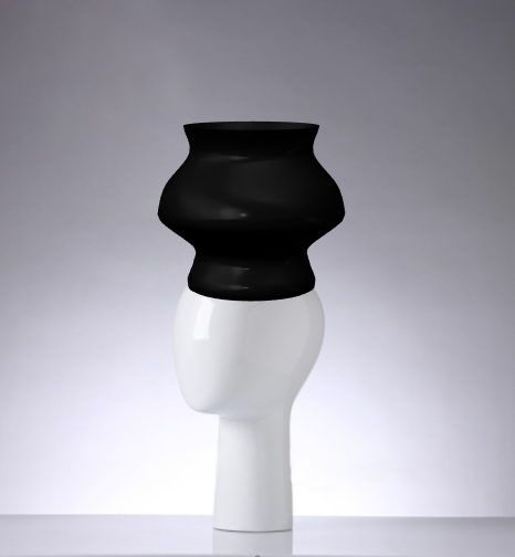
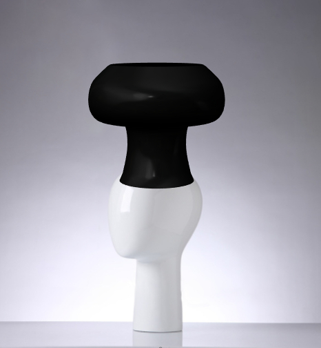
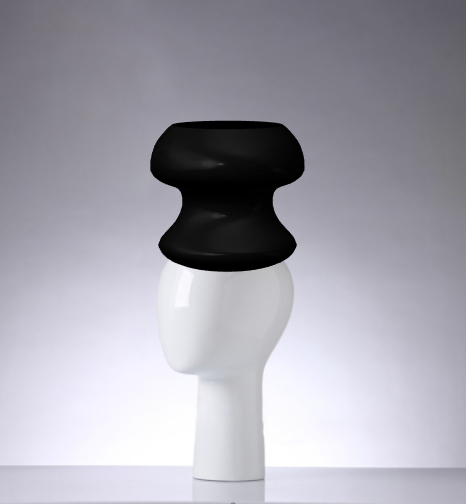
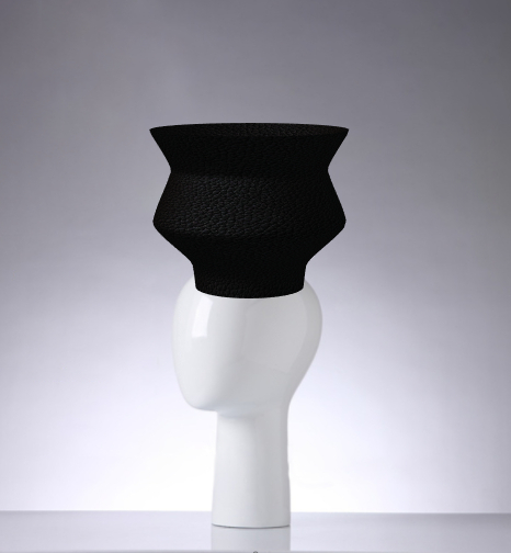
Vase designs:

This looks like an outdoor lamp more than a vase.

I wanted to make the opening to this vase larger but couldn’t figure out how to so I left it the way it is. Still cute either way!

This looks like the foot part of the legs in a fancy table.

Hat designs:
Woah, a red marble color!
Woah, it’s a levitating hat!
This reminded me of the water vases women of different African tribes carry on their head.
Chef hat!
Sous chef hat!
Black fabric hat.

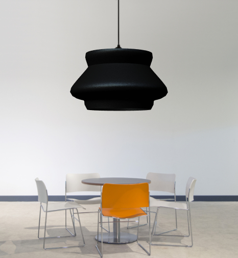
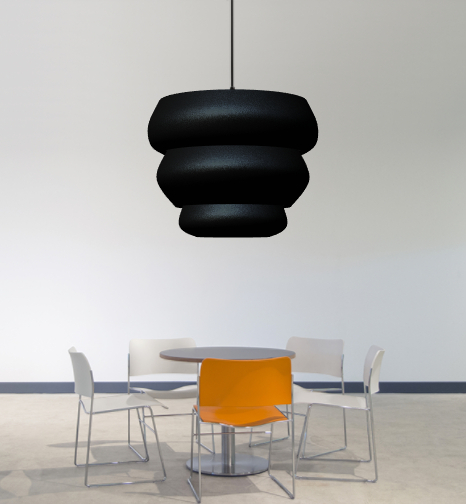
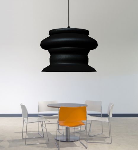
Lamp designs:
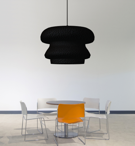
Black fabric lamp.
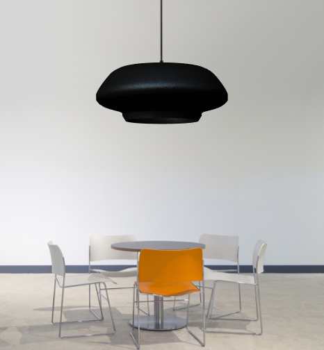
This one looks like a UFO lamp!
Statue designs:
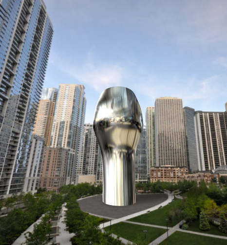
This looks like a giant chrome cup.
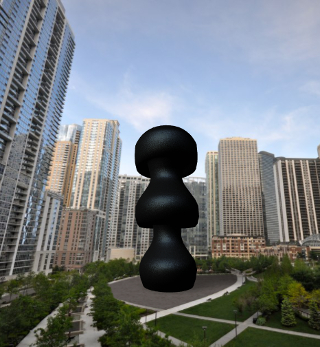
Poodle statue!
Wall pattern design:
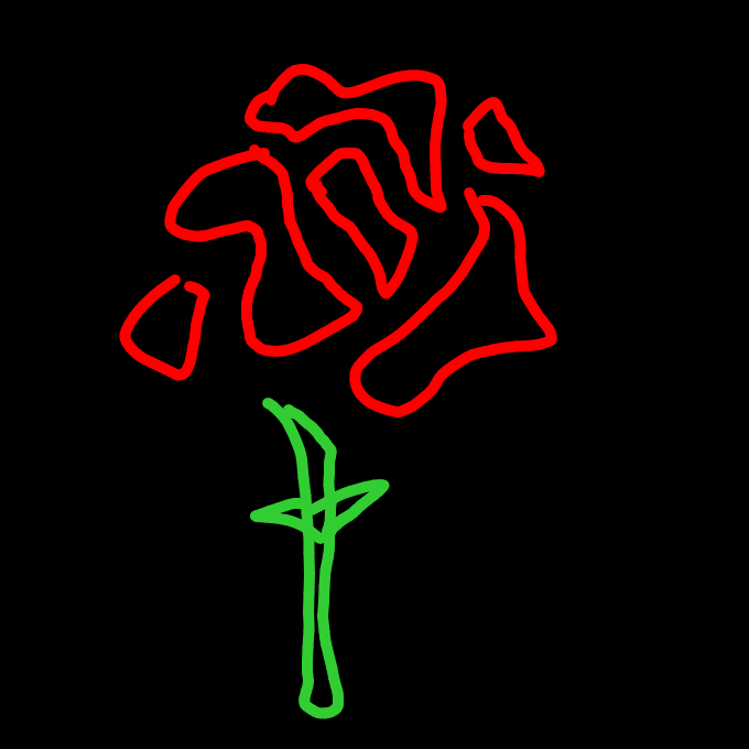
Rose design
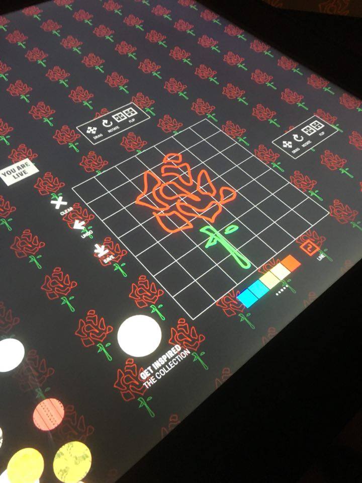
Rose Wallpaper
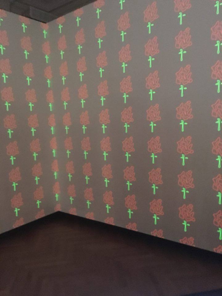
Rose Wallpaper
There was an area in the Pixar exhibit where you were able to draw character sketches. You start off by drawing a squiggle line in the first box and then draw what you interpret the line to represent in the second box. I tried this three times and here is what I got:
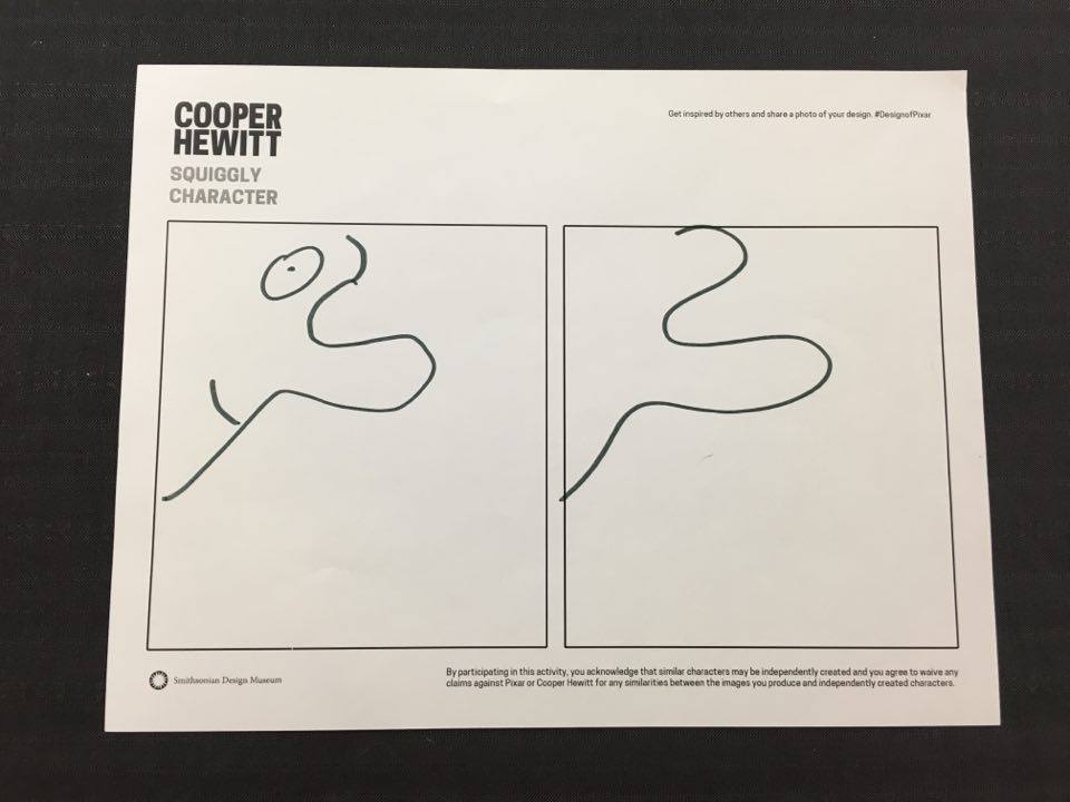
Guy with a big nose!
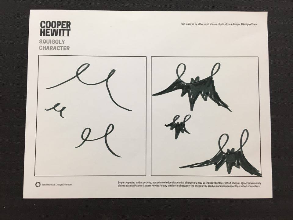
Bats!
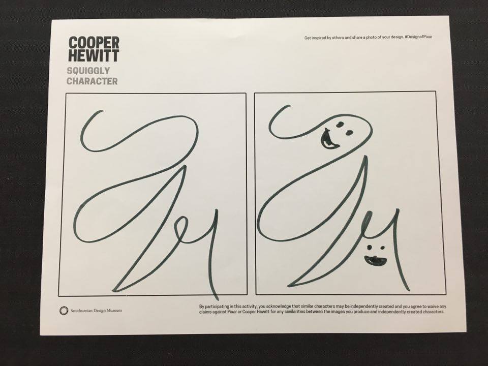
Ghosts and demons!
I literally scanned everything I could find in the exhibits and after shifting through the 22 pages of images I now had, the following are the pieces I found to be most eye-catching and visually enjoyable.
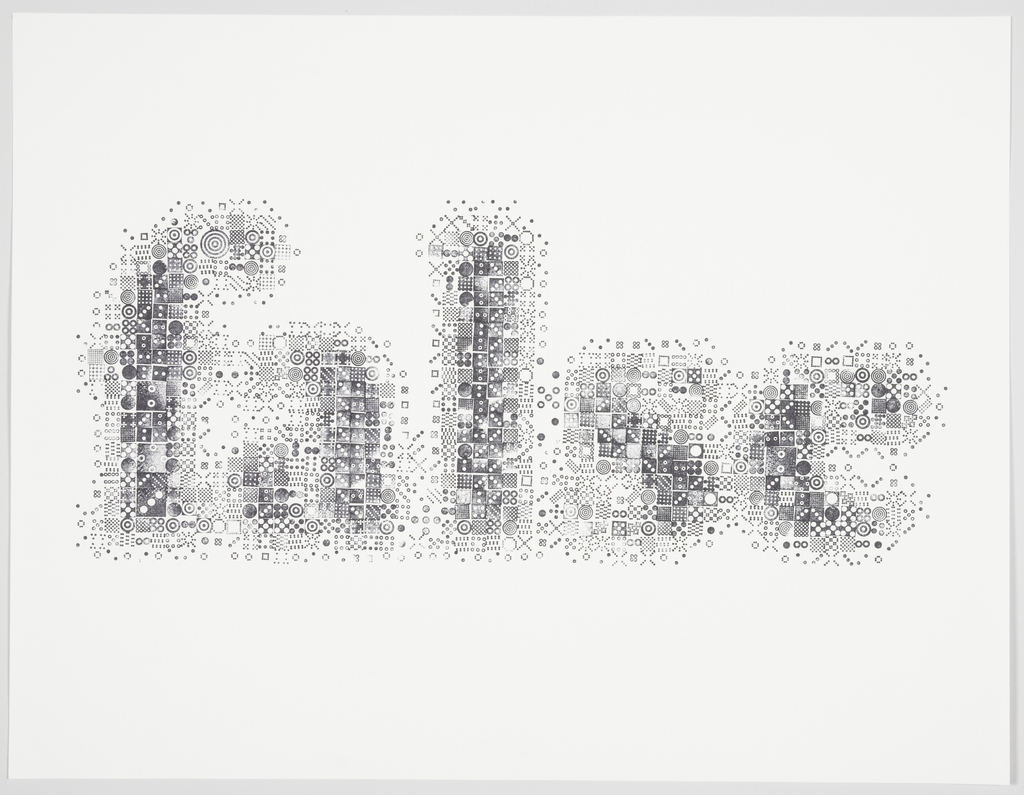
PRINT, SEEING THROUGH CIRCLES, 2015
This poster was designed by Kyuha Shim in 2015 and the medium is hand-stamped print. The piece is actually not a part of the museum but on loan and has been there for some time now. I was actually walking by when I briefly glanced at this and actually stopped walking to observe this piece. It is quite visually striking. The word represented is “false” and is composed of many small hand-stamped images. I also really enjoy the gray tones used. I love typography and type-based logos so this piece was one of the first ones I knew I would talk about in my blog.
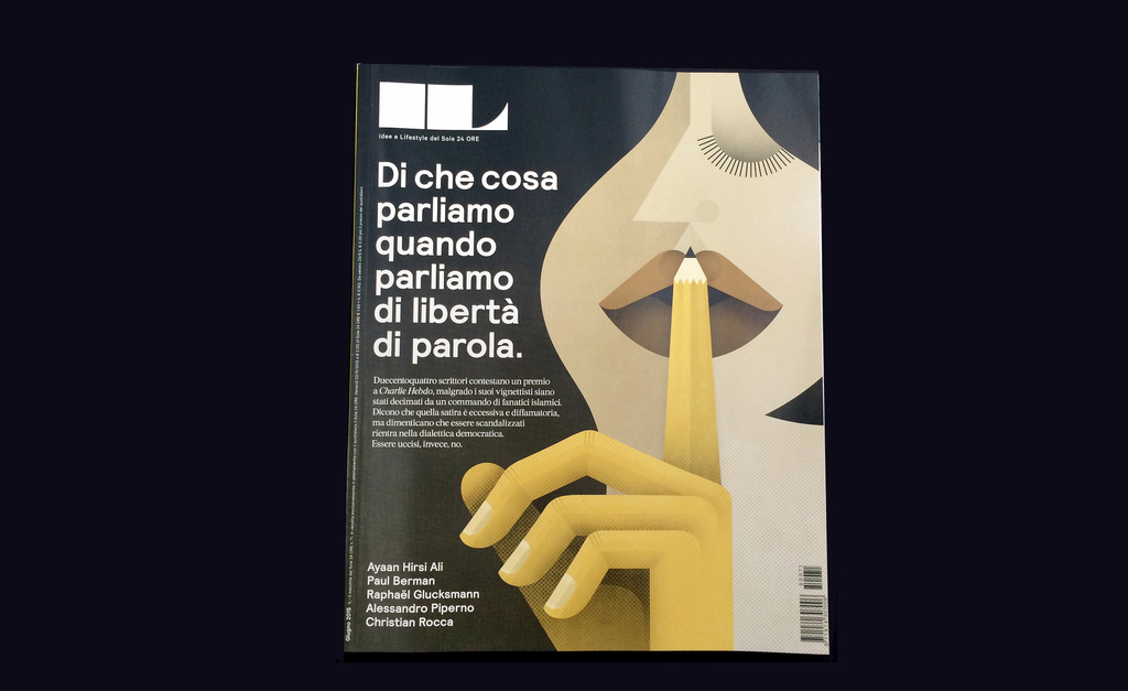
MAGAZINE COVER, DI CHE COSA PARLIAMO ANANDA PARLIAMO DI LIBERTÀ DI PAROLA (WHAT WE TALK ABOUT WHEN WE TALK ABOUT FREEDOM OF SPEECH), FROM IL, NO. 71, JUNE 2015
This magazine cover was designed by Francesco Franchi in June 2015 and the medium is offset lithograph. The piece was donated to the museum by Franchi. I quite enjoyed the use of geometric shapes and muted color palette. The piece bears a striking resemblance to prominent Art Deco artist A.M. Cassandre’s piece L’introns Power. (seen below)
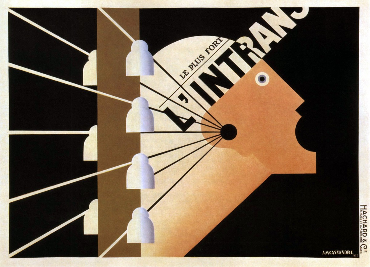
L’ Intrans Poster, 1925
My initial reaction was wondering if this was another piece to Cassandre’s collection but then noticed the date and knew it wasn’t. I remember learning about this piece from my summer history of graphic design class. This was my favorite piece by Cassandra and the one I chose to discuss for my essay question in my final exam. Since the piece reminded me of Cassandre’s work, I decided to talk about it in my blog.
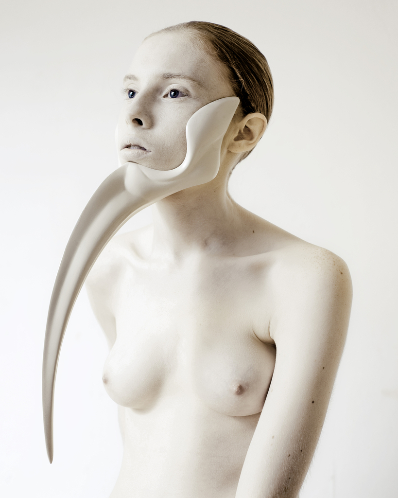
WEARABLE SCULPTURE, FROM ANIMAL: THE OTHER SIDE OF EVOLUTION SERIES, 2012
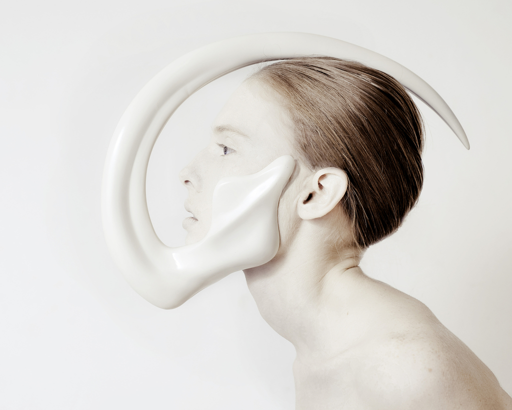
WEARABLE SCULPTURE, FROM ANIMAL: THE OTHER SIDE OF EVOLUTION SERIES, 2012
These two wearable sculptures are designed by Ana Rajcevic in 2012 and the medium is fiberglass, polyurethane and rubber. The piece is currently on loan to the museum from the designer. The pieces were in a set of three but these two are my favorites. I especially love the use of a nude model to represent the slim border between human and animal. This was one of my favorite pieces to observe and very visually striking. This was actually the second piece that caught me from the corner of my eye and once I turned my full attention to it, left me awe-struck. I had to stand and observe the sculpture set for quite a few moments to truly comprehend the beauty in them. Even further interesting is the resemblance the second sculpture has to one of my own illustrations for my Senior Project class. (seen below)
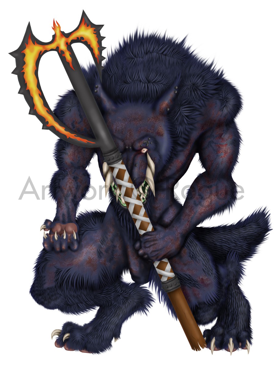
War, 2016.
This is one of my more noteworthy characters named War and he is a Calibanian Werewolf, a race of battle-ready werewolves that are shaped by the demons that possess them. One of their more prominent features is the large tusks that protrude from the top and bottom of their jaw, locking their mouths in a permanent snarl appearance. They have the ability to grow them to the point of the tusks curving around the top and bottom of the skull, similarly to the second sculpture by Rajcevic.
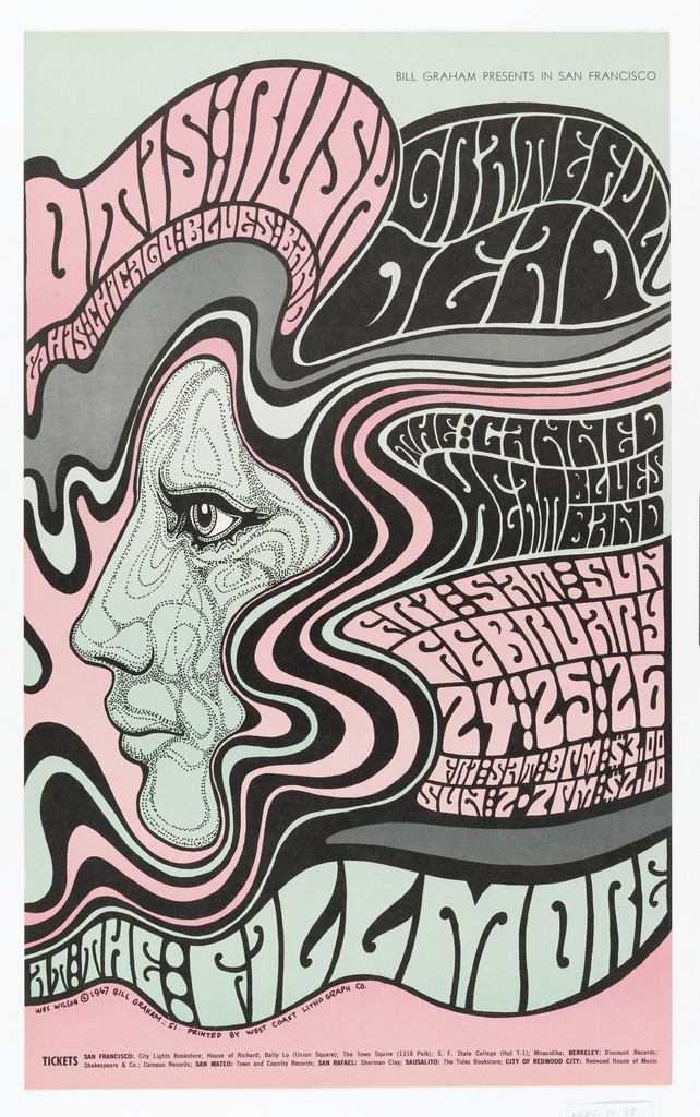
POSTER, OTIS RUSH, 1967
This piece was designed by Wes Wilson in 1967 in the medium of offset lithograph on white wove paper. The piece was given to the museum in 1979. It is part of a larger poster series designed for an Otis Rush, Grateful Dead and Canned Heat concert. The piece is a fine example of the psychedelic art movement seen in the 1960’s and 70’s with the hallucinagenic imagery and type. The font used is also one prominent during that time period. This is one of those designs where you have to observe it for a while to truly take in what the designer is trying to convey to you as the audience. I find the dark lines leading from the top and contouring the face to the bottom of the poster to be visually pleasing. It leads the viewers eyes to read the type from top left to right all the way to the bottom of the poster. Most psychedelic art contains color palettes that are the same hue in different colors, giving them the distorted and blurred effect that is common with these types of posters. However, this piece has more muted colors making it easier on the eyes for those of us who find it difficult to observe the blurry and dizzying effect these posters usually cause. A truly wonderful piece.
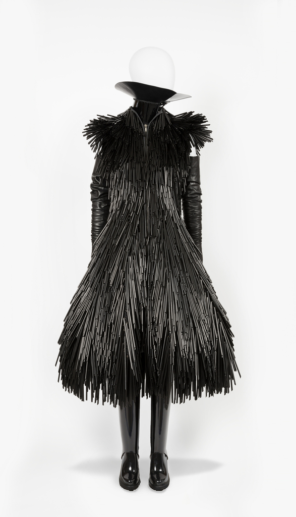
ENSEMBLE, FROM FALL / WINTER 2015 READY-TO-WEAR COLLECTION, 2014
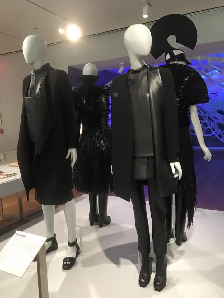
Complete set. You can see my favorite one in the middle/back of the picture.
This is an ensemble designed by Gareth Pugh in 2014 using the medium plastic drinking straws, patent leather, stretch leather and felted wool. This piece was, by far, the most visually striking one I observed while at the museum. I stood and observed this piece, along with the other three that this ensemble is a part of, for the longest out of any other exhibits I visited. Accompanied by the subtle and sexual glow of the black leather and striking rubber boots, the black straws give a wonderful texture to the piece. Even further, I adored the collar piece which gives the ensemble an aristocratic aura along with the initial fetish gothic sensation this piece emits. Needless to say, I would totally wear this to go dance at a goth club event.
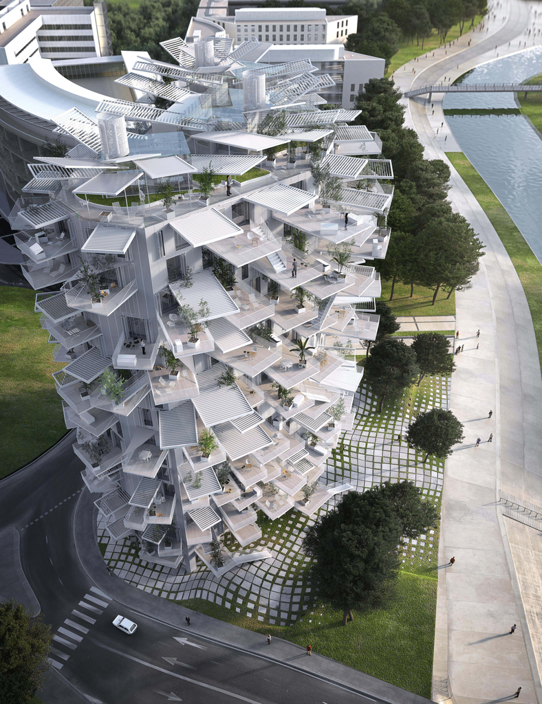
RENDERING, MONTPELLIER APARTMENT (L’ARBRE BLANC), 2014
This piece was designed by Sou Fujimoto Architects in 2014 in the medium of digital print. The building resembles a sci-fi pine cone. I’m not one to usually enjoy architecture but this one did catch my eye long enough to at least be mentioned in my blog. I do love the spiral stairs sensation the piece emits. When observing this with my friend Walker, I asked him a question, which I will ask you as well to see how long it takes you to find it. Do you see the dog somewhere in the building? Count how long it takes you to find it. I found it easily but only because I was starring at this piece so I could understand how it is even standing upright. A rather enjoyable piece to observe and try to understand indeed.
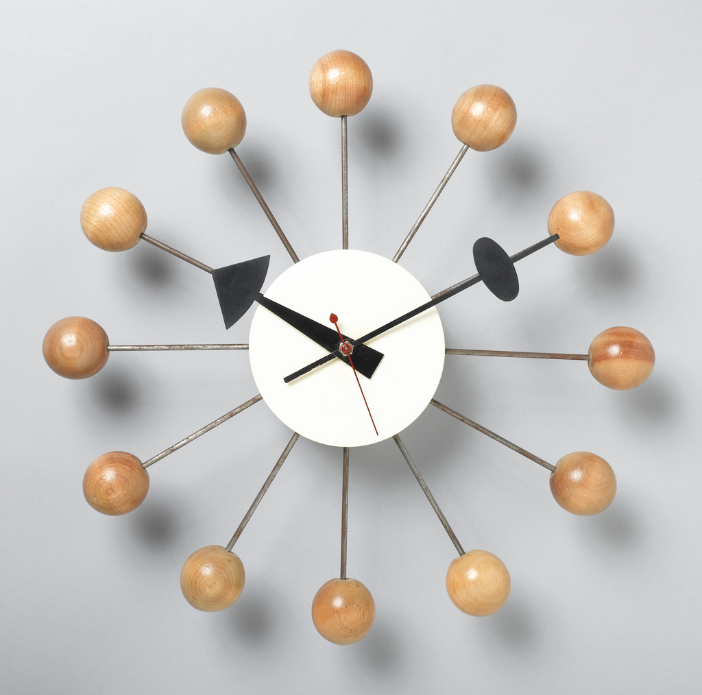
BALL WALL CLOCK, 1949
The final piece I will mention in my blog! This is a wall clock designed by George Nelson, manufactured by the Howard Miller Clock Company and Herman Miller Clock Company and firm: George Nelson and Associates in 1949 with the medium of assembled wood, painted wood, steel rods and sheet metal. The museum acquired the piece in 1991. The first enjoyable aspect of the piece is how it resembles an atom. I’ve always wanted a digital wall clock designed with the atomic era style but also with a playful twist to it, as this piece shows. The large hands of the clock protruding past the white sphere base is playful and fun. The wooden balls and large hands give this clock the feel as if it would be hanging in a children’s nursery during the 1950’s. A rather splendid piece to have!
Overall, my visit to the Cooper Hewitt museum was very enjoyable and I do plan on returning once again. I did observe the Pixar exhibit but seeing as this was the main part of the museum our class was to attend, I wanted to talk about other pieces found in the museum that may not have received as much attention as they deserved. The Pixar exhibit was fun and I loved watching the first animation of the iconic Pixar lamp.
When I do return to the Coper Hewitt museum, I will be sure to wear more comfortable shoes so I can easily win the next scan all the things competition I will force on any unlucky friends that decided to accompany me there. Ha ha.