This week we were asked to watch an online webinar from specific companies within our field and I chose to watch one about the company Monotype. The webinar mostly discussed the various uses for type and fonts as well as which are appropriate to use for different occasions, namely web use, where fonts are essential to the purpose of your text.
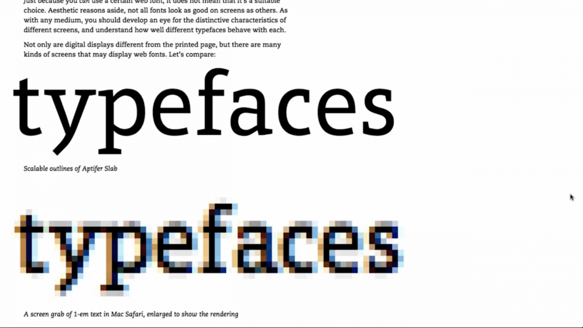
The discussion began with the outlines of fonts being rendered into a digital format for use. The representative Dan Rhatigan, showed the audience an example of the font Aptifer Slab and a blown up version of it in 1em.
Here we see some examples of the same section of text in the same font but using different devices and web browsers so we can observe the differences in screen renderings. (shown below)
Type and a blown up version of it to show the pixels needed for rendering.
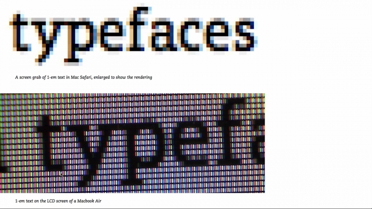
A look at the pixels on an LCD screen of a Mac Book Air.
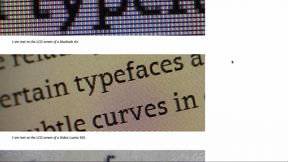
A look at the pixels on an LCD screen of a Nokie Lumia 920.
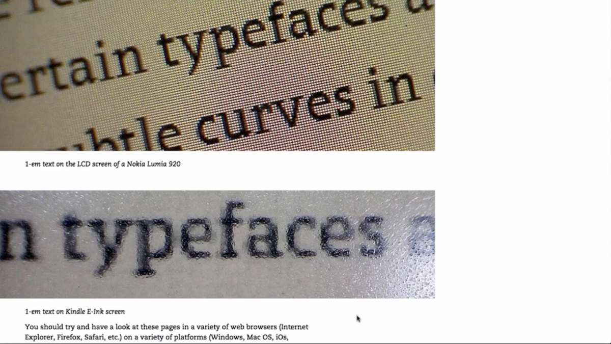
A look at the pixels on an LCD screen of a Kindle.
Now we began looking at the differences between fonts. Helvetica is much larger when compared to the more slender Garamond despite them being the same point size. These differences could be the most important aspect when choosing the font required for certain bodies of text. Using Garamond for large bodies of text with a smaller point size may give it a wonderful texture but will negatively affect the readability of the text. This is because the serifs in Garamond may distort the clarity of the text when used in small point sizes.This is not the case when using the much more solid and smooth sans serif Neue Helvetica. (shown below)
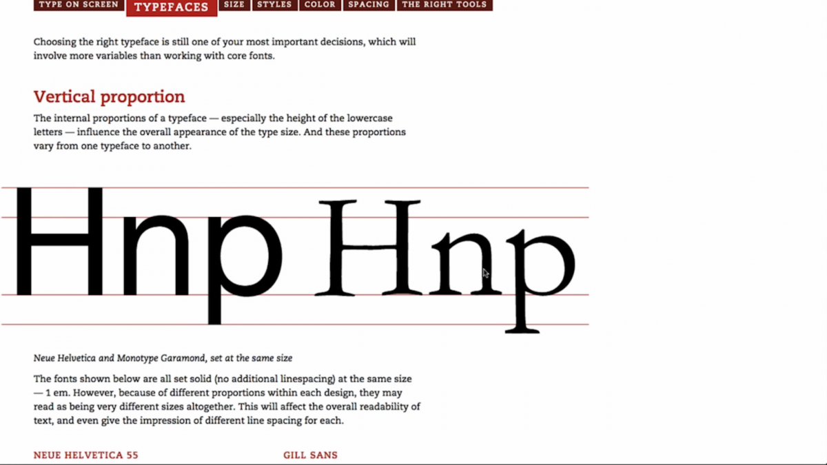
Proportion differences between Helvetica and Garamond.
We then moved on to discuss the differences between examples of text. Each body of text is set using different fonts but are each at the same point size and line height. You can see some of the fonts have rather obvious differences. Gill Sans and Helvetica look so much larger in comparison with the lighter contrast serif fonts. (shown below)
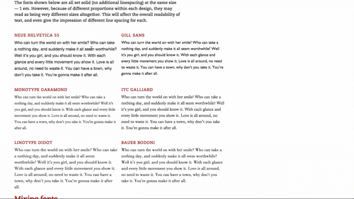
The differences between several font families.
Following the discussion of differences in appearances, we continued on to talk about mixing and matching fonts within the same body of text. An example shown was Neue Helvetica compared to Garamond italic; the point size seems to shrink drastically. The Helvetica text seems to engulf the seemingly smaller Garamond! Rhatigan then showed the same sample of text but enlarged the Garamond by .35em so the two fonts seemed to appear the same size despite the italicized Garamond being set much larger than the Neue Helvetica.
We then discussed various point sizes using, the font ITC Franklin, how the size affects the readability and what is the best font for online browsing.
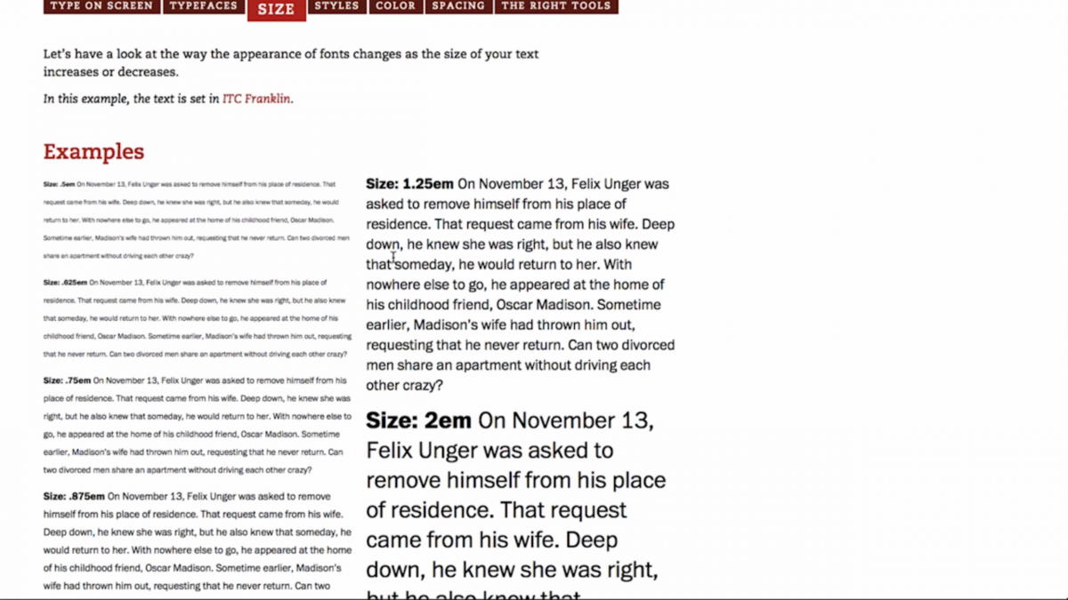
Examples of size readability of various fonts.
Rhatigan even said the no more than 2 fonts rule is not necessarily absolute so much as it is picking the correct fonts that compliment each other and make your text easy to read as well as fun. Size of the font will affect not only the readability but the flow of the other bodies of text on the screen. You can see this example when looking at the smaller .875em text and following it to the larger 2em text.
Larger fonts may not necessarily be more ideal over smaller ones as the smoothness of different fonts will affect the readability. For example, Optima and Garamond 3 have no straight lines and when used with a smaller point size, give the font’s curves the appearance of straight lines. When blown up to a larger size, you can see the subtle curves are present but the smoothness becomes more jagged. You can see this issue with the lowercase “p” in “Optima” and the top of the “m” in “Garamond.” There isn’t enough pixels to smoothly render the text without any jagged edges.

The smoothness of larger text that have no straight lines.
We moved on to discussing various styles within different font families. Here we see an example of the ITC Legacy font family. You have sans serif book, serif book, sans serif book italic, serif book italic, sans serif bold, serif bold, etc. When choosing a font family for web fonts, Rhatigan recommends especially paying attention to the font’s italicized style; the style tends to make the font appear more narrow and with a lighter color. The pixel grid requires more perfectly straight lines for ease in rendering, italicized fonts are usually completely slanted or have some degree of curvature so this results in the rendering of this style to be visually much more different than the book or regular styles from the same font family.
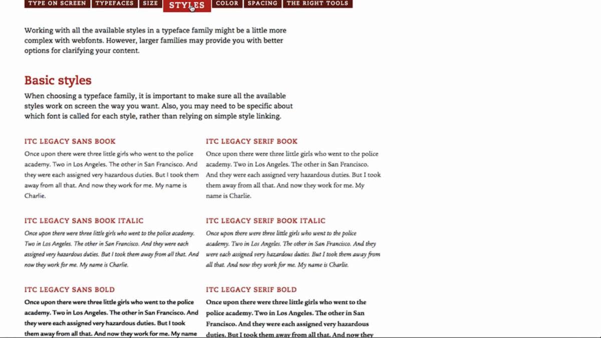
The differences in styles between various font families.
Similarly with serifed bold styled fonts; the serifs begin to merge with the thick black hands of the letter. It gives the letters a more chunky look and may affect the readability of certain bodies of text in different point sizes. The image is blown up so you can see the distortion present in the serifs of the font. (lower right on the image)
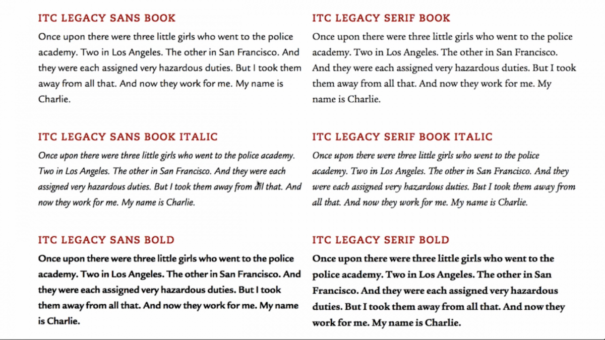
Chunky hands of serifed bold text.
We then continued on to discuss superfamilies, font families with large varieties of styles and weights. Some font weights are more clear when placed on a black background verses a traditionally white one. We see an example of this with the font Univers.

Univers font on black background compared to a traditionally white one.
We then moved on to discuss color. This topic seemed more of a no brainer for me but more novice designers may wish to take note that color can affect the readability of your text or may come off as inappropriate depending on the subject matter within the text. Optimal readability also depends on good contrast between the background and the text color. For example, black text on white background is much more readable than a gray or even a yellow color one. Not only are high contrasted colors easier to read but they allow the rendering of the fonts to be more clear as well. The example is using the font Malabri.

Color variations in text.
Here we see prime examples of the do’s and don’t’s when it comes to choosing colors for your text and background. The yellow background with white text is a complete eyesore. The grey example isn’t much better. Black text on white background is usually the best way to go. Red background with white text is also a good contrast, depending on the hue of the red of course.
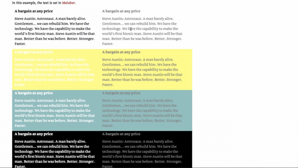
Prime examples of different contrasts in text and background colors.
In the black background with white text example, you also see the issue of the text “bleeding out” into the background because of the rendering attempting to strengthen the black in order to make it stand out more. It’s always good to test out the different colors before finalizing your overall color palette and even further, your entire web font designs.
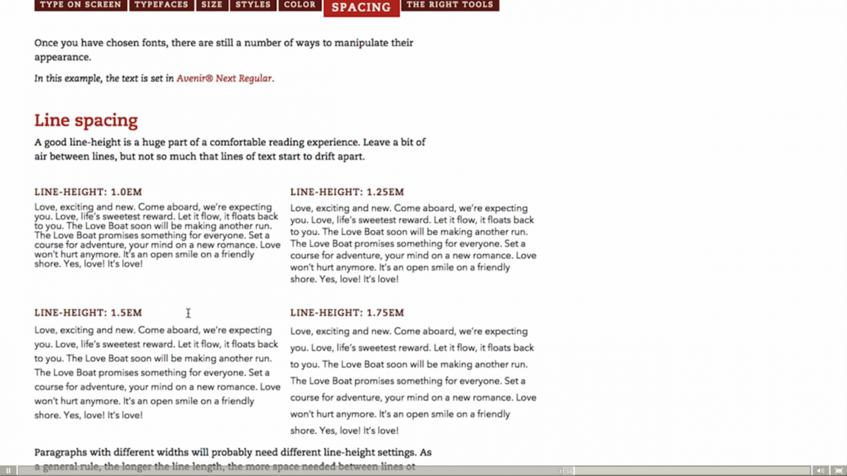
We now moved on to discuss the spacing between type and how it affects the clarity of the text. Avenir Next was used for the example based on the font’s large spacing between lines and individual letters. Larger counters between the lines of text help to guide the eye when reading but too much space gives the text the appearance of drifting off into space. Too little and the reader will get lost in this sort of sea of text! Properly spacing text is important!
Spaces within text.
Here we see an example of long line lengths and how that affects the appearance of the text. Pay attention to the length in your lines as some of the letters may overlap each other and can also affect the clarity of your text. A prime example of poorly spaced lines within text is the highlight sample. The “y” in “you” and the “f” in “for” are overlapping and the clarity of this paragraph is poor at best. Yes, you can still read it but for more picky audience members like me, you already lost my attention and I will not continue to read the eyesore you have put in front of me. It’s always best to test out line spaces in large bodies of text to ensure the readability isn’t negatively affected.
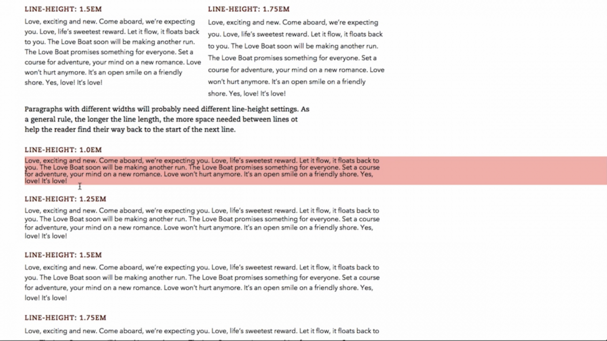
Line length changes the amount of line spacing needed!
Here we see examples of poor and properly spaced letters. Overlap can happen if you mess with the automatic letter spaces in text so it is always best to leave this alone. Too far apart and the letters look like they aren’t even a part of the same word or too little and you can barely read the text. You can see this in the “W” and “e” in “Welcome” in the bottom left example of 0em spacing. This amount of space looks just right but the bottom right example of .1em spacing shows the “e” slightly drifting away giving the “W” the appearance of not belonging to the same word. Adding anymore space in-between these two letters and the “W” will definitely drift away.

Letter spacing between individual letters can make or break your text!
Finally, we discussed how some companies are coming out with fonts specifically designed for web viewing. Monotype is a prime example of such companies releasing web specific fonts of preexisting fonts. These fonts are based off already existing print fonts but are easier to render and can also change in size. We can see that example with ITC Galliard and ITC Galliard eText. The red text is ITC Galliard while the grey text is ITC Galliard eText. The version made for web is notably larger than it’s preexisting relative.
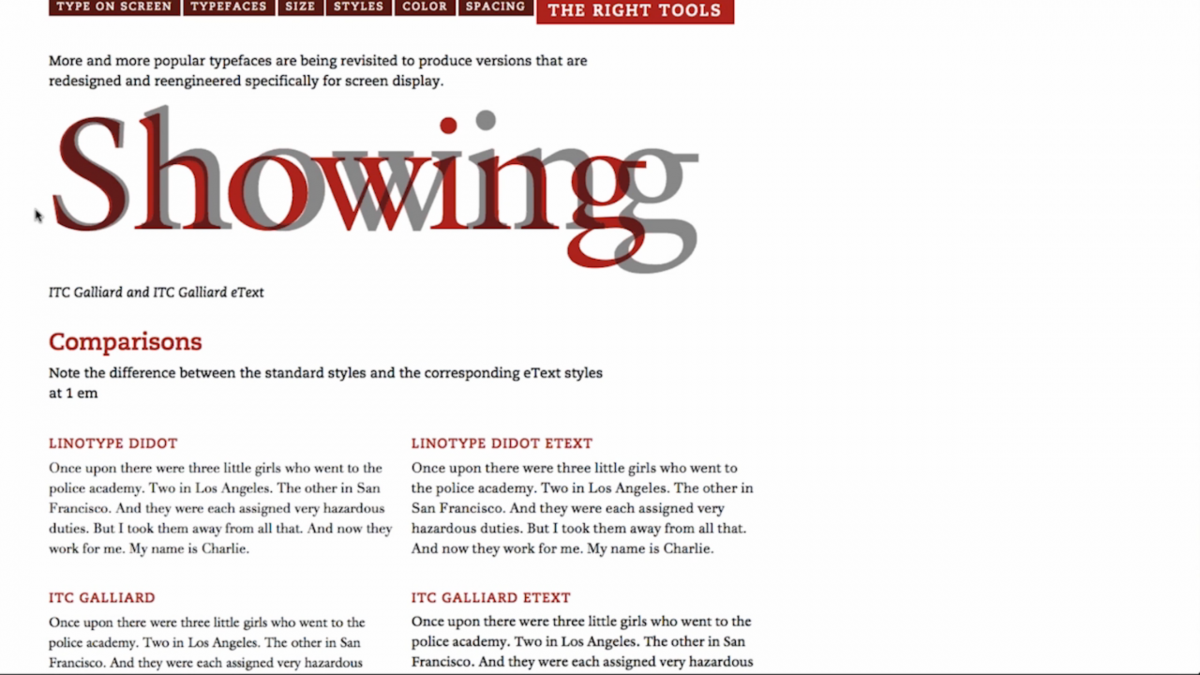
The differences with existing fonts verses eText fonts.
Larger eText versions of these fonts assist with the issue of contrast and poor rendering as they are specifically designed with these issues in mind to nullify them. We can see an example of this in the Didot example. Regular Didot on top of a black background appears blurred and the serifs are “bleeding out” while eText Didot is much more clear and readable.
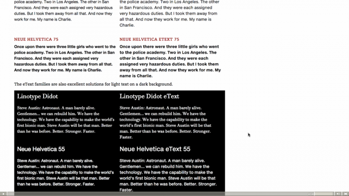
Readability in eText with contrasting colors.
Overall, the webinar was rather enjoyable, especially since the discussion of fonts and type was the entire topic of discussion. As a mostly 3D modeling and type/logo artist, type is always an interesting topic and of course an area I, as an artist, can improve on. It’s always good to retouch on these issues and of course to help new or novice designers as they begin their journey into this career path.

