City Limits Reflection

In the reading of Colson Whitehead’s “City Limits” we learn a lot about our own view of New York. We’re all New Yorkers when we see a building or area of New York and we can remember what has been there before. Everyone has their New York. In the second paragraph he talks about that and how everyone starts to build their own New York once they make memories from what they see or remember. He also goes on about telling us not to believe what we hear or read on TV, newspapers, etc that’s about New York’s history. He says it doesn’t matter in what our New York is. While reading this you might even feel really nostalgic over some of the things that it makes you think. We may have seen a store change to several different things over the years. He also explains that we never really get to say goodbye to those places that we go to because we never know when it’s the last time we will be there.

Towards the last few paragraphs he talks more about as being a New Yorker, we can remember the past and see changes. But he also explains that no matter what New York will constantly be changing, with or without us. We can eventually see an entirely new city compared to what’s been there in the past. However, that will always be our New York.

Aural Topographies: Research

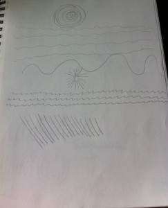
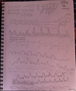
First I chose a song that has variety. Within the song the sound goes from calm to more upbeat a lot. It’s back and fourth, so it was a good song to choose for a variety. The song starts off with calm strums of the guitar for the first few seconds. It then goes into a repetitive beat also with the strums of the guitar but more upbeat. It gets more and more upbeat and then breaks down into a calm stage again. For the main chorus of the song there’s a much different sound than of just the guitar so it changes a lot. It then goes into a very calm beat for the middle of the song and quickly picks up into a completely different upbeat pattern, then quickly into the beat for the main chorus. At the end of the song it’s the main upbeat sound and then it quickly ends on a very light note. This song as I sad goes back and fourth from calm and sad to upbeat and happy which is why it was a good choice for a variety song.

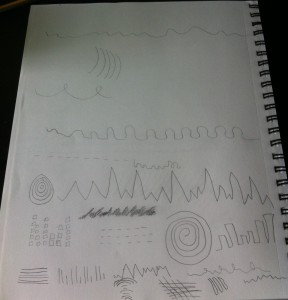
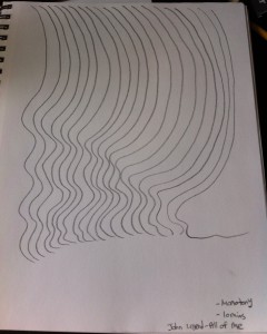
For the monotone song I chose a sad song that uses the piano. The beginning of the song is pretty much keys of around the same pitch quickly being played. The beat then goes into a slower beat. Throughout the entire song the beat is pretty much in the same slow beat. I hear a repetitive pattern  throughout the song.  There isn’t really any space in between the beat/the keys throughout the song which is why all of the lines are so close together. There isn’t much of a separation in the sound. The beat continuously gets slower towards the end of the song. That’s why in my picture you can see that there are less curves as it goes from left to right.

The song I used for the variety sketch is here: http://youtu.be/otSSixltNZ4

The song for the monotony sketch: http://youtu.be/Mk7-GRWq7wA

Variety Sketch

Monotony Sketch


Field Trip Reflection

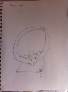
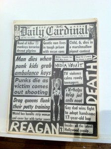
The field trip to the Center for Book Arts was very interesting and fun! I learned a lot about printing. From how it began to how it evolved and is what it is today. I found it really interesting how back then people had to get the letters one by one to create something to print. Looking at today’s technology there’s a lot less of a struggle for an issue or to get it done in general. If there was a typo back then you would have to do a lot of work to get that one letter out and replace it. Now it’s just simply an one second task with the keyboard. The zines exhibit was also very interesting. There were a lot of pieces that stuck out to me. One of my favorites was this fake newspaper with interesting headlines. It was called Daily Cardinal. I wouldn’t believe what I’m reading if I actually saw some of those headlines in the newspaper! It also did have articles on the headlines that were on the cover. On the second part of the field trip to the Rubin Museum I found all of the works of art that I saw to be very cool. The ones that I sort of got the meaning behind were very interesting pieces. I chose to sketch the piece called Hunger. It’s a picture of a man eating a snake while at the same time the snake is eating its own body. From what I read in the description of the piece the snakes body seems to be never ending while the man is eating it. Francesco Clemente also symbolizes Eastern and Western traditions in his piece. Both parts of the field trip were very fun and I can’t wait for future trips!

My sketch of the piece I  chose from the Francesco Clemente exhibit
My sketch of the piece I chose from the Francesco Clemente exhibit
The newspaper I saw at the Center for Book Arts

Project #1: Reflection

In project #1 I wrote a bio about myself. Mostly about me as a student and what inspires me to do what I do. I talked about my interests and such. By working on this project I learned a lot about what I need to work on in my writing. I also learned that organizing your essay before you write it is very helpful. My bio probably would have ended up as being all over the place if there wasn’t an outline for it. I’m most proud of the details I included even though it could still use a little bit more details. As for any other improvements I really want to improve on my use of vocabulary in my work. What was helpful during this project was the feedback from my peers. It really helped me to get the final piece done. If I didn’t have any feedback my work wouldn’t have improved very much from the draft to the final piece. I wish I had spent some more time on this project. What I spent the most time doing was thinking of what details to include into each paragraph and figuring out if it belonged there or made sense. I definitely need to work on time management though. I’m hoping for future projects I can put more time into them and have a great outcome!

Project #1: Introducing Yourself

Hello! My name is Priya Maharban and I am 18 years old. I am a freshman at City Tech. My current major is Communication Design because I would like to pursue a career in graphic design. However, that’s not my only interest. I also have an interest in video production. I love to shoot, edit, and produce videos all on my own! I like to make comedy videos such as mini skits. It’s been a hobby of mine since I was 11 years old! I’m also a video game lover. I’m mostly a fan of Nintendo games. Pokemon is my favorite video game franchise. The only other time I play a non Nintendo game is probably when I’m playing PC games on Steam. My favorite video game genres are pretty much RPG and adventure! My favorite video game for years has been Sonic Adventure 2 Battle. I know it’s a little weird that Sonic isn’t fully Nintendo and not Pokemon at all. I guess that just describes a little of my quirkiness! I’ve been playing video games ever since I was a child. They’ve began to inspire me as I grew up and helped me with what I would like to do in the future. A lot of my drawings are usually inspired by games.


My avatar is a picture of a Pokemon. It is my favorite Pokemon which is called “Ampharos”. It is also a fan made drawing that I found on Deviant Art. I love to see other peoples drawings, it inspires me to see those too. Especially if they have to do video video game characters or cartoon characters. The avatar also does give off a cute feeling to it because of the way the artist drew it. It really shows my love for art. Most people would probably see my icon as an anime of video game character, which is the sense that I am going for.


I can see my avatar being misinterpreted in many ways. For a start, there might be someone who’s completely lost as to what my avatar even is. They might not recognize it as a video game character at all. They might not even get a sense of it being something about video games, anime, or even cartoons. Someone could think it’s just a random picture that I found on the internet and know nothing about. I guess there could me a misconception if they only get the thought that I like anime or cartoons from it, since it is beyond that. The background of my avatar is pretty dark and nothing to bright or happy. The person could get the completely wrong idea about my personality by looking at the colors in the background. It doesn’t really have anything to do with the meaning of why I chose the avatar though. I just like the way the artist chose to design it, that’s why I still chose it as my avatar.


The purpose of my avatar is to hopefully show the viewer that I am a Pokemon fan. I know that not everyone would guess that. As long as someone can get a sense of video games, anime, or cartoons then that’s good enough comparing to who I am. For people who do recognize  the character in my avatar I hope that they would probably think that I’m a video game and Pokemon lover. Video games and Pokemon inspire me to draw different characters, which is why it’s an important avatar for me and for others to see. I also hope that the viewer would notice that it is a fan made drawing. It shows that I like other peoples drawings and I myself am an artist. In the future my e-portfolio could convey some of my drawings which are inspired most likely by me playing video games. It’s pretty much a circle of me playing or seeing a game, getting an idea about a drawing, and then drawing out that idea!
View From My Window: Assessment

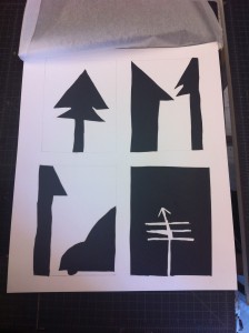
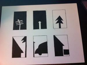
After completing the first project for ADV1100 I’m more excited for future projects. This first project was very interesting. The hardest part was honestly making the outlines for the boxes for both the inked thumbnails and the cut outs. Next to that would be cutting with the x acto knife. If I could go back I would probably use scissors more than I did the x acto knife just to make my work a little neater. Seeing the process of the entire project was really interesting to me. To see how not only my work, but how the entire class went from sketches to eliminating those into 6 inked thumbnails. Then eliminating 2 of the inked thumbnails into 4 big paper cut outs. Seeing the process on everyone e-portfolio’s was cool. The critique in class went very well. I like how much feedback each classmate gave to their peers. All of the feedback could be used to keep in mind to help for future projects. I learned a lot about ambiguous and stable figures which I know will be very helpful in the future. Overall I probably spent about 5 hours on the project in total. The sketches in the very beginning took about 30 minutes. Making the outline for the inked thumbnails took an hour! It got a little annoying to get the outline right but it was definitely worth it! The drawing and inking took me about another hour. After that making the outline for the paper cut outs once again took an hour, I guess I still wasn’t used to it! Then drawing, cutting, and gluing the papers took about an hour and a half. It was really worth it to spend this much time on the project though. The more time the better it might turn out to be too! This project was very fun and interesting and I’m excited for the future projects!

A City Tech OpenLab ePortfolio