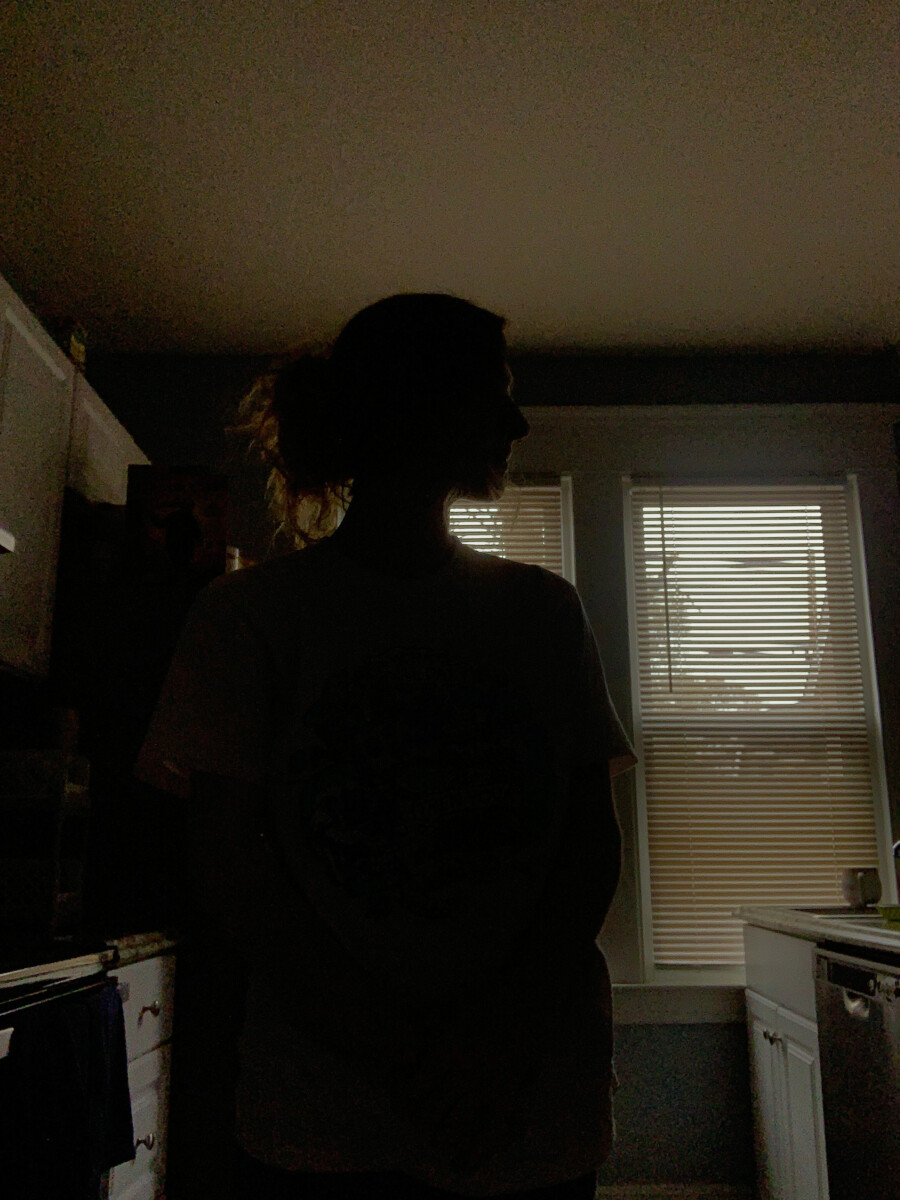
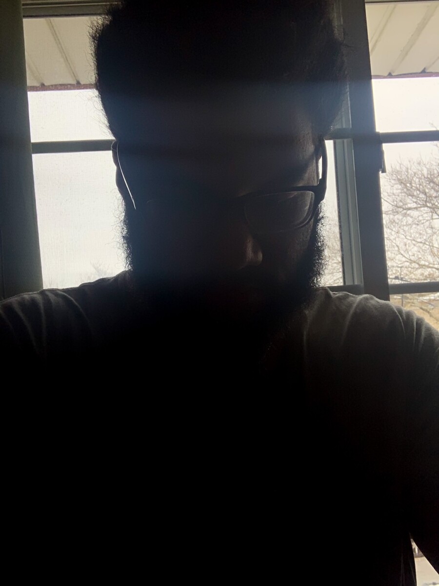
For both photos I had to bring the exposure down a decent amount before taking the photo and had to do it a bit more when editing. I had to darken the images with contrast, shadows, and blacks to be able to get a more solid silhouette.
Prof K Pelka : Monday 6:00 - 9:20
For both photos I had to bring the exposure down a decent amount before taking the photo and had to do it a bit more when editing. I had to darken the images with contrast, shadows, and blacks to be able to get a more solid silhouette.
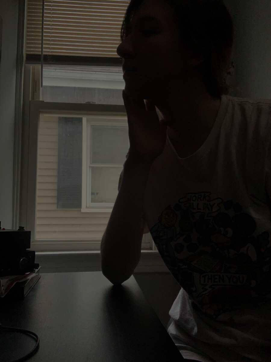
My process was to strike various poses in front of the window, making sure I was as dark as possible, so no features were highlighted. I wanted to just get a black figure with no prominence elsewhere. To get a clean silhouette, I made the blacks all the way dark in lightroom and straightened the photos a bit. The following photos are what I deemed as best two.
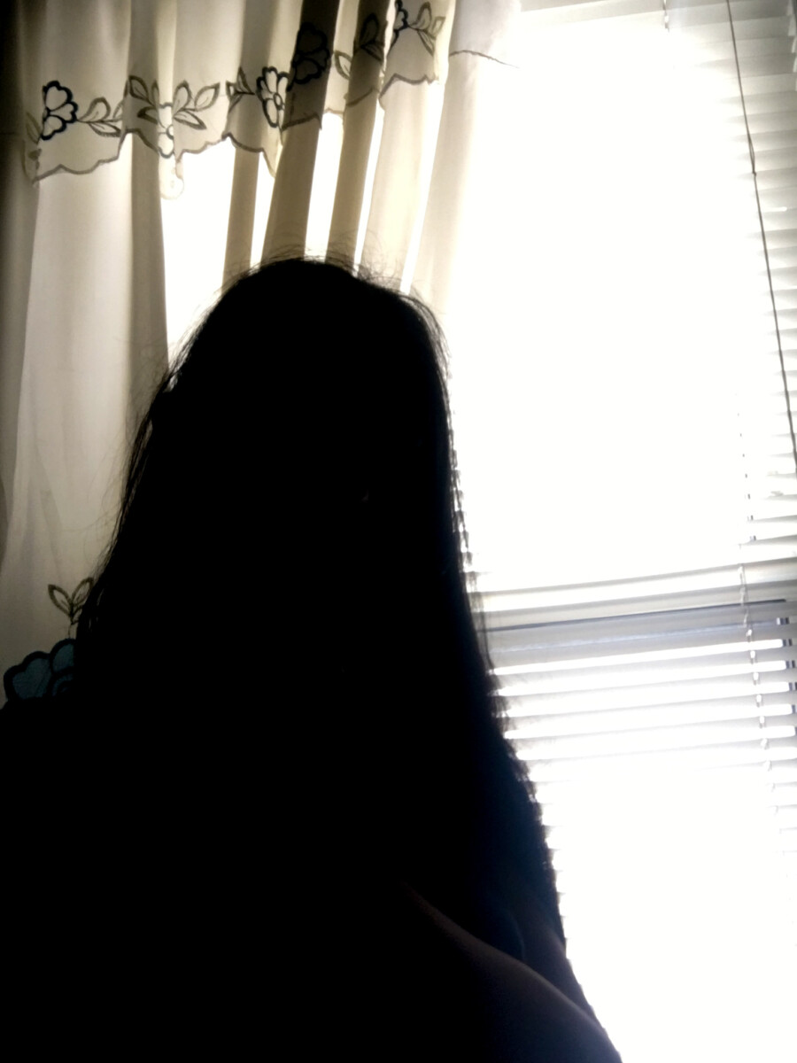
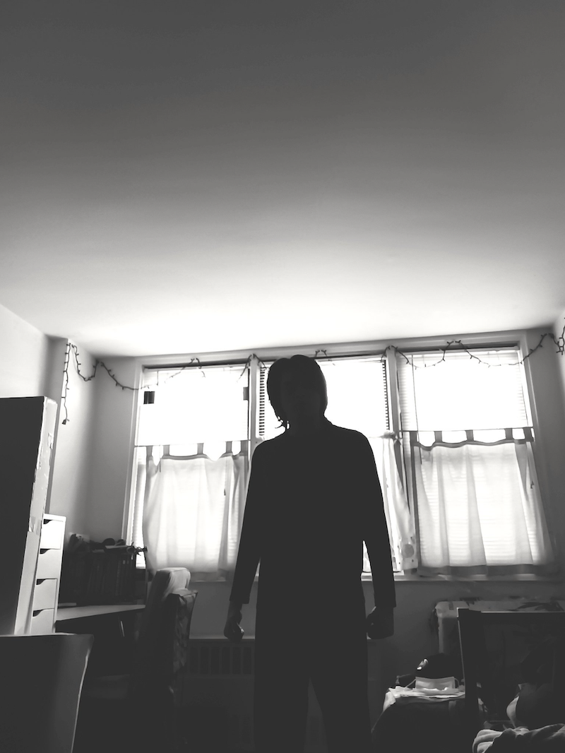
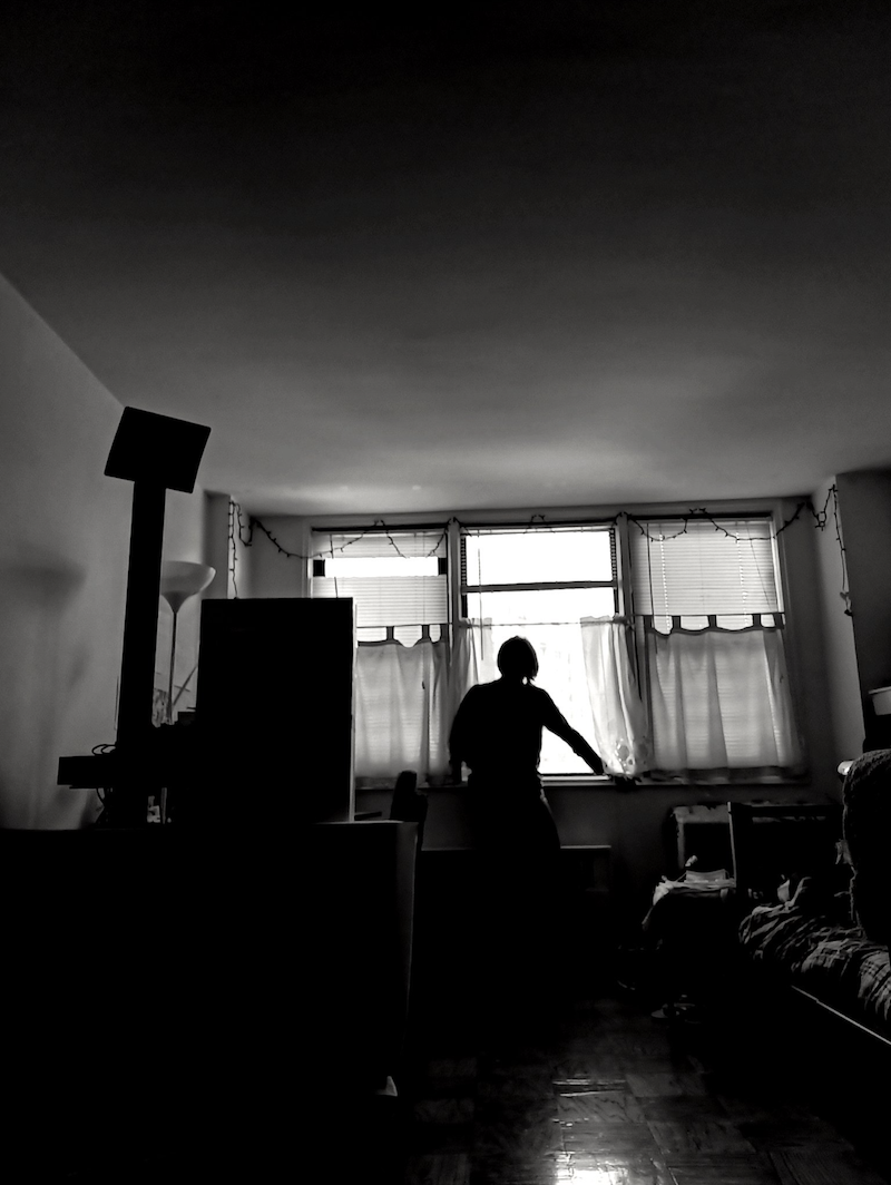
To get a clean silhouette, I first decided that I want this new album to be in black and white since I feel that the lack of colors would help my lighting and shadings pop out more. In lightroom, I just messed around with the adjustments, trying to find what work and didn’t work for me. I mainly wanted to show some details from out the window, but ultimately I wanted to also darken (or hide) the objects/furniture inside my apartment so that my body silhouette would stand out.
On flickr, my album may consist of photos that look like ordinary black and white photos with very little lighting adjustments but that’s mainly because it was on a very bright day and I didn’t want the pictures to look to dark or over-exposed.
I think creating a silhouette was a bit difficult sometimes it’s not dark enough so I just use Lightroom and made the black and shadow darker I also decrease the exposure a bit and made the contrast higher.
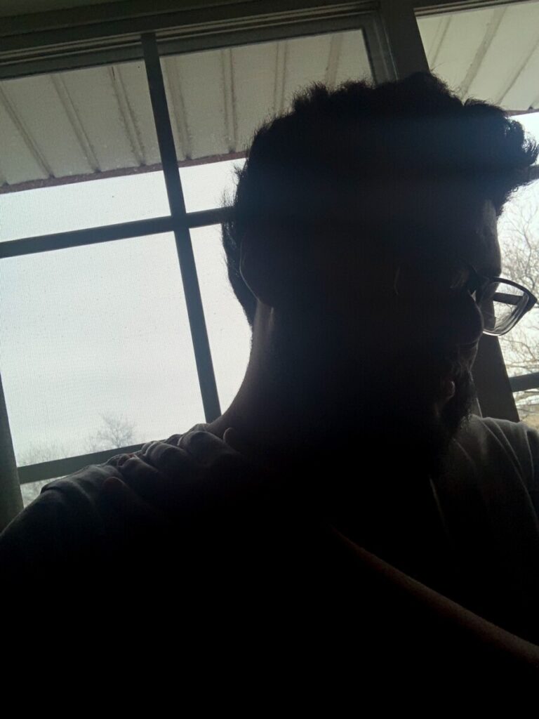
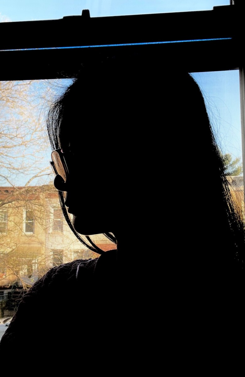
1: For image 1 I made sure that the light was of course behind me and the light was not to distracting, and making sure the background is not to distracting as well, but I made sure the darks were there and really dark so it could make a clean silhouette.
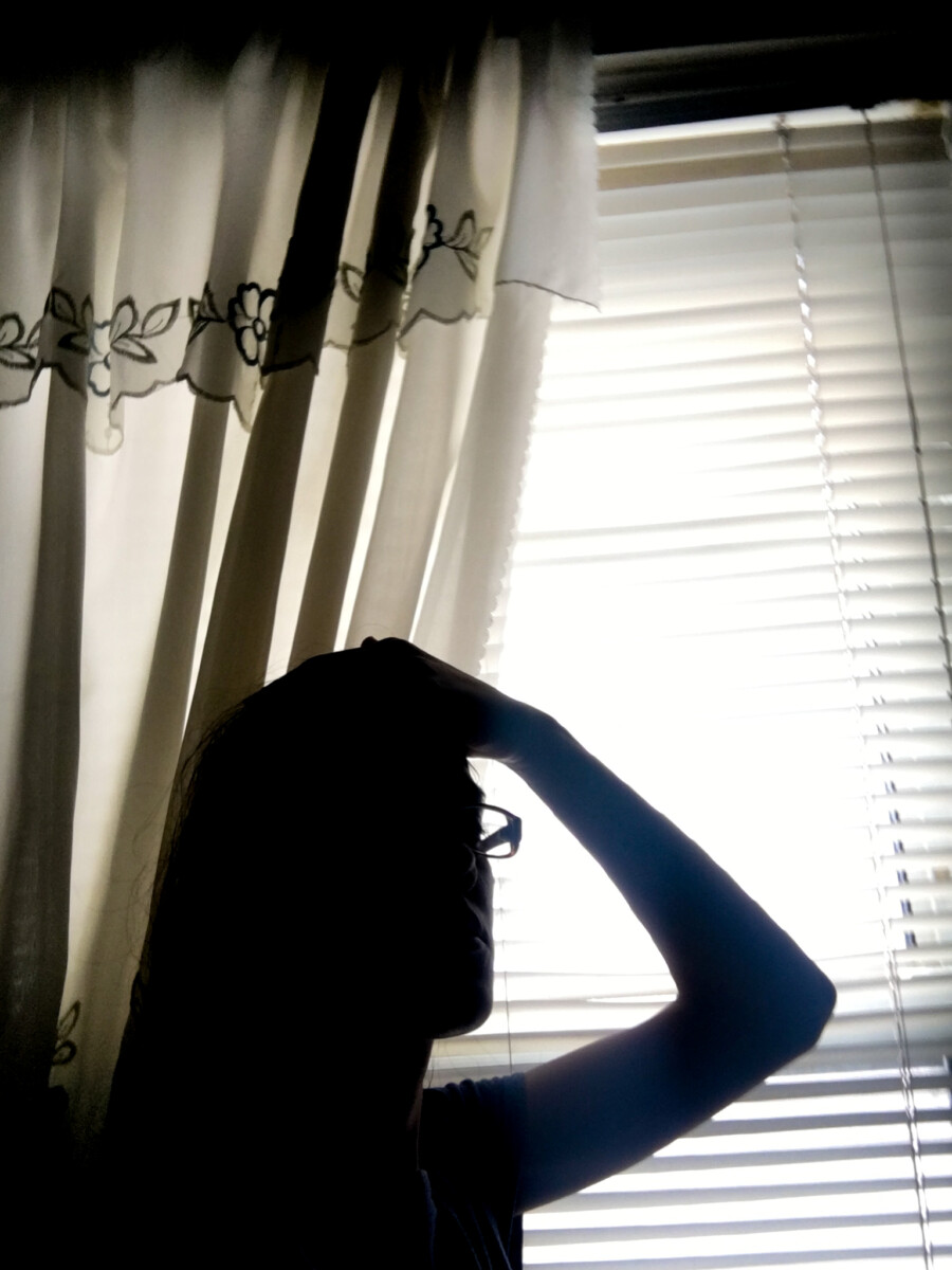
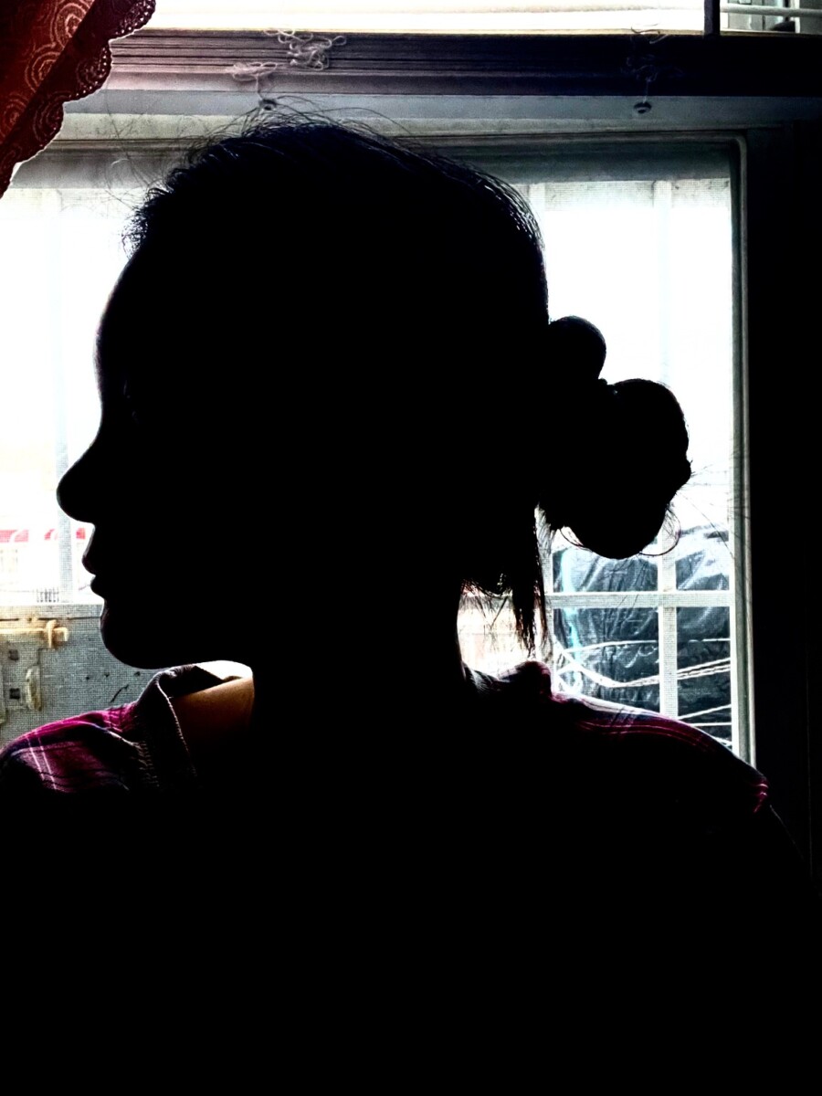
2: For the second image I did pretty much the same thing that I did for the first image, but this one has a different pose and you get a little more out of the background especially with more of the tree coming through which I thought was good and not too distracting to the image as a whole.

© 2024 COMD 1340 OL 90 Photography 1 Spring 2022
Theme by Anders Noren — Up ↑
The OpenLab is an open-source, digital platform designed to support teaching and learning at City Tech (New York City College of Technology), and to promote student and faculty engagement in the intellectual and social life of the college community.


Recent Comments