Prof K Pelka : Monday 6:00 - 9:20

Category: Discussions (Page 1 of 13)

Final Project Critique

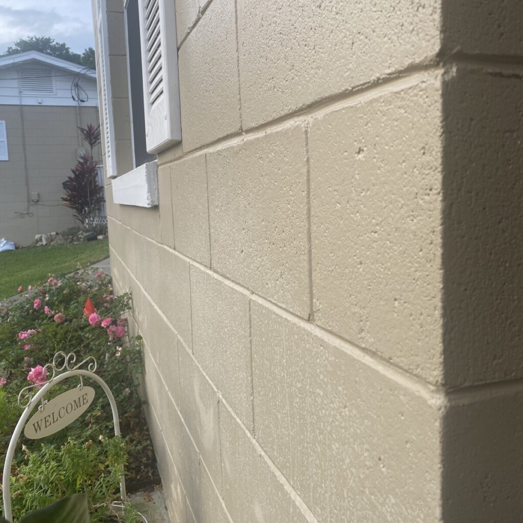
The first photograph by Bonnie is a black and white composition with tons of values and contrast. I really like how the fingers are elongated which creates a neat distortion. I noticed with the negative space and shadows, this creates a frame within a frame and gives off an abstract feel. In addition, the foreground not only has different textures, but the synchronicity of the lines and values really makes this photograph stand out.

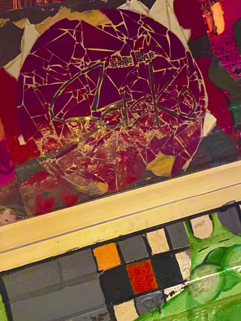
The second photograph by Damuel really caught my gaze due to the vibrant colors and shapes. I really like how this photo is balanced because the magenta color on top is strong with the added fractal bits in comparison to the muted colors in the bottom with the squares. The angle is also interesting and seems like it’s an obtuse angle.

Discussion 6

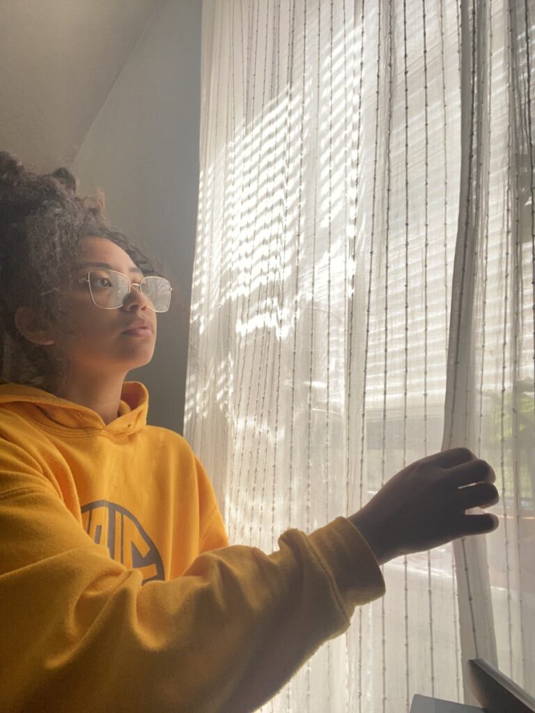
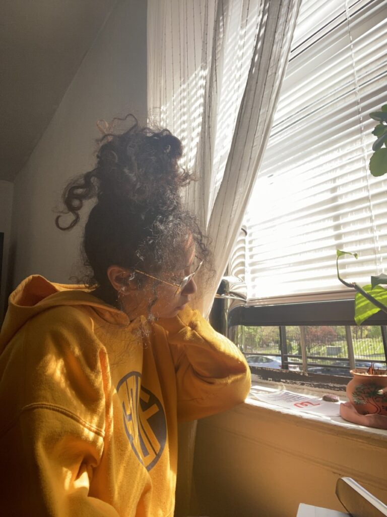
I chose these two because I like how soft the lighting looks in the first photo. The curtain softens the light and makes everything blend well together. The second photo is more sharp and I like how the light highlights different parts of my hoodie. The pop of green from my plant is pretty to the eye too.

Discussion 6 – Jeeniya Dewan

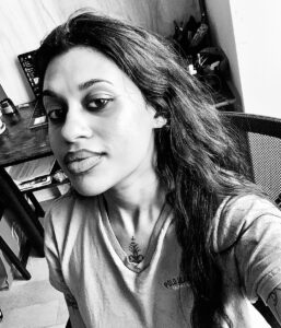
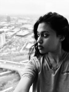
I chose these two photographs because I was content with overall composition showcasing the relationship of light and shadows. The top photo shows the light hitting the side of the face that is closest to the window. The light is casted 3/4 of the face with a slightly exposed ear, making this photograph an example of broad light. I really like the contrast between light and shadows, especially in black and white filter. The second photo contradicts the first photo because the light falls on the face where the ear is not visible. This would be an example of short light. The background creates an interesting effect to the photo, and we can see the way the light is hitting on only a few areas on the face.

« Older posts