Prof K Pelka : Monday 6:00 - 9:20

Category: Final project critique (Page 1 of 2)

Final Literary Critique

I really liked this image of Bonnie’s because it is a great example of frame within a frame, and the contrast the mostly solid forms with the silky lace texture really stood out to me. The shadows really played well into the overall composition of the photo!

I chose this photo of Noah’s because as a fellow appreciator of nature this photo really stood out to me with the exotic subject matter. The striking, vivid colors really stood out against the blurred background, and the subject matter was captured so well i can see all the tiny fine details so well.
Final Critique

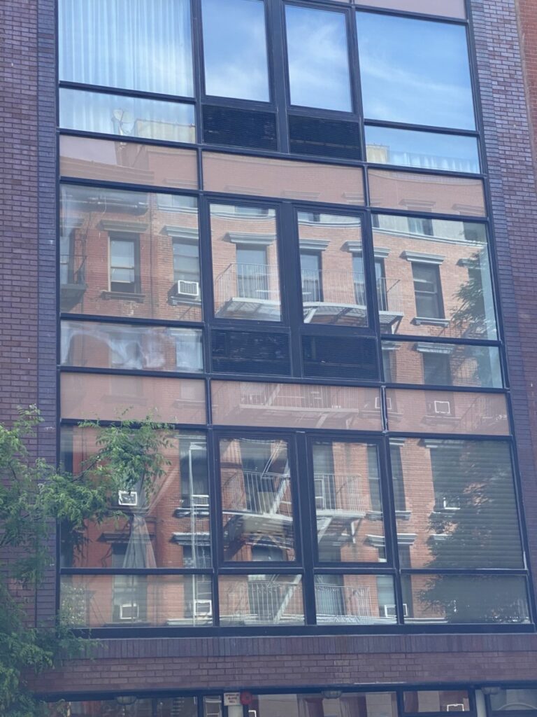
  1. This Dameul did perfect a medium shot. I love that he took a picture of a window that shows the reflection of a building from the sunlight. It also shows multiple square patterns.
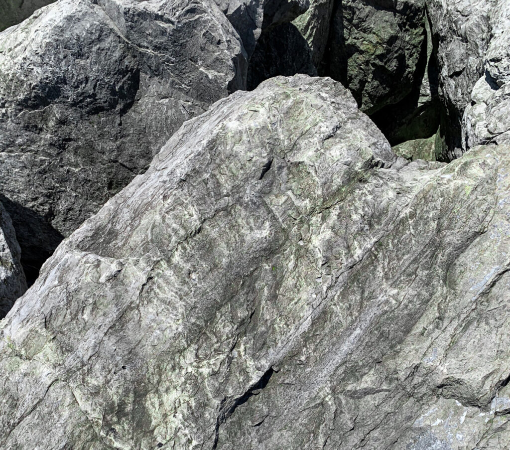
  2. Noah’s close-up photo has high contrast that shows a bit of shadow. The most intriguing part of the photo is that it looks as if a direct light was used and the rock had some cool patterns and textures.

Final Project Critique

The first photograph by Bonnie is a black and white composition with tons of values and contrast. I really like how the fingers are elongated which creates a neat distortion. I noticed with the negative space and shadows, this creates a frame within a frame and gives off an abstract feel. In addition, the foreground not only has different textures, but the synchronicity of the lines and values really makes this photograph stand out.

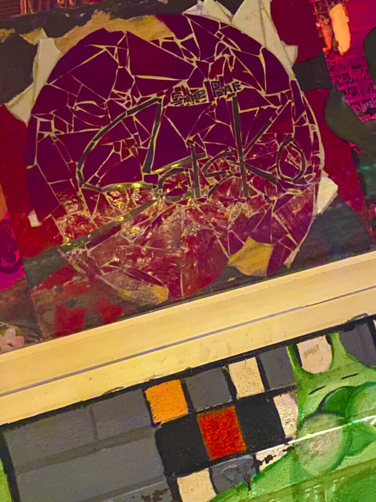
The second photograph by Damuel really caught my gaze due to the vibrant colors and shapes. I really like how this photo is balanced because the magenta color on top is strong with the added fractal bits in comparison to the muted colors in the bottom with the squares. The angle is also interesting and seems like it’s an obtuse angle.

Avar’s Final Critique


Cassidy

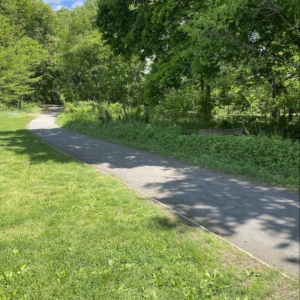
In Cassidy’s picture I can make out leading lines because I can see the path in the park lead to a certain point in the background. I think the shadows of the trees also make for a good pattern look.

Tyler Zech

In Tyler’s picture, I can see a long shot because I can see that his landscape is very broad. You really see a lot of the buildings in this one urban area. I think framing was also use to add some juxtaposition between the buildings.

Final critique

Tyler’s photo

In Tyler’s photo he uses low angle to take the picture of the buildings. It seems to be a cloudy day when the photo was taken so it’s a diffused light. The use of leading lines makes my eyes move around the photo and the reflection of the building adds to the picture.

Olivia’s photo

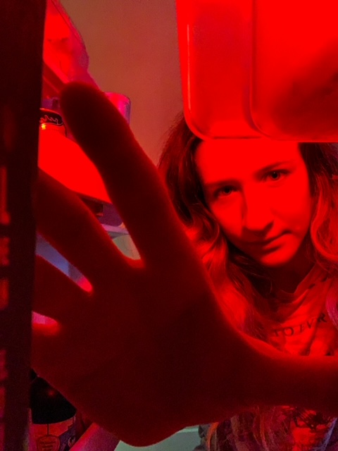
In Olivia’s photo, the refrigerator and her hand frame her face. I think it’s taken at a low angle. The rule of thirds also applies to this photo, her face is slight to the upper right. There is low contrast between the shadows and the light on her face. In addition, the red light set a horror mood in the picture.

« Older posts