Prof K Pelka : Monday 6:00 - 9:20

Category: Essay

Dorothea Lange

“Bad as it is, the world is potentially full of good photographs. But to be good, photographs have to be full of the world.” -Dorothea Lange and Daniel Dixon

Dorothea Lange was a brilliant documentary photographer who was born in Hoboken, New Jersey in May of 1895. She passed away in October of 1965 at the age of 70 in San Francisco, California but her work continues to live on. Lange became a major influence thanks to her photos during the Great Depression of homeless men and displaced migrant workers. She is famously known for her photo Migrant Mother in California in 1936.

I chose Dorothea Lange because of her importance in documenting the Great Depression, it changed how people saw the poor and displaced, not just in the 1930s but today as well. Lange showed how documentation through photography is still a form of art. An art form that can show the truth of the world in that specific time and place. This is why I am including the quote from Lange and Daniel Dixon, it represents her photos and photography as a whole. I believe that Dorothea Lange changed the world of documentary photography and is a great influence on the new world of photographers.

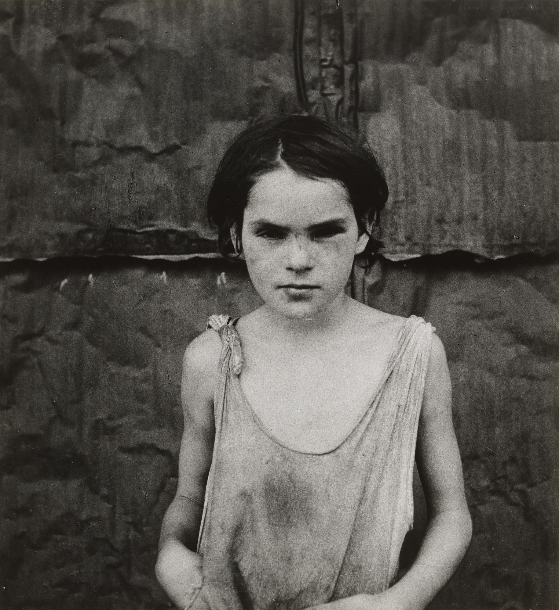
The photograph I have chosen by Dorothea Lange is Damaged Child, 1936. It was taken in Shacktown, Elm Grove, Oklahoma. The photo is of a young girl in distressed clothing, her eyes are very dark from the shadows and she seems to have dirt on her face, body, and clothes. The background looks to be the inside of a shack she is most likely living in. What strikes me most about this photo is the eyes of the girl being so dark, it makes you wonder what about her is “damaged” so much that Lange would title the photo as Damaged Child. I believe Lange is trying to show that even the children of migrant workers were hit hard by the change of the Great Depression. Lange uses framing, lighting, and use of line to move the eye to express the meaning of the photograph. She frames the child in the center so she is the main subject and what you focus on when looking at the photo. Lighting is used to express the damage in the child’s eyes, the heavy shadows also show how thin and frail she is, as well as dirty. Lastly, the use of line to move the eye is in the background, showing the pieces of the shack and how it was put together, giving the audience an idea of how the child’s living conditions were.
https://www.moma.org/media/W1siZiIsIjIwMTc2MiJdLFsicCIsImNvbnZlcnQiLCItcXVhbGl0eSA5MCAtcmVzaXplIDIwMDB4MjAwMFx1MDAzZSJdXQ.jpg?sha=38a0d25730f493a2

Essay On Photographer

Vivian Maier

Vivian Maier was born February 1, 1926 and was an American street photographer whose work was discovered and recognized after her death. During her lifetime, her photographs were unknown and unpublished. Vivian’s photographs were published on the internet in July 2008 but her photographs didn’t attract much attention. That was until October of 2009 when Maloof linked his blog to a selection of Maier’s photographs on a website Flickr, making Maier’s work go viral. Since then. Maier’s photographs kept gaining a lot of attention and have been exhibited around the world.

Self Portrait by Vivian Maier

In this photograph, Vivian is seen capturing herself as well as others. She tends to do that with a lot of her photographs. Which could be called self portraits but she includes other elements in those photographs such as other people, mirrors, anything with a reflection so she can also capture herself in those photographs. What I find interesting about the photo is that since it looks like she’s taking a picture of herself, the other people in the photo don’t question if they’re being photographed or not. Vivian found a way to photograph others without having to directly point the camera at the them. She can photograph their reflection. What I relate to in this picture is that I also prefer to take pictures of myself through a mirror instead of having a camera directly pointed at me. I feel there’s attention on me which I like. I think that what the photographer is trying to show is that you can be as creative as you can with photography as long as you’re being true to you and your work. You can still connect this photo to all of Vivian’s other photographs. Not just because she’s shown in her own photo but because it’s still her style of photographs. It looks like the photo is going on and on because of the reflection reflecting on another mirror that was behind her. It looks endless. Sort of like a frame inside a frame. it repeats itself in a way without including Vivian since she’s blocking her reflection.

Essay on Photographer

 Aaron Siskind

There’s many great Photographers out in the world, some that have many elements that showcase what they love in their own photos and how you know it’s their photos as well. When it comes to Aaron Siskind his photos are very different from the average landscape or self portrait photos that most photographers take because his style is more in the world of abstract art where he uses lots of Black and White to his advantage and close ups of different textures and sometimes people as well. It’s almost like a void of darkness and light mixed into one and we will explore it further as we look into his art and about him as well. 

Aaron Siskind, born in New York City in 1903 was a photographer that had a very keen eye in what he took in his photography. Aaron at first was a school English teacher after he graduated from the City College of New York in 1926, but from here he became interested in photography which would lead him down a path of becoming pretty well known in the photography world in 1903. Around 1933 he joined the Film and Photo league in New York which was a group of documentary photographers devoted to improving social conditions in contemporary society through their pictures. This is where some of his famous well known documentary photographs came from including those for The Harlem Document (1937-40), but eventually he fell out of the organization around 1941 to then go on and do new things in his photography work. This new work of his was assuming a new, more abstract focus which you see in his later works of showing textures and stuff that is not really recognizable to the human eye because it could be interpreted in many ways when looking at these textures and shapes and shadows playing around in his photos. So his early works were more documentary photos showing life in areas in New York like the Harlem Document which had many images of different things going on in Harlem. Then there were the Abstract photos which again show textures and many different things that are playing with almost imagination in a sense, even elimination of pictorial space and his concentration on the arrangement of objects within the picture plane was something significant in the Abstract photos. 

I chose Aaron Siskind as the photographer to write about because I really enjoy Abstract art and imagery especially with a camera and I feel that he really had that concentration that made him stand out between other photographers at that time. Abstract art or photography is really fun and interesting because you could look at it and someone else could get an idea that’s different from yours and it always makes a great conversation among others. I really think that Siskind made some really compelling stories with his Abstract photography and I for one enjoy the textures and other qualities that play out in those stories. For me they really make the image come to life and especially that it is in black and white I feel you get more quality out of his photos, even in his early documentary photos as well which you could really get the sense of story, I just think he makes some great photos that are very good conversation starters especially in the abstract world of art and photography. 

When we look at some of his art especially in this abstract work called Providence 33 (1989) we see this void of what looks like layers of light and dark playing together on a surface that kind of looks like paint on a wall, which I find very interesting and how you could interpret this as anything because it is abstract after all. I think what really strikes at me in this particular abstract photo is how there’s more blank space or black space at the bottom left as if the black or darkness of the picture is consuming the light, slowly making its way upward to the rest of the lighter portions mixed with some black at the top. I feel like I relate to this photo because I’m always feeling a bit mixed with my emotions and I feel that this photograph really shows something about being a introvert like myself and trying to figure me out as a person, to almost open up more to people around me i guess, but I think that’s the big portion that I myself relates to the most in this piece. The last piece of this image is how he uses compositional elements such as asymmetrical balance and point of view to capture this image. When looking at this image it’s kind of in the eye view or a minor low angle to show a little perspective of this piece to make it look big in some ways or to make it seem like a doorway of light and dark. The asymmetrical balance portion is playing a role as well because each corner is not the same in the photo as if the textures or the liquid black inc is moving throughout the picture, constantly changing shape in a way, which could also be repetition of forms as well. 

Essay on Sally Mann

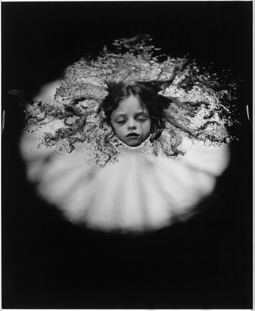
   “At Warm Springs” (1991) by Sally Mann
 

Sally Mann was born on May 1, 1951 in Lexington, Virginia. She attended Hollins College and graduated in 1947 with a Bachelor of Arts. She married Larry Mann in 1970 and has three children Jessie, Virginia, and Emmett. She is a photographer and writer who published many books. Her work is usually in black and white capturing people and landscape.

“At Warm Springs” by Sally Mann is a photo in one of her exhibitions called “Immediate Family”. It is about her family and the subjects are usually her three children, Virginia, Jessie, and Emmett. In the photo above, the subject is her daughter, Virginia. Her body is submerged underwater, only her head and hair is visible drifting in pitch-black darkness.

As I was searching for Sally Mann photos in google images this photo captivated me, it appears to be a head just floating in space. The photo got me intrigued, wondering what this was supposed to be about. As it piqued my curiosity, I clicked on the photo to enlarge it and saw details I could not see before. Her body engulfs in darkness only her expressionless but peaceful face is displayed along with her twisted hair. At first, I could not distinguish what the background is, I assumed she was buried in sand, but as I did my research I found out she is submerged in water. Looking closely, I can slightly see the ripples in the water near her hair and towards the back.

At the first glimpse, I thought death and mortality is the theme that Mann is trying to portray because the subject reminds me of a corpse, her emotionless but peaceful face, closed eyes, and buried. However, upon doing further research I realized I was completely wrong. The theme in the series is about her children’s childhood, freedom, and memories of everyday life. As mentioned before, I thought the photo was about death so I would say what I can relate to in the photo is my own expiration and the unavoidable loss of those close to me as morbid as that sounds, but now after doing research I can relate to the memories of my childhood in the pool with my family, the happier and peaceful time.

Sally Mann uses symmetry and high contrast of light and dark creating a dramatic composition. The darkness completely engulfs her body. Only the direct light illuminates her face and it also resembles a spotlight framing her and that holds my attention. As I try to look around at the dark background, the lines continue to lead my eyes toward the subject further emphasizing her importance. The use of symmetry makes the photo neat, and deliberate. It also looks dynamic because the subject is not straight in the center, but more towards the top. Furthermore, the texture of the ripples in the water creates an outline of her hair which make the photography intriguing.

I choose this photographer because I admire her work. As you know I prefer black and white, dramatic composition with high contrast, and the interplay with light and shadow. Many of my photographs do not have a human subject, I focus more on buildings and objects which is why I admire her portraits of people. I love how she is able to capture their expressions and movement. Her photos are also thought-provoking and compel you to click on her photos to view them more clearly.

Works cited:

Artnet.com, http://www.artnet.com/artists/sally-mann/biography.

Bellafante, Ginia. “Sally Mann Portrait in Which She’s the Star.” The New York Times, The New York Times, 31 Jan. 2007, https://www.nytimes.com/2007/01/31/arts/television/31sall.html.

Editorial, Artsy, and Matt Williams. “Sally Mann’s ‘Immediate Family’ Challenged My Understanding of Photography.” Artsy, 7 Jan. 2020, https://www.artsy.net/article/artsy-editorial-artwork-changed-life-sally-manns-immediate-family.

Mann, Sally. “Sally Mann’s Exposure.” The New York Times, The New York Times, 16 Apr. 2015, https://www.nytimes.com/2015/04/19/magazine/the-cost-of-sally-manns-exposure.html.

“Why Was Sally Mann’s Immediate Family so Controversial?” Public Delivery, https://publicdelivery.org/tag/sally-mann/.