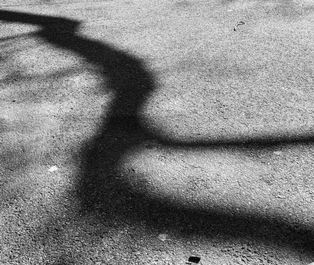
I like how the shadows look abstract and almost as if it’s moving. The light and dark also make a contrast and the texture of the ground makes this picture interesting.
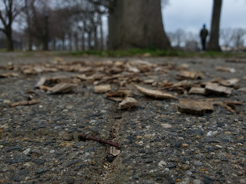
Georgina’s picture
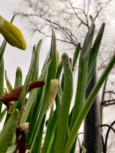
The use of low angle, close up and depth of view all make the focus on the plant instead of the background which I find interesting.
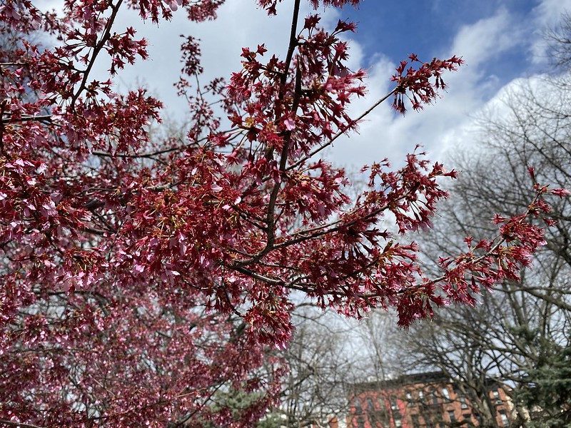
Dameul’s picture is a close up on the cherry blossom tree. This could be a depth of field example with the foreground being sharp and the background is not. He fills in the frame nicely as everything adds to the photo.
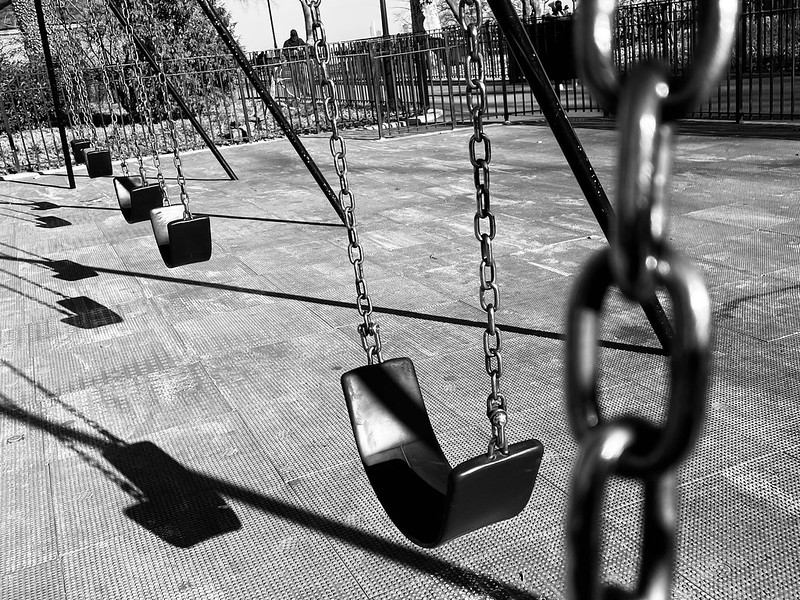
Bonnie’s picture shows a converging line. It creates shadows and creates a pattern. This indicates direct light was used. Diagonals are also seen in the shadows.
1: In Georgina’s photo I really love the way it tells a story using a high angle in a way but in a low to the ground format, as if you looking through the eyes of an animal. This mostly a close up which is why you see the texture of the ground and bark really nicely, but with depth of view playing a roll as the background gets blurry which overall tells a almost sad story when I look at this image.
2: In Cassidy’s photo, she really captured the frame within a frame in a cool manner. Using the reflection as another frame was a real good choice and in that you see great low contrast between the buildings and the brightest of blue of the high contrast sky. I also love how the buildings make leading lines as well. Overall I think she did a nice job and it’s one of my favorites from her 12 images.


Recent Comments