
Prof K Pelka : Monday 6:00 - 9:20
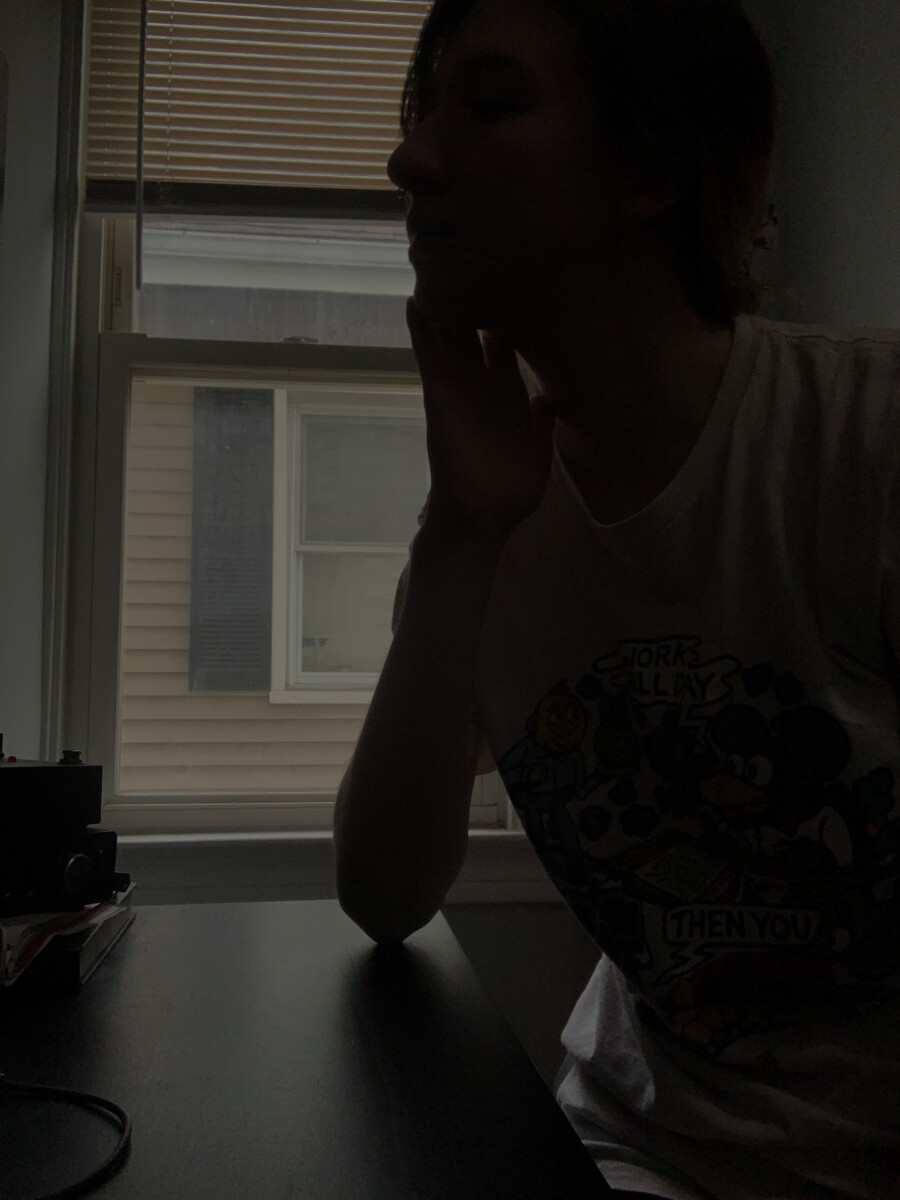
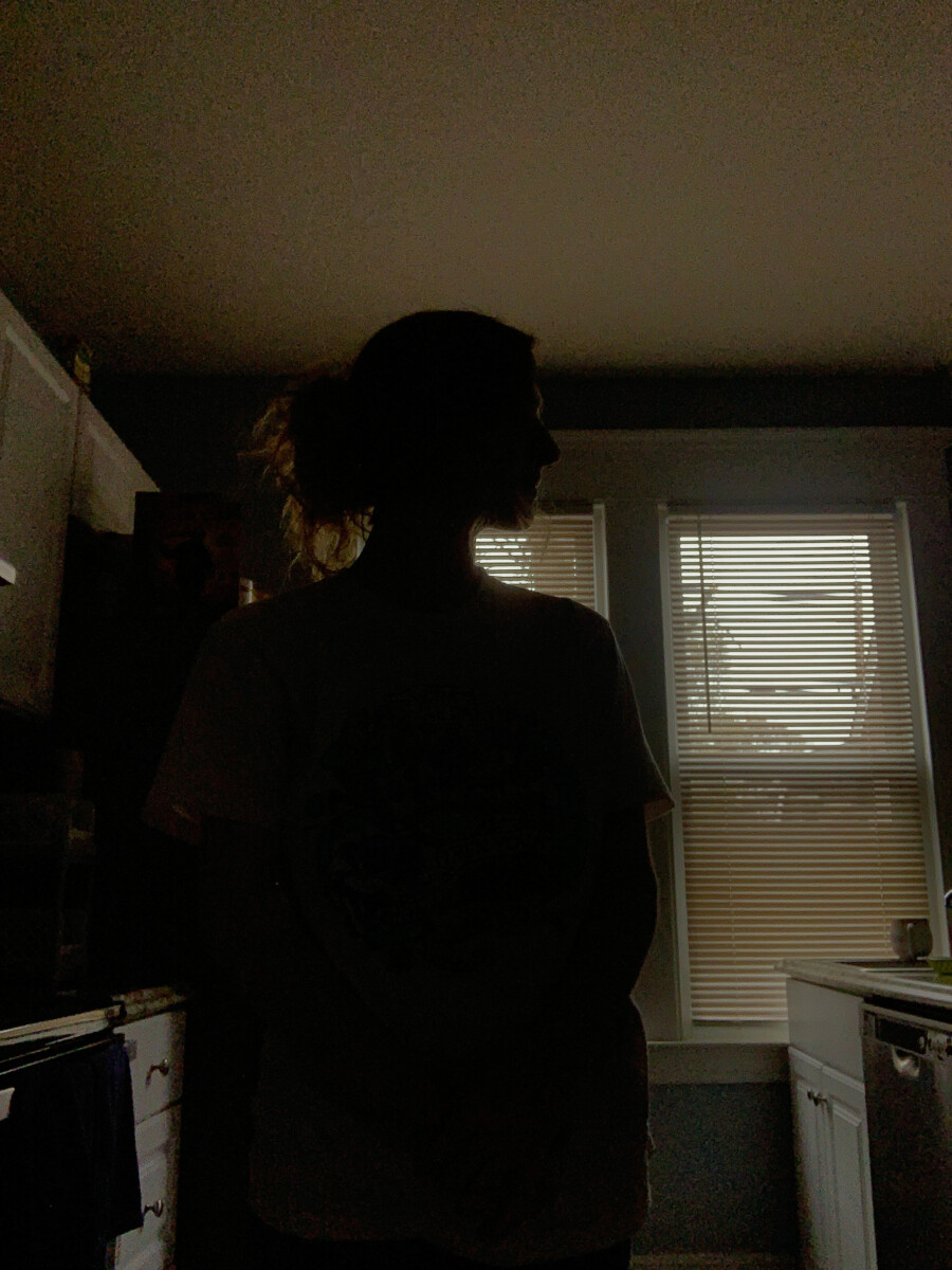
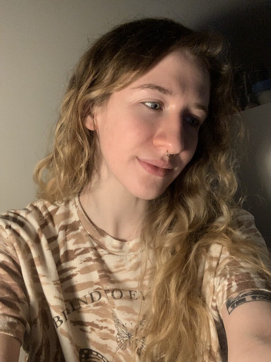
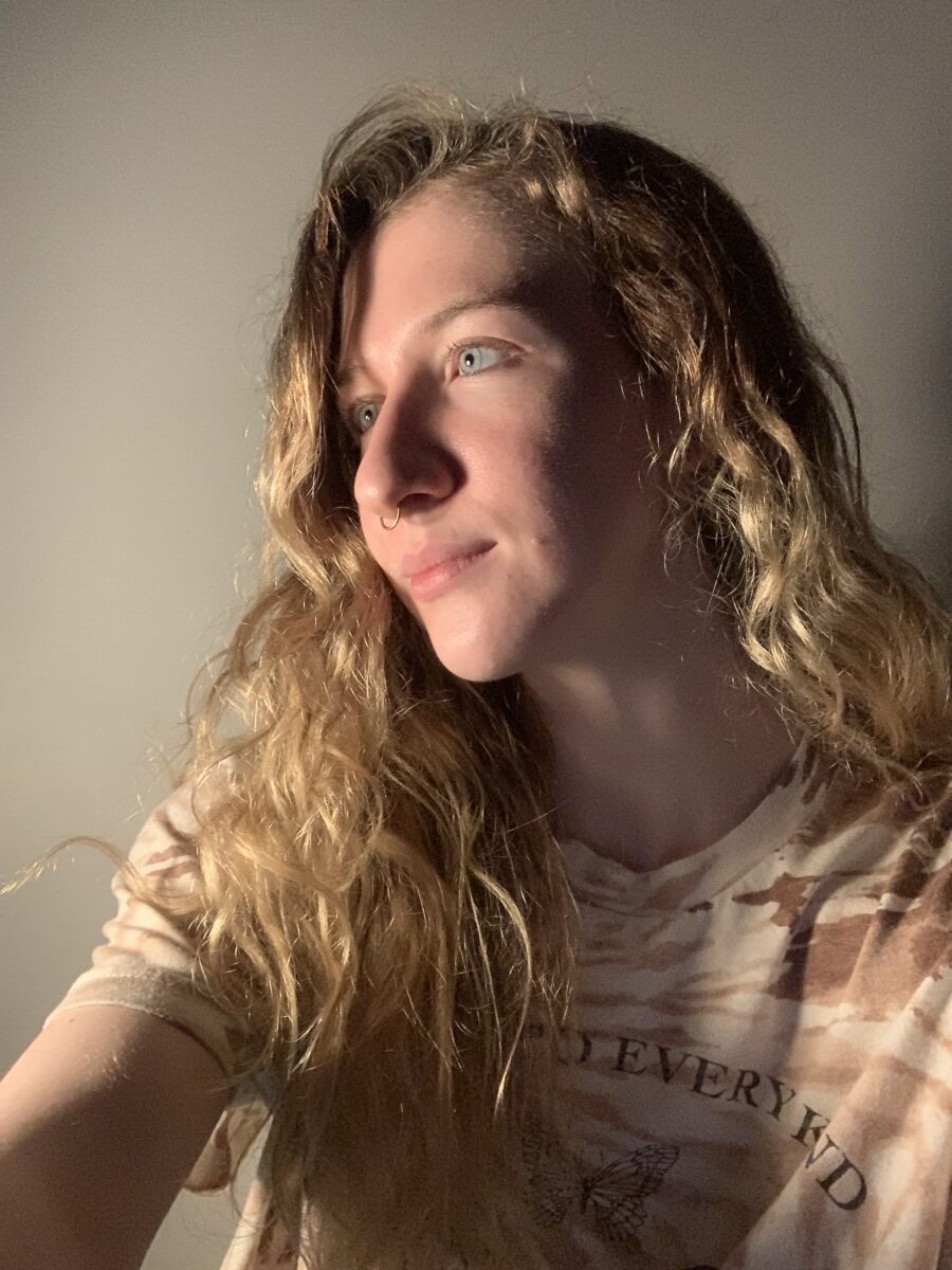
For both photos I had to bring the exposure down a decent amount before taking the photo and had to do it a bit more when editing. I had to darken the images with contrast, shadows, and blacks to be able to get a more solid silhouette.

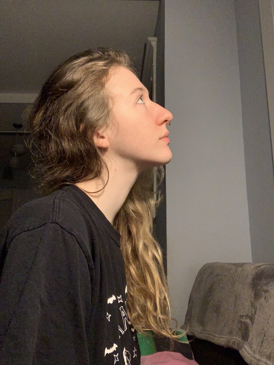
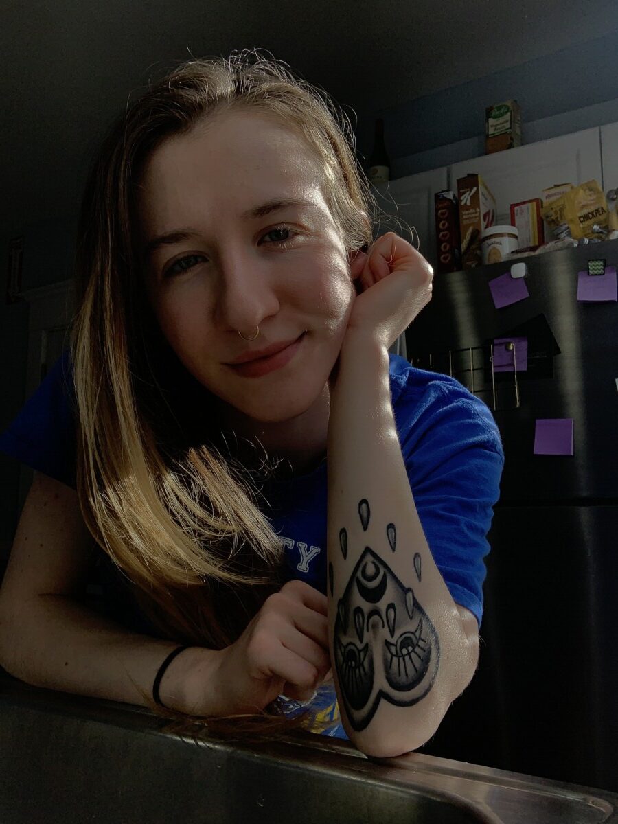
I liked this photo because of the strong areas of light and dark. I think the way my eyes and highlights of my skin look good with the light.
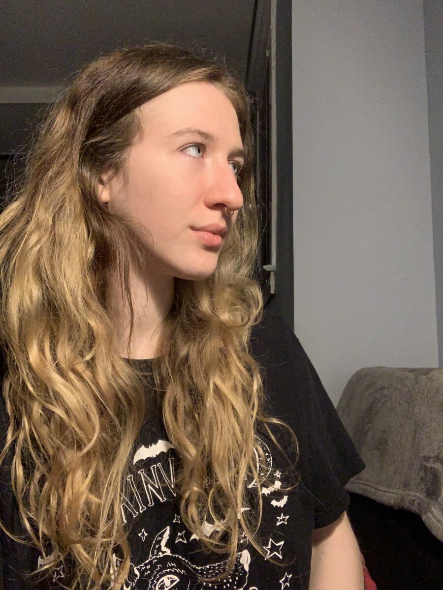
Similar to the first, I like the string contrast in light and dark, but this one has more of a pattern. I think the image looks very sharp due to the strong light contrast.


I think the Rembrandt light was the most difficult to create and I would say that the short light gave the best result.
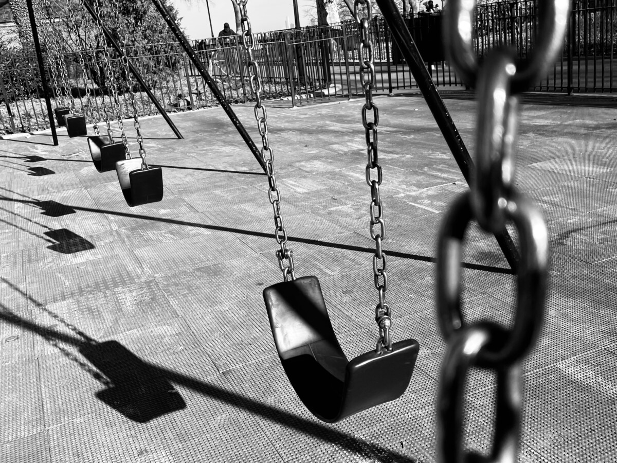
The first thing I noticed about Bonnie’s photo was the strongly contrasted shadows caused by direct light that form a bit of a pattern that draws the viewers eyes to the left. Bonnie also applied shallow depth of field to make the close-up object blurry from an eye-level view in comparison to the rest of the shot.
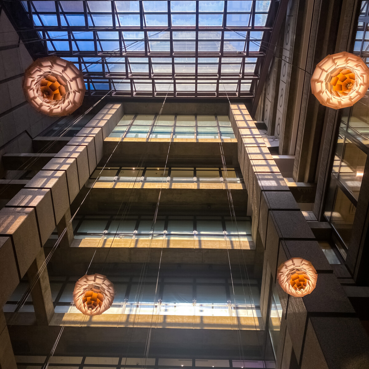
Cassidy’s photo has a lot of warm, vibrant colors that really drew me into the photo. There is an emphasis on the shadows and darker areas of the photos as there is also emphasis on the bright areas. The low angle shot allows for us the see the shape that the glass ceiling is making with the building that draws the eye in.

© 2024 COMD 1340 OL 90 Photography 1 Spring 2022
Theme by Anders Noren — Up ↑
The OpenLab is an open-source, digital platform designed to support teaching and learning at City Tech (New York City College of Technology), and to promote student and faculty engagement in the intellectual and social life of the college community.


Recent Comments