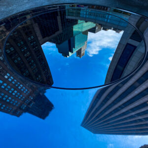
I really love this low angle shot of these buildings. It directly tells the viewer that this is a cityscape. It’s interesting there is a reflection beaming off the circular reflective object. This creates a distortion with the outer edge of the linear building and even the clouds. The vertical line on the tall building gives a leading line factor in the photograph. The relationship between the foreground and background is apparent and I like that there is a contrast between sky and buildings. The saturation of the blue definitely enhances the composition and makes the photo pop while also highlighting the focal point. Very cool shot!
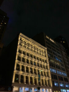
This photograph by Olivia definitely stood out to me because this picture was taken in the dark and yet the highlight on the building is so pronounced! There is a nice highlight and looks like the light source is coming from underneath. The high angle shot looks really cool in the nighttime and I also like the lit windows in the darker shadowed building. It adds a natural contrast. The sky is a hazy navy-blue color which doesn’t blend with the darkness on the side of the building but adds a monochromatic touch. The circular saturated blue light by the building to the edge of the photo also adds to the blueness of the sky. Great photograph!









Recent Comments