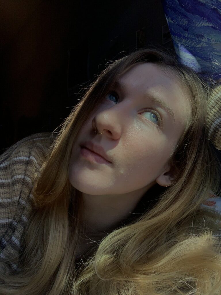
I liked this photo because of the strong areas of light and dark. I think the way my eyes and highlights of my skin look good with the light.

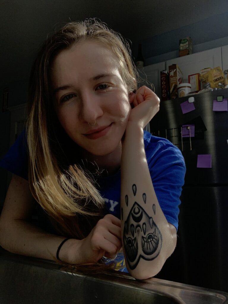
Similar to the first, I like the string contrast in light and dark, but this one has more of a pattern. I think the image looks very sharp due to the strong light contrast.


Good use light and darks. Top pic light captures more of face while bottom pic the expression
is engaging. Bottom pic background is distracting