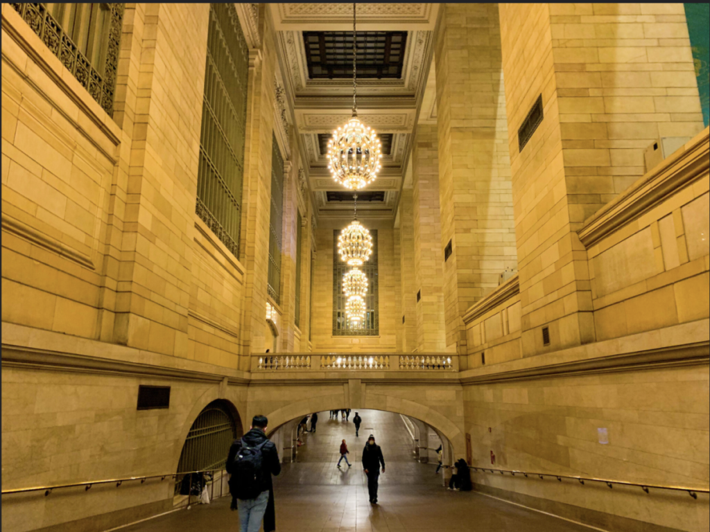
The thing that I noticed in Olivia’s photo was its medium shot. There’s also a leading line that follows through the bridge. The light fixtures that follow each other also make the eye go towards the back of the photo too.
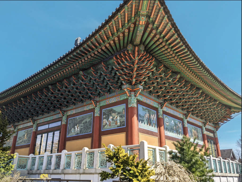
In Harry’s photo the pattern of the tiles on the building catch my eye. It’s shot in a eye/low level. You can grasp that the roof is large and extends outwards. There’s also a pattern that the shadow casts that adds something to the photo.


Cassidy, that’s Tyler’s work not Harry’s.