In Tyler’s photo he uses low angle to take the picture of the buildings. It seems to be a cloudy day when the photo was taken so it’s a diffused light. The use of leading lines makes my eyes move around the photo and the reflection of the building adds to the picture.

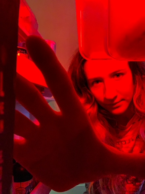
In Olivia’s photo, the refrigerator and her hand frame her face. I think it’s taken at a low angle. The rule of thirds also applies to this photo, her face is slight to the upper right. There is low contrast between the shadows and the light on her face. In addition, the red light set a horror mood in the picture.


Leave a Reply