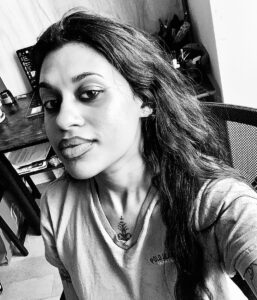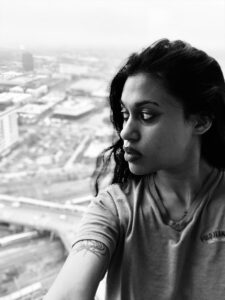

I chose these two photographs because I was content with overall composition showcasing the relationship of light and shadows. The top photo shows the light hitting the side of the face that is closest to the window. The light is casted 3/4 of the face with a slightly exposed ear, making this photograph an example of broad light. I really like the contrast between light and shadows, especially in black and white filter. The second photo contradicts the first photo because the light falls on the face where the ear is not visible. This would be an example of short light. The background creates an interesting effect to the photo, and we can see the way the light is hitting on only a few areas on the face.


good use of contrast for drama. Correct identification of light positions. Bottom pic the best. Both use asymmetrical balance but the background in the top pic is distracting