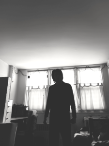
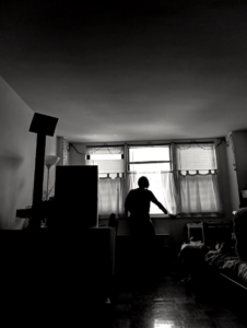
To get a clean silhouette, I first decided that I want this new album to be in black and white since I feel that the lack of colors would help my lighting and shadings pop out more. In lightroom, I just messed around with the adjustments, trying to find what work and didn’t work for me. I mainly wanted to show some details from out the window, but ultimately I wanted to also darken (or hide) the objects/furniture inside my apartment so that my body silhouette would stand out.
On flickr, my album may consist of photos that look like ordinary black and white photos with very little lighting adjustments but that’s mainly because it was on a very bright day and I didn’t want the pictures to look to dark or over-exposed.


Great shot on right. Left needs to be darker