The first thing I noticed about Bonnie’s photo was the strongly contrasted shadows caused by direct light that form a bit of a pattern that draws the viewers eyes to the left. Bonnie also applied shallow depth of field to make the close-up object blurry from an eye-level view in comparison to the rest of the shot.

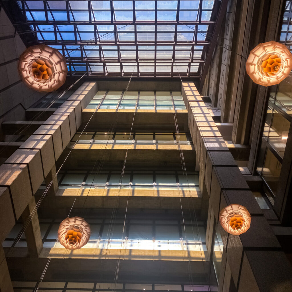
Cassidy’s photo has a lot of warm, vibrant colors that really drew me into the photo. There is an emphasis on the shadows and darker areas of the photos as there is also emphasis on the bright areas. The low angle shot allows for us the see the shape that the glass ceiling is making with the building that draws the eye in.


Leave a Reply