Nicole Harripersad
ARTH 3311
Professor Marianna Trofimova
May 17th, 2018
Cooper Hewitt Final
On Saturday, May 12th, I made my very first visit to the Cooper Hewitt Museum. It was located at 2 E 91st St, in Manhattan. I never visit museums so often, so I was very excited to visit one outside of Staten Island. Before going to the Museum, I did research about Cooper Hewitt, on how it features outstanding and amazing exhibit halls in different floors that consisted modern, contemporary art with a deep historical background on the design and the artist themselves. When I was exploring the museum, I noticed that it was very involved in various interactives in parts of the exhibits. It was weird because I had to carry around this big stylus to get information of the designs and art. But, it was fun because I was able to get a lot of useful information in the museum about Graphic Design, Shaped Art Styles, Deco Art Styles. After the trip, my mind opened up in many ways. I was able to have a deeper learning involvement in all of the styles and artists. I was able to see what sort of development the realistic works were affected and how the artists, designers, photographers were able to utilize them and make their own view and better clarity of it. The developments throughout time have impacted our reality of the art world and have been a motivation for some creators. And I am glad to say after my trip, I was able to get very useful information on many art styles such as Arts and Crafts, Illuminated Manuscripts, Art Deco, Art Nouveau, Russian Constructivism, and many more.
DRAWING, BLUE INTERIOR
 This is a painting of an interior of a room mostly consisting of different shades of blue. Thus calling this piece “Blue Interior”. It was created by an artist by the name of C. Rath. in 1877. Cooper Hewitt was able to grab this piece and put a display in 2007. What I really like about this piece is not just because my favorite color is blue, but the medium materials used in this piece such as watercolors, gold paint, and gouache, which is heavy watercolor. The type of art style that was most likely used in this piece would probably be an Art Nouveau style because of its unique historic style. Art Nouveau appeared to have some sort of old-fashioned look and had a distinctive decorative style because of color, texture, and space. And it contains traditional illustrational values for the reason of clarity and structure.
CABINET ON STAND
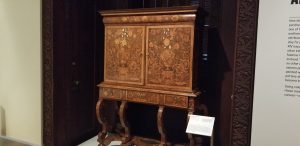
 This is a cabinet that was designed around 1675-1700s around the colonial era. Cooper Hewitt acquired this lovely piece around 1926. It was said that it was designed by a skilled Dutch craftsman providing the handcrafted wood. The cabinet was also probably made for a sophisticated English client. The cabinet features floral engravings which include tulips. The Floral arrangements with tulips were the subject of paintings, and engravings, It made this piece stand out. What I really like about this is because of the engravings because I think engravements in art pieces make the objects stand out and unique. The art style that was used in the cabinet was arts and crafts because it stood for simple and traditional artisanship, just like the artist who designed and engraved the cabinet and unique style of decoration.
THROUGH ANAGLYPH-COLORED GLASSES
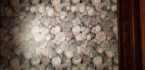
 In this exhibit, there was a piece where people can view a red and blue piece with 3D glasses. It was cool because of the way it’s viewed before and after. This wallpaper was designed by artist y Luz Elena Wood. This design consists of a bunch of Aeonium cacti. Luz Elena was inspired by photographs of the actual cacti and how it blooms. Quick info about this piece it’s called an Anaglyph it’s called this because of the 3D effect it gives off. This type of 3D effect was first designed in the 1850s. It’s what each eye sees using red and blue filters of different and usually opposite colors, typically red and blue. This type of style would be a bit of the art and crafts movement but also has a stronger influence on the movement of America because of the cacti print and the simple red and blue colors.
URN
 At first, I thought this was a vase. Because it literally looked like a vase, but then I was told it was an urn. And in my mind, I thought, how can something this pretty be an urn when it looks like a vase. This urn was designed and manufactured by an Olérys and Laugier’s pottery factory in 1780. Cooper Hewitt acquired this recently in 2017. Checking the date on when this was created, I would have said arts and crafts but it couldn’t have been because of the dates of the movements. I would say the Industrial Revolution has made an impact towards this because Artists have benefited both positively and negatively from the effects of the Industrial Revolution. Also producing new items made it easier to create clothing, textiles, and of course ceramics and vases and more.
POSTER, ATOMS FOR PEACE
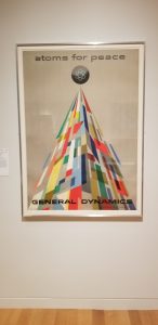
 This poster was designed by Erik Nitsche and was printed by Lithos R. Marsens and was made for a client called General Dynamic Corporation. It was created in 1955 and Cooper Hewitt manage to obtain it in 2013. The medium used is an offset lithograph on paper. This type of design style used is a Swiss-style mostly. Because of its use of typographic and graphic design. And a use of a standard grid base.
POSTER, THE MILLER BLUES BAND
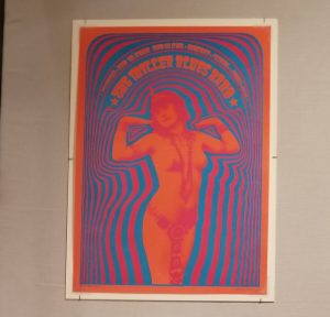
 My favorite design the most. Because of the use of color and the way it pops up, and I just love how it consists of only 3 color and the use of shades. This poster was designed by Victor Moscoso and printed by Neon Rose. It was created in 1967 and Cooper Hewitt acquired this piece in 1979. The materials in the medium consisted of an offset lithograph on white wove paper. This type of art style in my view would be Kitsch. Because of the bright uses of color, and the beautiful photography used in the work. It also looks decorative, as if someone would hang this up in their living room or bedroom. The kitsch design has its own aesthetic ideal of clarification and plays an outstanding role in popular culture and entertainment.


