Monthly Archives: December 2018

Museum visit-Rahel Lehar

Rahel Lehar
Russeck gallery visit
12/16/18

Damien Hirst “The Silver Heart” 2005

The art piece is obvious because it is clearly distinguished from a solid black background. The heart has repetition because it repeats having needles placed continuously all over it. It is achromatic because it lacks hue and saturation. The heart has shadow from the bottom and highlight from the top. It is high key because the values are more lighter.
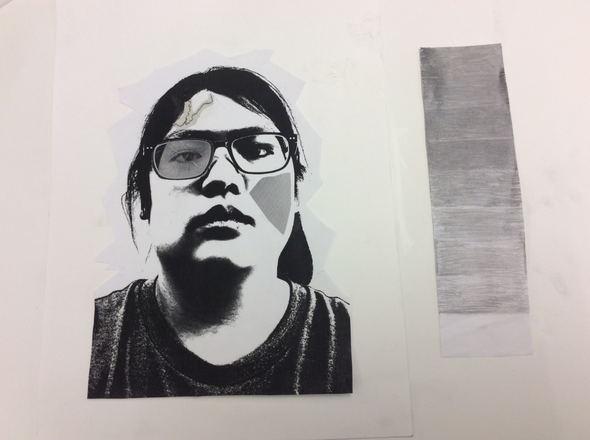
Both the silver heart and selfiemotion have values that are predominantly lighter. They both have shadow coming from the bottom and light forming at the top. They are both achromatic because they lack hue and saturation. The heart has the same angry mood as project 3. They only have grayscale.


Continue reading

Museum Visit – Amy

I visited the Museum of Metropolitan Art. Unbeknownst to me, there were a couple of famous paintings, including The Starry Night by Vincent Van Gogh. This piece in particular reminded me of the Project 1 – Lost and Found. Although not impressionistic, I found my art to be reminiscent of some of the details in Van Gogh’s painting.


Museum Visit – Alvin


Andy Warhol Screen Print on Canvas

Date Visited 12/17/18

The artwork I chose was from the Whitney Museum of Marilyn Monroe by Andy Warhol. It was a small portion of an all over print. I picked this piece because I found it very similar to our Project 4 assignment. He used color to define certain areas of interest as we did, he used color to also add texture and rhythm in the piece. It was interesting how he used scale to make this an even more powerful work of art.

Museum Visit-Natalie Soto


John Dunkley, Back to Nature, Mixed media on plywood, 1939

Project 1. Lost and Found

In Dunkley’s piece, Back to Nature, there are all sorts of organic shapes rather than geometric shapes, just like in my Project 1, Obvious and Ambiguous piece. There also seems to be a balance between the positive and negative space. In my piece it only consists of two colors, white and black. In Dunkley’s piece, there are more than two or three colors, there’s a whole variety, there’s also a bit of symmetry. There are barely any lines but instead i can make out a focal point.

Museum Visit – Caleb

The picture on the right was a image took at the Museum of the City of New York. The photo I took was a piece of illustration drawn by Don Freeman for his famous work on the popular children’s book, A Pocket for Corduroy. The image shows a room full of chairs and bed with blue and red being the primary colors being used. The elements I find in common with this art and my design is  they both are using 2 primary colors blue and a near reddish color. Some differences I see is my background is red orange and his art has a mostly blue background. Also his artwork has lost of objects in work but mine doesn’t.

museum visit christopher liao

Jeffrey Veregge: Of Gods and Heroes 12/14/2018 also american indians

this is hulk the famous marvel superhero with the giant muscles foreground is the green on him and the green squares represent strength on him. each square came from inspiration from the totem poles from native american tribes. the project i will compare this with is project 2 texture and pattern because with the squares represent an uneven pattern cause i chose a difficult object for the project which was all over the place and it had no direction. this pattern makes think that everything has its meaning regardless of pattern


Museum Visit – Cameron Scotland


(My piece, close-ups of it, and also my two compositions from the first project)

Museum: The Brooklyn Museum

Date Visited: 12/16/18

Piece Name & Date: “Aggregation 09-DO71 Blue”, 2009

Artist: Kwang Young Chun

I decided to compare the piece I chose to our very first project which focused on obvious and ambiguous compositions as we shot pictures of random places and things outside. There were multiple pieces I would have liked to analyze but this one I found the most interesting and thought would be nice to breakdown in terms of all the things I’ve learned over the semester.

Museum visit

during the visit to the museum was very interesting because I saw different kinds of artwork the most interesting was the hulk and marvel characters I stumbled upon by Jeffrey Veregge: Of Gods and Heroes.

Below the work there is hulk the mighty green super hero.this work shows squares muscles the features of super strength that he has. The green background is ambiguous because inside we do not know what it is. Within the squares on the outside show something to represent native Americans. For project 4 I had green background along with my red to show green is a good color to use